Tutorial: Create a groundwater quality map from borehole data
4. Interpolate groundwater quality data
4.4. Kriging
In this section we'll apply the kriging method for interpolating the NO3 measurements in our borehole dataset. Kriging uses the spatial autocorrelation in the dataset for interpolation. There are many different types of kriging, but here we use the most simple from: Ordinary Kriging. The method needs a semivariogram. With the Smart-Map plugin we can generate the semivariogram and fit models that can be used for kriging.
1. Install the Smart-Map plugin from the plugins manager. You probably need to install missing Python packages. Check the documentation of the plugin by clicking Homepage.
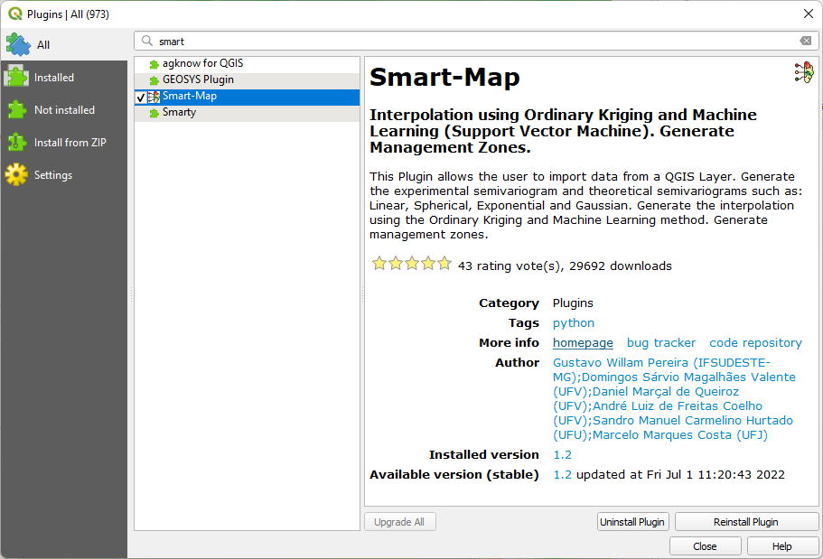
You can add those packages to QGIS using the OSGeo4W installer. Check this video:
2. After successful installation, click the  icon in the toolbar.
3. In the Smart-Map dialog stay on the Data tab and choose the NO3 layer as Input layer and choose NO3_mg_l from the drop-down list to choose the Z value. Click Import....
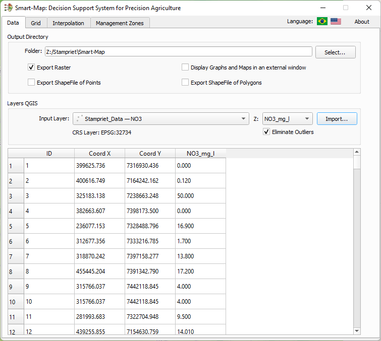
This will ingest the data and a table shows the data.
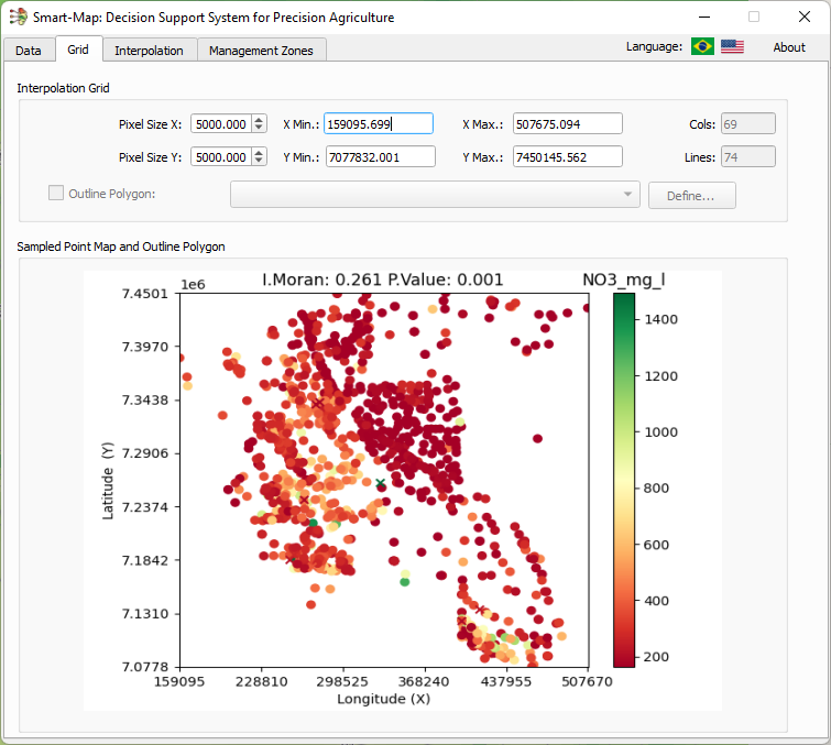
4. Go to the Grid tab. Here we can define the spatial resolution of the output raster. Set the Pixel Size X and Pixel Size Y both to 5000 m so it matches the resolution of our IDW interpolation.
5. Go to the Interpolation tab. This is where we're going to create and fit a semivariogram. Click Calculate... to see the first result under the Variogram subtab.
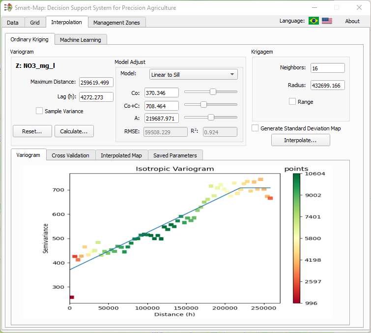
We need to change some parameters to get a better result.
This is an explanation of the settings:
- Maximum distance: maximum distance (m) for which points are considered for the variogram
- Lag(h): the distance (m) over which points are paired to calculate the semivariance
- Model: semivariogram model that is fitted using the parameters below
- Co: Nugget, which accounts for random error.
- Co+C: Sill, the maximum semivariance, which is achieved at the range distance
- A: Range, maximum distance of spatial autocorrelation
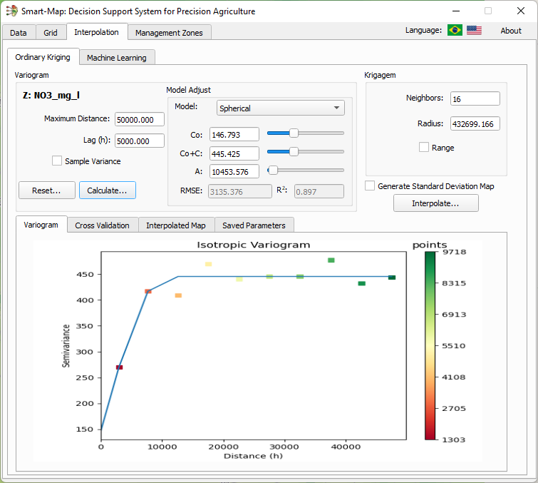
7. Play with the parameters to improve the model.
8. Once satisfied with the model, click Interpolate....
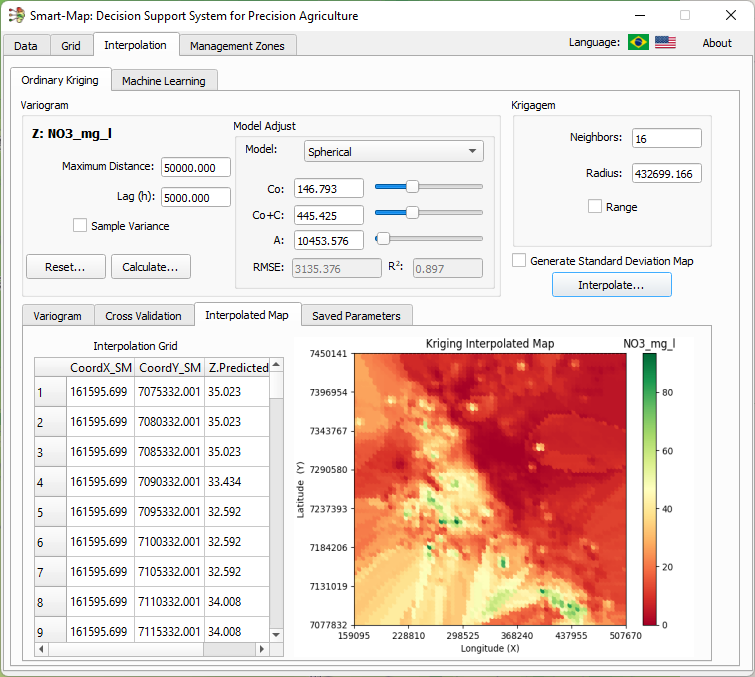
The result is shown in the dialog and the raster is loaded in the map canvas.
9. Close the dialog and click Yes in the popup to confirm.
10. Paste the style from one of the other interpolations and compare the results.
What also helps to interpret the results is to colour the NO3 points with the same gradient.
11. Move the NO3 point layer to the top of the Layers panel.
12. In the Layer Styling panel choose the Graduated renderer, use NO3_mg_l as the Value and select the same ramp as the interpolation results.
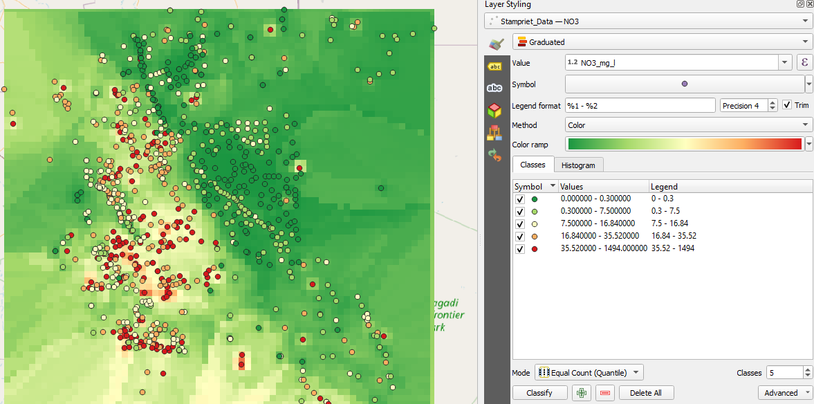
13. Adjust the class boundaries (edit the Values column) to better resemble the raster colours.
- Describe the results. Do you see patterns, what are differences?