Tutorial: Remote Sensing Image Classification with QGIS
5. Using the Semi-Automatic Classification Plugin
5.6. Evaluate Training Areas
We can compare spectral signatures of the ROIs. Let's first compare signatures of one class to check the inter class variability.
1. Select all cotton signatures by selecting the row that only mentions cotton. Then click  to add their signatures to the spectral signature plot.
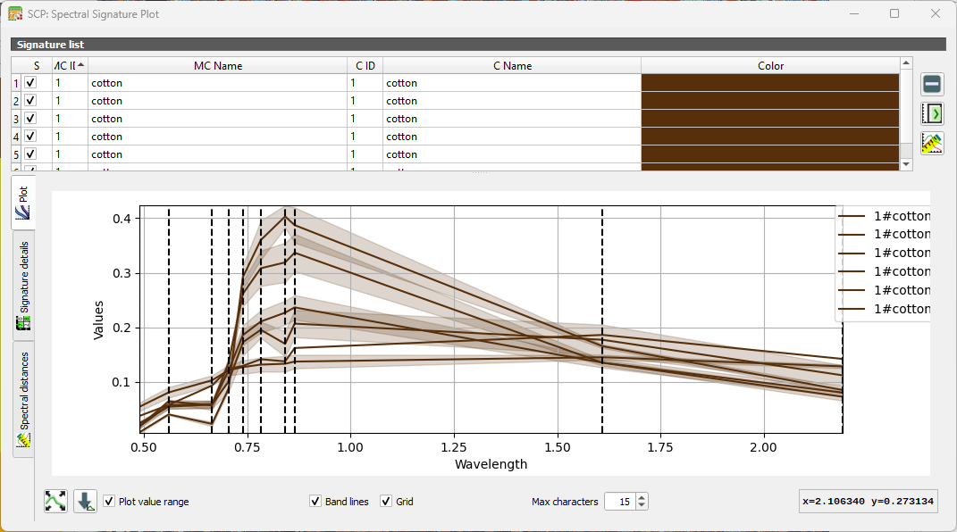
You can show/hide specific curves by checking/unchecking the box in the first column of the table. The vertical dashed lines show the bands.
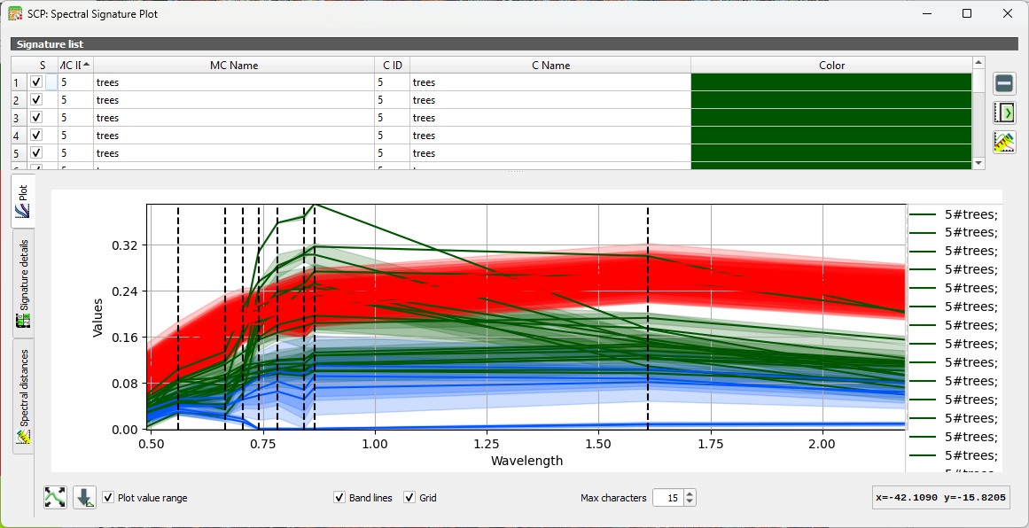
2. Repeat this for several classes. You can add and remove signatures from the table in the Spectral Signature Plot dialog.
3. Now compare signatures of different classes.
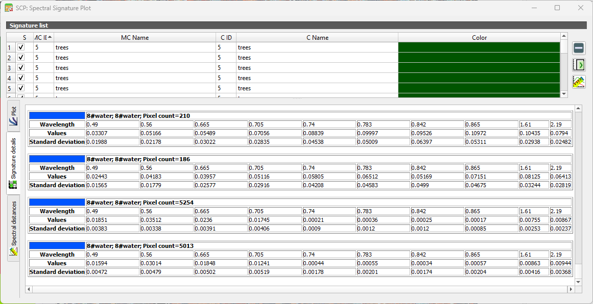
Under the Signature details tab you can see statistics for each ROI.
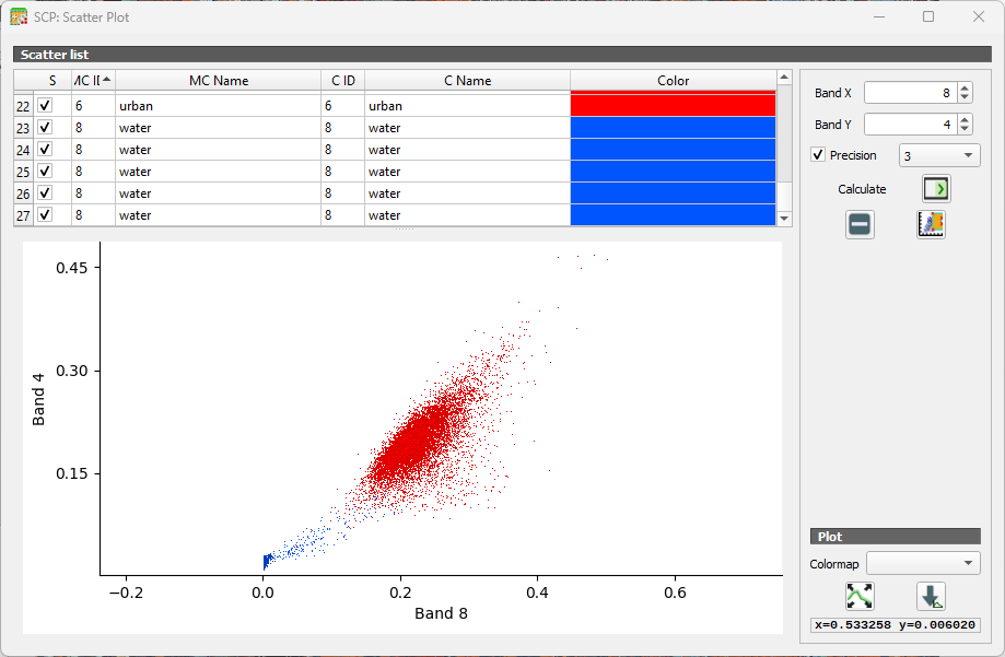
Another way to look at the classes is in the Feature Space Plot. The Feature Space Plot is a visual tool that helps you understand how different land‑cover classes are distributed in spectral space. It’s especially useful before classification, because it shows whether your classes are spectrally separable, a key requirement for good supervised classification.
A Feature Space Plot displays:
- Two spectral bands on the axes (e.g., Band 4 vs Band 8)
- Training samples (ROIs) plotted as points
- Colors representing different classes
- Clusters showing how similar or different classes are in spectral space
You can think of it as a scatterplot of reflectance values. If two classes form distinct clusters, the classifier can easily tell them apart.
If clusters overlap heavily, the classes may be confused during classification. This often happens with:
- Similar vegetation types
- Bare soil vs built‑up
- Water shadows vs deep water
Points far away from the main cluster may indicate:
- Mislabelled training samples
- Mixed pixels
- Cloud shadows or noise
 .
.