Symbolizing Points by Varying Size
| Site: | OpenCourseWare for GIS |
| Course: | Creating data visualisations with graphs, maps and animations |
| Book: | Symbolizing Points by Varying Size |
| Printed by: | Guest user |
| Date: | Sunday, 26 July 2026, 11:24 AM |
1. Introduction
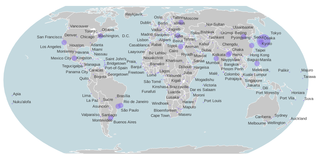
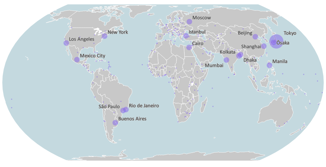
Good, clear symbology and limited color palettes are very common in newspapers and other news media. That is why we are going to make a map here with limited use of colors, but with as much expressiveness as possible.
In the map we are going to make, we visualize cities by means of semi-transparent circles, which vary in size based on the population. The transparency allows us to see both the overlap between cities, as well as the borders of provinces and countries under the circles. We'll also add nice label and create a Print Layout with an intuitive legend.
For this tutorial we'll use open data from Natural Earth. In the next section you'll learn how to download and load the data.
The materials are based on a course by Dirk Voets, lecturer at NOVI University of Applied Sciences and modified for this course by Hans van der Kwast.
2. Download Open Data from Natural Earth
Let's download the open data for this tutorial from Natural Earth. Natural Earth is a public domain dataset with vector and raster data that you can freely use to create maps.
1. In your internet browser go to the Natural Earth website: https://www.naturalearthdata.com/.
2. Go to the Downloads tab.
3. Download the GeoPackage to a folder on your hard drive where you want to work for this tutorial. Remember that you shouldn't use spaces, minus or other strange characters in the folder and file names.
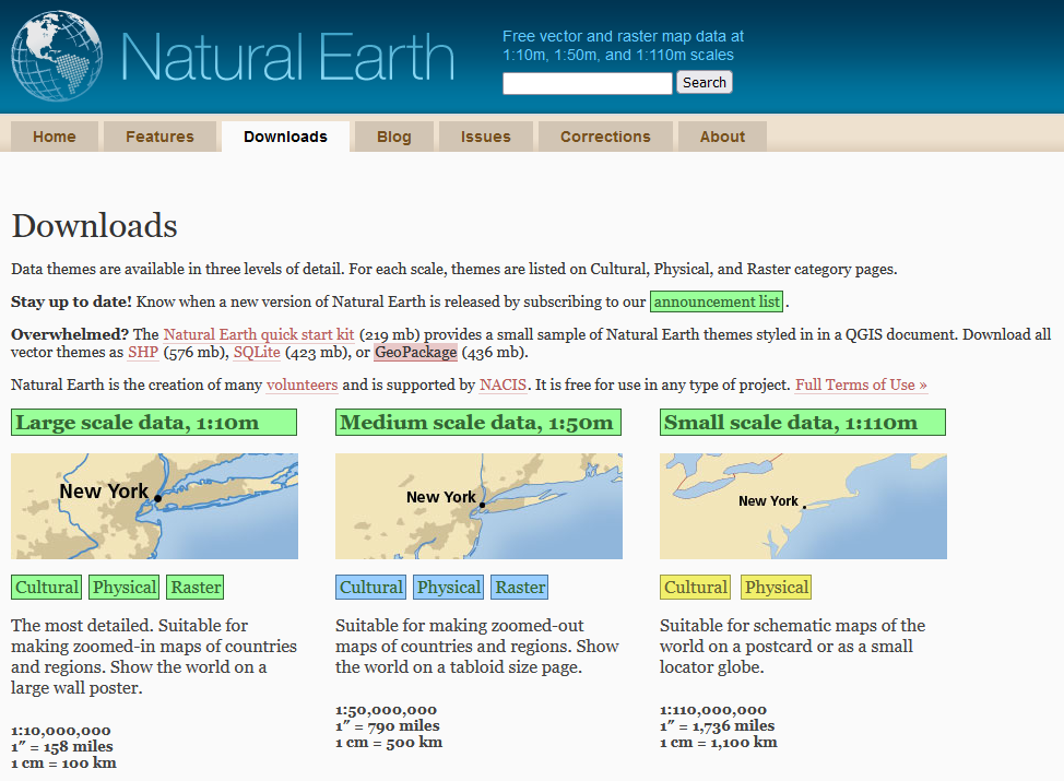
The downloaded file is a ZIP file, which means it's compressed and you need to unzip it before you can use it.
4. Extract the file (e.g. with 7-Zip).
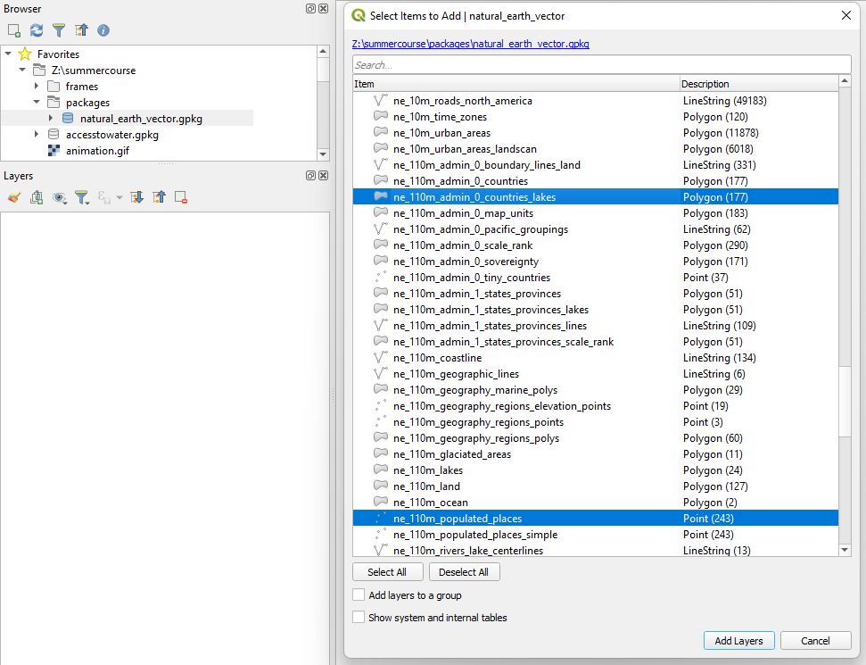
5. Start QGIS Desktop with an empty project.
6. In the Browser panel go to the packages subfolder that you extracted and drag natural_earth_vector.gpkg to the map canvas.
A popup will show to select the layers that you want to load.
7. Only load the following layers by selecting them with the Ctrl button pressed and click Add layers.
- ne_110m_admin_0_countries_lakes
- ne_110m_populated_places
3. Styling the Country Polygons
Now we're going to style the country polygons.
 to open the Layer Styling panel.
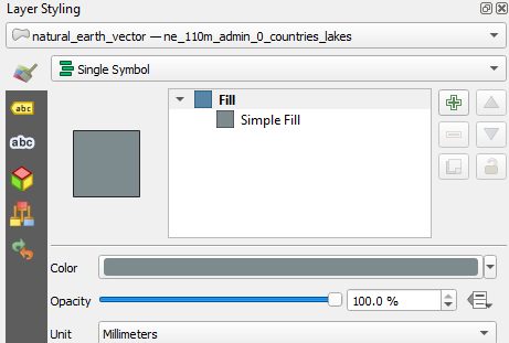
 to go back.
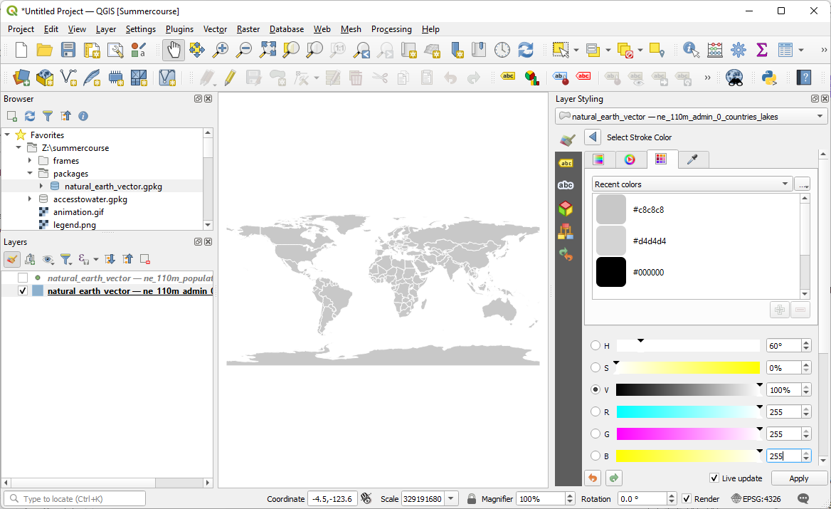
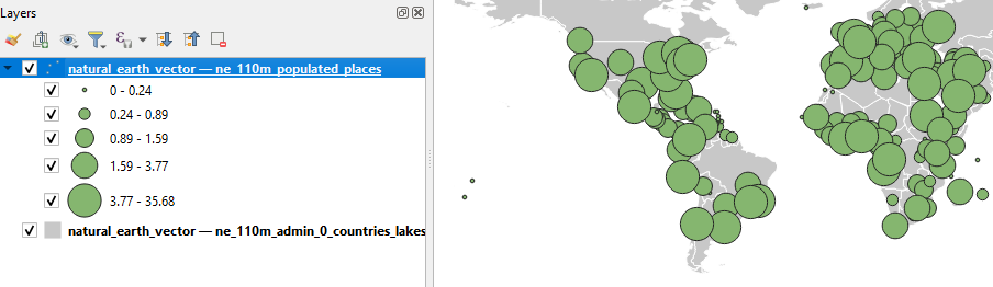
4. Styling the Population of Cities
Time to show the cities nicely. Of course you are not familiar with this data, in real life you will probably know your data a bit better. But one tip we can give you here is that the population is an attribute for each city. You can find this in the field POP_MAX. It is the total number of inhabitants for the agglomeration, not just for the place of residence.
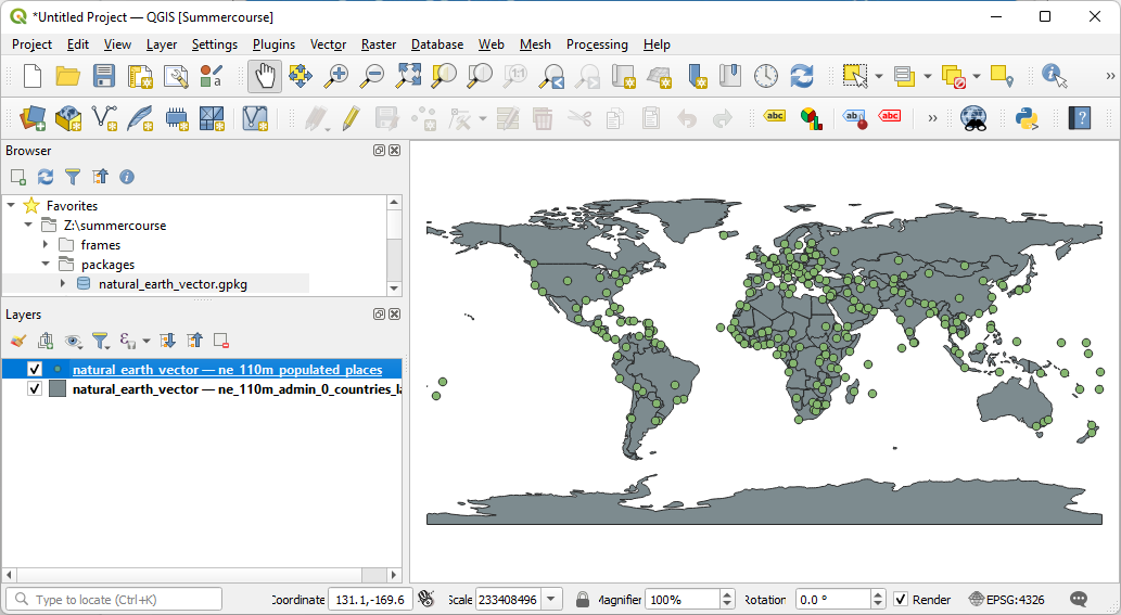
1. Switch on the point layer with the cities by checking the box before the layer in the Layers panel.
2. Make sure this layer is the target in the Layers Styling panel.
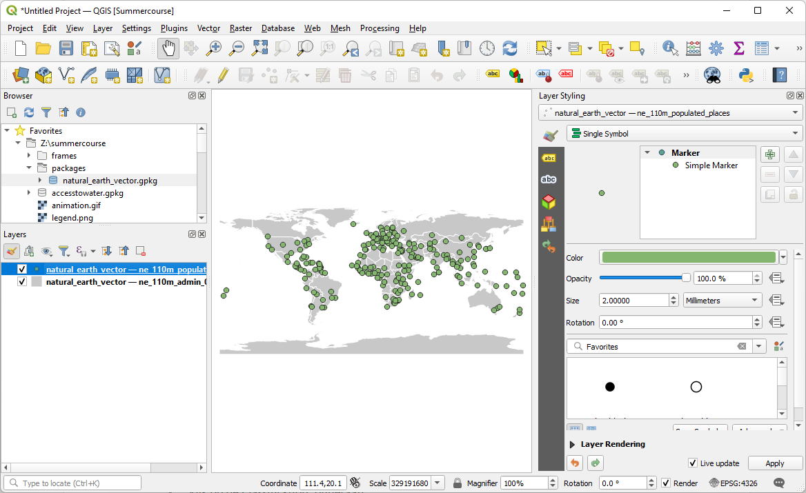
We don't want to show the cities all with the same symbol. We want them to be represented with different sized circles, which symbolize the number of inhabitants. Let's set that up now.
3. In the Layer Styling panel use the drop-down menu to change the Single Symbol renderer to the Graduated renderer.
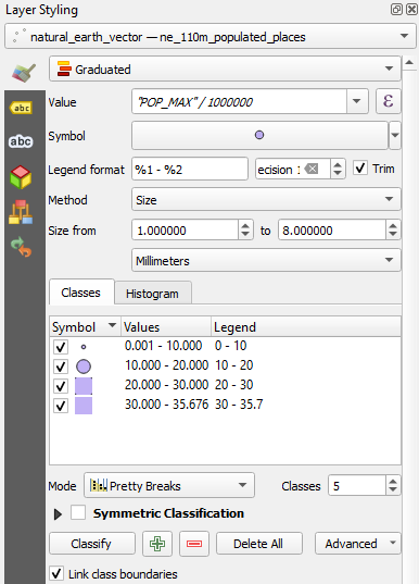
4. Choose the POP_MAX field for Value.
5. Change the Method from Color to Size.
6. Click Classify.
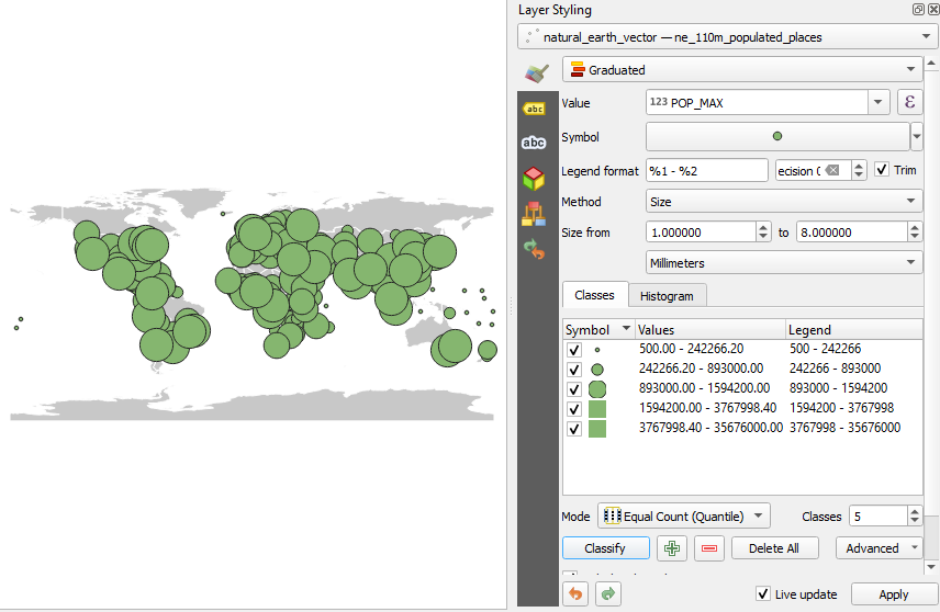
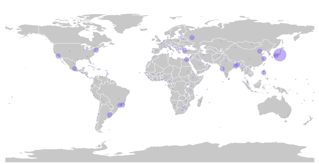
You will now see a first map with circles showing the population. The legend is still quite illegible, because the number of inhabitants gives very large numbers! It is better to work with millions of inhabitants as a unit, instead of individual inhabitants. We're going to change that now.
7. In the Layer Styling panel click  next to Value POP_MAX to open the Expression Dialog.
8. Change the expression to:
"POP MAX" / 1000000
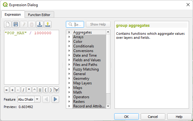
9. Click OK to close the dialog.
10. Click again on Classify to apply the calculation of the new values.
The legend is now much more readable.
The cities are still displayed with a random color, in this example green. You probably have a different color. That is not the desired color. We'll adjust that now.
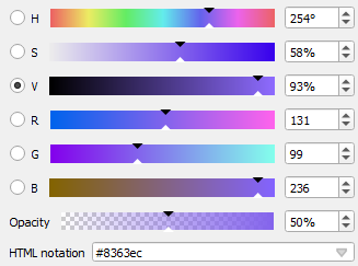
11. In the Layer Styling panel click on the point next to Symbol.
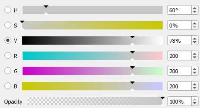
12. Click on the Color bar and change the color to RGB 131 | 99 | 236.
13. Set the Opacity (that's the inverse of transparency) to 50%.
14. Go back by clicking  two times.
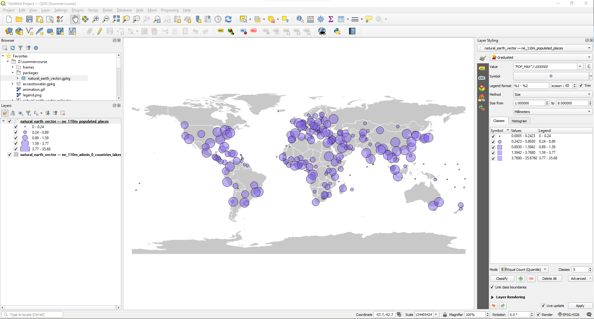
In the Layer Styling panel you can see that by default it creates five classes for the population in the cities and that it uses the Equal Count method or Quantile. Quantiles are a nice statistical principle to create classes with, but now you get very weird class boundaries. Although a little less attractive statistically, we are going to adjust the class boundaries so that the boundaries are more appealing for the user.
15. In the Layer Styling panel change the Mode from Equal Count (Quantile) to Pretty Breaks.
16. Next, uncheck the box for Trim and see what happens to the legend. Then switch it back on.
Most cities fall in the lowest class. For these circles the stroke is too thick in comparison with the surface area of the circle and their color is almost invisible. Therefore, we're going to remove the stroke specifically for the lowest class.
17. In the Layer Styling panel, double-click on the symbol of the lowest class to change the styling properties for this specific class.
18. Select the Simple Marker renderer.
19. Change Stroke style from Solid Line to No Pen.
20. Click to go back.
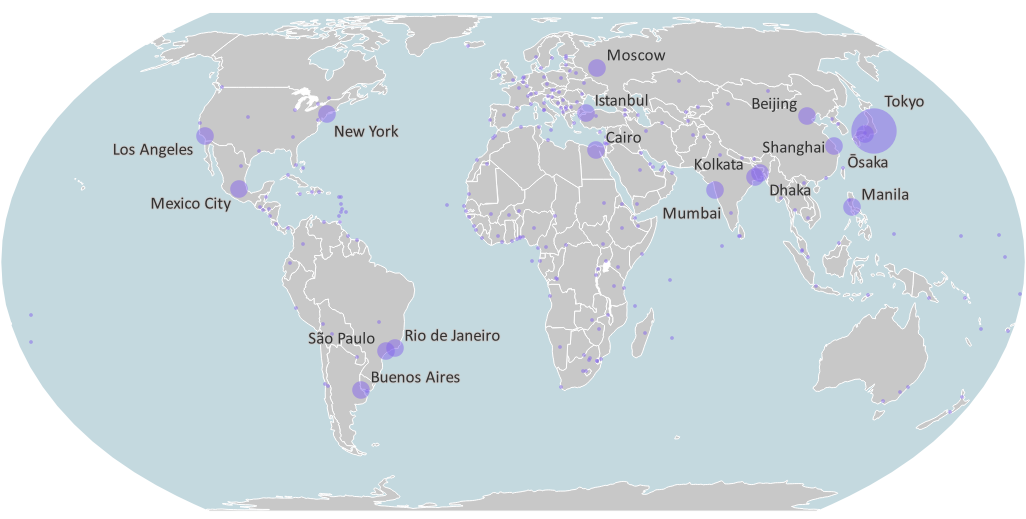
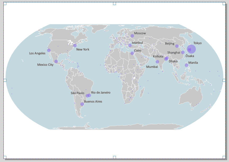
You just generalized the map. The map itself still shows all cities, but attention is now drawn to the large cities, which apparently have more emphasis than the small ones. This will help the reader to get a better sense of how the population is spread over the earth.
Maybe we can make the map even more dramatic and clearer by boosting the size of the circles a bit.
21. In the Layer Styling panel the Size is by default scaled between 1 and 8. Change this to a scaling from 1 to 12.
Play with bigger circles. The larger the circles, the more expressive. But at some point they overlap so much that it becomes too much. It is a personal assessment of what is correct in this case, there is no standard rule for that. Intuitively I would say that 1-12 gives a nice expressive map, without exaggerating.
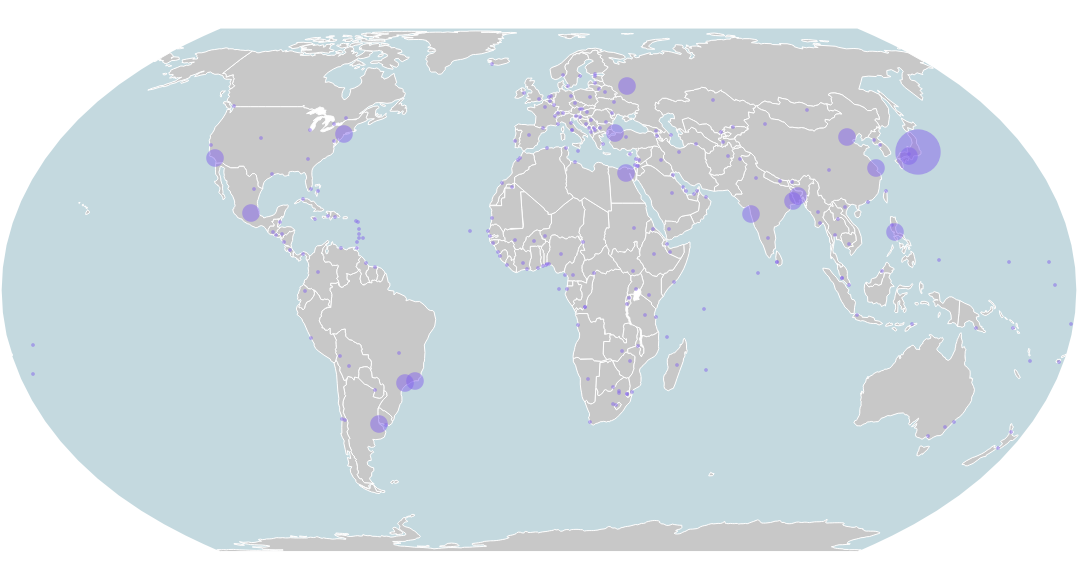
In the next section we're going to add a background color for the oceans and change the projection.
5. Adding the Ocean
The background is now white. Let's change it to a blue ocean.
The projection of the project is now in Geographic Coordinate System (WGS-84 with latitude/longitude coordinates in degrees, EPSG:4326). Let's first change this to the Equal Earth projection, which preserves the proportion of surface areas.
1. Click on the EPSG code in the lower right of the QGIS window.
The CRS tab of the Project Properties now opens.
2. Type Equal Earth at Filter.
It now shows several matches. Some of those projections are centered on Asia Pacific, some on the Americas. For Europe (=Greenwich) there are three. The first of those three pretends that the Earth is a perfect sphere (and it isn't, but maybe it doesn't matter on the map scale we're going to use). The second is based on WGS-84 as a description of the shape of the earth and comes from the European Petroleum Survey Group (EPSG). The third is actually the same, but comes from ESRI.
3. Let's choose EPSG:8857.
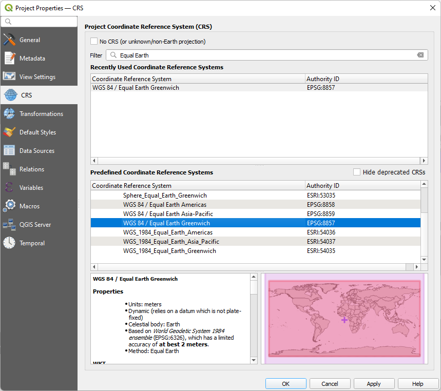
4. Click OK.
5. Now add the ne_110_ocean layer by dragging it from the Natural Earth GeoPackage in the Browser panel to the map canvas.
6. Drag it to the bottom in the Layers panel.
7. In the Layer Styling panel make sure that is the active layer and change the fill color to a subtle light blue that goes well with the rest of the map.
8. Change the Stroke Style to No Pen.
In the next section we'll add labels to the cities.
6. Add Labels
It's time to add the labels.
1. In the Layer Styling panel make sure that the target layer is the layer with the cities and go to the Labels tab by clicking  .
.
2. Change from No Labels to Single Labels.
Bang! Your maps is full of labels!
Well, that's a bit too much for our nice map.
Let's see what we've done, and what we can improve on.
First of all, the software has estimated that you will probably want to use the NAME field to display the name of the places, which is okay.
The default font can be improved.
3. Change the font to Calibri, 13 points. This is a nice sans serif font for readability.
In the map as it is now, there is actually nowhere a conflict between the black texts and the background. It is debatable whether a text buffer is necessary in this case. Nevertheless, we do it once, then at least you know where it is. And who knows,
if it doesn't help, it might not hurt either.
Now that we're on the second tab about Labeling in the Layer Styling panel, you've got NINE (!!!) extra tabs with settings there. So there is a lot to set up and understand.
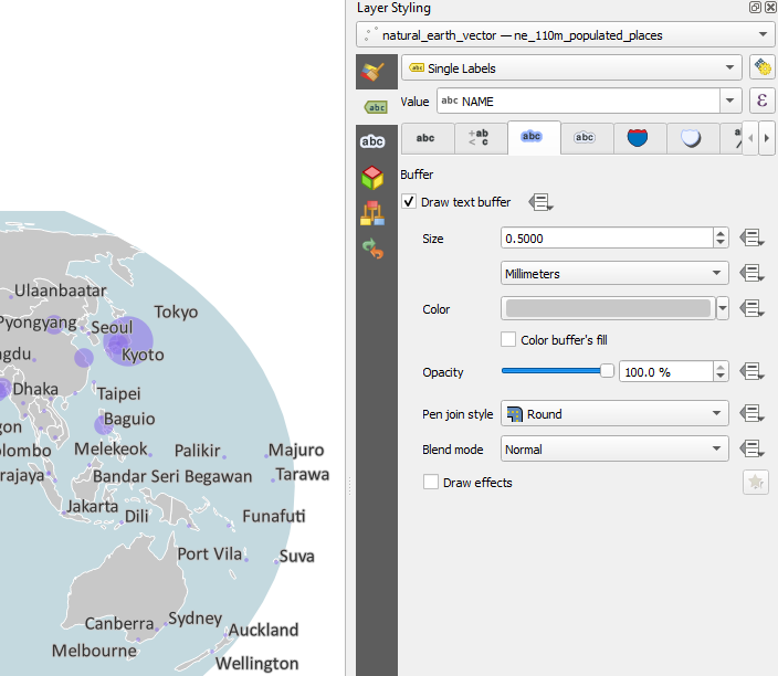
4. Go to the Buffer tab .
.
5. Check the box to Draw text buffer.
6. Because it's a bit too prominent, change the buffer Size to 0.5 mm.
7. Change the color of the buffer to hex code #c8c8c8. That's the same color as the countries in the background.
You probably also find the map too full. Nice labels, but way too many. Time to do something about that.
A simple and effective way to do something about this is to label only the big cities and leave the small ones without. For example,
we could set the limit at 10 million, but this is arbitrary. Another limit is also possible. For the sake of recognisability, we choose 10 million as the limit here, but try other cut-off values yourself to experiment.
8. In the Layer Styling panel go in the Label settings to the Rendering  tab.
tab.
9. Check the box before Show all labels for this layer (including colliding labels).
Yes, now it got worse, but wait...
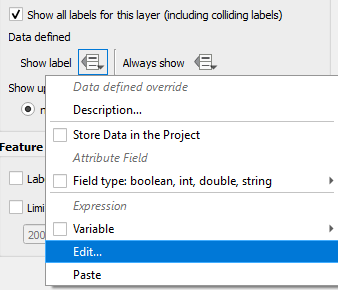
10. Go to the Data defined override at Show Label. Use the drop down menu to select Edit....
11. Now write an expression that the population should be more than 10,000,000 for showing a label.
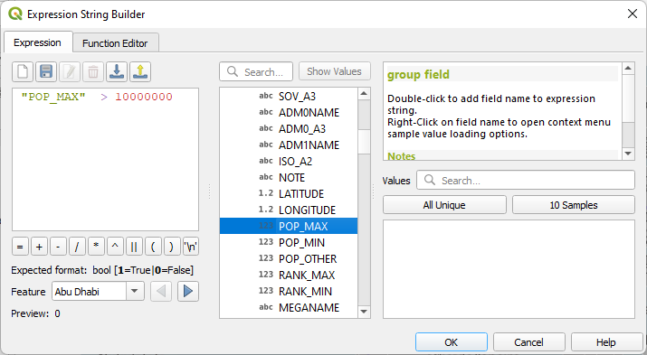
12. Click OK to apply and close the Expression String Builder dialog.
Now you have successfully generalized the number of labels!
You may have noticed: especially at Osaka and Tokyo the labels don't look very nice now. They don't have much chance either: the circles overlap. Where should they go?
To solve that we can use some advanced settings, but that is going too
far for now. We're going to fix it manually.
We're going to use the Label Toolbar.

13. Click the Move a Label, Diagram or Callout icon  .
.
Your cursor now changes to a crosshair.
14. Click at the label that you would like to move, for example Tokyo.
You'll now see a popup window asking for choosing the primary key in the attribute table to join the edits to. This is asked only once.
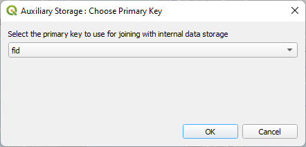
15. Accept the default fid field and click OK.
Now you can click on any label to move it. A green rectangle will appear around the label. Then you can click at its destination location.
16. Move labels in such a way that the result looks nice.
Watch this video to verify the steps until this point:
7. Create a Print Layout
Now our map looks nice, we can make it ready for printing in the Print Layout.
1. In the main menu go to Project | New Print Layout....
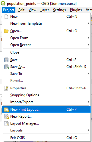
2. In the popup give it the name Population map and click OK.
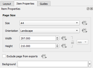
3. Right-click somewhere on the sheet and choose Page Properties....
In the Item properties tab you can see that the Size is A4 and the orientation is Landscape. Keep these settings.
The empty sheet of paper is a bit boring, it's time to put things on it. On the left side of your Print Layout screen you will see buttons from top to bottom to interact with objects on your layout. Most of those buttons have a green plus sign next to them. Those are the buttons with which you can add information to your layout. We're not going to use all of them now, but move your mouse slowly over those buttons to see what kinds of objects you can add. One of my favorites: HTML! You can just include a small web page on your layout, if you'd like. We're not going to do it today, but cool that it's possible...
4. Click the Add map button  and drag a rectangle on the sheet to add the map.
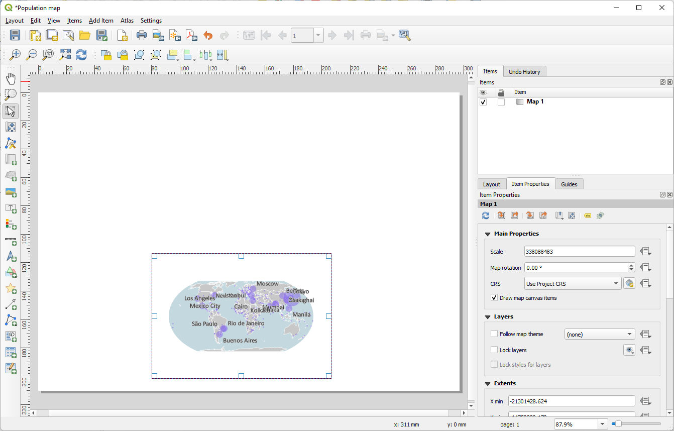
5. Drag the corners of the rectangle to the corners of the sheet. The corners will automatically snap to each other, so they will align correctly.
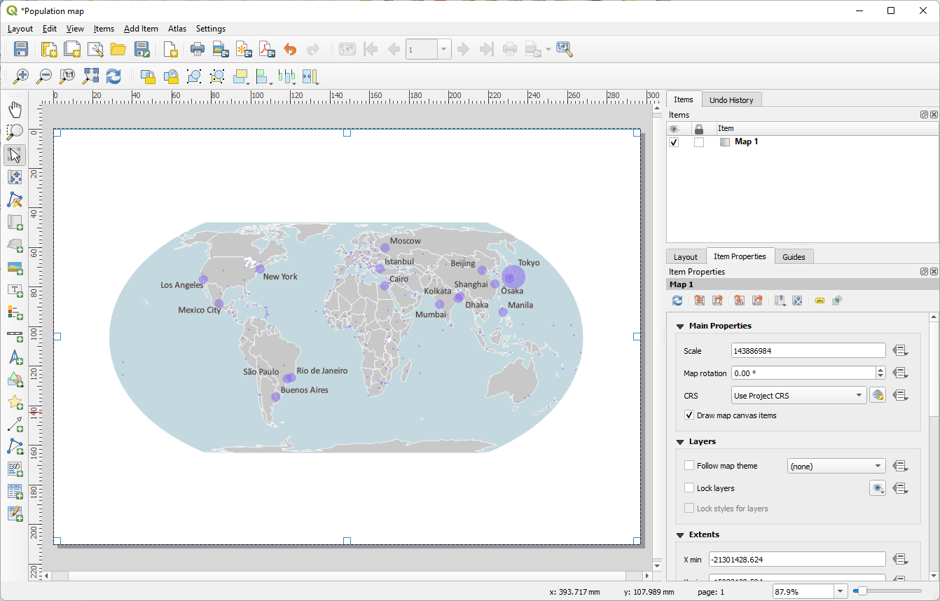
Due to the shape of the map and the shape of the A4 sheet, we now have a relatively large amount of white space below and above the map. It is less so on the sides. We may soon need the space for the legend and other items. At the very top, we need at least one more title for the map.
6. Zoom and pan the map inside the map frame using  .
.
Now let's add a title.
7. Click the Add Label button  and drag a box where you would like to place the title. An easy way to center the text later is to drag the rectangle over the complete width of the page.
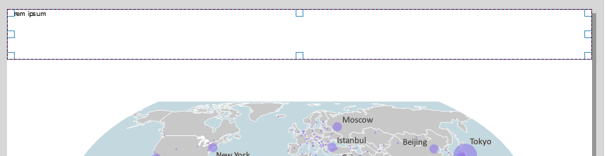
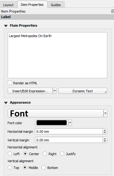
8. In the Item properties tab replace the dummy text Lorem ipsum with "Largest Metropoles on Earth".
9. Click on Font and change it to Calibri, Bold, 24 points.
10. Change the Horizontal alignment to Center and the Vertical alignment to Middle.
Now let's add a legend.
In the map we have three GIS layers: the ocean, the countries and the cities. While it may be worth discussing, probably everyone would agree that the ocean and the lands need no explanation. Only the cities, and the size of the cities, we have to explain.
We're going to add a legend first, and then we're going to focus on the cities.
12. Click the Add legend icon  and drag a rectangle in the lower left of the sheet.
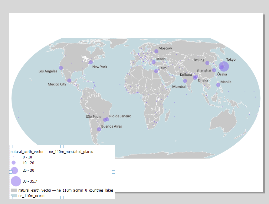
The legend with all items is drawn immediately. However, we only need the cities.
13. In the Item Properties tab go to the Legend Items section and uncheck the Auto update box.
Now we can edit the legend items.
14. Select the ne_110m_ocean layer and click the  button to remove the item. Do the same for the countries item.
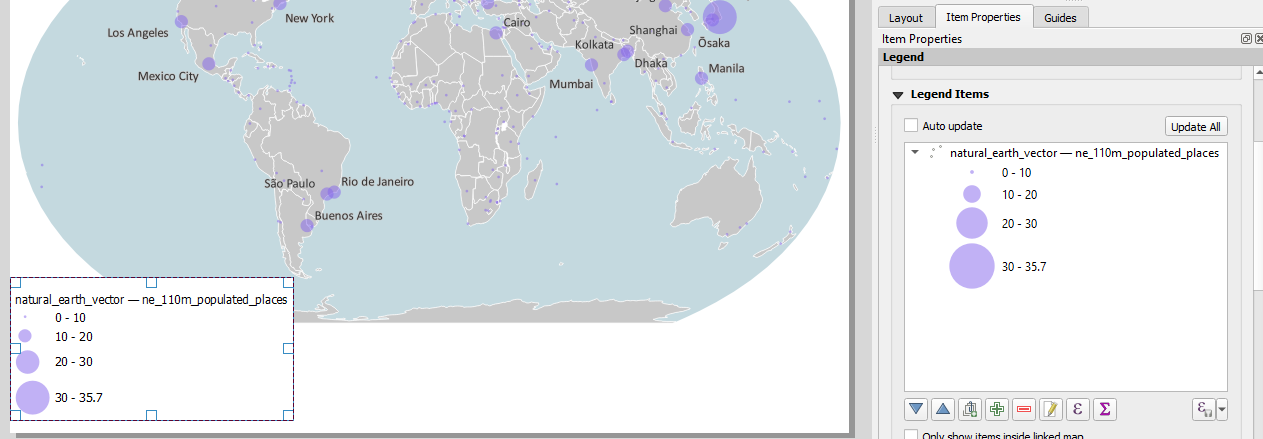
Your legend almost fits on the map sheet now, and looks a lot more charming.
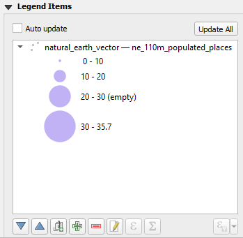
Of the four classes we now have in the legend, the third class is unused. Apparently there are no cities on Earth between 20 and 30 million inhabitants. Perhaps we should have changed the classification of the classes a bit on closer inspection, but for now it will suffice (to show that it is possible…) to edit the representation in the legend.
15. In the Item Properties of the legend double-click on the text 20-30 and change it to 20-30 (empty).
16. Also edit the first class 0 - 10. Add a space before the 0 so the numbers show a better alignment.
The legend block now almost fits, but still not quite. Maybe we should use the Pacific Ocean to put the legend block in? That's possible… Whether it makes the situation better: we don't know yet. Let's give it a try...
Then only that block should not have a white background. And preferably the title should be shorter, because it is now very long. Maybe with a subtitle.
17. To make the legend block transparent, uncheck Background in the Item Properties.
18. Add the Title Metropolitan Areas under Main Properties.
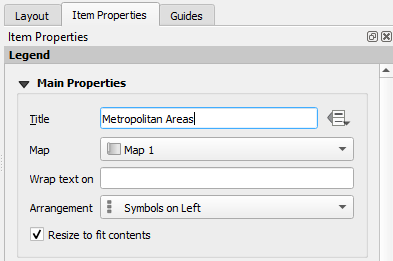
19. Double-click on natural_earth_vector — ne_110m_populated_places and replace it with In millions of inhabitants.
20. Now move the legend into the Pacific Ocean.
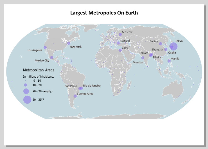
Perhaps there is now a slight imbalance in the layout. There is a lot of white at the bottom. We're going to move the map and legend down about a centimeter to see what that looks like.
21. Click the Move item content icon  , click somewhere on the map and move it a centimeter down.
 button, and then you can type in the map scale and extent on the right in the Item Properties.. That is not necessary now. Manual scrolling is also fine. button and move the legend down so it fits again well in the Pacific Ocean.
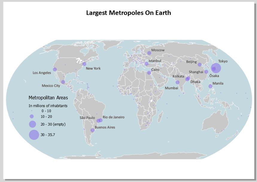
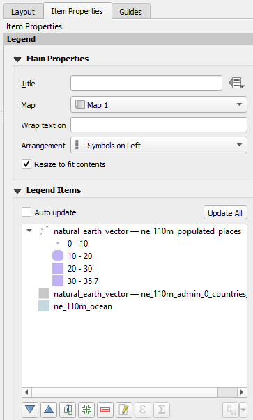
8. Improve the Legend
The legend is now displayed by means of four circles, one above the other. That takes up a relatively large amount of space. And is that really so beautiful? Can't we make those circles overlap?
And the answer is: yes you can! But not by default, not based on this symbolization. We need a data driven size symbolization. So we have to adjust the symbols, and then we can get the right legend on the layout. It's just a few steps, it's not much work. It's just a bit unexpected, it's not very obvious. Are you in?
1. Go back to the main QGIS window and save the project. Just in case...
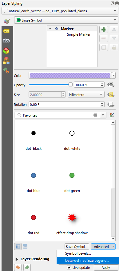
We're now going to change the Graduated point symbol back to Single Symbol.
2. In the Layer Styling panel make sure that the point layer with the cities is the target layer and change the renderer from Graduated to Single Symbol.
The first of the four symbols is now reused. It has the same color and is 50% transparent. But it's very small and without stroke.
3. Click on Simple Marker and change the Size to 2 mm.
4. Change the Stroke Style to Solid Line.
Now we're going to vary the Size with the population.
5. Click on the Data defined override button  next to Size.
6. Choose Assistant... from the drop-down menu.
7. For Source create the expression
"POP_MAX" / 1000000
8. The values still go from 0 to 0. Click the refresh button  to calculate the correct range.
9. Change Size from to 0.5 and to 12 as we had before.
10. Choose for Scale method Radius.
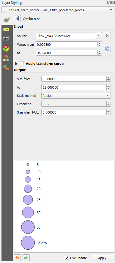
11. Click  to go back.
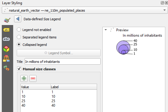
12. Click on Marker and then on Advanced. Choose Data-defined Size Legend... from the dropdown menu.
13. Choose the option Collapsed legend.
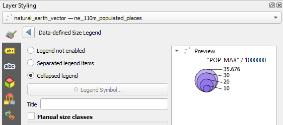
That already looks like something!
"POP_MAX"/ 1000000 is not very human readable.
14. At Title write In millions of inhabitants.
Actually the legend is already quite nice, but we're going to improve it further.
15. Check the box before Manual size classes.
16. Click the  button and add 1 as class boundary. Repeat this for 10, 25 and 40.
17. Go back to the Print Layout. If you had closed the window you can find the Print Layouts of the project in the main menu under Project | Layouts.
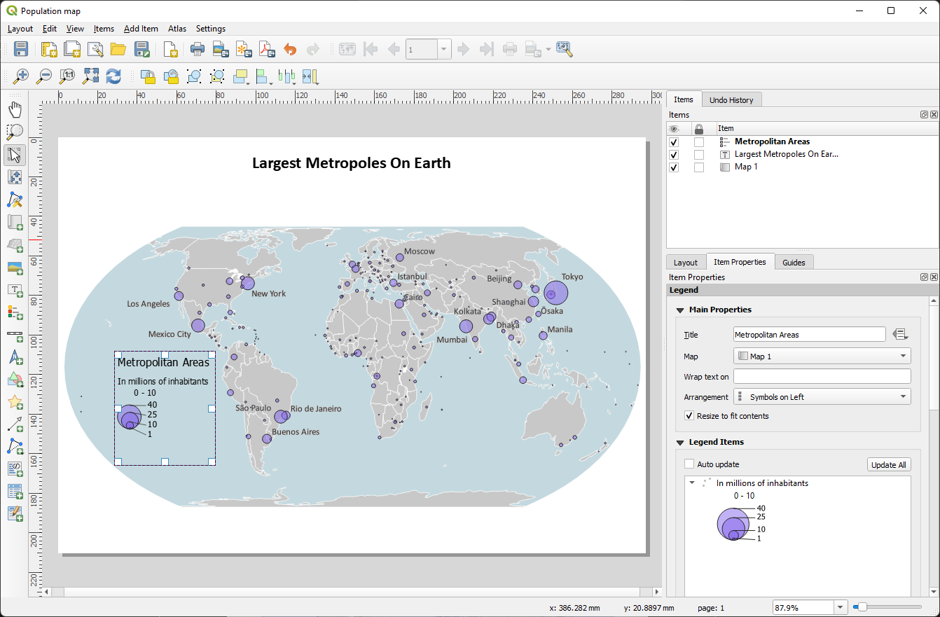
For some reason (bug?) the 0 - 10 class remains.
18. Remove the 0 - 10 class.
19. Add text with the data source and the author of the map.
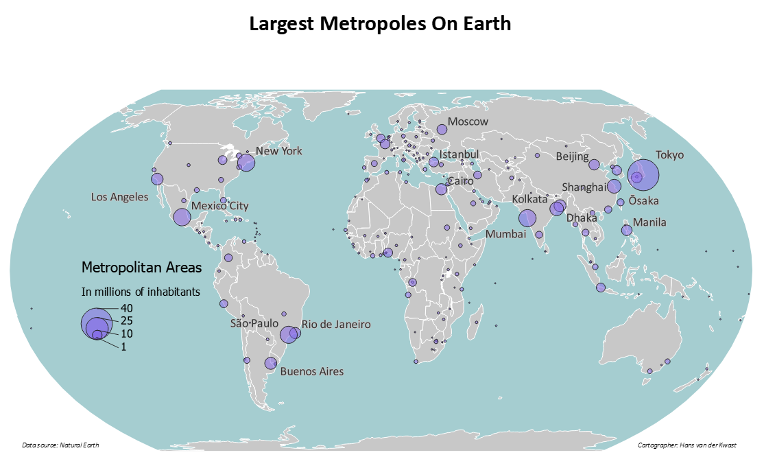
19. Export it to PDF by clicking  .
.
In the next section are some questions to reflect on the map.
9. Some reflection on the result
- What do you think of the title? If there were three titles to choose from, what would those titles be? Which one do you prefer?
- What do you think of the balance on the page? How is the division of space on the page?
- We have now chosen the map layers that are preferably displayed at 1:10,000,000. We only show them at 125,000,000 (approximately). That's not what they were meant for. Can you see in the map that we shouldn't have done that? Or are you happy with this choice?
- The legend now stands in the waters of the Pacific Ocean. Is that sensible? Was there another option? What do you think?
- What do you think of the use of color afterwards?
- That edge around the circles… Do or don't? And why?
- What do you think of the Equal Earth projection for this map for this purpose?
- Are there any map items missing?