Choropleth Maps
| Site: | OpenCourseWare for GIS |
| Course: | Creating data visualisations with graphs, maps and animations |
| Book: | Choropleth Maps |
| Printed by: | Guest user |
| Date: | Tuesday, 2 June 2026, 7:34 PM |
1. Introduction
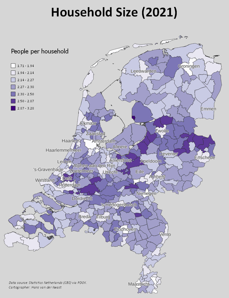
In this tutorial we're going to create a choropleth map. A choropleth map is a map that uses intensity of color to correspond with statistics of a geographic characteristic within polygons, such as population density or per-capita income.
For this exercise we're going to calculate the household size for municipalities in the Netherlands. We'll use Open Data from Statistics Netherlands (CBS) made available in QGIS through the PDOK Services
plugin. PDOK is a platform for disseminating geodata from the Dutch government.
2. Load and Prepare the Layer with Municipalities
Let's start with loading the data.
1. Open QGIS Desktop with a new project.
2. Install the PDOK Services plugin from the Plugins Manager.
3. Click the PDOK Services  icon in the toolbar.
As you can see the PDOK Services plugin gives access to thousands of open data layer for the Netherlands. They are available through different OGC services (WMS, WFS). This includes high resolution digital elevation models (AHN) and aerial photographs for example. Here we'll need to look for the WFS layer with recent statistics for municipalities. WFS, because we need to have the vector data. Remember that WMS only gives a rendered picture and not the data.
The interface is in Dutch, but you'll understand it quickly using the following steps.
4. At Zoeken (search in English) type:
gemeenten wfs
Gemeenten means municipalities.

In the box at the bottom the metadata is presented. It shows that the layer contains the 2021 statistics from Statistics Netherlands (CBS).
5. At Laag toevoegen (Add layer in English) click Standaard to add the layer to the Layers panel. Click Close to close the dialog.
Now it will start drawing the map with municipalities with a random fill color.

This layer contains the polygons of municipalities with and without water bodies. For the visualization we only need the boundaries without the water bodies.
The layer is large, so it's better to not open the attribute table now to check the fields. Instead we'll use the Layer Properties.
6. In the Layers panel, right-click on the gemeenten layer and choose Properties... from the context menu.

In the Fields section at the Information tab you can see the fields in the attribute table.

There's a field named water. We can use that to select the polygons that don't include the water bodies. We will later calculate the number of people per household. Then we'll use the aantalInwoners (number of inhabitants) field and the aantalHuishoudens (number of households) field.
7. Click Cancel to close the dialog.
8. Click the black arrow next to the  icon in the Attributes toolbar and choose Select Features by Expression from the drop-down menu. We're using this instead of opening the huge attribute table.

9. In the Select by Expression dialog expand in the middle panel Fields and Values and click on water. In the right panel click All Unique and wait for the result.

The water field in the attribute table contains the values B, JA and NEE. Obviously NEE means No and we need to select those features.
10. Double click on water to add it to the Expression. Then click the equal  button and double-click on NEE to add it to the Expression.
The expression should now read:
"water" = 'NEE'
Note the double quotes for field names and the single quotes for strings.

11. Now click Select Features to select the polygons without water bodies.
12. Click Close to close the dialog.
The selected municipalities are now highlighted in yellow in the map canvas.

Now we can export the selected polygons from the WFS layer to a GeoPackage, so we can easily use it in further calculations.
13. In the Layers panel right-click on the gemeenten layer and choose Export | Save Selected Features As... from the context menu.

14. Save the layer to a GeoPackage with the name municipalities.gpkg in the folder on your hard drive that you'll use for this project. Give the layer the name municipalities without water.

15. Click OK to export the layer and load it into the map canvas.
16. Remove the gemeenten layer from the Layers panel (right-click and choose Remove Layer... from the context menu and click OK to confirm).
Now our layer is ready for calculations and styling. Don't forget to regularly save your projects. You can save the project in the GeoPackage to keep everything together.

3. Calculate People per Household
The next step is to calculate the number of people per household. This results in a normalized value for the choropleth, so we can easily compare municipalities after styling with a color ramp in the next section.
The dataset is still large, so we'll do the calculation without opening the attribute table.
1. In the Attributes toolbar click the Field Calculator  button. In this way we don't need to open the huge attribute table.
2. In the Field Calculator dialog Create a new field with PeoplePerHousehold as Output field name. Change the Output field type to Decimal number (real).
3. Create the following expression (double-click the field names in the middle panel under Fields and values to add them to the expression):
"aantalInwoners" / "aantalHuishoudens"
This means we're going to divide the number of inhabitants of each municipality by the number of households in each municipality.

4. Click OK to perform the calculation and create the new field.
5. Click  to toggle off editing (the Field Calculator automatically turned it on for you) and save the changes.
In the next section we'll style the data as a choropleth map.
4. Create the Choropleth Map
Now the data is ready to be presented as a choropleth map.
1. Click  to open the Layer Styling panel.
2. Change the Single Symbol renderer to the Graduated renderer. The Graduated renderer is used to assign ramps to choropleth maps.
3. Choose PeoplePerHousehold as the Value field used for the styling.
4. Click Classify to see our first results.

Let's tweak it a bit to make it nicer. First we need to improve the color ramp.
5. Click the drop-down arrow at Color ramp and choose All Color Ramps | Purples from the menu.
You can choose another nice one. Most important is that the color ramp should not give a bias to the interpretation. Blue is associated with water, red with danger. So here I choose purple because it's a bit neutral.
6. Increase the number of Classes to 7.
7. Change the Mode to Natural Breaks (Jenks).
You can play with these settings to get a nice result. With these settings there's a nice contrast between the municipalities with a high number of people per household and the other ones. Read this blog Lisa Charlotte Muth from Datawrapper to better understand color scale to use with your data.
8. Change the Precision to 2, to show only 2 decimals in the legend.
9. Have a look at the Histogram tab, click Load Values to see the distribution. This can also help you to decide on the class boundaries.

For the user it's easier to understand the map if we plot labels with the names of the municipalities.
10. Go to the Labels  tab.
tab.
11. Change from No Labels to Single Labels.
12. Choose gemeentenaam as the Value field. This field contains the names of the municipalities.
The map looks to crowded now. Let's adjust the settings so we only see the large municipalities.
13. Go to the Rendering  tab.
tab.
14. Click the Data defined override  button next to Show label.
15. From the drop-down menu choose Edit....

16. In the Expression String Builder dialog create the following expression:
"aantalInwoners" > 100000
This will filter the municipalities with more than 100,000 inhabitants and only those labels are shown.

17. Click OK to apply.
Now we need to improve the readability of the lables.
18. Go to the Buffer  tab and check the box to Draw text buffer. Set the Size to 0.5 mm.
Feel free to improve the map further and create a Print Layout.
Discussion questions:
- How can the map be further improved?
- Can you give an interpretation of the result? Is there a trend?
5. Conclusion
In this tutorial you've learned to create a choropleth map.
Watch this video to check the steps: