Create an Animated Choropleth Map
| Site: | OpenCourseWare for GIS |
| Course: | Creating data visualisations with graphs, maps and animations |
| Book: | Create an Animated Choropleth Map |
| Printed by: | Guest user |
| Date: | Monday, 25 May 2026, 9:09 PM |
Table of contents
- 1. Introduction
- 2. Prepare the World Map
- 3. Prepare Data Tables
- 4. Join Data from Different Tables (one to one)
- 5. Normalize the Data
- 6. Convert String to Date Attributes
- 7. Join Temporal Data with Polygons
- 8. Styling the Map
- 9. Setting Up the Temporal Controller
- 10. Adding Decorators and Counter
- 11. Export Frames and Create Animated GIF
- 12. Conclusion
1. Introduction
Sometimes data is not static, but shows trends over time. If the data is spatial, we can create animated maps with showing time series of data.
In this tutorial you'll create an animated choropleth map showing the trend in amount of people who don't have access to an improved water source.
We'll use data from Our World in Data and the UN country boundaries.
This tutorial is inspired by Kurt Menke's tutorial for the Community Health Maps.
2. Prepare the World Map
First we need to have a world map with country boundaries. There are many resources for country boundaries. In QGIS you can type world in the Coordinate field and it will load a world map with boundaries provided by Natural Earth. There are unfortunately many disputed borders, so it is safer to use the UN world map. Let's add the map to QGIS.
1. Start a new project in QGIS Desktop.
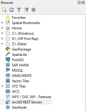
2. In the Browser panel right-click on ArcGIS REST Servers.
This is used, because the data is on an ArcGIS server, which can be accessed through QGIS with an internet connection. Let's setup the connection.
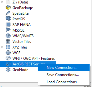
3. Choose New Connection...
4. Name the connection UN Boundaries and add the following URL: https://geoservices.un.org/arcgis/rest/services/ClearMap_WebTopo/MapServer
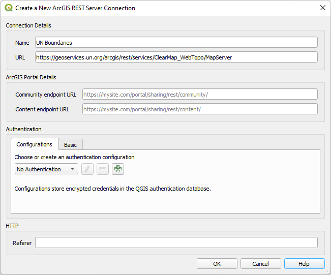
5. Keep the rest as default and click OK.
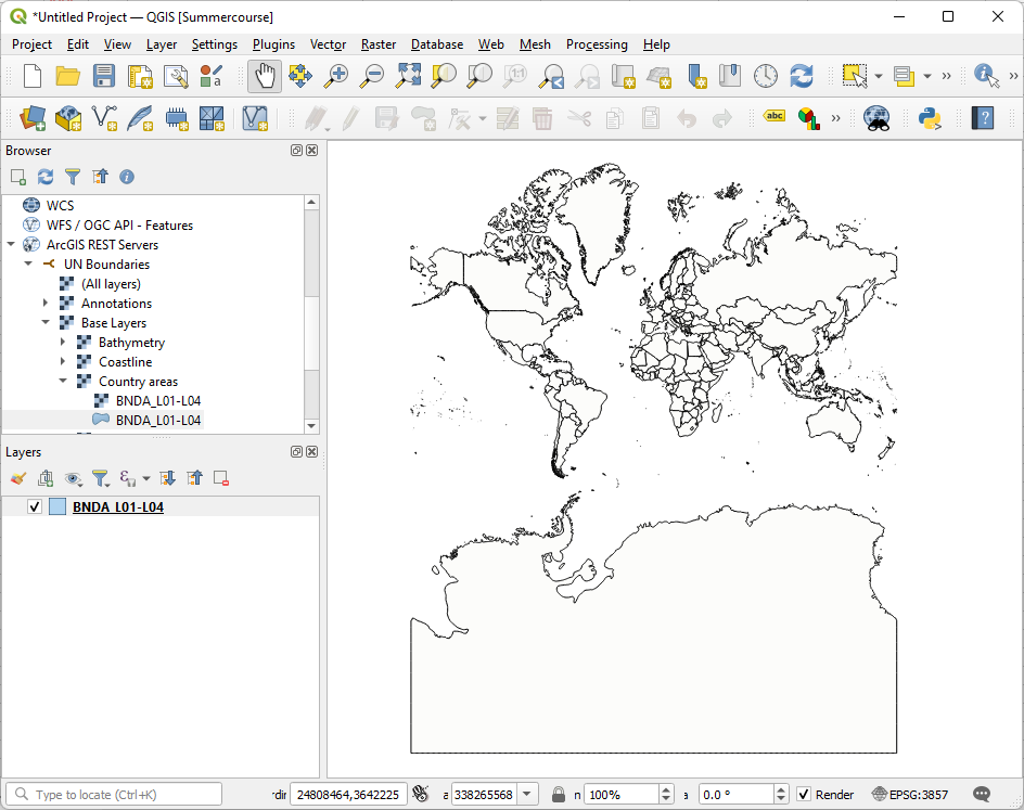
6. Expand the ArcGIS REST Servers section in the Browser panel by clicking the little triangle. Next expand UN Boundaries, Base Layers and Country Areas.

7. Drag the BNDA_L01-L04 polygon layer to the map canvas.
It will take some time to load. Now your map canvas looks like this:
The layer is an online layer. To process is further we need to store it.
8. Right-click on the BNDA_L01-L04 layer in the Layers panel and in the context menu choose Export | Save Features As...
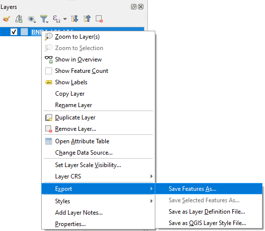
9. Save the layer in the GeoPackage Format with the name accesstowater.gpkg (use  to browse to the folder where you want to store the GeoPackage). For Layer name type country_boundaries. Keep the rest as default and click OK.

Now the layer form the GeoPackage is added to the map canvas with a random fill color. Don't worry, we're going to improve the map soon.
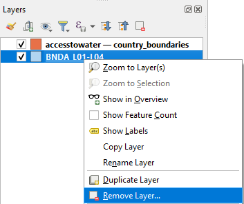
10. Remove the BNDA_L01-L04 layer bij right-clicking and choosing Remove Layer... from the context menu.
In the next step we'll add the necessary open data for our project.
3. Prepare Data Tables
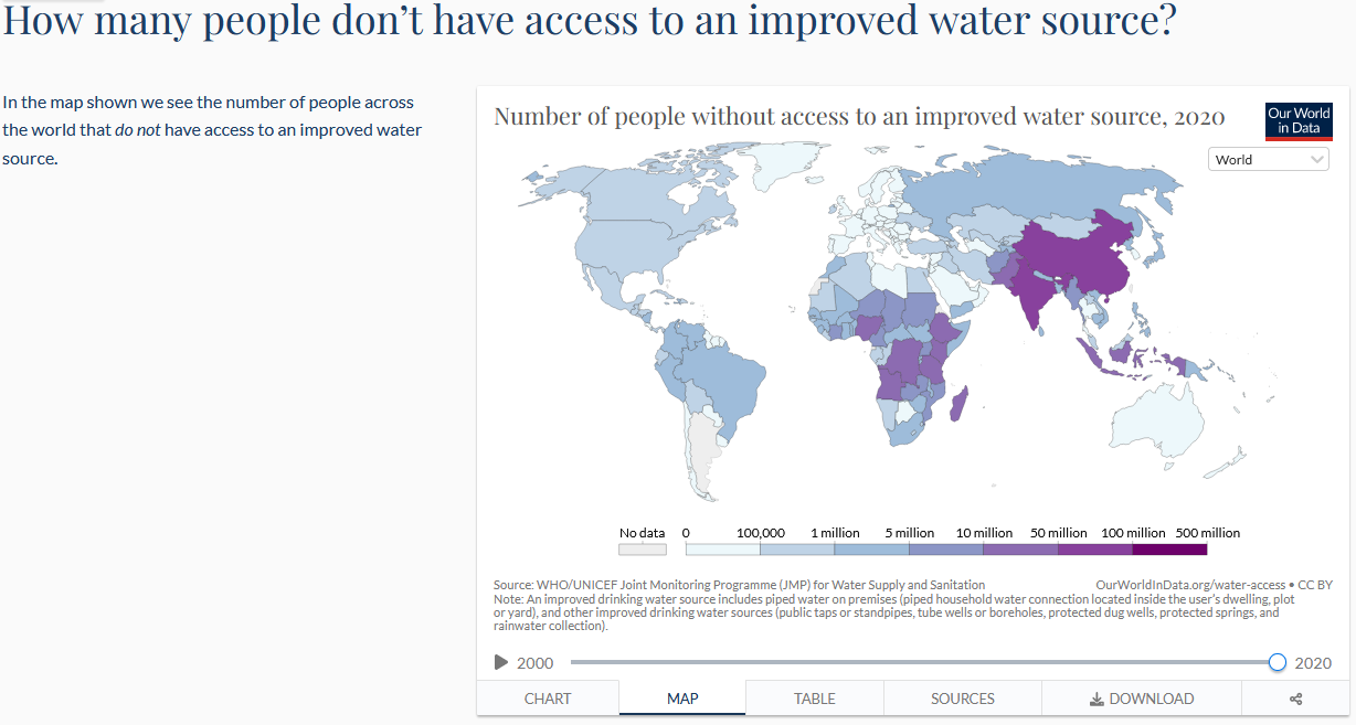
We're going to use open data from Our World in Data. Their goal is to make the knowledge on the big problems accessible and understandable. Have a look at the website and search for water related themes.
For this tutorial we're going to download a data table with trends in access to improved water sources. Improved water resources are defined as “piped water on premises (piped household water connection located inside the user’s dwelling, plot or yard), and other improved drinking water sources (public taps or standpipes, tube wells or boreholes, protected dug wells, protected springs, and rainwater collection).”
2. Explore the data om the page and make sure you understand what you're going to download.
3. Click the Download tab and download the Full data (CSV) to the folder where you store the data for this tutorial.

4. Open the file with Notepad. It is good practice to check the data and the column separator in a text editor, before using the data in a GIS.
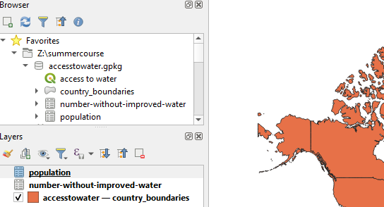
5. Go to the QGIS Browser panel and drag the CSV file to the accesstowater.gpkg to import it.
6. Drag the number-without-improved-water layer from the GeoPackage in the Browser panel to the map canvas.
The (non-spatial) layer is now added to the the Layers panel.
7. Open the attribute table and check the contents.

Because the table only has the number of people without access to improved water sources we need to download population data to normalize and calculate the percentage of the population per country without access to improved water sources. Only then we can compare countries.
8. Download the population data from here: https://ourworldindata.org/grapher/population
9. Repeat steps 4 - 7 and import the data to the accesstowater.gpkg.
10. Save your project in the accesstowater.gpkg
In the next section we're going to join the population data with the data on the number of people without access to improved water sources.
4. Join Data from Different Tables (one to one)
In order to calculate the percentage of people without access to improved water sources we need to join the two tables that we have imported in our GeoPackage in the previous steps.
Because we need to join features based on country code and year we need to create a new field that combines both.
1. Open the attribute table of the population layer.
2. Click  to open the Field Calculator dialog.
3. Create a new field with the name CODE_YEAR and Output field type Text (string). Under Expression create the following expression:
"Code" || "Year"
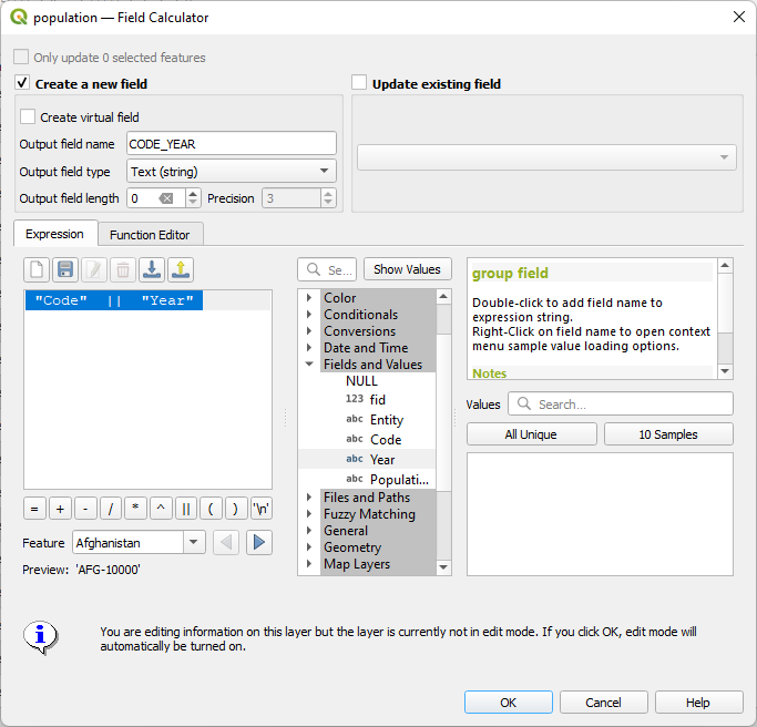
This will concatenate the text in the "Code" field with the text in the "Year" field.
4. Click OK to calculate the result.
5. Click  to toggle off editing mode and click Save to store the results. Close the attribute table.
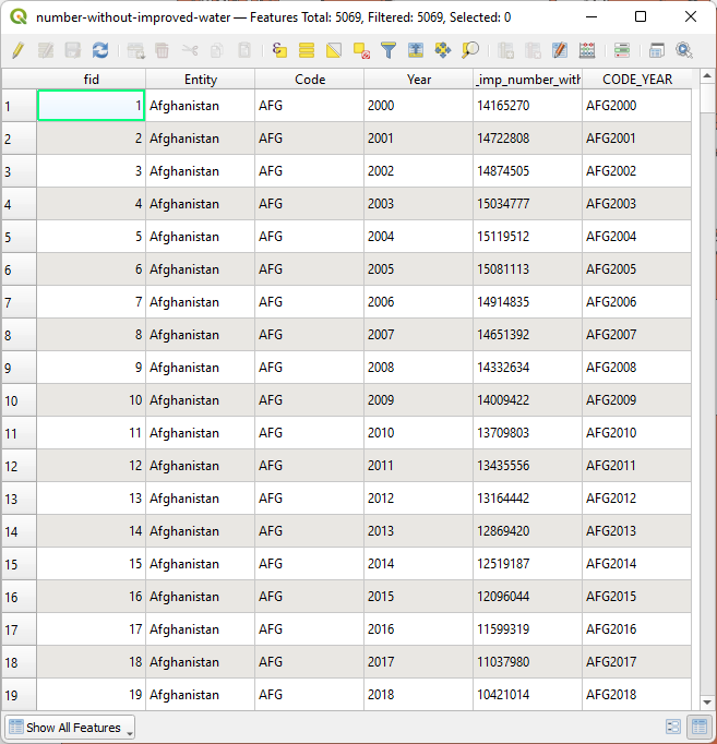
6. Repeat this for the number-without-improved-water table so it also has a new field with the Code and the Year called CODE_YEAR.
Now we can join both tables.
7. Right-click on the number-without-improved-water layer and choose Properties... from the context menu.
8. Go to the Joins tab.

9. Click the  button to add a join.
10. Choose population as Join layer and choose CODE_YEAR for both Join field and Target field.
11. Expand Joined fields and check the box. Check the box for Population so it will only join this field.
12. Expand and check the box for Custom field name prefix and delete the text there.
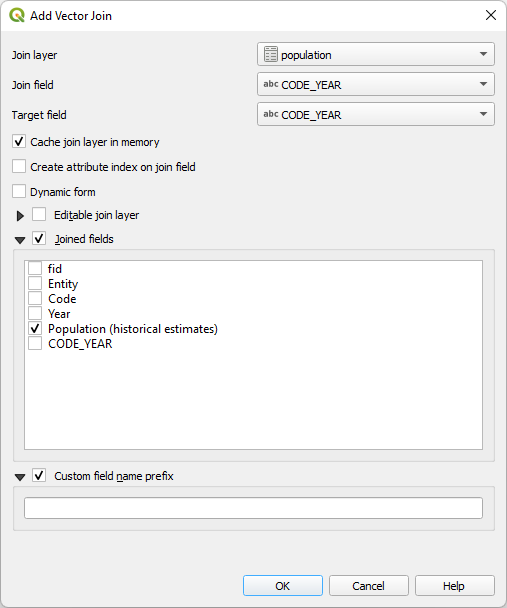
13. Click OK to continue.
14. Expand Join layer and check if the settings are okay. Then click OK to apply and close the dialog.

15. Check the result in the attribute table of number-without-improved-water. Note that the years that did not match were not added to the table.
In the next section we'll calculate the percentage of population without access to improved water sources.
5. Normalize the Data
The next step is to normalize the data by calculating the percentage of the population without access to improved water sources.
1. In the attribute table of the number-without-improved-water layer go to the Field Calculator by clicking  .
.
2. Create a new field with Percentage as Output field name and Decimal number (real) as Output field type. Create the following expression:
( "wat_imp_number_without" / "Population (historical estimates)" ) * 100

3. Click OK to close the dialog and check the result.
Next we'll make a final correction in the attribute table.
6. Convert String to Date Attributes
There's one more issue that we need to solve in the attribute table. The Year field is text and it should be a date, otherwise we can't use it later in the Temporal Controller.
4. Go back to the Field Calculator.
5. Create a new field with the name Date and Output field type Date. Use the following expression:
to_date( "Year" , 'yyyy')
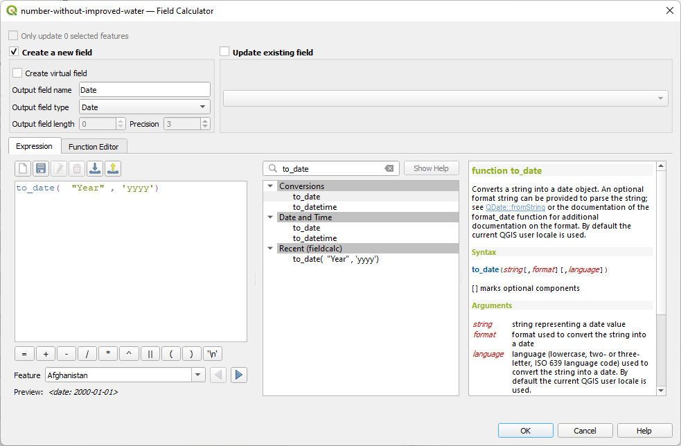
With the to_date function you can convert a string to a date. We indicate with 'yyyy' that it's year with for digits.
6. Click OK and check the result.
Note that the dates are all set to 1 January of the year. For us it's only relevant that it now recognizes the years as dates.

Now we're ready to join the data with the country boundary polygons.
7. Join Temporal Data with Polygons
Our temporal data is now ready, but lacks the geometry. We need to join the attributes to the country boundaries. We can't use the regular join that we've used before, because we have multiple years for each polygon, i.e. there's a one-to-many relation. In the next steps we'll join the data in such way that there's a separate feature for each matching feature.
1. In the Processing Toolbox go to Vector general | Join attributes by field value.
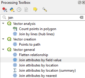
2. In the Join Attributes by Field Value dialog choose country_boundaries as Input layer, ISO3CD as Table field, number-without-improved-water as Input layer 2 and Code as Table field 2. Note that ISO3CD and CODE are the common key for the join, which are the 3 character country codes.
3. Click  under Layer 2 fields to copy and choose the Percentage and Date fields. Click the blue arrow to go back.

4. Under Join type use the dropdown menu to choose Create separate feature for each matching feature (one-to-many).
5. Save the layer in the GeoPackage with the layer name percentage_without_improved_water.

6. Click Run and Close the dialog after processing.
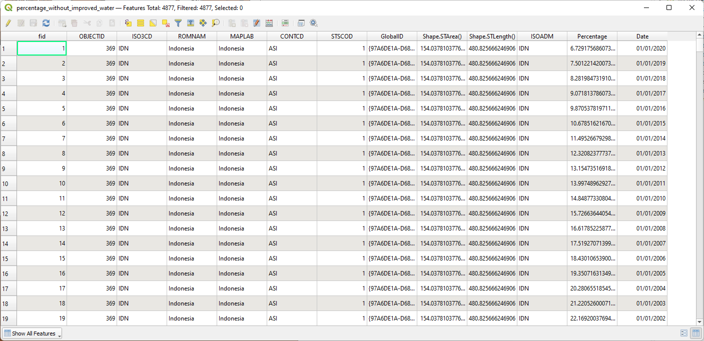
7. Check the attribute table of the percentage_without_improved_water layer which has now been added to the Layers panel.
Now you can see that it has for each country all the years with the percentage of population without access to improved water sources.
8. Save the project before we continue with styling the data.
8. Styling the Map
Now we're ready to style the choropleth map. We need an appropriate color ramp and the borders of the countries should be visualized in a subtle manner.
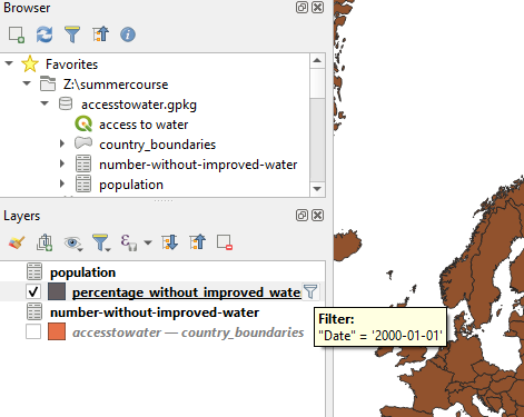
Because the data contains many polygons now (each country, each year), we first need to set a filter to only show one year to set up the styling.
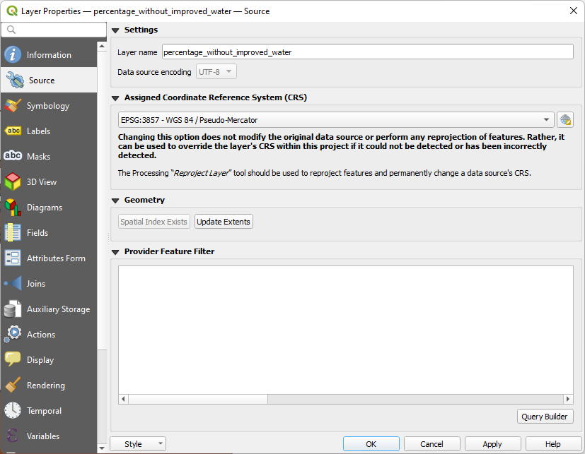
1. In the Layers panel, right-click on the percentage_without_improved_water layer and choose Properties... from the context menu.
2. In the Layer Properties dialog go to the Source tab.
3. In the Provider Feature Filter section click on the Query Builder button.
4. In the Fields box highlight the Date field and in the Values box click All to see all years.
5. Formulate an expression in the Provider Specific Filter Expression box. First double-click on the Date field to enter that in the lower box. Then click on the equals operator. Finally double-click on the year 2000.
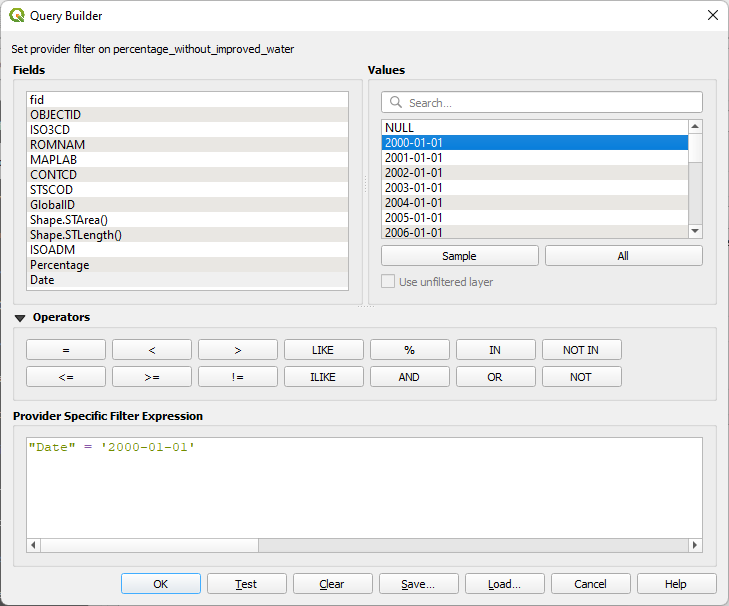
6. Click OK to close the Query Builder and click OK to close the Layer Properties dialog.
7. Make sure only the percentage_without_improved_water layer is visible, uncheck the other layers if any.
The filter icon next to the layer name indicates that you're now using a filter. When you hover your mouse over it, the expression shows.
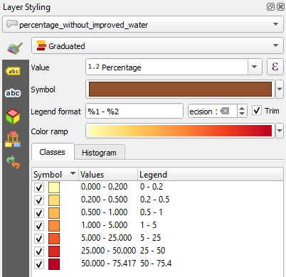
Now we'll style the filtered dataset.
8. Open the Layer Styling panel by clicking  in the Layers panel.
9. Make sure that the percentage_without_improved_water layer is the target layer in the Layer Styling panel.
10. Use the dropdown menu to change the Single Symbol renderer to the Graduated renderer. The Graduated renderer allows you to symbolize the countries based on a numeric field.
11. For Value choose the Percentage field.
12. Click the Classify button and you will see the countries classified into the default 5 classes in your default color ramp.
13. Change the Mode to Natural Breaks (Jenks).
14. Increase the number of Classes to 7.
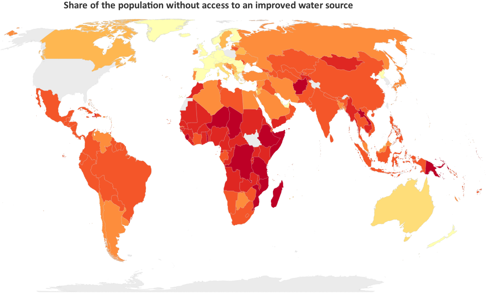
15. Use the Color ramp selector to find a nice color ramp. Here I'm using the YlOrRd ramp. The more red, the worse the condition.
16. To get nicer class boundaries, you can adjust the ranges by changing them in the Values column. In the Legend column you can edit the legend text labels.
Let's now work on the country boundaries. Some countries have nodata in some years and now their borders don't show up. We also would like to have more subtle borders.
17. In the Layer Styling panel click the color bar at Symbol.
18. In the Symbol Settings click Simple Fill and and change Stroke color to a light gray (RGB 212 | 212 | 212).
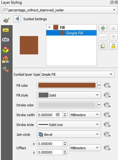
19. Click  to go back and change the Stroke width to 0.06 mm.
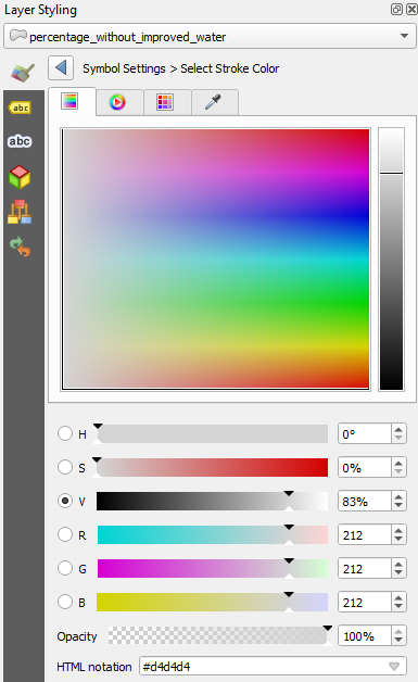
20. Now activate the original country_boundaries layer in the Layers panel and drag it above the percentage_without_improved_water layer.
21. Make sure the country_boundaries layer is now the target layer in the Layer Styling panel.
22. Go to Simple Fill and change the Fill color to a light gray with RGB 235 | 235 | 235.
23. Go back and change the Stroke color to the same as we have used for the percentage_without_improved_water layer (RGB 212 | 212 | 212) and set the Stroke width also to 0.06 mm.
24. In the Layers panel, now move the country_boundaries layer below the percentage_without_improved_water layer and check the result.
The colors look nice now, but the projection is misleading. The project now uses the Pseudo Mercator projection, which results in disproportional areas. Let's change the projection where areas of countries are proportional.
25. Click on the EPSG code in the lower right of the QGIS window.
26. Change the projection to EPSG:8857 - WGS 85 / Equal Earth Greenwich.
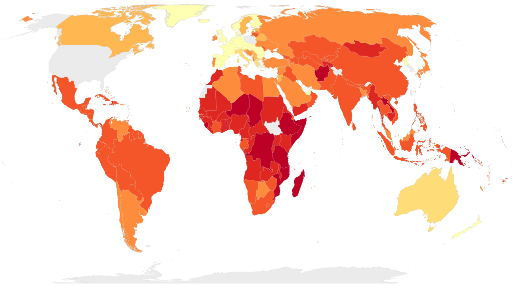
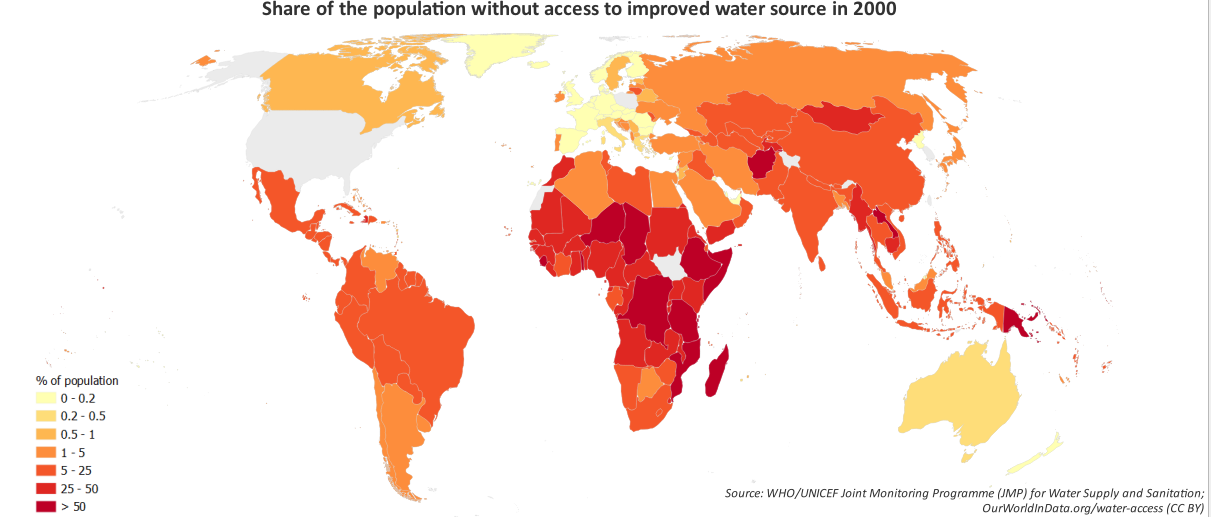
Your map should now look like this:
27. Now that you have the styling set, we can clear the layer filter. Click on the filter icon in the Layers Panel to open the Query Builder. Click Clear and OK.
In the next section we'll setup the Temporal Controller.
9. Setting Up the Temporal Controller
In this section we'll setup the QGIS Temporal Controller.
1. In the Layers panel, right-click on the percentage_without_improved_water layer and choose Properties... from the context menu.
2. In the Layer Properties dialog go to the Temporal tab.
3. Check the box for Dynamic Temporal Control. Change Configuration to Single Field with Date/Time. Set the Field to Date and Event duration to 1 year.
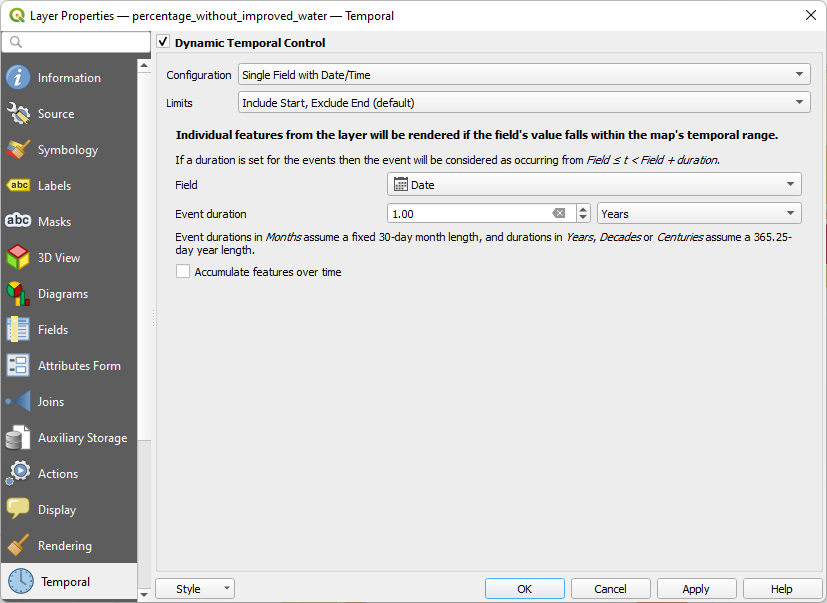
4. Click OK to apply the settings and close the dialog.
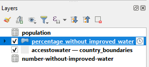
Now you'll see the Temporal Controller icon next to the layer name.
Let's animate the result so far.
5. Click on the Temporal Controller  button on the Map Navigation toolbar to open the Temporal Controller panel.
6. in the Temporal Controller panel, click the Animated Temporal Navigation button  .
.
7. Click  to set the range and change the Step to 1 year.
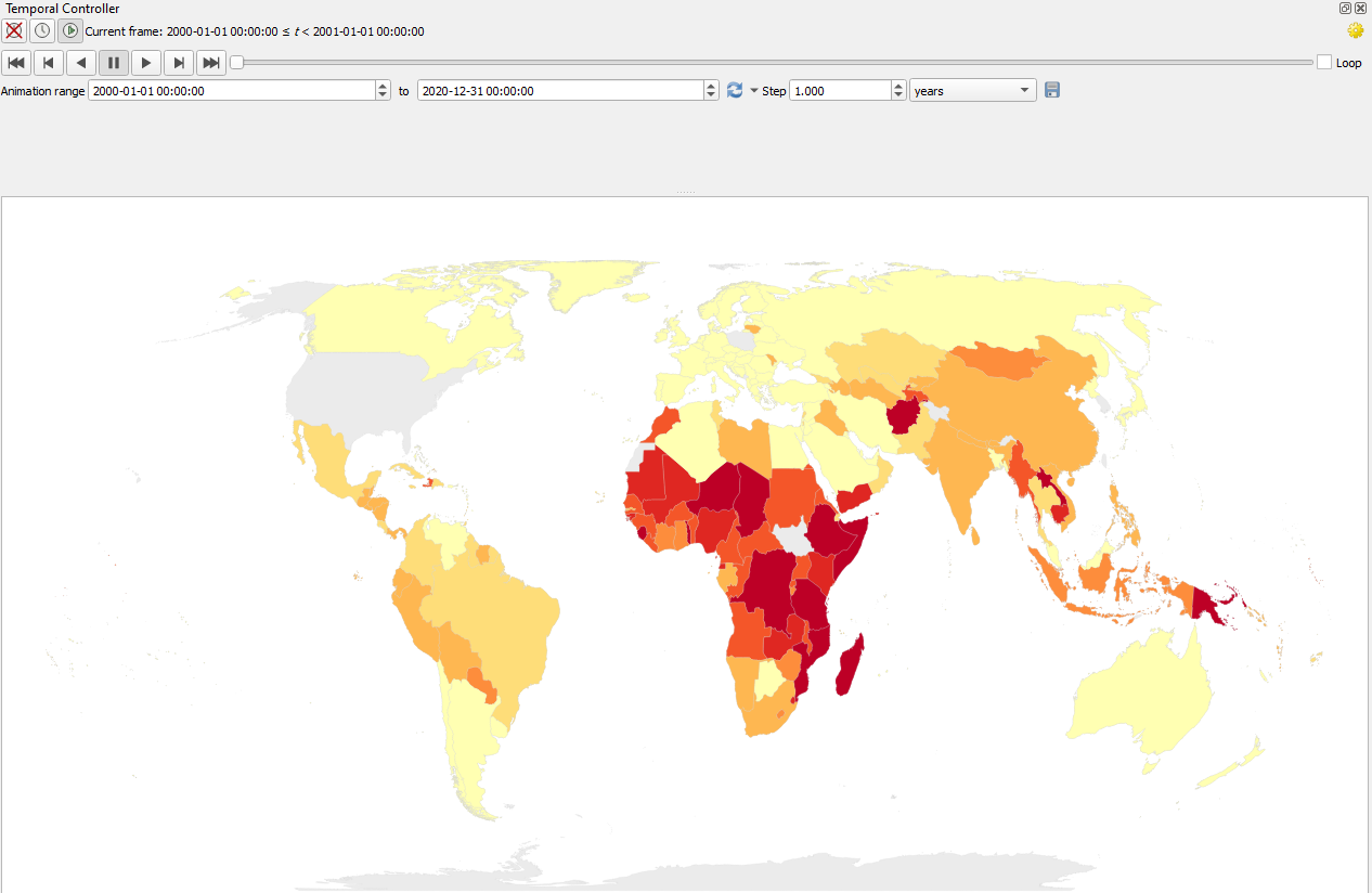
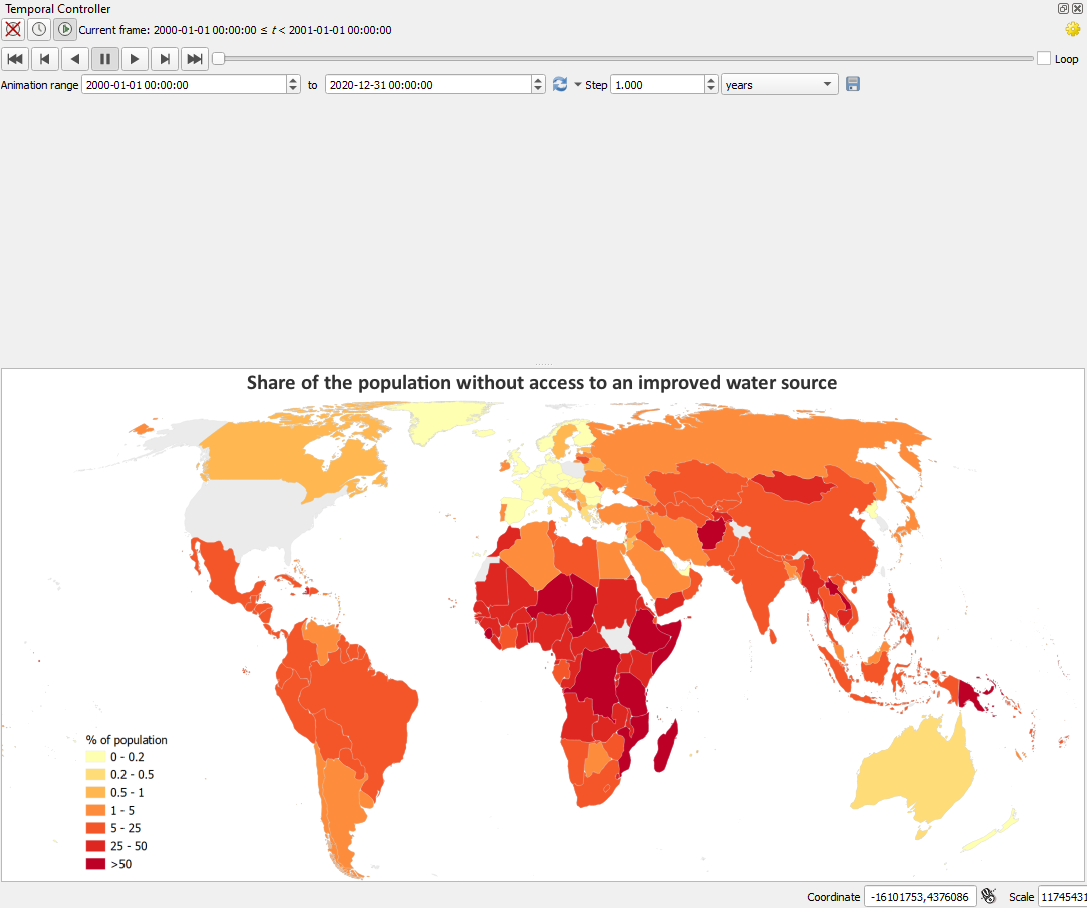
8. Now click  and check the resulting animation.
The user of the animation needs a bit more context. In the next section we're going to add a title, legend and counter.
10. Adding Decorators and Counter
To give the user more context, in this section we're going to add a title, legend, data source and a counter.
Let's start with the title.
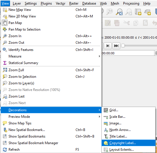
1. In the main menu, go to View | Decorations | Title Label....

2. In the Title Label Decoration dialog, check the box to Enable Title Label.
3. Type the following Title label text:
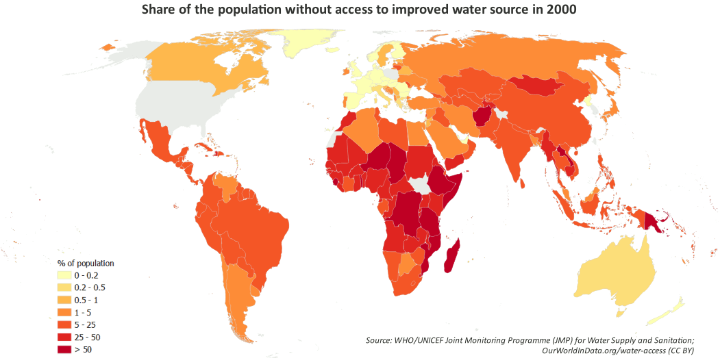
Share of the population without access to improved water source
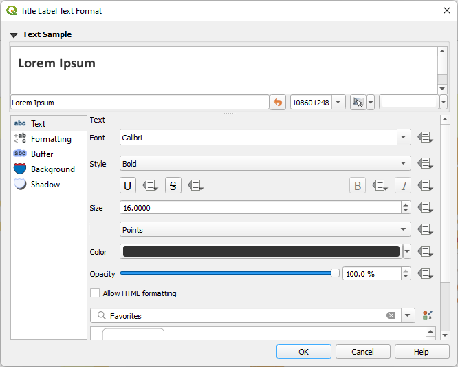
4. Change the Font to Calibri, Bold, 16 points. Change the background color to white.
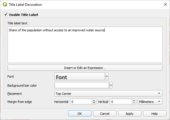
5. Click OK to apply and close the dialog.
To add a legend we need a picture of the legend. We can best make this in the Print Layout.
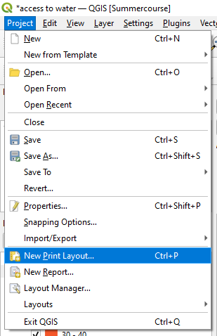
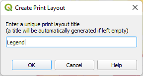
6. In the main menu choose Project | New Print Layout....
7. In the popup type Legend for the print layout title and click OK.
8. Only add a legend to the Print Layout by clicking the Add Legend icon  and drag a box on the sheet.
9. In the Item Properties panel go to the Legend Items section and uncheck the Auto update box so we can edit the legend.
10. Use  to remove all legend items except percentage_without_improved_water.
11. Double-click on percentage_without_improved_water and change the text to
% of population
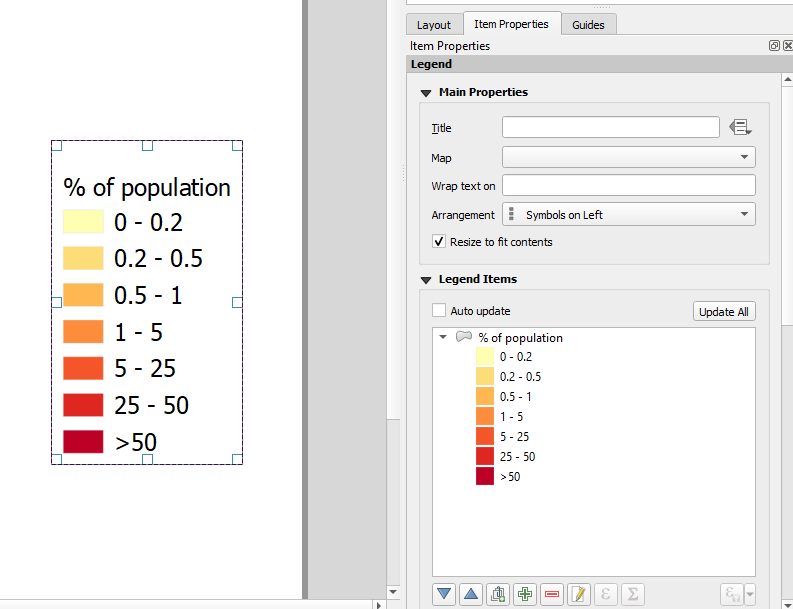
12. Make a screenshot of the legend and save it to a png file.
13. Close the Print Layout to go back to the main QGIS window.
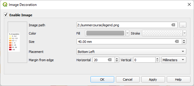
14. In the main menu go to View | Decorations | Image....
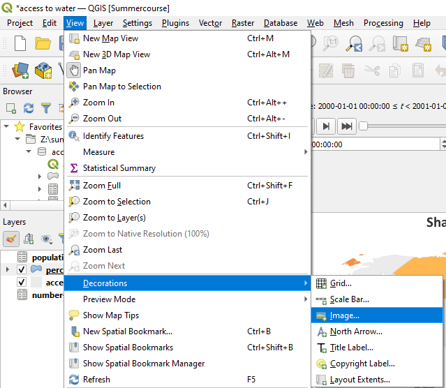
15. In the Image Decoration dialog check the box to Enable Image. Browse to the file with the saved screenshot of the legend. Change the Size to 40 mm and the Horizontal Marigin from edge to 20 mm. Keep the rest as default and click OK to apply and close the dialog.
16. Move the map and expand the Temporal Controller panel in such a way that the elements show nicely in the map canvas.
It's important to mention the data sources that you have used. Let's add them in a similar way.
17. In the main menu go to View | Decorations | Copyright Label....
18. In the Copyright Label Decoration dialog check the box to Enable Copyright Label. Remove the default text and add the text given in teh screenshot below.
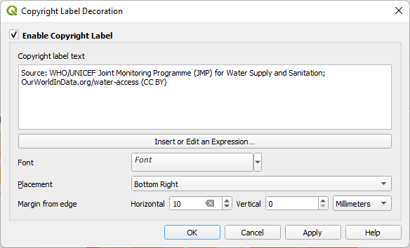
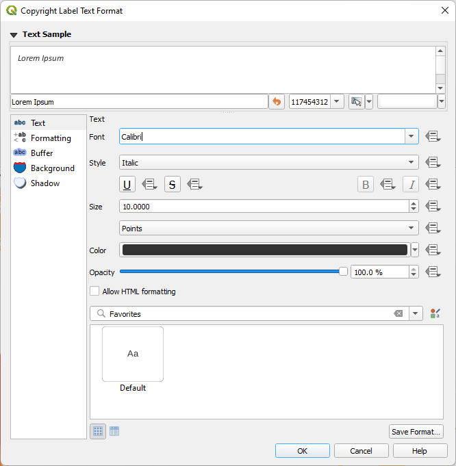
19. Click on Font to change the font to Calibri, Italic, 10 points.
20. Click OK to go back an click again OK to apply and close the dialog.
21. Nudge the map canvas between the panels in such a way that the map and added elements are nicely displayed. Note that we can move the Antarctic out of the view, but make sure that New Zealand is in!

The map doesn't need a North arrow, because from the world map it's clear where the North is. Also a scalebar is not needed in this case. However, a dynamic map needs a time counter, in this case for the year that is displayed. Let's add that.
22. Go back to the title decorator.
23. Add "in" to the text and click Insert or Edit an Expression.
There are a series of variables tied to the Temporal Controller.
24. Expand the Variables section and double-click on the map_start_time variable to add it to your expression.
This variable represents the start of the map’s time range. As you step through time on the map, this variable will update to represent the current start date for the map. We need to format the variable in such a way that it nicely shows the year.
25. Put your cursor before @map_start_time, search for the format_date function and double click it to add it to the expression. Complete the expression so it reads:
format_date( @map_start_time,'yyyy' )
You can read in the right box what the syntax and arguments of the function are.
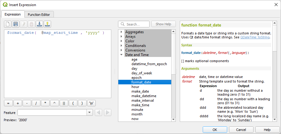
26. If the Preview in the lower left corner looks correct, click OK to apply and close the dialog.
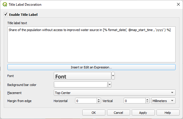
The Title Label Decoration dialog should now look like this:
27. Click OK to apply and close the dialog.
28. Click  in the Temporal Controller panel to see the result.
In the next section we're going to create an animated GIF from the result.
11. Export Frames and Create Animated GIF
Visualization of the temporal data with the QGIS Temporal Controller can be slow and difficult to use for non-GIS experts. Therefore, we're going to export the frames and create an animated GIF that we can add to presentations, include on web pages or send to end users.
1. In the Temporal Controller panel click the Export Animation button  .
.
2. This will generate png files with the frames following the Template file name, which we keep as default. Choose an Output directory. You can create a new subfolder in the folder where you are storing the data of this project. Make sure it uses the Map Canvas Extent and the box to Draw active decorations is checked.
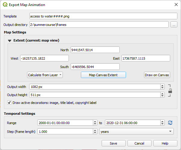
3. Click Save to export the png files to the folder.

After exporting a message that the animation was successfully exported will appear above the map canvas.
Now we can create an animated GIF in the open source image editing software GIMP (equivalent of Photoshop).
You can install GIMP from here: https://www.gimp.org/.
4. Open GIMP.
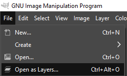
5. From the main menu choose File | Open as Layers....
6. Browse to the folder, select all png files and click Open.
Now all frames are opened. This can take a few minutes.
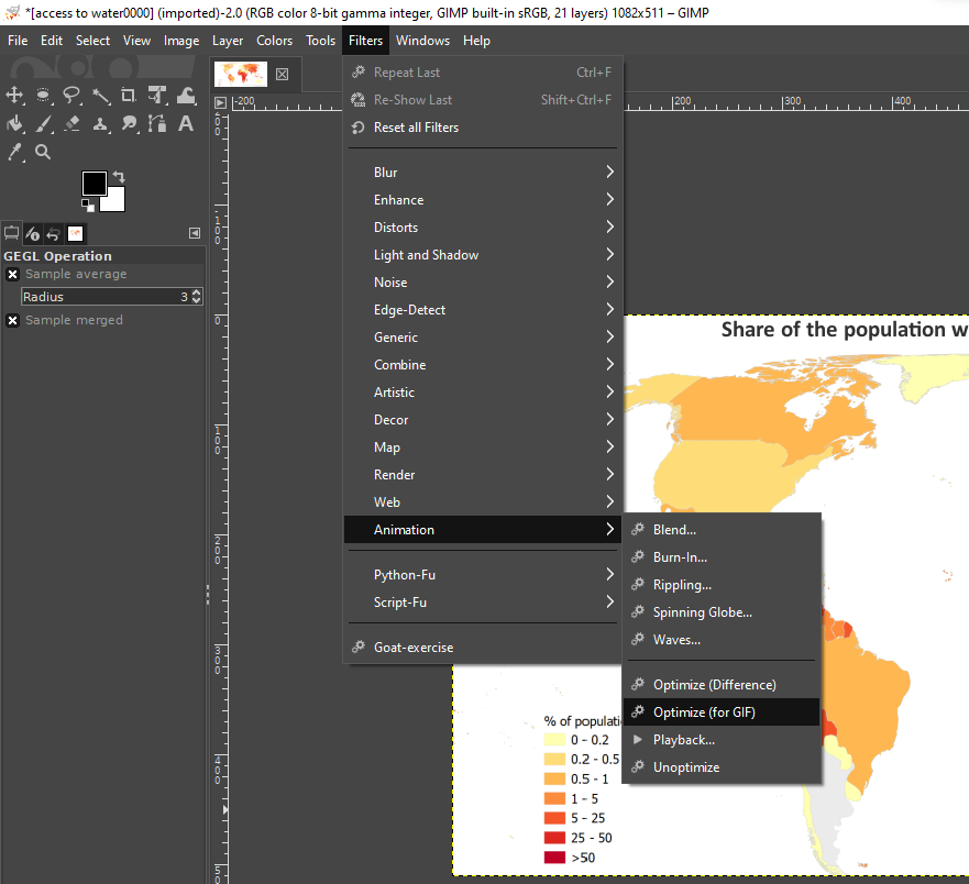
7. After loading the layers go in the main menu to Filters | Animation | Optimize (for GIF).
You can see the progress in the status bar of GIMP. Proceed with the next step when it's done.
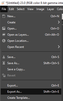
8. In the main menu choose File | Export As....
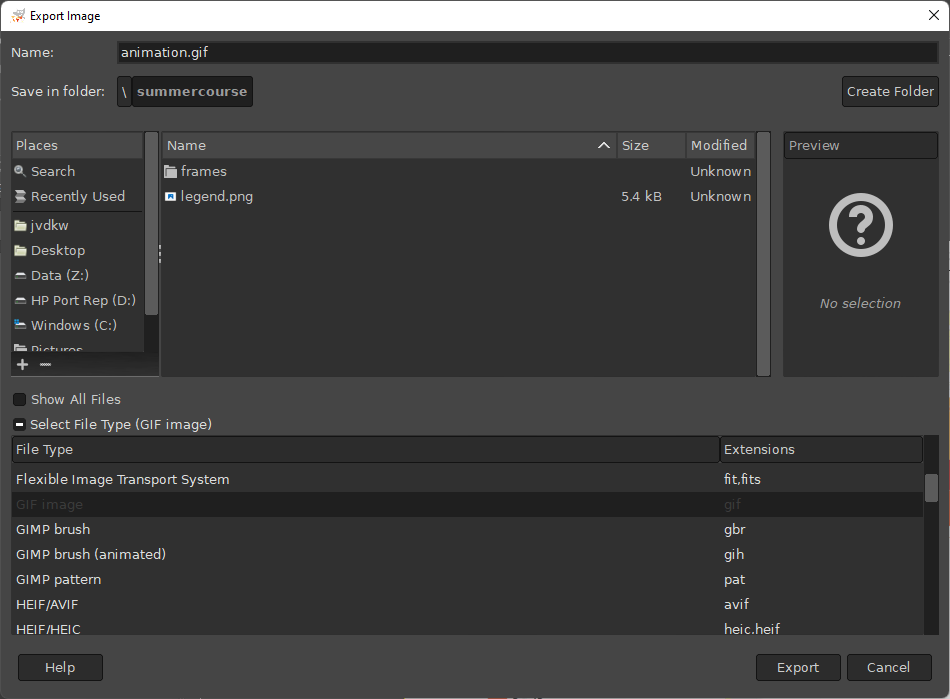
9. Expand Select File Type and choose GIF image. Browse to the folder where you want to store the file and give it a file name.
10. Click Export.
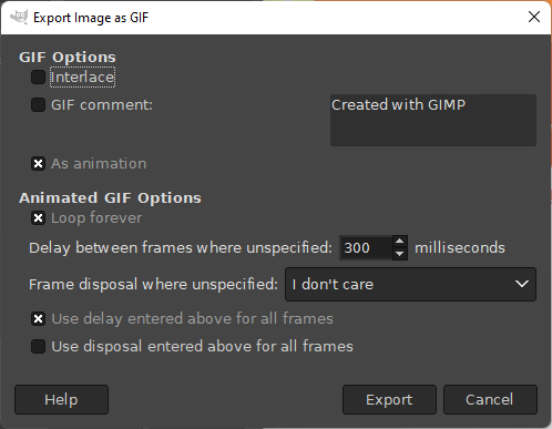
11. In the Export Image as GIF dialog uncheck the GIF comment box and check the As animation box. Change the delay between the frames to 300 ms and check the box to use the delay for all frames.
12. Click Export and check the resulting animation.
12. Conclusion
In this tutorial you've learned to make an animated choropleth map using the QGIS Temporal Controller.
Watch this video to check the steps: