Visualize and Animate Mesh Data
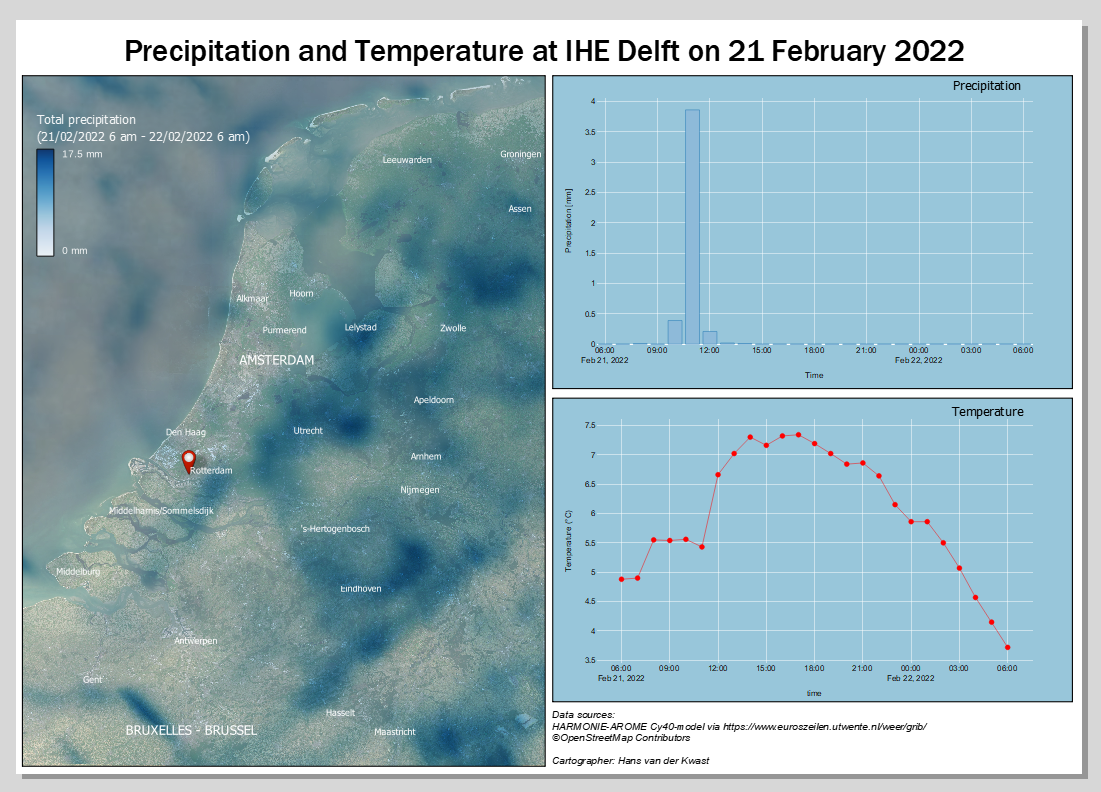
| Site: | OpenCourseWare for GIS |
| Course: | Creating data visualisations with graphs, maps and animations |
| Book: | Visualize and Animate Mesh Data |
| Printed by: | Guest user |
| Date: | Monday, 27 July 2026, 6:59 AM |
1. Introduction
- Style a precipitation mesh
- Animate a precipitation mesh
- Calculate precipitation sum with mesh calculator
- Extract precipitation at a specific location
- Make graphs with the Data Plotly plugin
2. Visualize Precipitation Mesh Data
We're going to visualize precipitation predictions from the HARMONIE-AROME Cy40-model. This model predicts precipitation for the next 48 hours with a spatial resolution of 2.5 km and a temporal resolution of 1 hour. The data are provided as open data by the Royal Netherlands Meteorological Institute (KNMI). The files come in the GRIB mesh format. The GRIB format from KNMI, however, is difficult to use in QGIS. Therefore we use the files provided by Euros Zeilen.
On the main page you can download the GRIB file of 21 February 2022, when a lot of rain was predicted for the Netherlands. After the tutorial you can try to apply what you've learned to the recent predictions available at Euros Zeilen.
1. Open QGIS Desktop with a new project.
2. Locate the downloaded GRIB file in the Browser panel and expand it by clicking the black triangle.
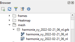
The mesh format is indicated with the  icon.
icon.
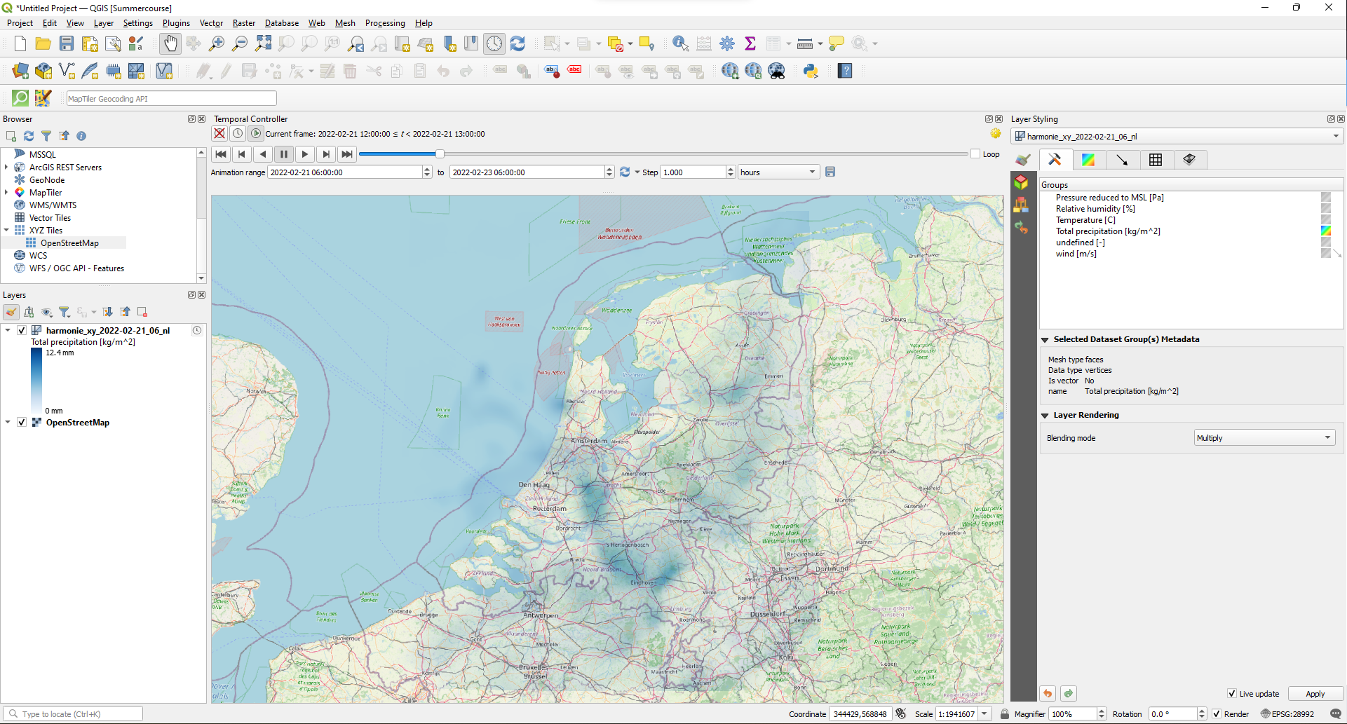
3. Drag the mesh layer to the map canvas.
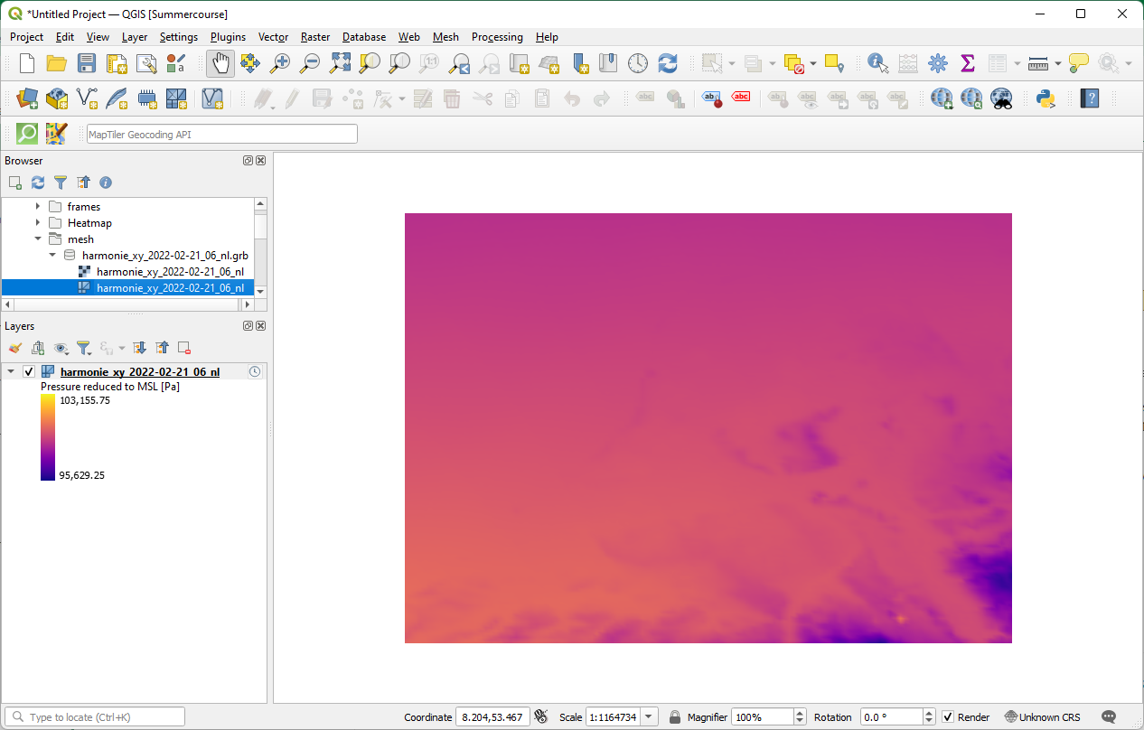
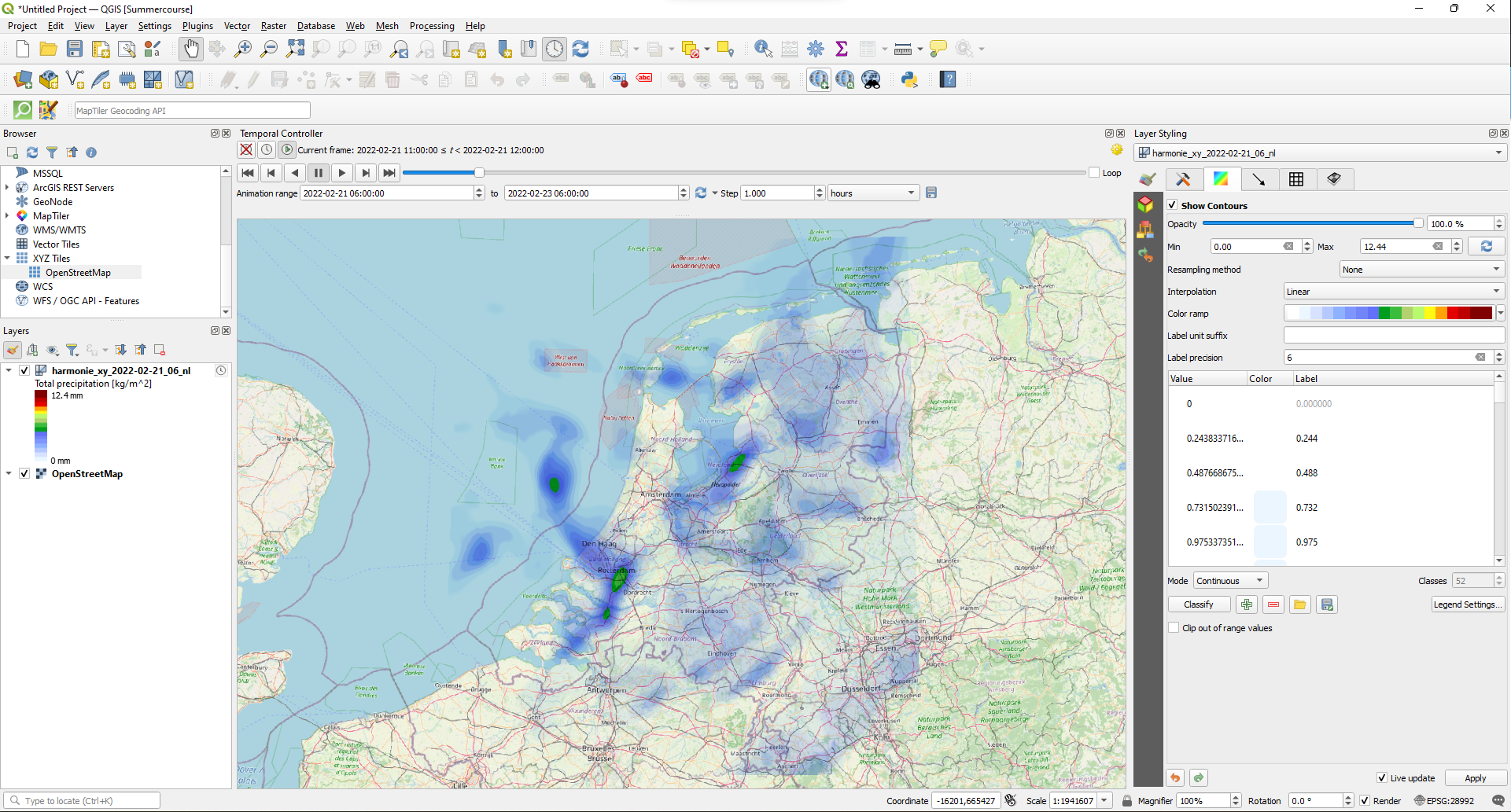
The mesh layer shows the default color ramp and has an Unknown CRS according to the projection of the project shown in the lower right of the window.
Let's improve this.
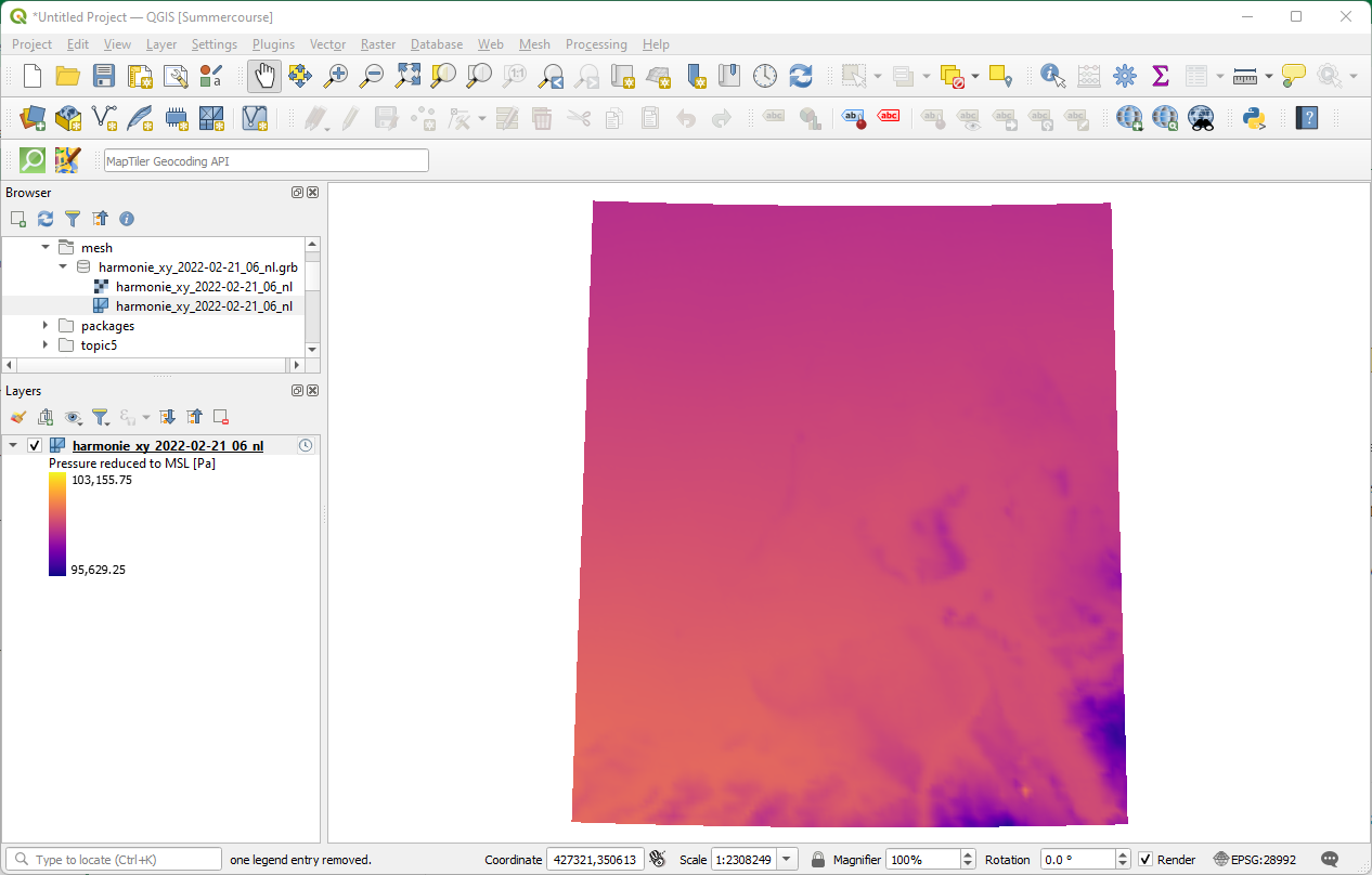
4. Set the projection of the project to the Dutch Amersfoort / RD New projection (EPSG:28992) by clicking on Unknown CRS.
To be sure that the mesh is at the correct location (Netherlands) and to have a nice backdrop, we're going to add OpenStreetMap.
5. In the Browser panel, expand the XYZ Tiles folder and drag OpenStreetMap to the map canvas. Accept the default transformation and make sure that the OpenStreetMap layer is at the bottom of the Layers panel.
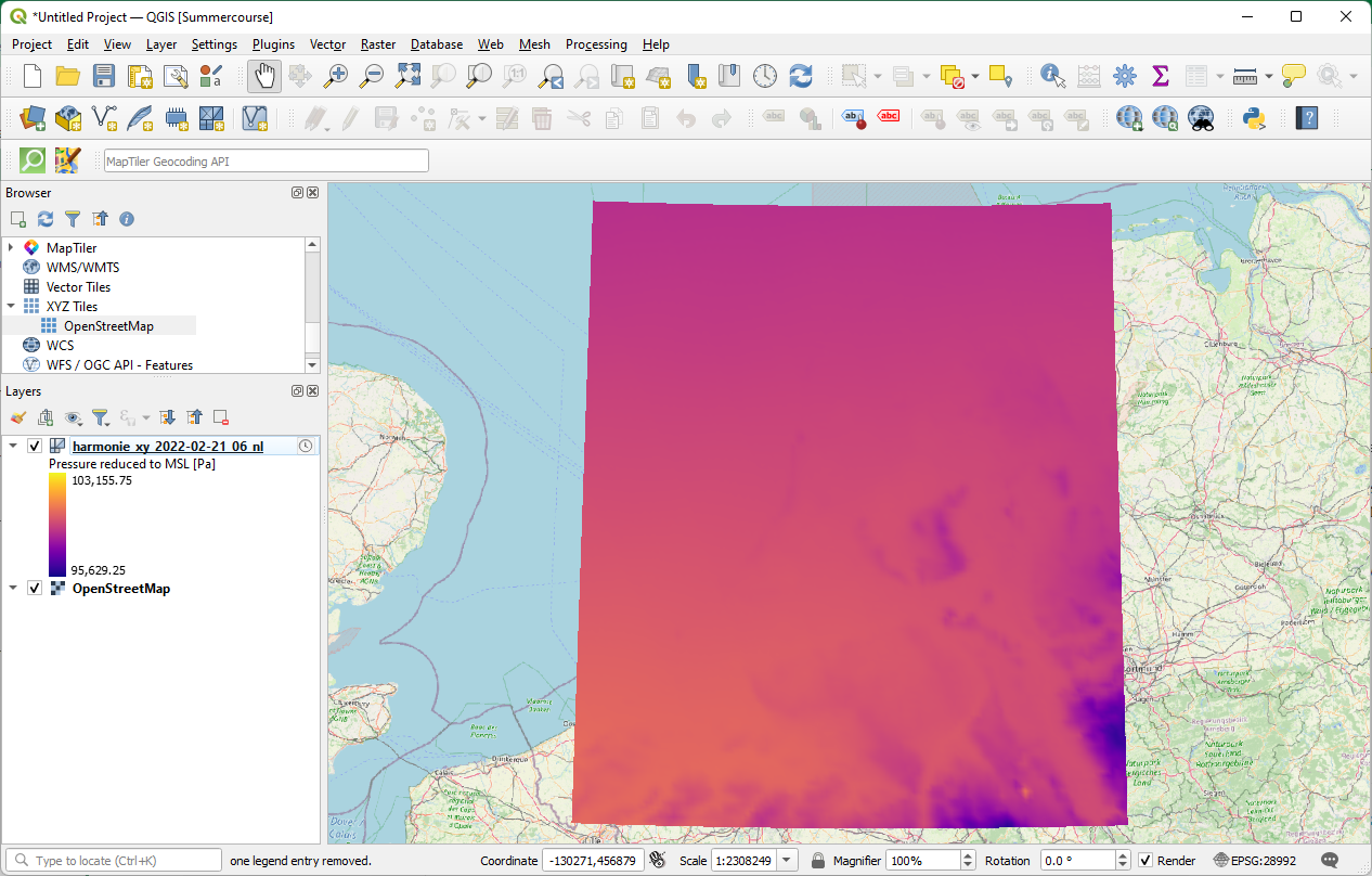
Great, the mesh is at the expected location!
Note the  icon next to our GRIB layer. This indicates that it is a temporal mesh.
6. Click the  icon to inspect the Temporal Layer Properties.
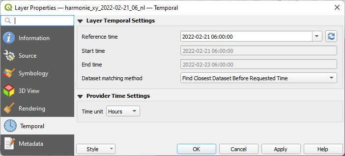
This is read from the mesh file.
7. Keep it as it is and click Cancel to close the dialog.
Now let's change the styling.
8. Click  to open the Layer Styling panel.
Note that the Layer Styling panel is adjusted to show the options for styling mesh data.
9. In the Datasets  tab click on the contour
  icon for Total precipitation [kg/m^2], because that's the variable that we want to visualize.
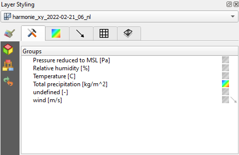
Note that the units of precipitation are in kg/m2 , which equals mm.
10. Now go to the Contours  tab.
tab.
Here we can change the color ramp.
11. Choose Blues for Color ramp.
It would be nicer to have the 0 mm cells (no precipitation) transparent.
12. Double-click on the Color of the row with the 0 value and set the Opacity to 0%.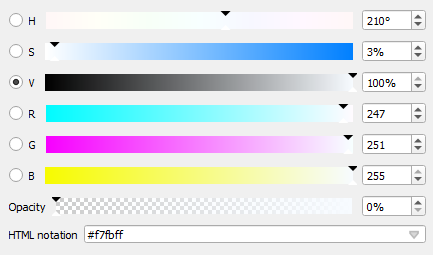
13. Click  to go back.
Let's improve the legend.
14. Click Legend Settings....
15. Type mm for Suffix (note that there needs to be a space before the unit).
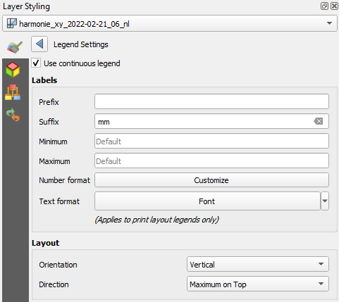
16. Click Customize at Number format.
17. Set Round to to 1.
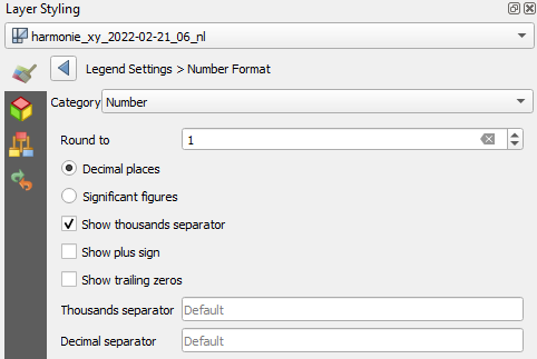
18. Click  to go back.
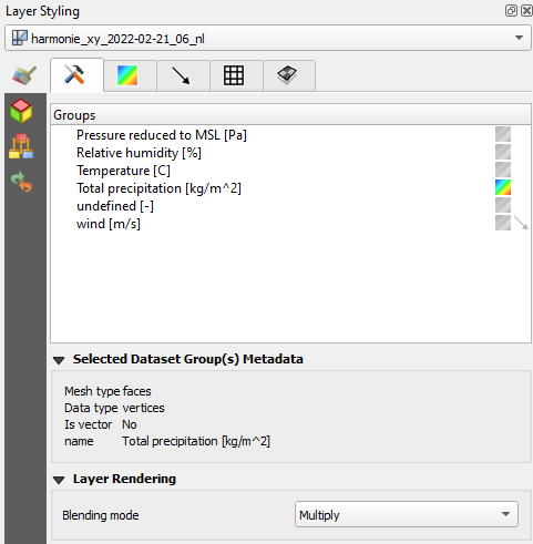
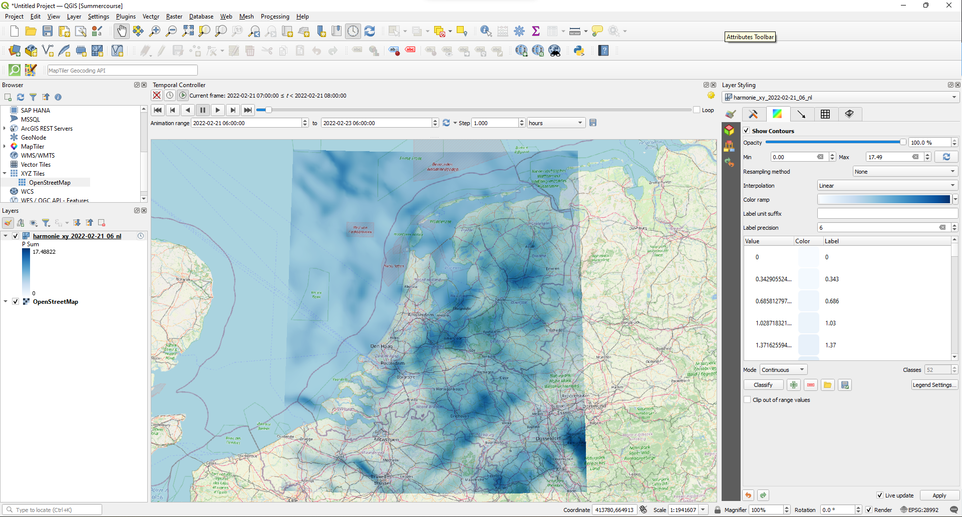
19. Go to the Datasets  tab and change under the Layer Rendering section the Blending mode to Multiply.
Now we're ready to animate the precipitation.
20. In the Map Navigation toolbar click the Temporal Controller Panel  icon.
icon.
21. Click  .
.
22. Resize the panel if needed and click 
Let's try another color ramp.
23. Go back to the Contours  tab in the Layer Styling panel.
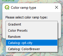
24. Use the drop-down at Color ramp to choose Create New Color Ramp....
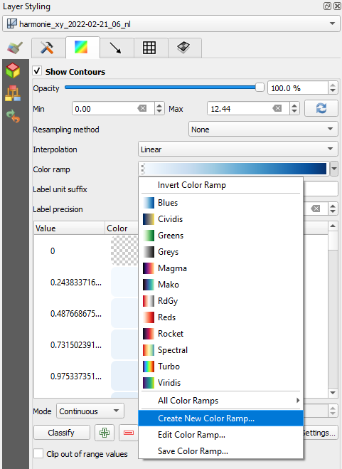
25. From the popup choose Catalog: cpt-city and click OK.
In this catalog you can find many presets of ramps categorized per theme.
26. Choose the Precipitation theme on the left side and select one of the ramps, for example precip2_17lev.
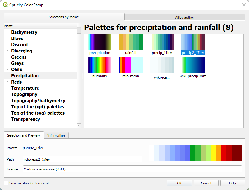
27. Click OK to close the dialog and apply the ramp.
28. Check the result and adjust the ramp if needed.
Next, we're going to do some calculations and create a graph.
3. Calculate Precipitation Sum with Mesh Calculator
We can also do calculations with mesh layers. For this purpose there's the Mesh Calculator, which works similar to the Raster Calculator.
1. Make sure the mesh layer is active (selected) in the Layers panel.
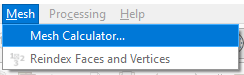
2. In the main menu go to Mesh | Mesh Calculator....
The Datasets in the active mesh layers are now available in the Mesh Calculator dialog.
We're going to calculate the total precipitation in 24 hours.
3. Check the box to Create on -the-fly dataset group instead of writing layer to disk. Give it the Group name: P Sum.
The on-the-fly dataset group will be visible in your mesh layer, but is only temporary.
4. Keep the Spatial Extent as it is, but change the Temporal Extent to a range that starts at February 21 2022, 6:00 am to February 22 2022, 6:00 am (24 hours).
5. Click the sum (aggr) button to add the sum function to the Mesh Calculator Expression.
6. Double-click on Total precipitation [kg/m^2] under Datasets to add it to the Mesh Calculator Expression and click a closing bracket to complete the expression.
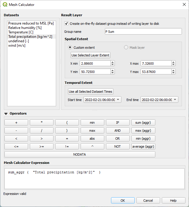
7. Click OK to perform the calculation and close the dialog.
A message in the map canvas will indicate that the dataset has been successfully calculated.
In the Layer Styling panel, under the Datasets  tab, you can now see that P Sum has been added.
8. Visualize P Sum by clicking on the Contour  icon.
icon.
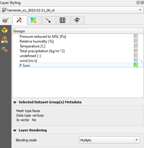
9. Change the color ramp to Blues in the Contours  tab.
tab.
The result is a static map showing the total precipitation in the 24 hours period that we have calculated.
Next, we're going to extract the precipitation time series at a specific location.
4. Extract Time Series at a Point
If we're interested in the 24 hour precipitation trend at a specific location we can extract a CSV file for that point. Let's do that for the location of IHE Delft.
We can use the Locator bar in the lower left of the window to search for addresses. It uses the Nominatim geocoder to find the location of addresses.
1. In the Locator bar type
> Westvest 7 Delft
The > indicates that you want to search for an address. You add a space and then type the address.
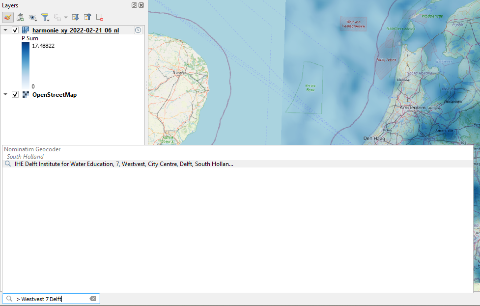
As you can see it found IHE Delft Institute for Water Education at the address.
2. Double-click on the result to zoom in to the result. Zoom out a bit to get a better view of the building.
Now we're going to digitize a point at the building, the location for which we want to report the precipitation time series. This will be a temporary scratch layer.
3. Click on  in the toolbar or select Layer | Create Layer | New Temporary Scratch Layer... from the main menu.
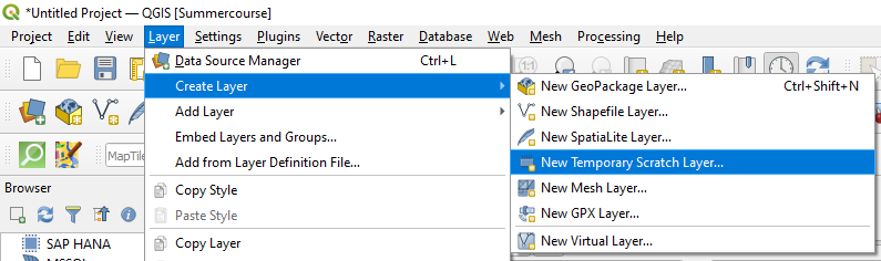
4. Change the Layer name to Location, choose Point for Geometry type and change the projection to the one from the project (EPSG:28992). We don't need to add attributes.
5. Click OK to add the empty layer to the Layers panel.
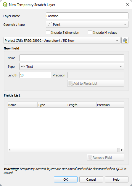
6. Click Add Point Feature  in the Digitizing toolbar.
7. Place the point at the IHE Delft building in the map canvas.
8. Click  to toggle off editing and save the edits.
Now we can use the point to sample the precipitation values from the mesh layer.
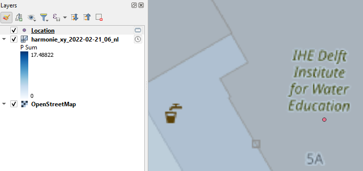
9. In the Processing Toolbox go to Mesh | Export time series values from points of a mesh dataset.
10. Choose our mesh layer as Input mesh layer.
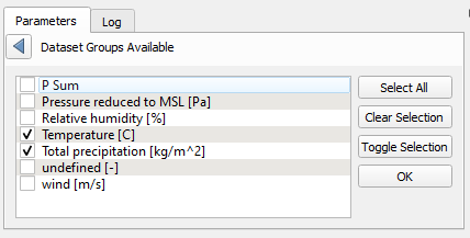
11. We're going to use precipitation and temperature. Click on  at Dataset groups and choose Select in Available Dataset Groups from the drop-down menu.
12. Check the boxes for Temperature [C] and Total precipitation [kg/m^2] and click  to go back.
13. Use the drop-down menus to select a date range from 21 February 2022, 6:00 am until 22 February 2022, 6:00 am.
14. Make sure that Location is selected as Points for data export.
15. Keep the rest as default and save the result as PandT.csv.
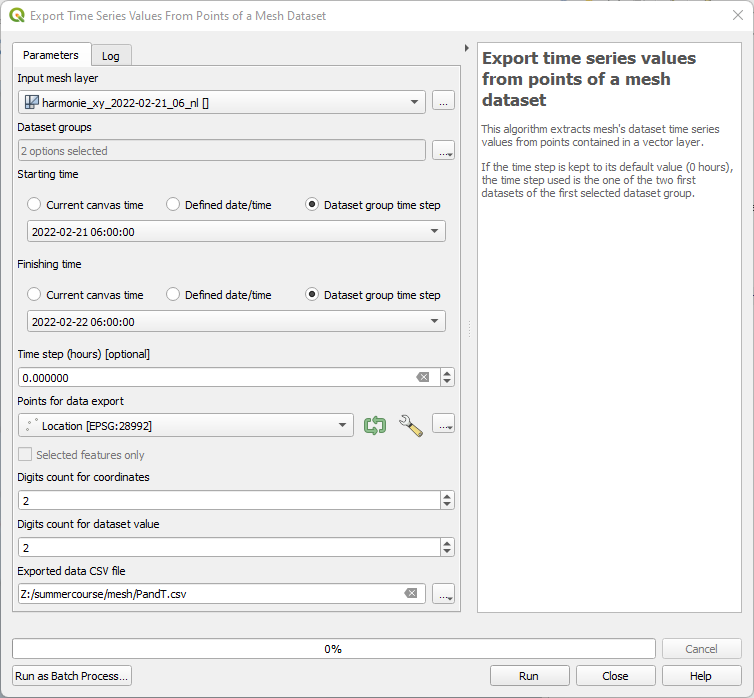
16. Click Run and Close the dialog.
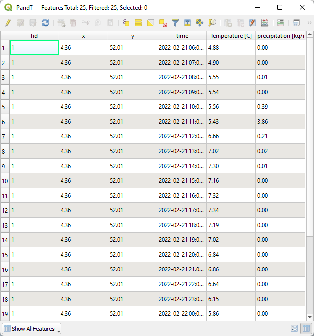
17. Go to the Browser panel and drag the PandT.csv file to the map canvas (if you don't see the file, you need to click the Refresh  button).
18. Right-click on the CSV file in the Layers panel and choose Open Attibute Table from the context menu.
Check the result.
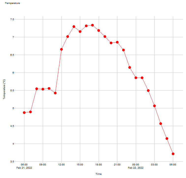
In the next section we'll create plots from these time series.
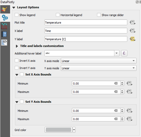
5. Create Graphs with the Data Plotly Plugin
The time series in our CSV file can be used to create graphs with spreadsheets or other software. In QGIS we can create graphs with the Data Plotly plugin.
1. Install the Data Plotly plugin from the Plugins Manager.
2. Click  in the toolbar to open the Data Plotly panel.
Let's visualize precipitation as a bar plot.
3. Change Plot type to Bar Plot.
4. Change the Layer to PandT.
5. Choose time as X field and Total precipitation [kg/m^2] as Y field.
Don't bother about the Legend title, we'll not show a legend for the graph. Keep the blue colors for Bar and Stroke.
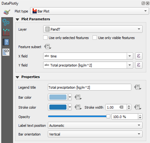
6. Go to the  tab and uncheck the box for Show legend.
7. Type Precipitation as Plot title.
8. Change X label to Time and Y label to Precipitation [mm].
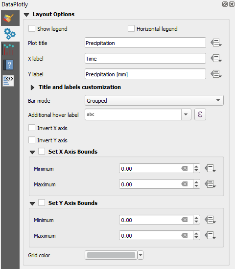
9. Click Create Plot.
10. Adjust the panel to the proportion of the plot that you would like to see. Click  to export the plot to a PNG file.
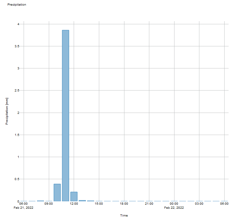
- How can we improve the bar plot?
 tab.
tab.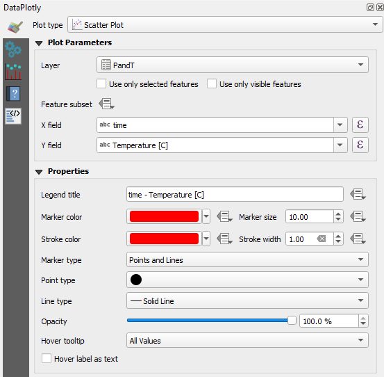
 tab and change the Plot title to Temperature.
 button and choose Edit.... from the drop-down menu.
'Temperature' || ' (' || char(0176) || 'C)'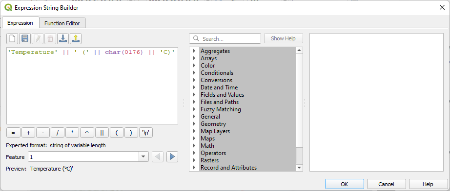
 to export the plot to a PNG file.
- How can we improve this plot?
6. Create a Print Layout including a Data Plotly Plot
It is possible to add the plot to a Print Layout.
Let's first improve a few things in the map.
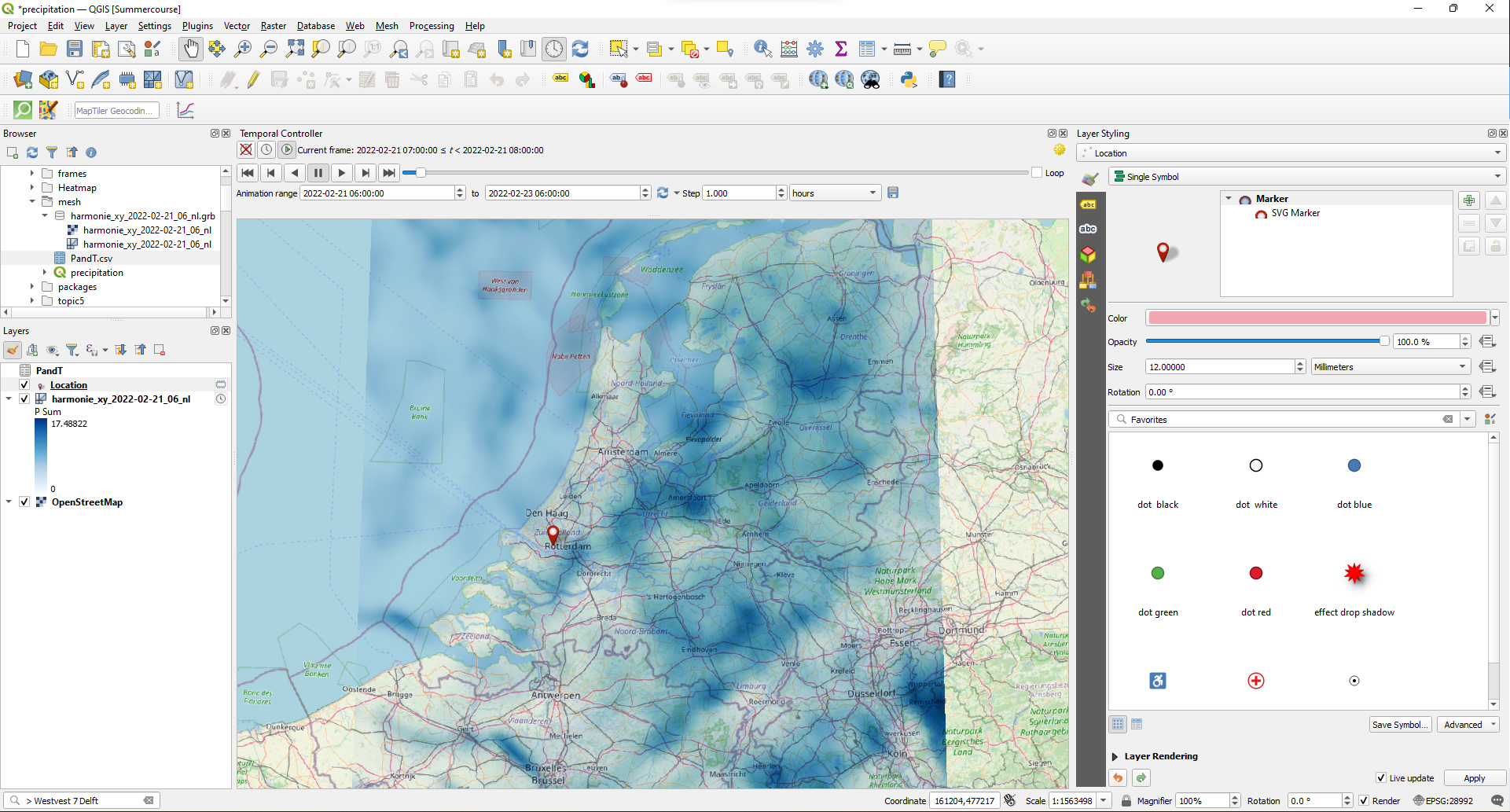
1. In the map canvas zoom out to the Netherlands and make sure that the P Sum is still visible.
2. Go to the Layer Styling panel and choose Location as the target layer.
3. Click on Simple Marker. Use the drop-down menu at Symbol layer type to change the Simple Marker to SVG Marker.
4. In the SVG browser choose the red marker under symbols.
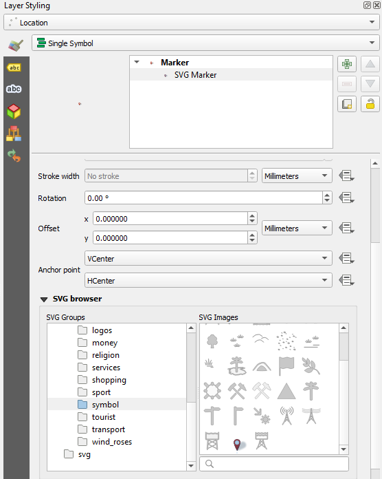
5. Click on Marker and change the Size to 12 mm.
Now let's create a new print layout.
6. Click  in the Project toolbar or choose Project | New Print Layout... from the main menu.
7. Name it Precipitation.
We'll keep the orientation of the sheet to landcape, because we want a map and a graph next to each other.
8. Click the Add Map  icon and drag a box that covers the left half of the sheet, leaving a little space at the top for the title.
9. Use the Move item content  icon to adjust the position and scale of the map. Make sure the whole country fits and that there are no gaps without precipitation data.
10. In the Item properties check the box to add a Frame.
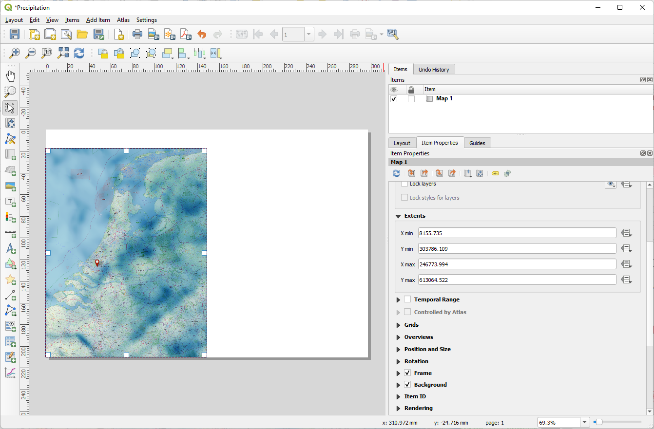
11. Click the Add Plot Item  icon and drag a box that aligns with the top of the map, is half its height and keep some space between the map and the plot.
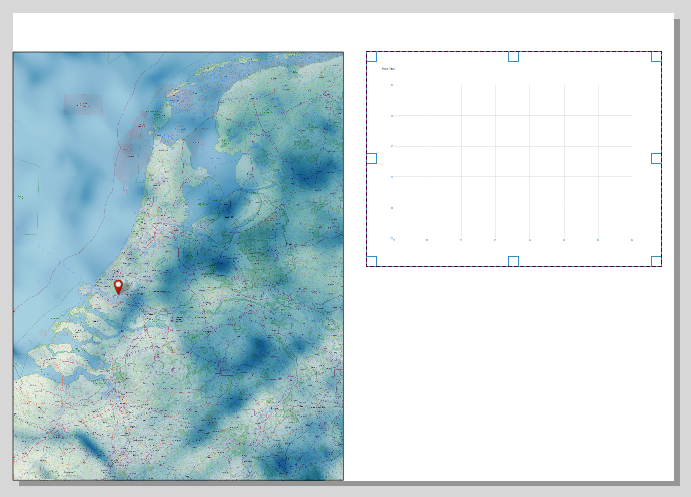
12. In the Item Properties click Setup Selected Plot.
13. Set it up for Precipitation as we did before (and try to implement some improvements). Don't add a title and make the fonts size 16.
14. Nudge the graph so it aligns better with the top of the map.
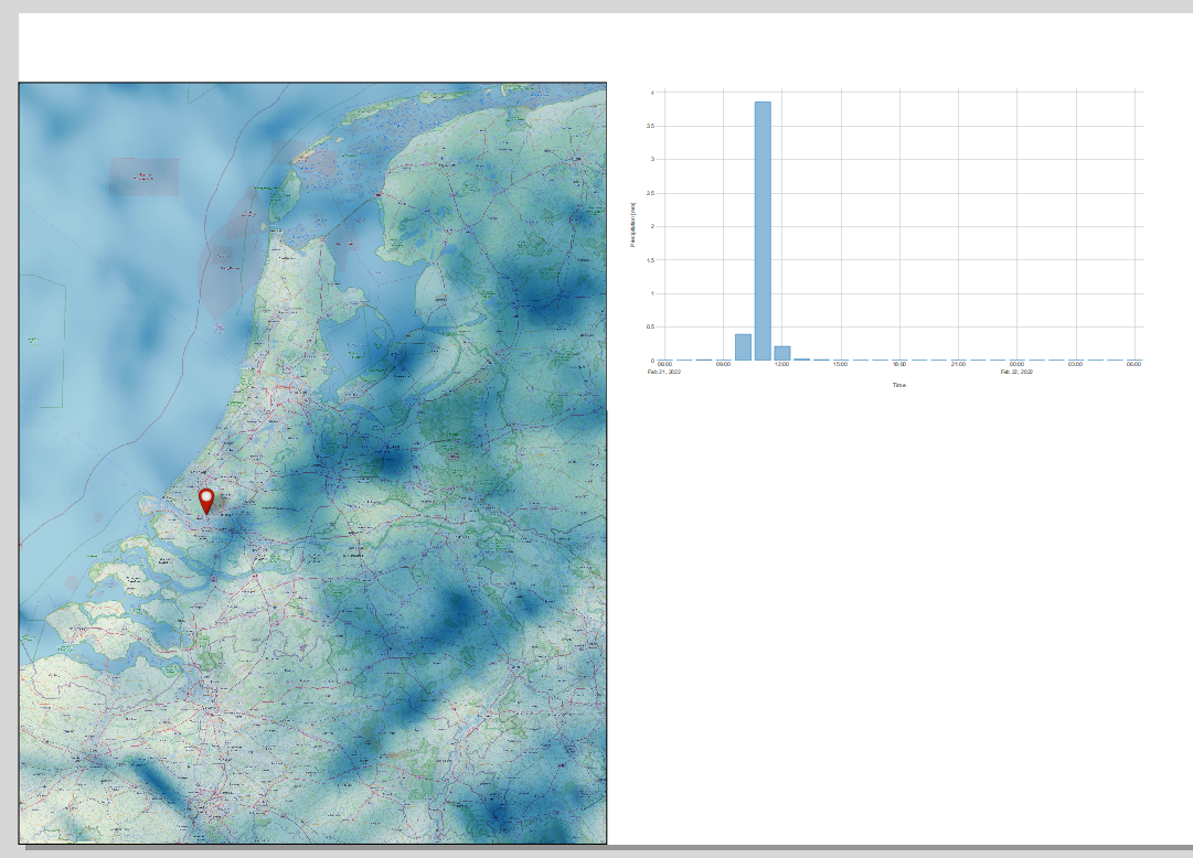
14. Now add a new plot for the temperature in a similar way. Tip: for the y-axis label expression you can find the expression that we used before under Recent (generic) in the Expression String Builder.
15. Click Add Label  and drag a box covering the white space at the top of the sheet completely.
16. Type in the Item Properties Precipitation and Temperature at IHE Delft on 21 February 2022.
17. Choose a clear sans serif font, size 24, Horizontal alignment Center, Vertical alignment Middle.
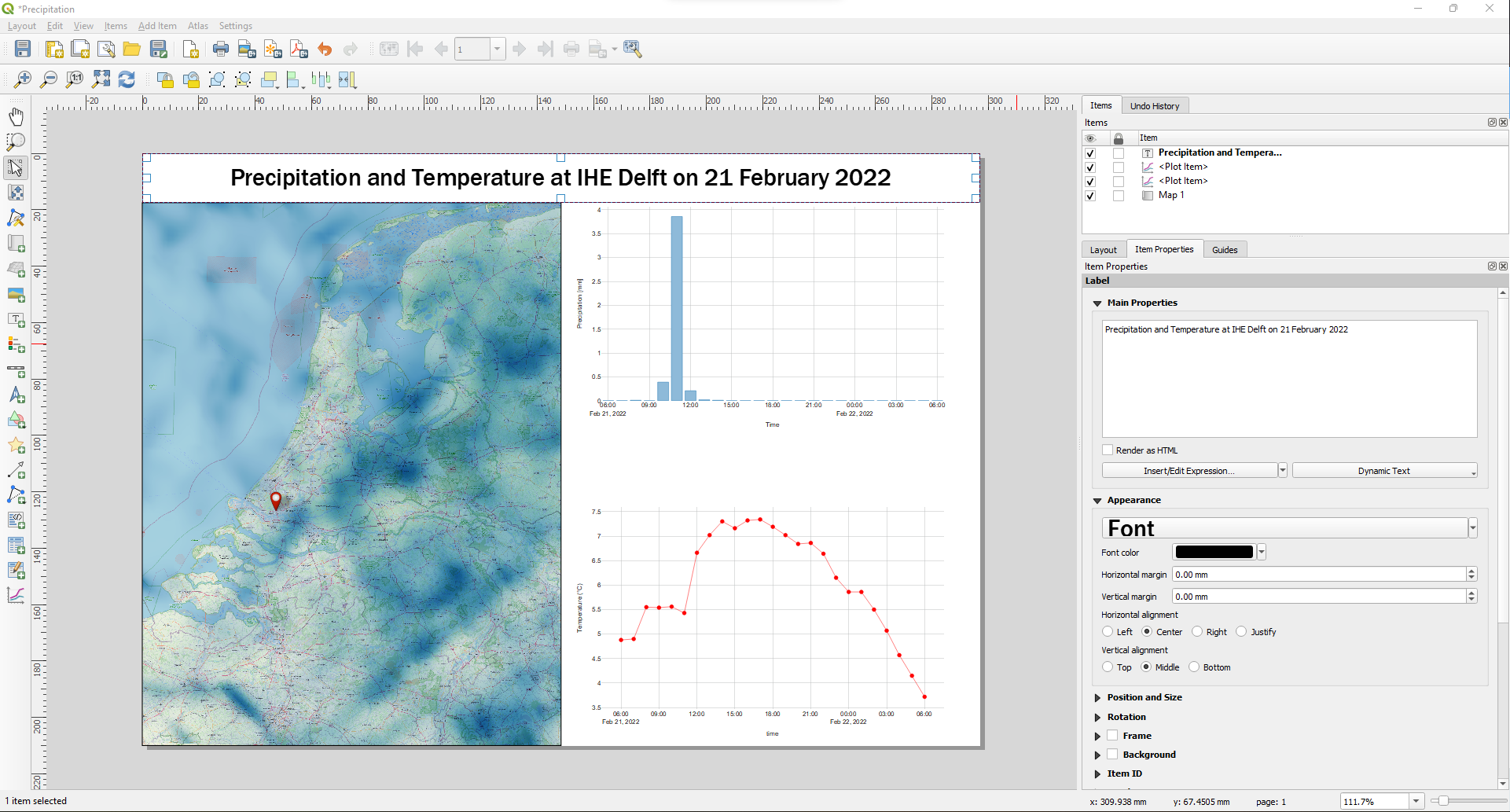
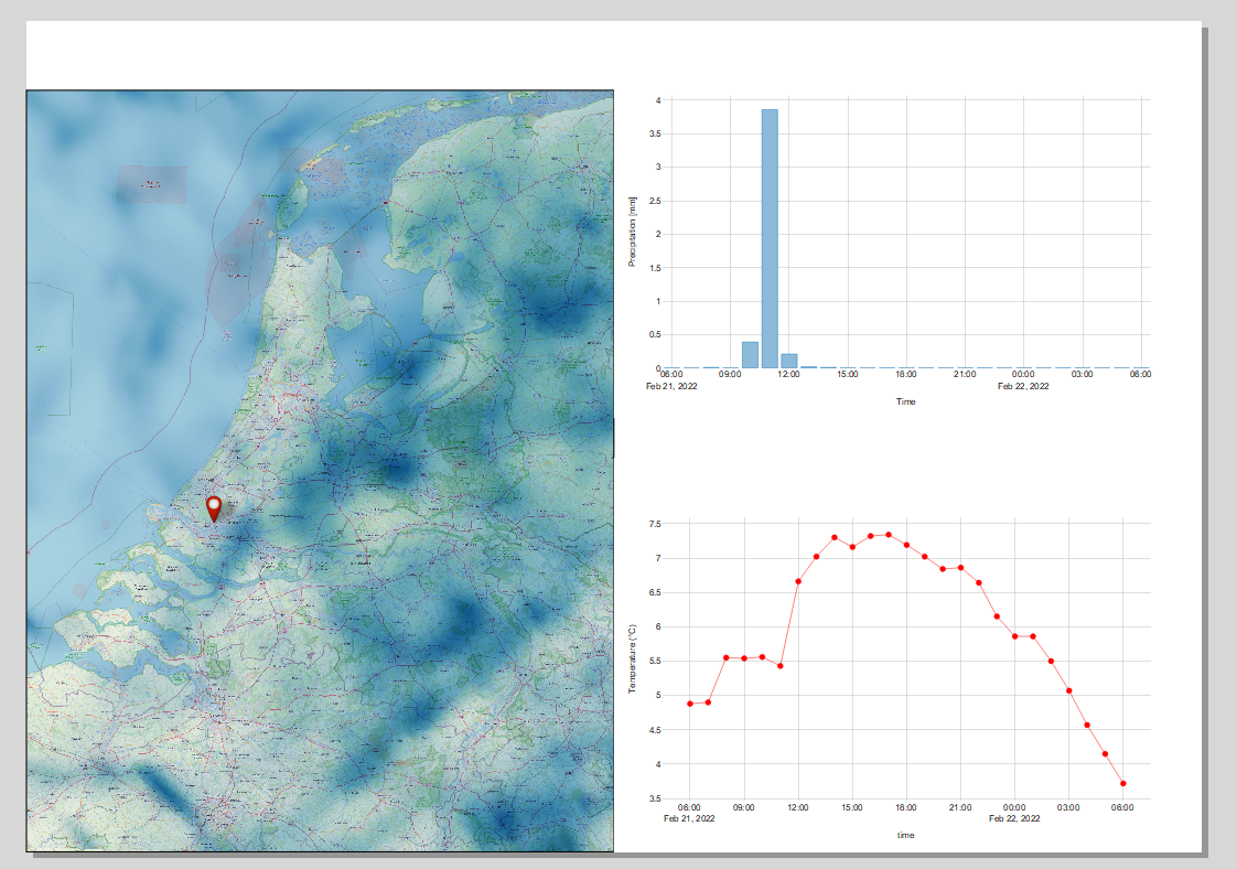
Let's add a legend for the map.
18. Click the Add Legend  icon and drag a box in the North Sea.
19. In the Item Properties uncheck the box for Auto update.
20. Remove all layers, except the mesh layer from the legend using  .
.
21. Remove P Sum by selecting it and clicking  .
.
22. Double click the layer name and change it to:
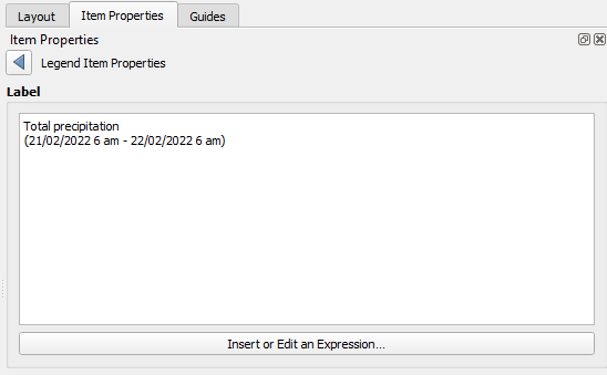
23. Click  to go back.
24. Double-click on the color ramp.
25. Change the Width to 5 mm and the Height to 30 mm. Set the Suffix to mm (don't forget the space before the unit).
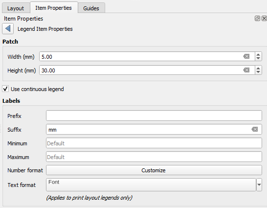
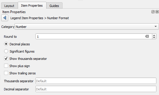
26. Click Customize at Number format and set Round to to 1.
27. Click to go back.
28. Set the Font to 8 points.
29. Click to go back.
30. In the Item Properties scroll down and expand the Fonts and Text Formatting section.
31. Change the Subgroup font to 10 points.
32. Scroll further down and uncheck the box before Background.
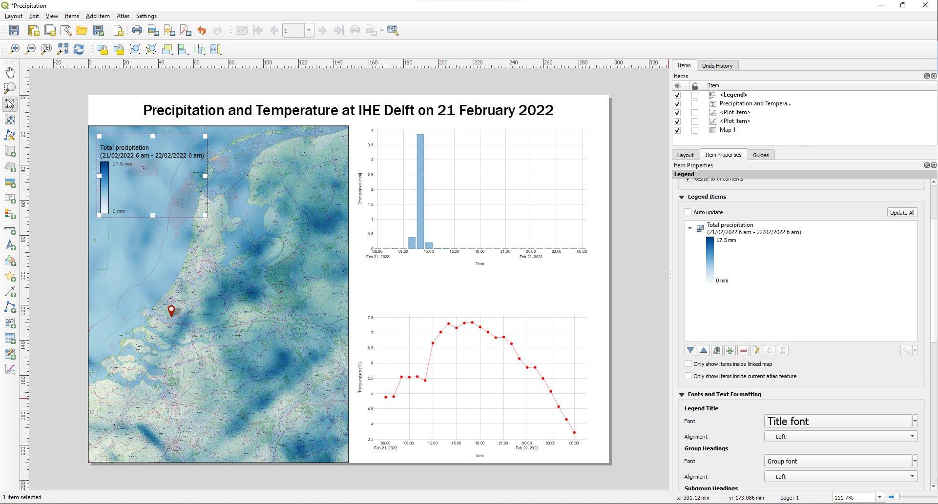
A reader from the Netherlands doesn't need a scale bar when the map covers the whole country so we can leave that away. Also a north arrow is not needed in this case. However, we do need to cite the data sources.
33. Add a text mentioning the data sources and author.
34. Try to tweak the Print Layout so that looks great.
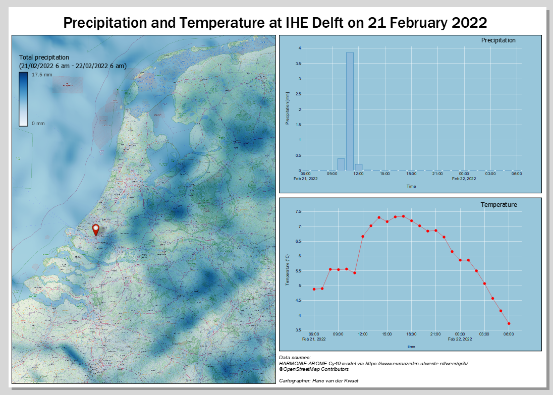
You can also try a different backdrop by using a vector tile from MapTiler.
7. Conclusion
In this tutorial you've learned to visualize spatial-temporal mesh data, use the Mesh Calculator, export time series at a specific point to a CSV file and to create plots with the Data Plotly plugin.
This video summarizes the exercise: