Tutorial Cartography for Map Figures in Academic Journals & Books
| Site: | OpenCourseWare for GIS |
| Course: | Creating data visualisations with graphs, maps and animations |
| Book: | Tutorial Cartography for Map Figures in Academic Journals & Books |
| Printed by: | Guest user |
| Date: | Tuesday, 30 June 2026, 8:06 PM |
1. Introduction
This workshop will discuss approaches and guidelines for creating map figures for academic books and journals. I will use QGIS
to illustrate one workflow in a graphical GIS. This general workflow
can be applied to other graphical GIS programs or even non-map figures.
This workshop was developed by Dr. Michele Tobias from UC Davis (GPL 3.0 license) and updated to QGIS 3.22 with some minor changes by Dr. Hans van der Kwast. The original workshop can be found here.
When you're flipping through a book or journal article, you probably look at the pictures first. Because figures draw our attention, they can be an incredibly important tool for conveying the message of your text. Communicating clearly within the restrictions of map figures requires a specific set of skills that is a little different from making larger maps for other purposes.
How are map figures different from other maps you might make?
- restricted size
- restricted color palette
- limited in number
- citations & license for data you use
Key Concepts:
- MINIMIZE! Keep only what's absolutely necessary
- What do I want my reader to learn from this map? How does it support the claims I make in my text? What story should my map tell?
- Does my map communicate well?
In this workshop, we'll learn strategies and steps to take in making map figures for publications.
Before proceeding make sure you've downloaded the data from the main page.2. Steps in Making a Map for a Journal Figure
Before we're going to create an example map, I'll present in the next subsections the steps you need follow for designing the map figure.
2.1. What Story Are You Telling?
The very first thing you need to do is understand what story you need to tell. Why are you making this map? What should the reader learn from this map?
Here's one real life example. I made a set of maps for a professor in Sociology. He was writing a book about cinemas in Paris. He needed readers to understand the location of the cinemas he wrote about in relation to other key features like subway lines and streets. So that's the story - where are the cinemas in relation to the streets and subways?

2.2. Data
What data do we need to tell our story? In the case of the Paris
cinemas, I needed the cinema locations, the streets, and the subway
lines. In some cases, this is easier said than done. Data processing
is pretty common at this stage to isolate just the pieces of a data you
need or to convert the data into a different format. For the cinemas, I
had addresses and those needed to be geocoded to create points. I had
OpenStreetMap data for the line work, but that includes a lot more lines
than I needed so I had to subset to the larger roads (excluding foot
paths) and subways.
2.3. Journal Art Specifications
We still haven't made a map yet. We need to know what the publisher specifications (specs) are before we start anything else. There's no point in creating a beautiful map at full page size when you won't be able to use it in the final product. Publisher specs are often rather restrictive. This will drive much of your creativity but also provide a decent amount of frustration. Be prepared. Additionally, if you submit art that doesn't follow the publisher specs, the art staff may alter your file. This is something to avoid as much as possible for maps because the art staff won't necessarily understand some of the subtleties like how resizing a map would alter it's scale bar or that cartographers can get very picky about label placement.
Let's look at one real-world example: Nature's Journals
I look for the following pieces of information:
- Maximum figure size: 89 mm (spans 1 column) or 183 mm (spans 2 columns) wide and maximum 247 mm high. This means our figures should be one of the two width dimensions and not a variation. We can have whatever height we need up to the maxium.
- Aspect ratio restrictions: none listed. That's fine because we have very specific dimensions.
- Color guidance or restrictions: Color figures have a monetary charge in Nature's journals; uses four-color reproduction (they use cyan, magenta, yellow, and black (CMYK) inks for printed material). If they charge for color, try to make a grayscale map.
- Font guidance or restrictions: none listed for maps. Some journals will specify a particular font or that the font must be an open font. I suggest sticking with something fairly common unless you really need a special font.
- Format and quality: electronic format, suggesting .JPG "at good enough quality to be assessed by referees". Eventually, you'll submit higher quality figures for publication but not for the review process. Some journals will specify things like .eps files or .tiff of a certain dpi and may also expect certain color encoding (CMYK, RGB, etc.). For images, if dpi is not specified, I will usually use 600 dpi. Note that if you can't supply a .eps file, a plain .svg is usually readable by Adobe Illustrator with minimal issues.
- Other limitations: Nature dos not want figures to have separate panels within the same figure unless they are related to each other. This means we can only have one map per figure unless they are related.
Often you will need to piece together specs for maps from different sections of the author instructions. Parts of the figure specs, photography, or graphs may apply.
2.4. Page Set Up
Once you know your art specs, set up your page in the print
composer/layout manager. I typically do this immediately after loading
my data, or even before. You want to assemble your map at the right size
from the start to avoid having to re-do steps.
2.5. Design & Layout
Fonts
For readability, I suggest 8 pt or larger font.
How many fonts? I use one, maybe 2 in a journal figure map. Bold, slant, itallic, and light variants of one font are more than enough options if I need them at all. Simplicity is key.
Which font? It depends. Pick a font that is readable at small sizes. Typically, I find sans serif fonts (think Calibri) to work better than serif fonts (think Times New Roman) in small maps, but that's not a rule. Calibri is a good standard choice available on most computers. My current favorite is an open font called Glacial Indiference which has a bit of a mid-century modern vibe, but just because I like it doesn't mean it's always a good choice. Remember to ask yourself: Does this communicate the message well?
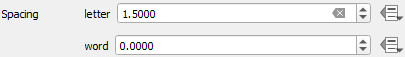
Some font tricks that can help: adjust the line spacing and kerning (the distance between the letters) to tighten up labels and make them take up less room or space them out to fill a larger space. Don't go crazy, but adjusting the spacing is sometimes helpful.
Be careful when downloading fonts. Be sure you're using a reputable source. Also, some fonts may not have all the characters you need, so be sure to check that they include the punctuation and international characters that your map requires.
Visual Hierarchy
Visual Hierarchy refers to the order in which we notice elements on a page. Certain characteristics get noticed first. We can use these charactersitics to our advantage to make sure the reader sees what we want them to see.
Contrast
Even when you're restricted to a gray-scale color palette, you can make use of visual hierarchy. Elements that have high contrast with respect to the other elements around them are noticed first. For example, darker elements stand out in comparison to light backgrounds and lighter elements stand out on a dark background.

Vary the amount of black in your grays (10% black is pretty light vs. 90% black is almost black). Save black for the most important items in your map - the things you need the reader to notice.
Size
Larger things get noticed before smaller things and size can also convey imporatance. Vary your line width or the size of your points to draw attention to more important elements.


Here is an example of a map that makes use of visual hierarchy. The roads are there, but muted to let the arrondisement boundaries and the point locations stand out.

Reference map published in Smoodin, E. 2020. Paris in the Dark: Going to the Movies in the City of Light, 1930–1950. Duke University Press.
If you use color, save bright, saturated colors for the elements that need to stand out. In the example below, I used grays and a muted blue for background information and for the important information (the railroad line variants) I used bold, saturated colors (that also print well in grayscale). This image was made for a journal article with several similar maps, but this particular one was not needed because we decided we didn't need to discuss this particular area of the study in the paper.

Background Data
Remember Step 1 where we discussed our story? I bet "Google Maps" or "All of OSM" wasn't a part of that story. My personal preference is to not use "base maps" or pre-assembled data tiles unless I absolutely have to. Vector data is better for clear line work and often "base maps" contain too much information. They can also be difficult to cite properly when the data has been re-processed by a commercial company.
I almost NEVER use an airphoto. I love airphotos. They are fun to look at because they have a lot of information in them, but that's the problem. We need simplicity and airphotos are not simple. Polygons in our map often cover up the airphoto, so that kind of defeats the purpose.
Figure Caption
One special thing about figures in journal articles is that they get captions! Captions are text that explains why you put this image in the article and what the reader needs to know about it. Caption text can sometimes take the place of a map legend. For example: Figure 1: Study site locations. Black squares indicate sites treated with experimental weed killer and open circles indicate control sites.
Depending on the journal, the figure caption should contain the citation in the journal's preferred style for the data you used and the cartographer's name.

Be prepared to cite the data you used and the cartographer's name in the figure caption, as well as give any contextual information that the reader will need to know to interpret the map. (Myles, C., M.M. Tobias, & I. McKinnon. 2021. “‘A big fish in a small pond’: How Arizona wine country was made” in Agritourism, Wine Tourism, Craft Beer Tourism: Local Responses to peripherality through tourism niches. M. Giulia Pezzi, A. Faggian, N. Reid, eds. Routledge.)
Map Elements
You may have learned in your introductory GIS class that all maps need a title, legend, scale bar, and north arrow. That was a lie. Well... let me explain. We talked earlier about identifying your story and tailoring your map to communicate well. Some map figures will need some of these things. Others will not.
Title: You'll almost never need a title (that's what the figure caption is for).
Legend: If your style choices are obvious, you don't need a legend. For example, study site locations marked with bold black dots, clearly labeled, probably don't need a legend. Legends should show the elements a reader woudn't figure out on their own.
Scale Bar & North Arrow: If your map shows the entirety of a recognizable geographic element, such as a continent, you probably don't need a scale bar and if you haven't rotated the map, you don't need a north arrow.
When you need to add map elements to the layout, please keep it simple and subtle. Your reader will find the north arrow if they need it. It doesn't need to scream at them.
Only add the elements that help your reader understand the map. Eliminate everything extra. When it doubt, explain it in the figure caption.

A map figure with selected elements - notably it does not need a scale bar and north arrow - published in Myles, C., M.M. Tobias, & I. McKinnon. 2021. “‘A big fish in a small pond’: How Arizona wine country was made” in Agritourism, Wine Tourism, Craft Beer Tourism: Local Responses to peripherality through tourism niches. M. Giulia Pezzi, A. Faggian, N. Reid, eds. Routledge.
2.6. Image Export
Refer to your publisher specifications. Export the format they ask for using the parameters they want. If it's a raster format (.jpg, .png, .tiff), export the image in the highest resolution they ask for.
Often you will submit lower resolution images for the review process and higher quality images for the final submission.
Caveats for the final submission: If they ask for 300 dpi or less, I'm still sending 600. If they don't specify an image format or resolution, I default to 600 dpi .tiff or .png. If they ask for a .ai or .eps file and you don't have access to Adobe Illustrator to create that, a plain .svg, or a .pdf will also work because Illustrator can open and edit these formats too.
2.7. Licensing
Can you cite your data? Are you allowed to publish it?
More and more often, publishers are asking for proof of their ability to publish the data legally. This means that the data either need to be open licensed or you need a document giving you permission to use the data in a publication. You decide the license for the data you create. Where people typically get hung up is on data they download from the internet. When you do this, look for the data's license statement, readme file, or metadata to find the license and save that information alongside the data files. I often put relevant license information, source, and date I downloaded it in a .txt file in the same folder with the data to have the information ready when I need it..
Some journals want to know who made the maps you include in your submission to avoid reproducing images that belong to someone else - i.e. maps you find online and want to use.
3. Hands On
To gain experience with the concepts we just talked about, let's make a map!
3.1. What story are you trying to tell?
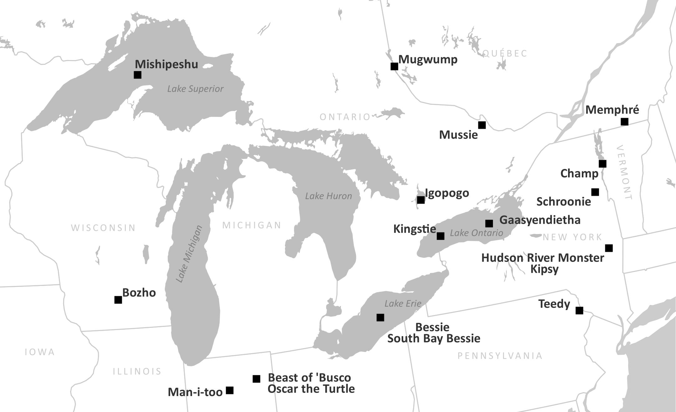
The Premise of this Exercise
Let's pretend we want to a map for a journal article about the underpinnings of the distribution of cryptozoology sightings in the northeastern US and southeastern Canada, focusing on lake monsters, creatures reported to live in lakes that are mainly known from folklore and typically take on the the shape of extinct or extraordinarily large living reptiles. You want your readers to understand the relationship between the monster locations and also their location on the planet. In our imaginary scenario, we plan to submit our paper to one of the Nature journals.
What's the story? What should readers learn from this map? What data do you need to tell that story effectively?
The story I plan to tell is where are these monsters reported to live? What are their names? For reference, what lakes and states or provinces are they in? The story you want to tell might be different, so feel free to make adjustments as needed.
3.2. Download Data
If you haven't already, download the workshop data from the main page.
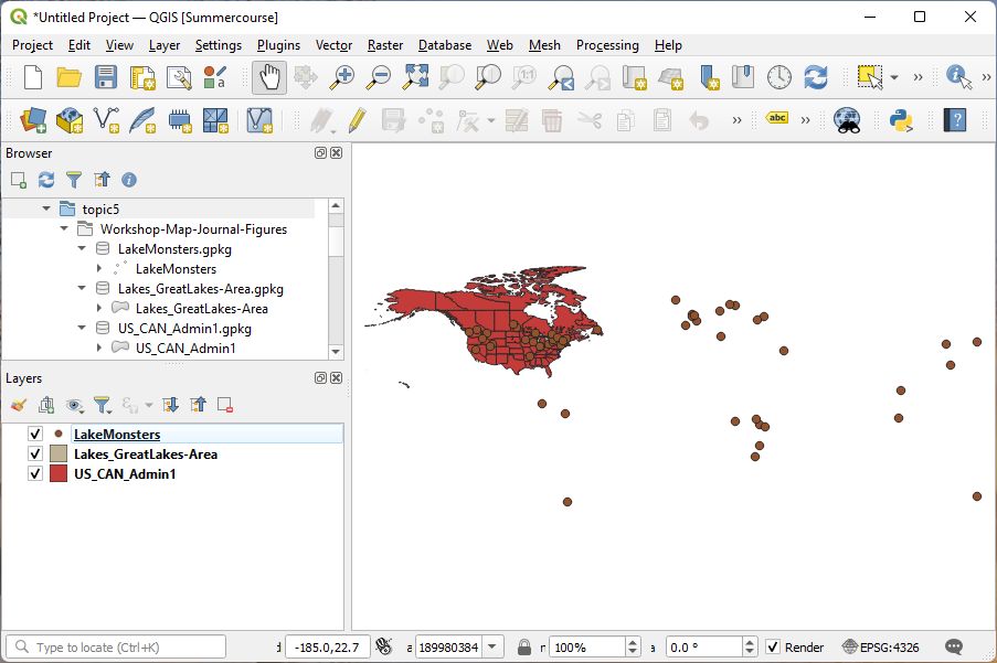
The data we have to work with today is:
- Lake Monsters - LakeMonsters.gpkg - locations of lake monsters; global distribution
- Lakes - Lakes_GreatLakes-Area.gpkg - a clip of the Natural Earth Data lakes dataset for the Great Lakes and areas adjacent
- States - US_CAN_Admin1.gpkg - a clip of the Natural Earth Data states and provinces data for the US and Canada (I'm going to refer to these as "states" for simplicity, but I want to acknowledge that this includes Canadian provinces as well.)
Geopackage (.gpkg) is a single file, open vector format. We're using it today because it's one file per dataset (unlike Shapefile), which makes data management so much easier. See the README.txt file that comes with the data download for more details and sources of the data.
Data Processing
We'll be working with an international dataset of locations of lake monsters, the most famous of which is arguably Nessie who supposedly lives in Loch Ness in Scotland. This dataset was assembled from Wikipedia's List of Lake Monsters. The lake names were geocoded (you can find the R script that I wrote to process the data in the r_scripts folder of this repo), corrected, then exported to a geopackage file. Why did I process this data for you? It took a few hours to do and requires skills we are not focusing on in this workshop.
3.3. Publisher Specifications
Let's assume this map is for an article in one of the Nature journals, so all of the specifications we discussed earlier will apply.
Most importantly:
- Size: 183 x <240 mm
- Format: .jpg
- Other: No divided images unless the sections are related
3.4. Setting Up Your Map Project: Assemble all the data
-
Open QGIS Desktop and start a new project.
-
Load in the data in QGIS - Lake Monsters, Lakes, Admin 1 boundaries (states). All of the data we're working with today is vector data.
-
Save your project file.
-
Set your project's projection to North America Albers Equal Area Conic (ESRI: 102008). I'm using the first transformation it offers me because that one is most appropriate for the area we'll be mapping today.
Save the project again.
3.5. Set Up The Print Layout Page
In QGIS, the print layout interface is where you compose your map. Typically, I will set up my layout before I start styling data (mainly because I just looked up my art specs and don't want to have to go find them later when I'm ready to finish up the map).
Open a new layout:
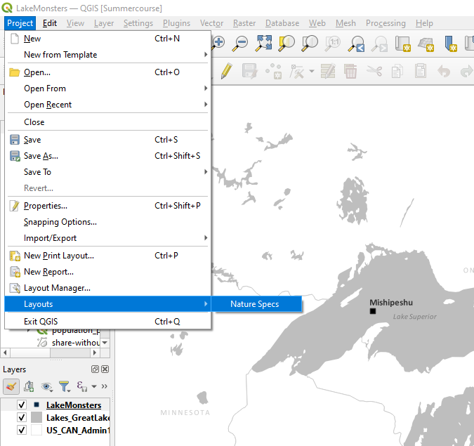
- In the main menu choose Project | New Print Layout....
- In the window that pops up, give your new layout a name. I'll call mine "Nature Specs" so later I'll know this layout was for my Nature submission with this data. Click OK.
- A new blank layout window should now be open.
Set the page size:
- Right click anywhere on the white page in the middle of the window
- Select Page Properties from the menu
- On the panel on the right side of the screen, set the Size drop down to Custom, then set the Width to 183 mm and the Height to 240 mm for now - we'll shrink this later as needed. Note: there is a units drop down to the right of the Width and Height options.
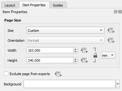
- Click the Save button
 . This saves the whole project, not just the layout.
Now that this is set up, we can close this window and come back to it after we've styled the data.
3.6. Style The Data
We've decided on our story, loaded our data, and set up our page. Now it's time to style the data.
- First, let's center our view on the Great Lakes area using the zoom tool. It doesn't have to be perfect. We will adjust later.
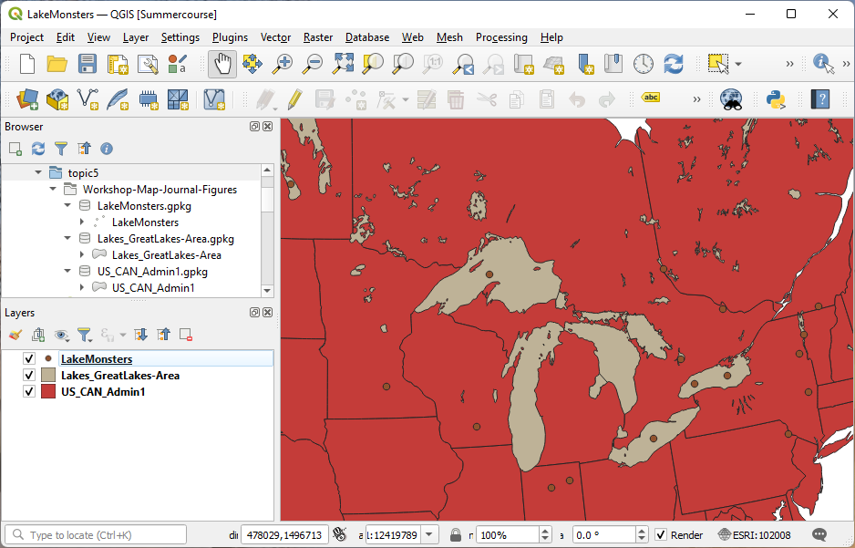
Again, these colors do NOT communicate well at all. We'll change it soon.
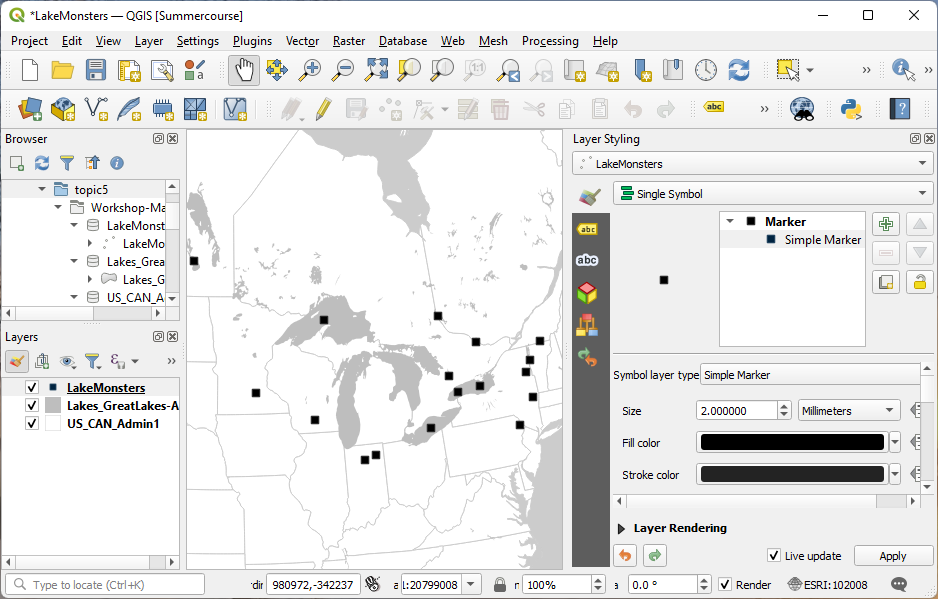
Let's open the Layer Styling Panel. This is a toolbar that can be docked on the side of the window and allows us to make changes to the layer styling with live updates (so we don't have to keep clicking to update).
States
Let's start with the largest background layer. This will have a big impact on how we style the other layers and will help set the tone for how we work.
- Open the Layer Styling panel by clicking

- In the Layers panel (table of contents), click on the States layer (US_CAN_Admin1). The options in the Layer Styling panel on the right should now reflect the current state of the States layer.
- In the Layer Styling panel, click on the words Simple fill - this lets us access the details of the way the state polygons are displayed.
- Click on the colored box for the Fill color.
- I want to make the fill of the states white, so in the HTML notation box, I will specificy #ffffff as the color (6 Fs). You could pick any color you like from the various color selector methods. When you're done, click the back buton
 to go back to the Simple fill options.
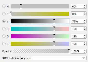
 - For the Stroke color (the outline of the polygons), I want to pick a shade of gray. Click in the color box next to Stroke color. In the color sliders, you can move the V (for value) to 80%, or you can put #cbcbcb in the HTML notation.
The stroke on the states might look a little light and might be confusing to the eye because the ocean color is the same color as the fill. Let's change the background color to make the ocean color easier for our eyes to understand:
- On the Project menu, select Properties.
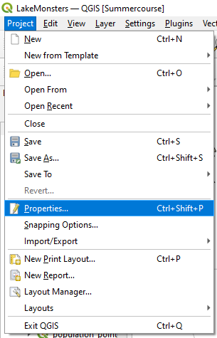
- In the General tab, click on Background color. Change it to the same color as the stroke of your states. Click OK in the color interface.
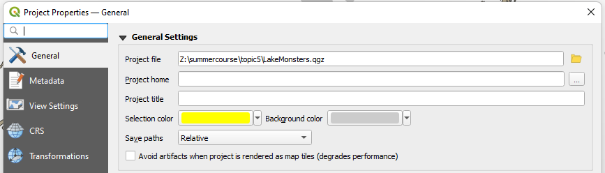
- Click OK in to close the Project Properties dialog.
We've got more work to do, but this is already starting to look better!
Lakes
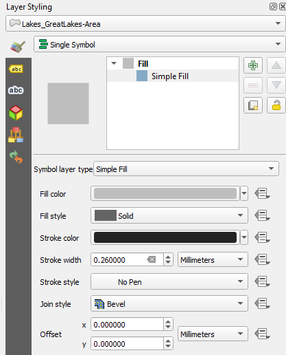
Let's work on the lakes next.
- Select the lakes layer (Lakes_GreatLakes-Area) on the Layers panel so it's activated in the Layer Styling panel.
- In the Layer Styling panel, change the fill color to 75% white (25% black)
- For the Stroke style drop-down menu, pick No pen, which removes the stroke altogether.
Remember our discussion of Visual Hierarchy? The background layers - the states and the lakes - now seem to recede and demand less of our attention. This is important so we can make the monster locations stand out next.
Lake Monsters
The last layer to style is the lake monsters.
- Activate this layer in the Layers panel by selecting it.
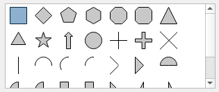
- In the Layer Styling panel, click on the words Simple marker.
- Scroll down to the box that contains different marker shapes. Circles are the obvious choice for point data, but I like to use squares for my point markers rather than circles because they stand out. Both are good options. In academic publications,
I try to avoid shapes like stars. They might look silly, but more importantly, they are complex shapes and we're trying to avoid complexity. Choose the square.
- For the Fill color, I'm going to use straight up black (#000000). This will make the points stand out well against the lighter background data.
- Adjust the Size as needed. I'm going to leave this for now until I see how it looks in the composer.
3.7. Labels
 icon on the strip of icons on the left
side of the panel.
icon on the strip of icons on the left
side of the panel. I like to pick a single font to work with for the whole map. I will use Calibri here and show you ways to vary this single font to meet our needs. Note that my default font is some system font, so I'll need to change that for each layer. You can use whatever you like. The reason I'm using Calibri is that (1) you are likely to have it as well, (2) it's sans serif (it has simple lines and no flourishes... compare it with Times New Roman which is a serif font), and (3) it has many variants - regular, bold, bold italic, italic, light, light italic - so it's like have 6 fonts that all go together.
Another choice I'll make up front is that I will use 8 point font unless I need something bigger (probably the point labels will be larger).
3. For each layer, go to the text tab and set the Font to Calibri, 8 points.
States
tab change the Font Color to the same as the ocean and state stroke (#cbcbcb). tab and change the Type case to All Uppercase.
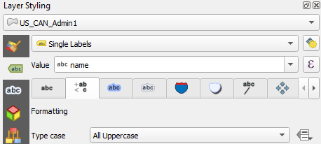
7. Now go to the Rendering  tab and check the box for Show all labels for this layer (including colliding labels).
Lakes
We'll used rule-based labeling with this one so we just label the big lakes. Labeling all the lakes would clutter the map.
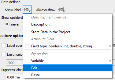
8. In the Rendering tab under Data defined click the Data defined override button at Show label.
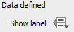
9. From the drop-down menu choose Edit....
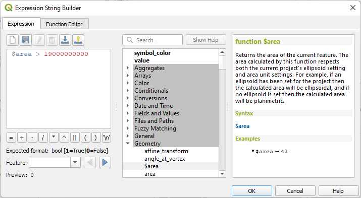
10. In the Expression String Builder write the following expression:
$area > 19000000000
 tab and change the Style to Italic (traditionally, water bodies are labeled with a slant or italic font... it's not a rule).
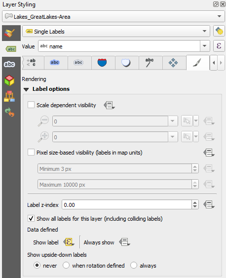
Lake Monsters
tab change the Style to Bold and the Size to 10 points. Keep the Color of the font black.tab and type a comma at Wrap on character. When labels contain a comma, the comma is replaced by a new
line character so the labels with two names print each name on its own
line. tab check the box for Show all labels for this layer (including colliding labels).
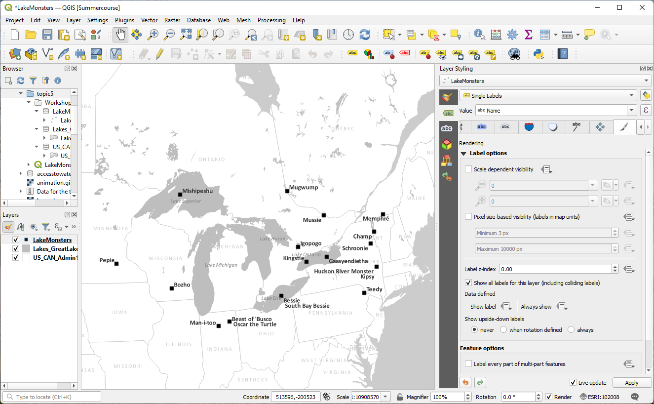
3.8. Make adjustments
Use the Label Toolbar to move and rotate labels by hand to put
them where you want them.

This will take some time. Just get them
close and don't spend time getting things perfect. We'll need to adjust
more later.
3.9. Print Layout
Now that we've styled the layers we can go back to the Print Layout to finalize the map design.
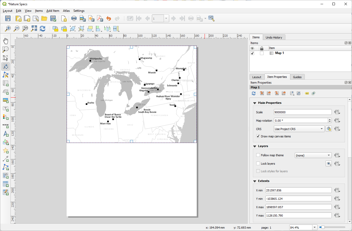
1. Open the Print Layout we made earlier with the page dimensions set to our journal specifications. In the main menu go to Project | Layouts | Nature Specs (or whatever you named your layout).
The Print Composer requires that you add any map elements that you want in your composition, including the map itself. Each of these items also has properties that can be accessed by clicking on the element on the page. The properties for any given element are displayed in the right side panel. Remember to switch back to the Select/Move Item button or the Pan Layout Tool after adding things.
2. Add the map with the Add Map  tool. Fill up the
space at the top of the page, allowing the tool to snap to the corners.
We won't need the whole length of our layout as it currently is, but
we'll adjust that later.
tool. Fill up the
space at the top of the page, allowing the tool to snap to the corners.
We won't need the whole length of our layout as it currently is, but
we'll adjust that later.
With the map selected, let's adjust the scale and center of the map.
3. Change the scale number in the Item Properties and recenter the map with the Move Item Content tool such that the data is centered and fills up the map space. Remember that our story focuses on the Great Lakes area, so we don't need to show data outside that space.
4. Using the resizing handles (they look like white squares when the map is selected), adjust the size of the map to fit the data well.
Now that we've picked a scale to render our map at, your
labels may not look quite the way you want them.
5. Copy the number in the
scale box of the Item Properties for the map. Switch to the
main QGIS window and paste that copied number in the scale box at the
bottom center of the window.
Now the scales match and we can see the effect it has on our labels.
6. Spend some time adjusting them to a better position.
7. Switch back to the layout window and click the Refresh view button. I might adjust my scale, center, and some of the labels as needed. For states that are not fully visible in the map, I will probably move the labels off the map so they aren't getting cut off. Also, you may need to turn off the option to Show all labels for this layer (including colliding labels) for any labels that are misbehaving (some of mine were in different places than I put them in the layout).
8. Now we can resize the map to tighten up the border.
Again, using the resizing handles, adjust the size of the map to fit the
data well. (I adjusted some label placement yet again as I refined my
composition. This is normal. As you change one aspect, others may need
adjustment too.). I also changed label settings in the Print Layout and unchecked Allow truncated labels on edges of map. In the Rendering tab in the Layer Styling panel check what happens if you uncheck Show all labels for this layer (including colliding labels) and check the box Only draw labels which fit completely within feature. It's a bit trial and error between a combination of settings and manual edits of individual labels.
Finally, let's adjust our map canvas to fit our map:
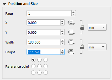
9. In the properties for the map, look in the Position and Size section to see how high the map is. Copy that number.
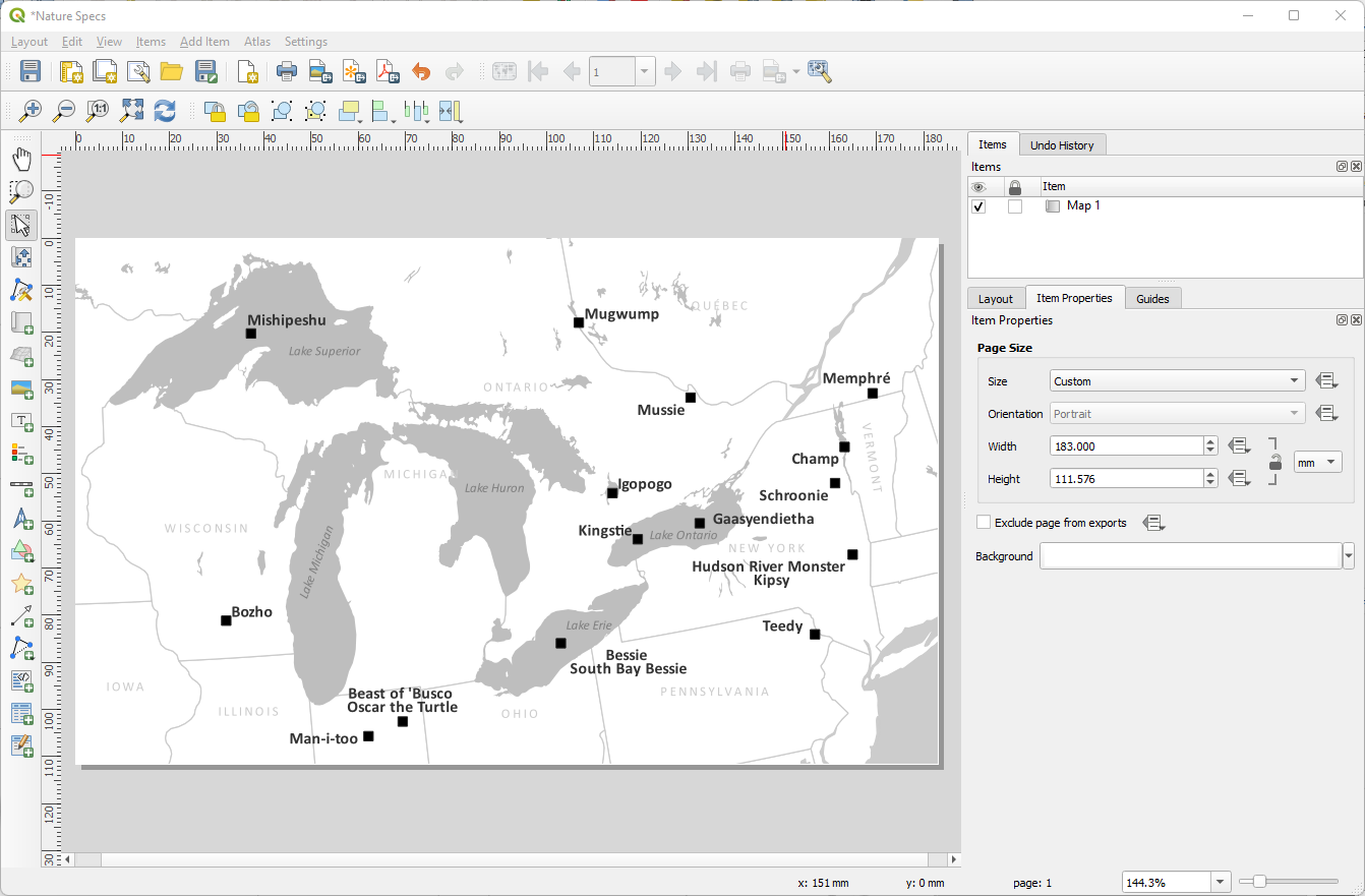
Finally, do we need any other elements? This depends on (1) your story, (2) your audience, and (3) what other maps you have in the paper you are submitting. Is this for a North American audience? Then you probably don't need a scale bar or north arrow because the Great Lakes are a fairly recognizable area. Is it for an international audience? Maybe you need those things. Maybe I have another map that shows all of North America or the world and I've already outlined my study area in that. Then I don't need to add extra context.
If I was going to put a scale bar and north arrow, I would put them on Iowa and Illinois and I would make them the same gray as the state lines or maybe the same color as the lakes and they would be reasonably small. Complex compass roses are wonderful for large maps, but they are not a good choice when your space is limited.
Sometimes I will put a box behind the scale and north arrow filled with the background color (white in this case) to avoid conflicts with the data around them. We can cut off a part of the Iowa/Illinois state line to make the label more clear and not hurt the way the map communicates the data.
3.10. Export Your Map
Finally, we're done with our map! (Ok, it's normal if you're now seeing a dozen things you would change, but you've got to submit that paper, so let them go!) Let's export it!
Exporting happens in the Print Layout.
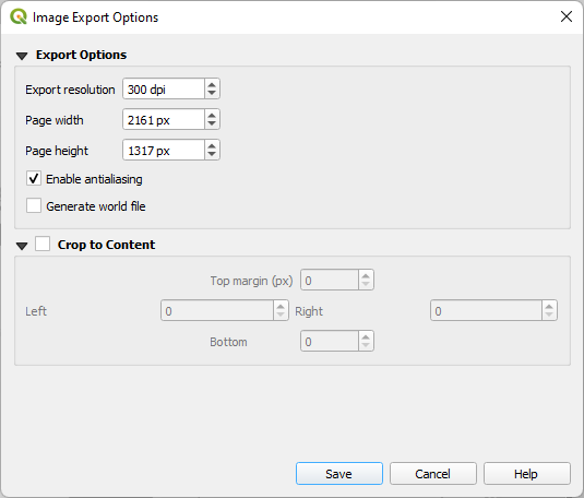
1. Click the Export as Image button, decide where to save your map and what file type you want. The journal asks for a .jpg file at a high enough resolution for the reviewers to review it in the first submission. Later, they'll want something of a higher resolution and probably a different format, but for now, let's pick .jpg. Give it a descriptive name so we know what it is when we put it in the paper. I'll call mine GreatLakeMonsters.jpg Once you click the Save button, a window will pop up asking for more parameters. 300 dpi is sufficient for the first submission. Leave the page height and width as they are - it adjusts automatically to match the dpi - and Save.
3.11. Resources
Here are some resources to help you refine your maps:
-
Inkscape - I use this program for fixing fine details. It's a free and open source vector illustrator program so it is similar, but not the same as Adobe Illustrator. Export a .svg file from the QGIS print composer and open it in Inkscape to edit things like labels with super fine control.
3.12. Conclusion
In this tutorial you've learned how to design map figures for academic journals and books.
Watch this recording of the workshop by Dr. Tobias: