Share your results!
| Site: | OpenCourseWare for GIS |
| Course: | Enhancing Water Productivity with WaPOR: A Hands-On Workshop Using WaPLUGIN in QGIS |
| Book: | Share your results! |
| Printed by: | Guest user |
| Date: | Saturday, 20 June 2026, 12:19 AM |
Description
fffff
1. Show us your maps
Congratulations on completing this short workshop with the WaPLUGIN team! We love beautiful maps, and we'd love to see yours. Using the indicators you computed during this workshop, or from any other area of interest, create a map and share it on your social media platforms.
1.1. Organize the Layers in QGIS
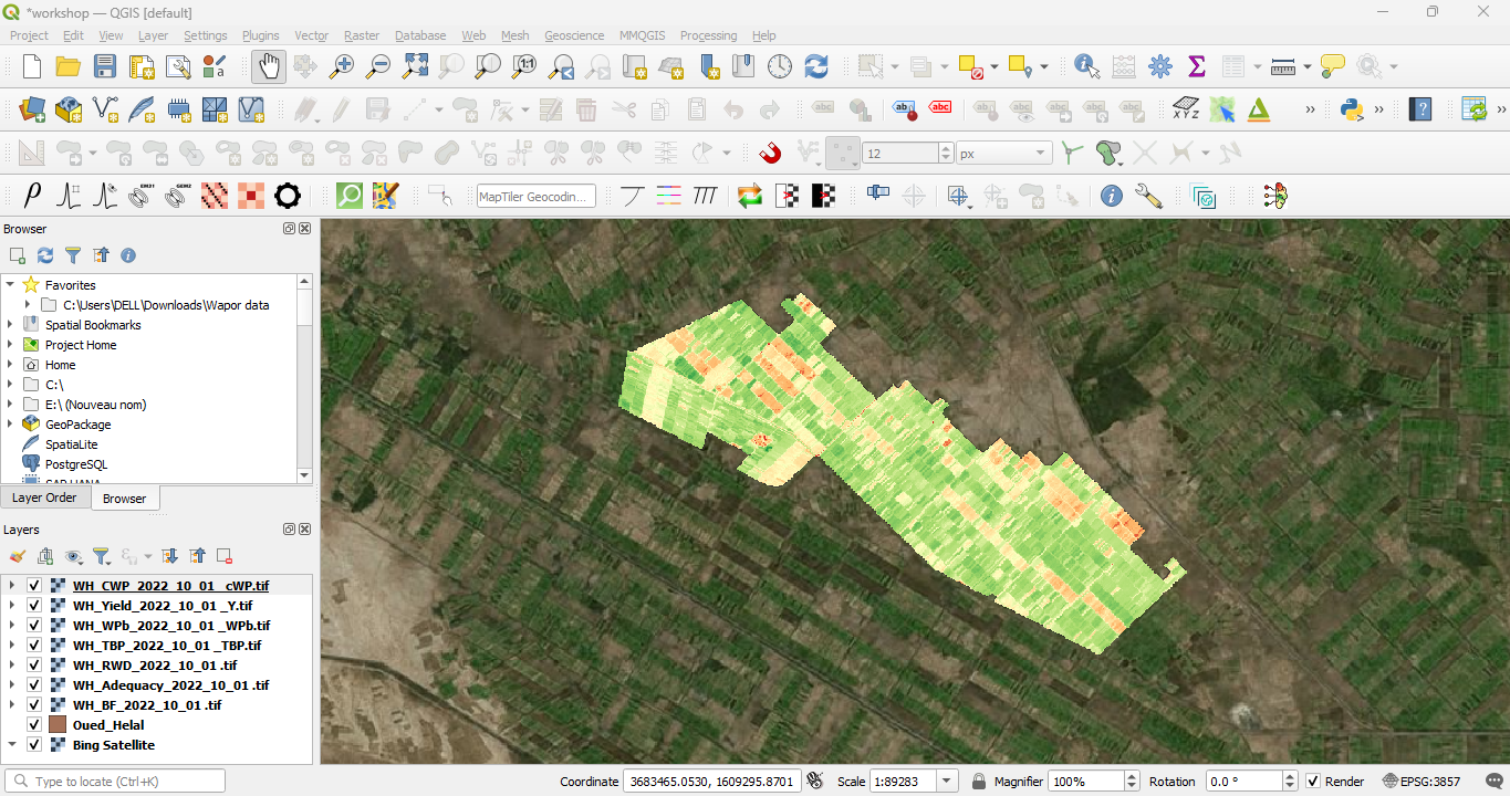
Let's first organise the layers in the project.1. Make sure all the computed indicator layers (Beneficial Fraction, Adequacy, Relative Water Deficit, Total Biomass Production, Biomass Water Productivity, Yield, Crop Water Productivity) are loaded into your QGIS project.
1.2. Change the Color Ramp for Each Indicator Layer
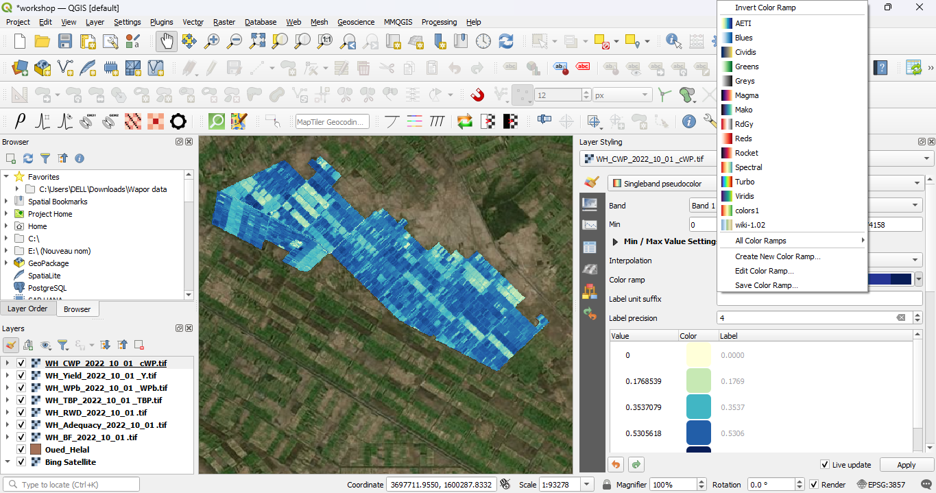
Let's make the colour ramps representative for the indicators.1. Select a layer (e.g., Adequacy) in the Layers panel and click
 to open the Layer Styling panel.
2. Change the renderer from Singleband gray to Singleband pseudocolor to visualize the data with a color ramp.
3. Click on the Color Ramp dropdown to choose a suitable colour ramp for each indicator.
1.3. Create a Map
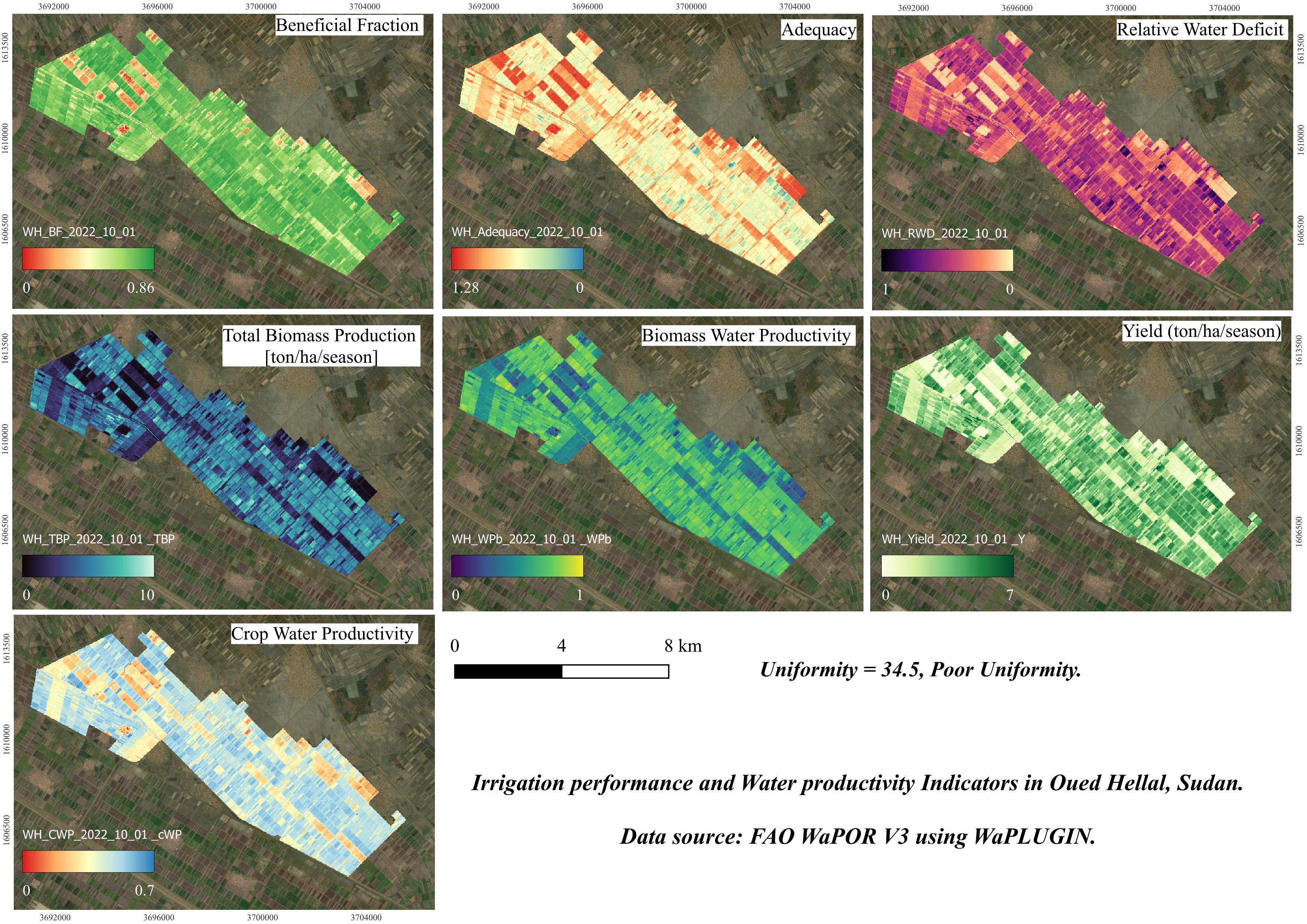
We're going to create a map in the Print Layout.1. To create a map, go in the main menu to Project | New Print Layout and give the layout a name (e.g., Oued Hellal Indicators Map).
2. In the Print Layout window, click on the Add Map
3. Drag the mouse to create a map frame in the layout, which will display the view from your QGIS project.
4. Choose the Add Label
- You can customize the font,
size, and color in the Item Properties panel.
- You can adjust the title
and format the legend using the Item Properties panel.
- In Item Properties, you can adjust the units (e.g., meters or kilometers) and the scale.
8. Choose a file name (e.g., Oued_Hellal_Indicators_Map) and save the map to your computer.
1.4. Post on Social Media
Share your map on social media (for example LinkedIn). You can tag our official page on LinkedIn.