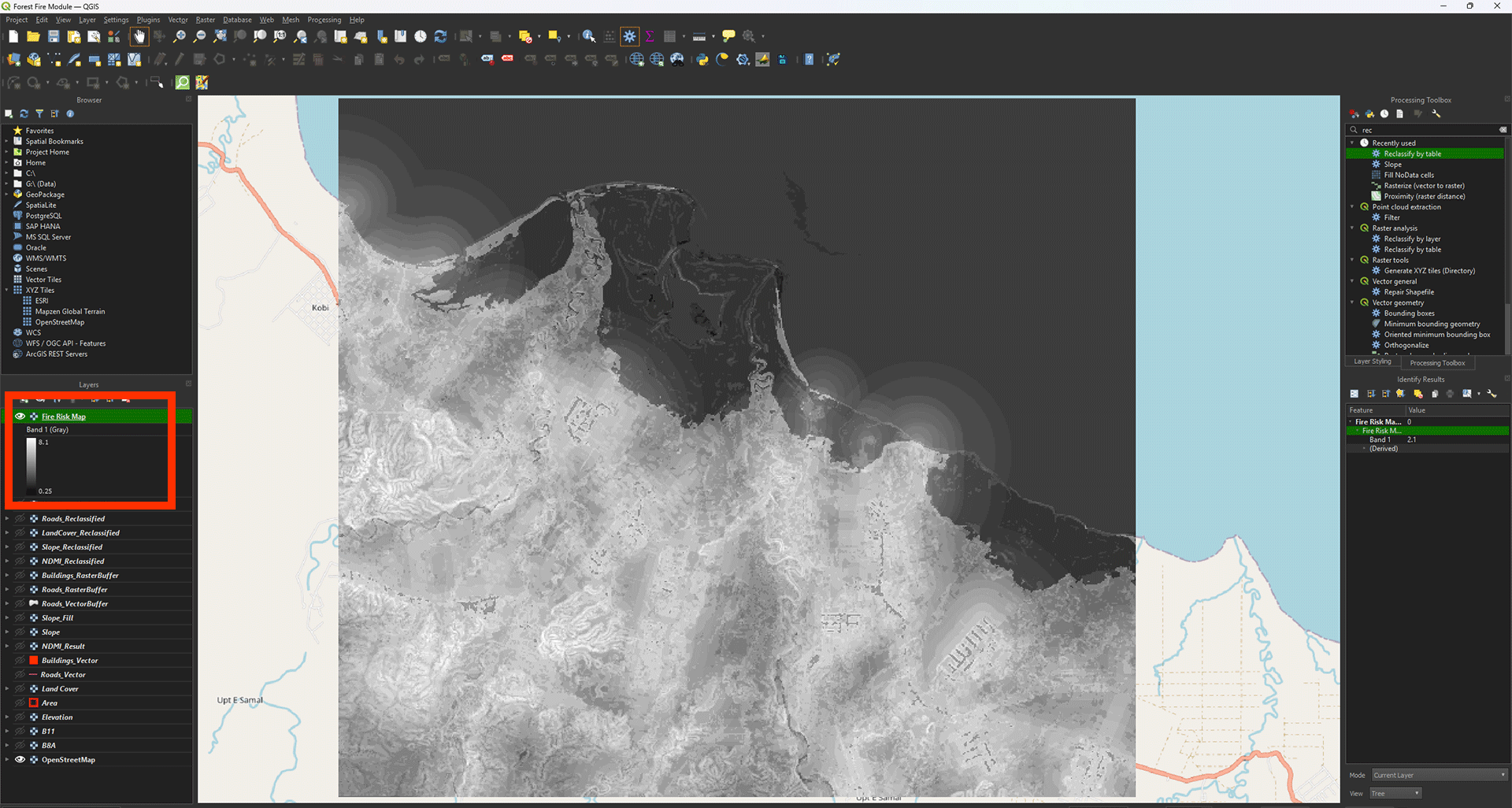
Fire Risk Map
| Sito: | OpenCourseWare for GIS |
| Corso: | Create a Fire Risk Map with QGIS and Remote Sensing |
| Libro: | Fire Risk Map |
| Stampato da: | Invitado |
| Data: | giovedì, 16 luglio 2026, 02:38 |
Descrizione
Learn how to create a Fire Risk Map using QGIS and remote rensing.
1. Introduction
Since the industrial revolution, the temperature on earth has been steadily rising. Global emission of CO2 is at the heart of this problem and are widely known as the cause of what is called the Greenhouse Effect. Higher temperatures are causing longer and more extreme periods of drought and more intense fire seasons. In the drier areas of the world, forest fires are a widely known phenomenon with yearly reoccurring events. Australia, for example, is extremely susceptible to bushfires due to its hot and dry climate. Fire thrives in these conditions because it provides dry air, hot temperatures and a great amount of fuel with low moisture content. But as global warming continues to rise, dry areas are no longer the only places affected by wildfires. Like Indonesia, which usually has a wet, tropical climate, has been experiencing long periods of droughts, resulting in an increase in extreme forest fires. Research has linked this increase to both global warming and also to more extreme El Niño events. El Niño is a weather phenomenon that happens every few years when trade winds from the east lessen and humid air (which causes rain) moves away from the Indonesian coast, causing periods of extreme drought. Recent studies have shown that global warming is causing this phenomenon to be more extreme. During the El Niño period of 2015, a thousand megatons of CO2 got released into the atmosphere as a result of Indonesian forest fires, which burned nearly 0.4 million hectares of forest down.
Both global warming and droughts caused by El Niño are not the direct cause of forest fires, they only provide ideal circumstances for fire to thrive. Forest fires usually start as a result of human activity. For example, in Indonesia it is common practice to burn down plots of forest to create more farming land. But forest fires can also start because of human errors like a campfire that grows out of control or a cigarette that’s not properly thrown away. The second and less common way that fires start is by lightning, but this rarely is the case. In this module, these factors will all be combined and taken into account to create a viable risk map. This risk map is meant to show which areas are most prone to forest fires during periods of drought. In this module you will be learning how to use QGIS to create this risk map. You will learn what steps need to be taken to find and prepare data, how to use this data to perform analyses, and how to reclassify and combine multiple maps into a complete risk map.
Watch the video below to get a full introduction of everything you need to know before starting with the module.
1.1. Project Goals
The first step to take when starting a project like this, is to research the important factors that contribute to the problem at hand. When you know what these factors are, you can start looking for data that’s available. In the case of forest fire mapping, you need to research what factors in an environment cause a fire to be more likely to occur. Research has shown that a lot of different factors can influence fire susceptibility, but for the sake of keeping the module approachable, the most important factors have been chosen. These being: the Normalised Difference Moisture Index (NDMI), Land Cover, Slope, distance to roads, and distance to buildings. Factors like weather (windspeed, temperature, rain, etc.) are also important factors, but they can be hard to implement in this map, because we will be making a map that captures a single moment, and these factors can be vastly different from time to time. In the next few paragraphs, a short explanation will be given as to why each factor was chosen for this module. You can read it if you find it of interest, but it is not essential for the module, so you can proceed to the next step if you want.
NDMI
NDMI stands for Normalised Difference Moisture Index and is used to show heat stress in vegetation. Heat stress occurs when vegetation has a low water content. This low water content can be calculated from infrared imaging taken from satellites in space. Further in the module, the process of calculating this will be shown. The reason NDMI is so important for this module is because fire needs fuel to be able to burn. Dried out vegetation provides this fuel. The Index from NDMI ranges from -1 to 1, with -1 being barren land containing next to no moisture and 1 being lively land with no heat stress. The closer the NDMI on your map is to -1, the more likely fire is to occur, meaning higher risk.
Slope
Another factor that should be taken into consideration when creating a forest fire susceptibility map, is the slope of the research area. The topography of an area can give hints as to why fire is more likely to occur in a place. Research has shown that areas with a steeper slope, fires are more likely to occur. This has to do with the area being dryer in steep slopes due to rainwater runoff. The steeper the slope, the less time the vegetation and soil have to retain the water, causing these areas to be dryer. Fire is also able to move quicker uphill due to the pre-heating of vegetation on a slope. When a slope is steeper, heat radiation from the fire gets absorbed by the vegetation and soil above the fire, and combustion will happen quicker. For both these factors, the rule is: the steeper the slope, the more susceptible the area is to fires.
Land Cover
The type of land use in an area is maybe the most important factor. It is after all, extremely difficult to start a fire in a river. The land cover map shows what type of vegetation can be found in an area, as well as how the land is used. Possible land cover types can be rivers, croplands, grasslands, forests, shrublands, etc. This matters, because not all land cover types are as susceptible to fire. For example, shrublands tend to be drier, and thus are of a higher fire risk than forests, which often contain more biodiversity with a higher ignition point. It can also be used to filter out areas which are less susceptible to fire like rivers. Research needs to be done on what types of land cover provides the most useful fuel for fires. This research can be done more effectively when you know exactly what type of vegetation grows in an area, this is however not known data for this project. This is why an approximation is made for what land cover type is most at risk, based on research and other studies regarding this topic. The result of this research shows that land cover types most at risk are shrublands, followed by tree covered areas (forests), after that, cropland, and after that, grasslands. The combination of the NDMI and land cover, gives us a good idea of what areas are most susceptible to fire.
Distance to Roads and Distance to Buildings
Lastly, 80-85% of all forest fires worldwide are the cause of human intervention. Either by accident or on purpose. In Indonesia and in a lot of other countries, it is commonplace to set plots of land on fire to create more farmland. This is done because it’s an easy, cheap solution to accommodate the increasing demand for products like palm oil. Fires can also be started on accident because of human errors, like campfires, thrown out cigarettes, or car accidents. This is why it is important to take human settlements into account when creating a forest fire susceptibility map. The closer an area is to human activities like roads, cities or farmlands, the more at risk the area is for fires to occur.
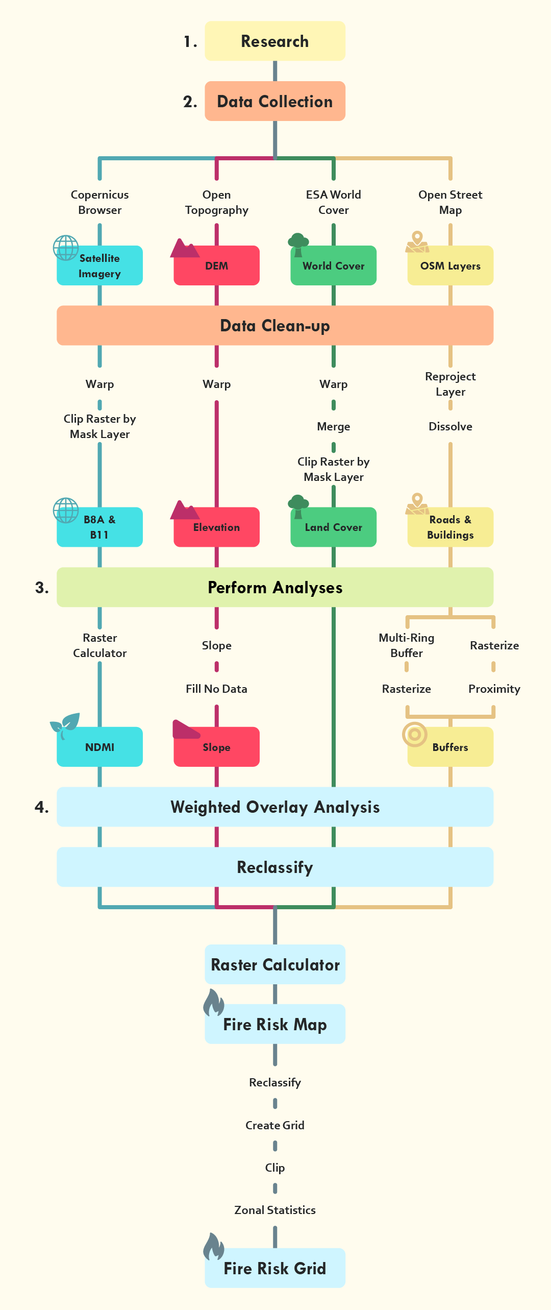
Flowchart
Below you see the flowchart of the analysis you will perform during this module. It lays out every step with all the tools and data that will be used. You don't need to remember the steps, as the module explains everything you need to know, but it can be helpful for the future if you need a quick reference.
1.2. Learning Goals
During this module the main goal is to teach participants about climate issues while also learning how to use QGIS for visualising these climate issues. The main focus will be forest fires as a climate issue. At the end of this module, you will have learnt enough about QGIS and forest fires that you will be able to complete the following learning goals associated with each chapter:
Chapter 2:
At the end of chapter 2, the trainee is able collect data from different sources, identify their quality and convert it to a unified standard and can be used for further analyses in QGIS.
Chapter 3:
At the end of chapter 3, the trainee is able to use the data from chapter 2 to perform three different analyses in QGIS on a selected area (calculate the NDMI, use the Slope tool, and create a Buffer), as well as to visualise the outcome using the symbology panel in QGIS.
Chapter 4:
At the end of chapter 4, the trainee can identify for each map what conditions provide ideal circumstances for fires to occur and classify them into risk zones to be used in a Weighted Overlay Analysis.
- The trainee can use the results of the Fire Risk Map and create different types of maps, like a vector grid map.
1.3. Download Instructions
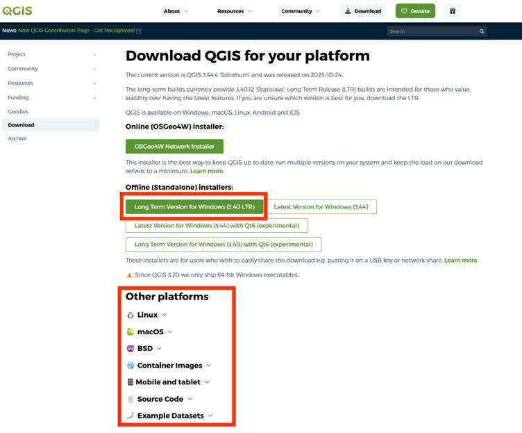
If you haven’t downloaded QGIS yet, you can download the latest version here.
You only need the Offline (Standalone) installer. There are a few options. The most common choice is the Long Term Version for Windows (in this case the 3.40 LTR version), which is the most stable version. If you are on a different system other than Windows, you can also download the version for Linux and MacOS if you scroll down.
Note: This module is written for Windows devices. If you use another operating system (OS), there could always be a chance that you run into some issues that the module won't go over.
1.4. Change Language
This course is provided in English. When you installed QGIS, your version may be set in a different language. To follow the module, it is recommended to set the language on English.
1. Go to the top bar and click on Settings > Options.
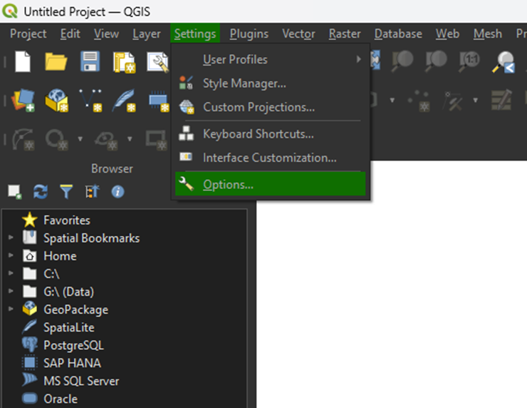
2. Click on the General tab.
3. Under User interface translation, select American English from the dropdown menu.
4. Click OK to apply the changes.
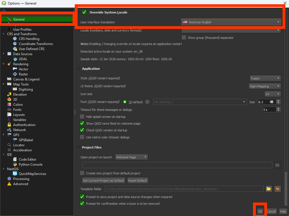
You'll have to restart QGIS to fully apply the new language.
1.5. Plug-Ins
A plugin is an add-on for a programme, such as QGIS, that enables you to access extra functions that are not available by default.
Read more about plugins in QGIS here.
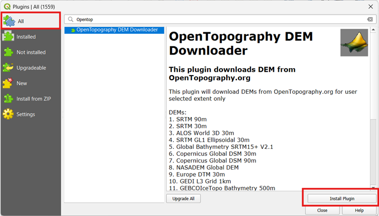
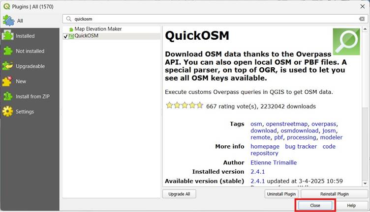
1. In QGIS, go to Plugins > Manage and Install Plugins.
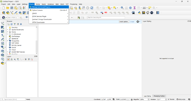
2. Select the All tab and use the search bar to find and install the following plugins:
OpenTopography DEM Downloader:
Quick OSM:
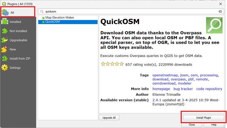
3. Once you see that the plugins are installed, click on Close.
You have now installed the plug-ins. Go to the next step to get the necessary data.
1.6. Data
Before we start with the module, we need to download data. This module provides all the necessary data to complete the steps. Data is an important part of GIS analyses, but it can be a pretty long and difficult process. This is why some of the data is already provided for you. You can download them via these links:
Make sure to unzip the data and save it on an easy to find location!
If you wish to learn how to download the data yourself, you can go to 6. Download Your Own Data and learn how to do it. If you are new to GIS, it’s recommended to use the download links provided by the module.
If you are having trouble to download any of the other data during the module, you can download all the data via this link as well. Once downloaded, unzip the folder and save it on an easy to find location on your device.
You are now ready to start creating the Fire Risk Map in QGIS. Go to chapter 2. Data and Preparation and follow the steps provided.
2. Data and Preparation
When starting a GIS analysis, you will always need to collect data first. Depending on the type of analysis, you’ll use different types of data. For our Fire Susceptibility map, we need a few different things:
- Satellite imagery. This is used for the NDMI analysis.
- Digital Elevation Model (DEM). This shows the elevation of the Earth’s surface and is used to calculate the slopes.
- Land cover. This shows the different types of land cover that we will encounter in the study area.
- Buildings and Roads. This uses vector data to show where buildings and roads are located. It will be used to calculate the distance to the built-up areas.
We will use this data to perform different types of analyses. At the end we can combine all the results and create the final Fire Risk Map using a Weighted Overlay Analysis.
In this chapter, you will learn how to set up a project in QGIS and how you to prepare data so that it can be used in further analyses.
2.1. New Project and Coordinate System
Before we start on the data, we need to set up our QGIS project and add the correct coordinate system. A coordinate system is a framework that uses numbers (coordinates) to define the position of features on the Earth, and it is essential for accurately mapping, analysing, and combining spatial data. There are many different coordinate systems, each designed for specific regions or purposes, to ensure accurate representation of spatial data. Learn more about a coordinate system here. When starting a new project in QGIS, these steps are always important to follow before you do anything else.
In this module, we will use the coordinate system EPSG:32752 – WGS 84/UTM Zone 52S . This is the most suitable for the area in which we will do our analysis. This coordinate system belongs to the UTM (Universal Transverse Mercator) system, which divides the Earth into zones. Zone 52S covers part of the southern hemisphere, including Seram Island in Indonesia, which will be our study area.
It is important to use the same coordinate system for each map layer so that they fit together properly. Using different coordinate systems for different layers can result in errors in location or distance measurements, which affects the reliability of the analysis.
Start a New Project and Set the Coordinate System
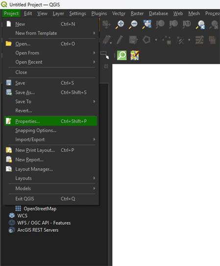
1. In QGIS, go to Project > New to create a new empty project.
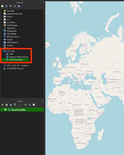
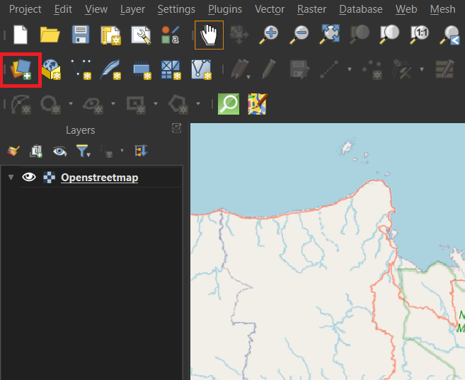
When starting a project, it’s helpful to add a basemap. This provides visual context and makes it easier to locate and understand the area you are working with. OpenStreetMap is already provided in QGIS, so it’s an easy way to add our basemap.
2. Scroll in the Browser to XYZ Tiles and double-click on the OpenStreetMap layer or drag it in.
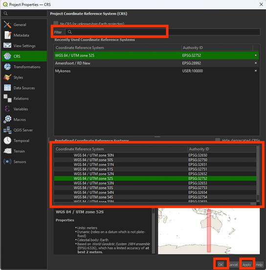
3. Then go to Project > Properties, and go to the CRS (Coordinate Reference System) tab.
4. Search for EPSG:32752 – WGS 84 / UTM zone 52S.
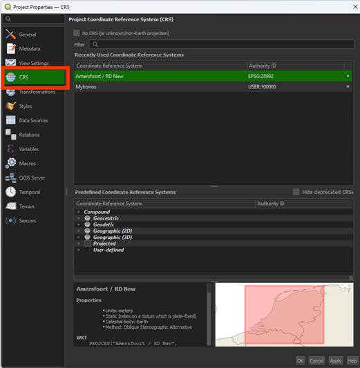
5. Select it and click Apply and then OK.
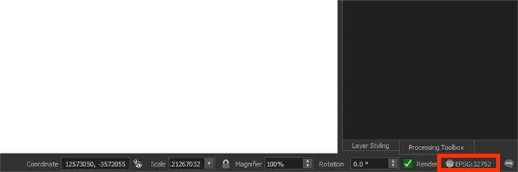
You will now see the coordinate system updated in the bottom-right corner of the QGIS window.
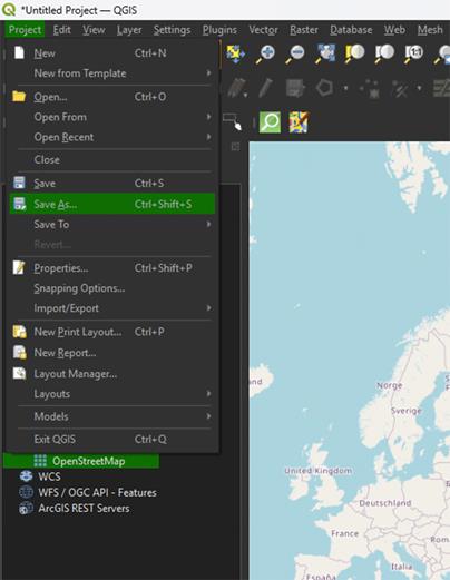
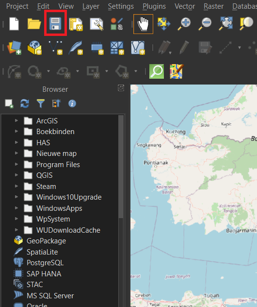
6. Click on Project and Save as. Find the correct location and give the file a proper name.
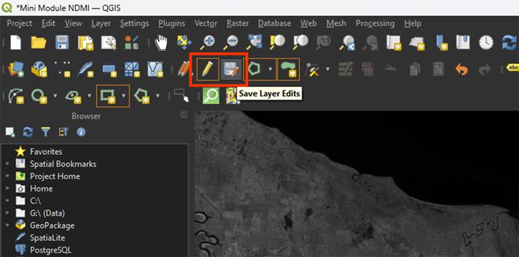
Make sure you save your project often, to prevent losing your progress. You can press the save icon on the top left or press ctrl + s.
2.2. Satellite Imagery
A major part of remote sensing is the use of satellite imagery. Throughout the year, satellites orbit the Earth and make images of the surface. These images can be used for all kinds of applications, including the monitoring of vegetation. As we want to make a Fire Risk map, it’s vegetation we are most interested in.
During this module, we will be using imagery from Sentinel-2, which is used by the European Space Agency (ESA). For this, we will make use of the Copernicus Browser. There are multiple satellites using different types of sensors, but we want to use Sentinel-2, as it has the sensors we need for our analysis. There are a lot of different types of analyses you can perform on vegetation, but we will get into the specifics in chapter 3. Perform Analyses.
Currently there are two Sentinel-2 satellites orbiting Earth, Sentinel-2B and Sentinel-2C. The satellites contain 13 spectral bands, named B01 to B12. B08 has two versions depending on which resolution you use. It uses a Multi-Spectral Instrument (MSI) which go from the visual spectrum all the way to infra-red, while being in a resolution of 10 to 60 meters. As our main goal is to do a Normalized Difference Moisture Index (NDMI) analysis, we are going to use a mix of B8A (B08 is only available for the 10 meter resolution) and B11. It’s going to be a bit confusing with all the different band types, and other satellites, like Landsat 8, use different names. SentinelHub is useful for referencing which bands you need to use for the analysis you want to perform, providing band names for both Sentinel and Landsat.
In the case of an NDMI analysis we use:
- B08: Near infrared (NIR).
- B11: Short wave infrared (SWIR).
If you haven't downloaded the data yet, you can download the Satellite Imagery here.
Importing Data
QGIS provides a few different ways to import your data. The easiest way and the only way you really need for this module is to drag it in from your file explorer.
1. Open your data folder on your device. If you used the link to download the data, it will only contain 2 files.
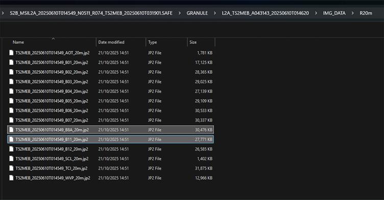
2. Add the T52MEB_20250610T014549_B8A_20m.jp2 and T52MEB_20250610T014549_B11_20m.jp2 files into your map by selecting them in your folder and dragging them to QGIS and onto your map.
You should now see the T52MEB_20250610T014549_B8A_20m.jp2 and T52MEB_20250610T014549_B11_20m.jp2 layers in the Layers panel.
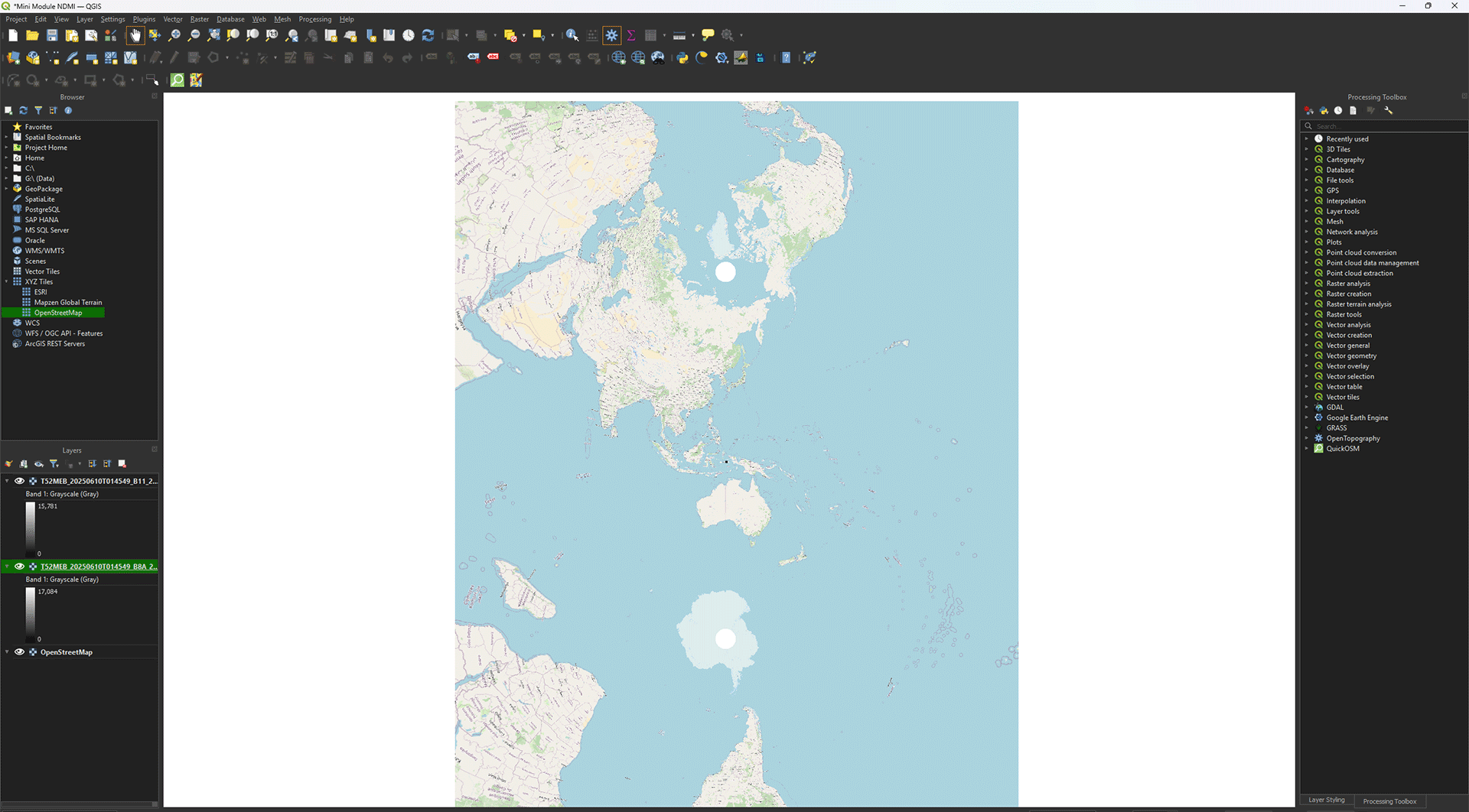
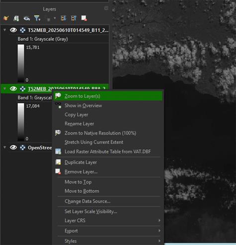
3. If the map stays zoomed out, you can right click on the layer and press Zoom to Layer(s).
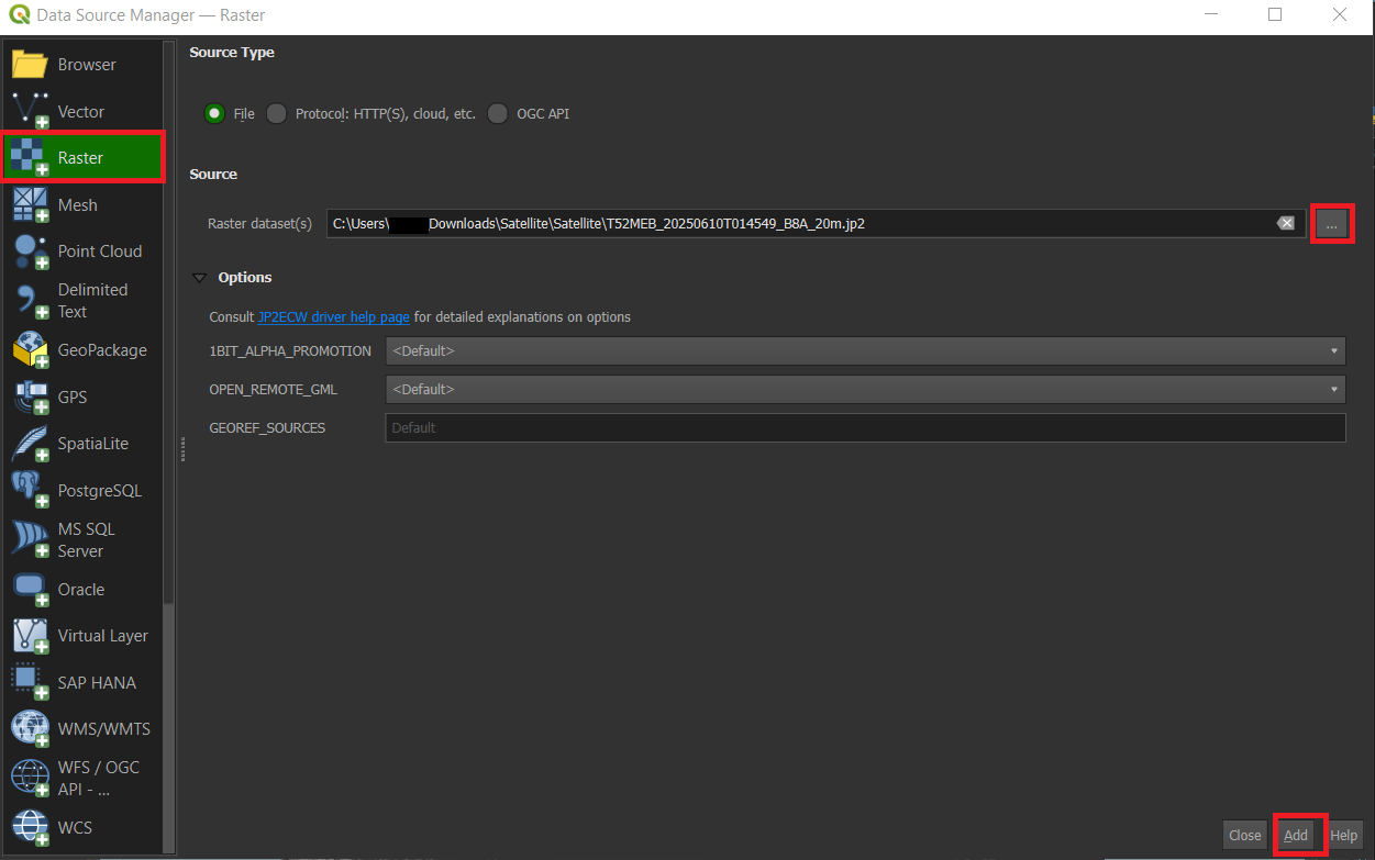
Another way to import data is via the Data Source Manager in QGIS. This can be helpful if you have very specific data types that need the certain settings to import correctly, like CSV (usually used in Excel) data. You can choose for yourself which way you prefer, for this module we won't need to import settings, so it does not matter how you import the data.
After clicking on Data Source Manager you will get a pop-up screen, here you can select what kind of data you want to import on the left. In the case of the satellite bands, we want to import Raster data. You can click the three dots on the right of the Raster dataset(s) to import the data you want from your computer. After selecting the file you want it will show up in the Raster dataset(s) box. Click Add to load the data from the file into your map.
Or you can find your data via the Browser panel as well. In the browser panel you will see your own files, you can search within these files for the place where you saved the data you want and drag it onto the map.
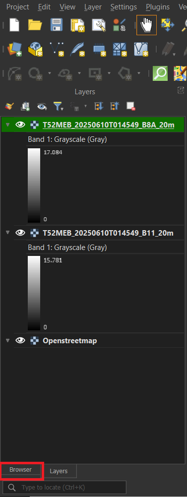
Another important thing about working with QGIS, is that it will often save newly created layers as Temporary Layers. The ones we just imported are Permanent Layers, as they are saved on your device, while Temporary Layers are only, as the name suggests, temporary. You can recognize them by this symbol.
This means that the file will be deleted when you close QGIS, even if you saved the Project. You can right-click on the Temporary Layer > Export > Save as. Save it on an easy to find location. Once done, you can delete the Temporary Layer from the Layers panel.
Reprojecting
When importing data into QGIS, it will often times place the data on the wrong CRS. In chapter 2.1, we set the CRS of the project to EPSG: 32752. All data that gets imported into QGIS for this project needs to be placed in the same CRS, otherwise your map can be slightly blurry and distorted. Like your map is now if you look very closely. This is because the layers we just imported are projected on WGS84 CRS instead of the projects CRS. To fix that we are going to reproject the layers first, because otherwise the resampling we need to do later will fail and break our data.
If you have any trouble during these steps, there is a guide video at the end of step 7.
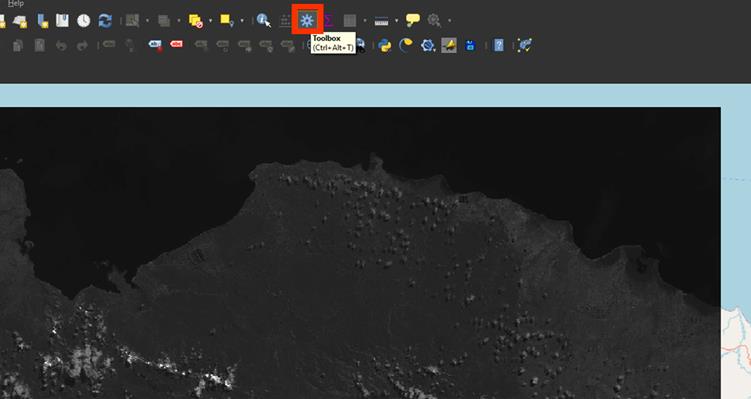
1. If you don’t have the Processing Toolbox open already, go to the cogwheel symbol on the top of the screen.
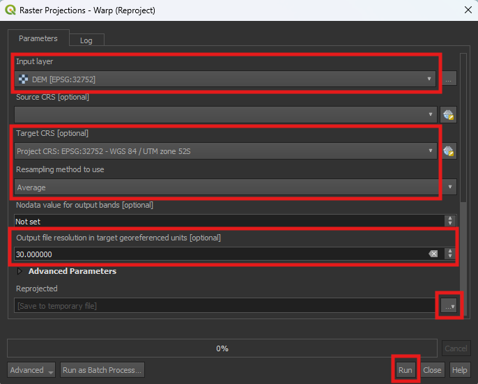
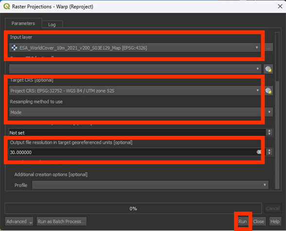
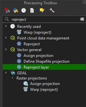
2. Go to the Processing Toolbox and search for Warp (reproject) under GDAL > Raster projections. Double click to open the tool.
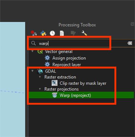
Note: The standard Reproject tool is meant for vector layers. We are reprojecting a raster layer, so we need to use Warp instead.
A new window will open. Here we can change the settings and reproject our layers.
3. On Input layer, select the T52MEB_20250610T014549_B8A_20m.jp2 layer.
4. Set the Target CRS on EPSG: 32752.
5. Set Resampling method to use on Average This will take the average values and create new pixels based on them.
As we are using multiple data sources, we need to make sure that all the rasters are the same resolution. A good rule to follow is that you always resample all the data to the data with the lowest resolution. It’s easy to remove data, but difficult to create data from a low-resolution source. We will use a Digital Elevation Model, which only goes to a resolution of 30 meters. Our satellite imagery is 20 meters. This means we are going to resample it to 30 meters.
6. Under Output file resolution in target georeferenced units, set the value on 30. This will convert our 20 meter resolution to 30 meters.
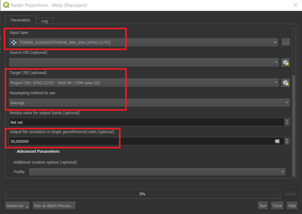
7. Scroll down to the bottom of the pop-up to find the saving button. Under Reprojected, press the arrow button and save the file in an easy to find location. Name the file B8A_Reprojected, then click Run.
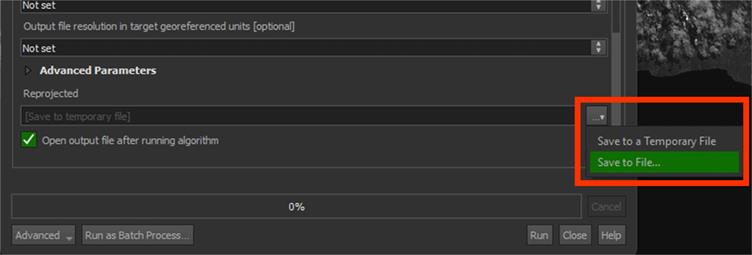
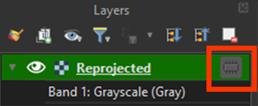
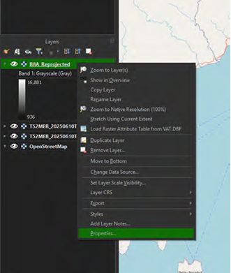
The layer is now correctly reprojected. You can check if the CRS is correct by right clicking the B8A_Reprojected layer > Properties > Source. It should say EPSG: 32752. Under information, you can see the resolution. It should say 30.
Note: If you can't see the layer, try rearranging your layers in the Layers Panel. You can do this by dragging the layers above or below each other or you can deselect the Eye next to the layer’s name to make it invisible.

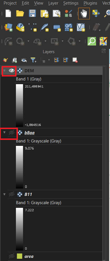
![]()
You can watch these steps in this video if you are having trouble.
8. Follow the same steps to reproject the T52MEB_20250610T014549_B11_20m.jp2 layer, starting from step 2, by using the Warp tool. Save the file the same way and name it B11_Reprojected.
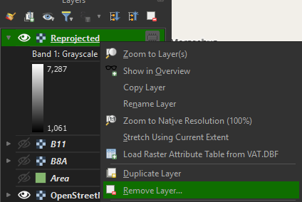
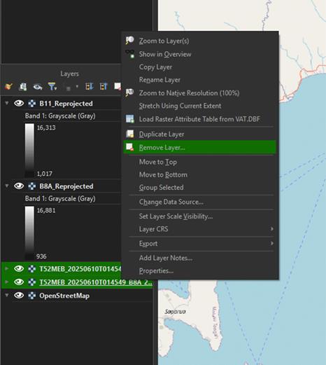
You can delete the imported layers, as we don’t need them anymore. Right click on the layers and press Remove Layer.
Clip Study Area
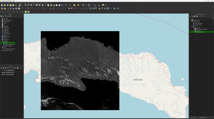
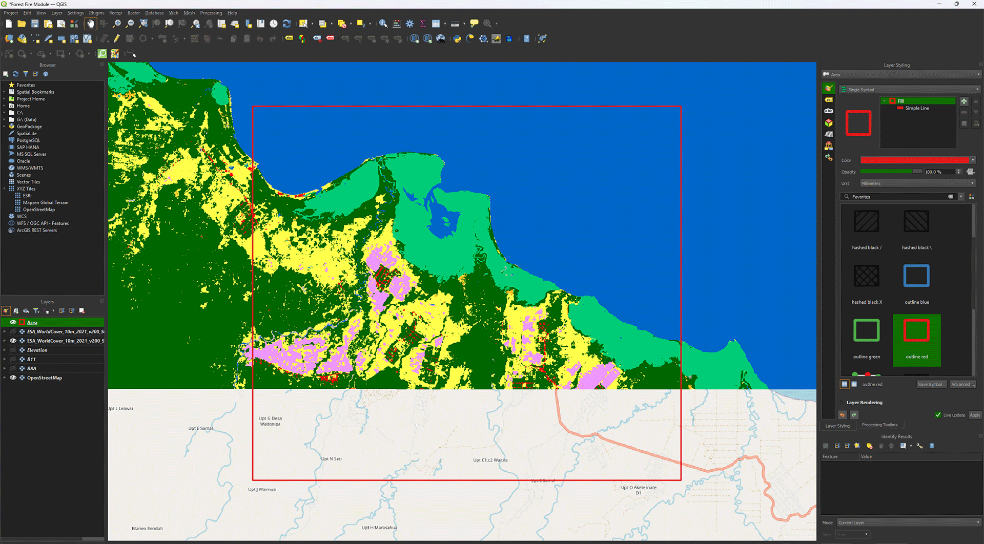
As we want to analyse a small area, we need to make our data a lot smaller as well. If we use the entire image to do our analyses, we will dedicate a lot of time and compute power to something that we don’t need. For most projects, we make use of an area of interest. This is usually done with a polygon layer. You can get them from a variety of sources, like a country’s borders, but for this module we will create our own.
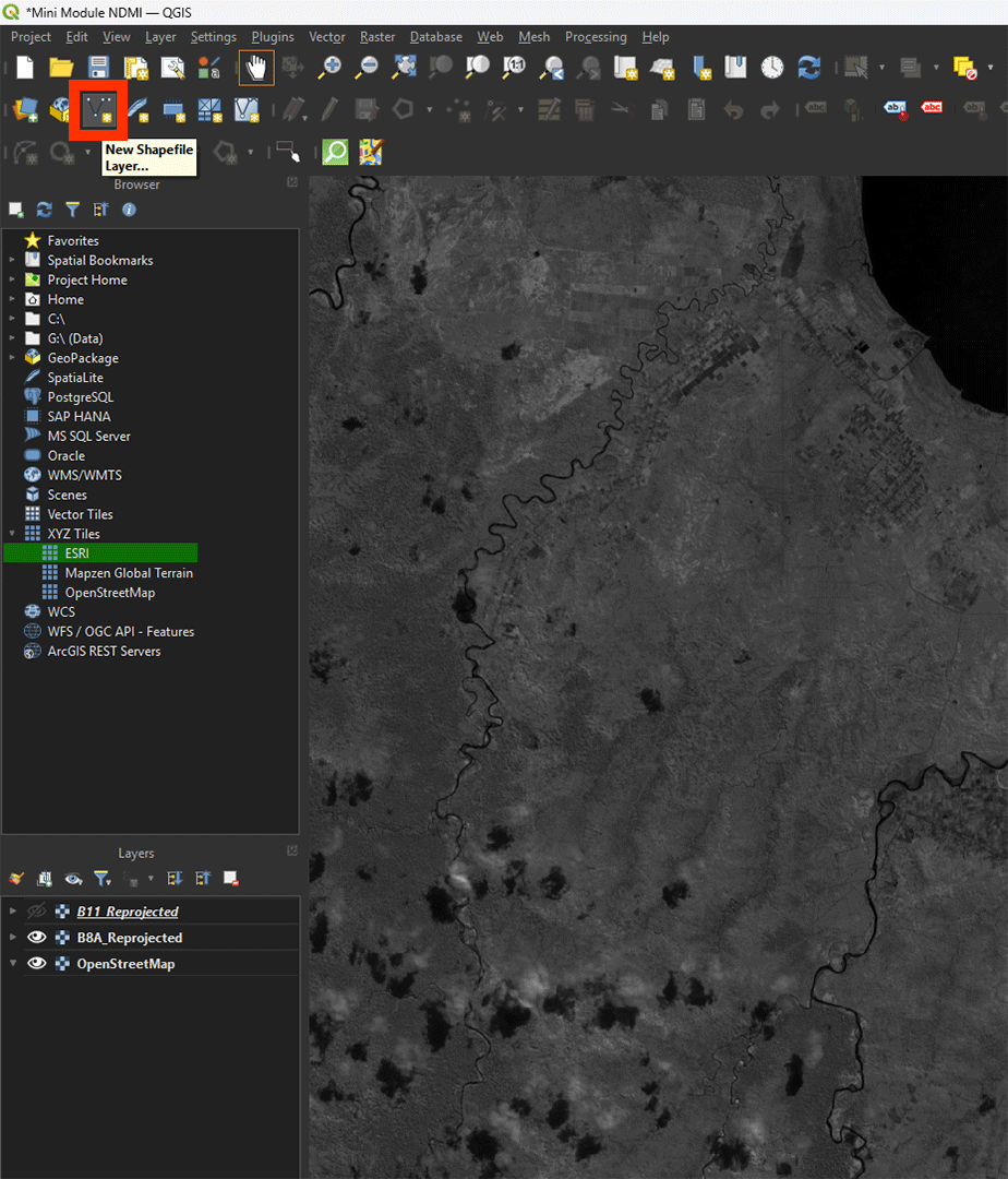
This area is what we are going to use. Make sure the B8A_Reprojected layer is visible.
1. Click the New Shapefile Layer to create a new polygon.
Any polygon, line, or point will need to be saved into a Shapefile. Shapefiles are made of vectors, meaning they are infinitely sharp, as they don’t use pixels like a raster does. A lot of data uses Shapefiles, so you’ll come across them quite often. We will delve deeper into vector layers later.
2. Name the file Area and press the ‘…’ button to save the layer on an easy to find location.
3. Select Polygon under Geometry type.
4. Make sure that the CRS is set to EPSG: 32752.
5. Click on OK.
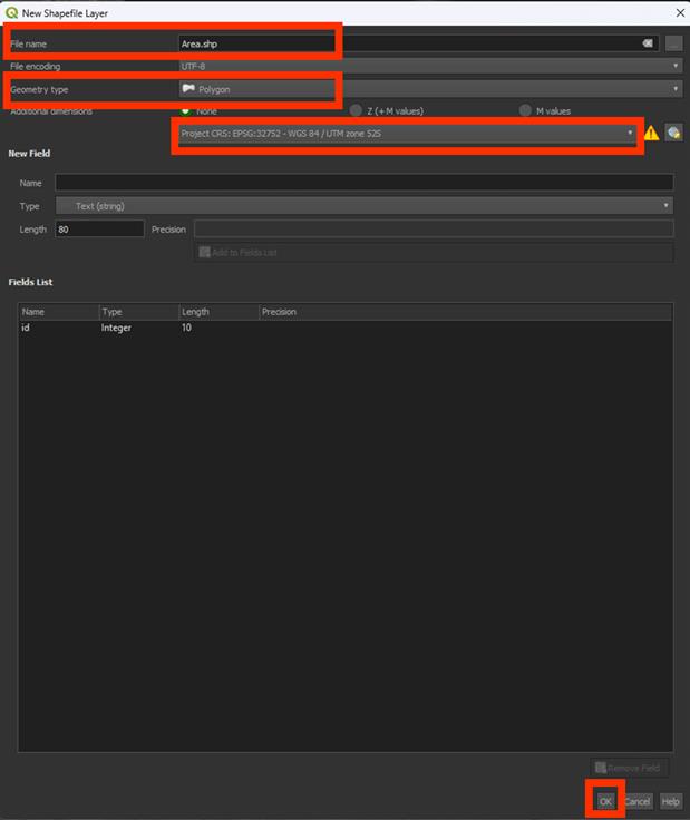
Now, we will see a new layer in our Layer panel, but nothing on our map. We will need to create our polygon.
6. Click on Toggle editing and make sure the Add polygon and Rectangle from the extend buttons are selected.
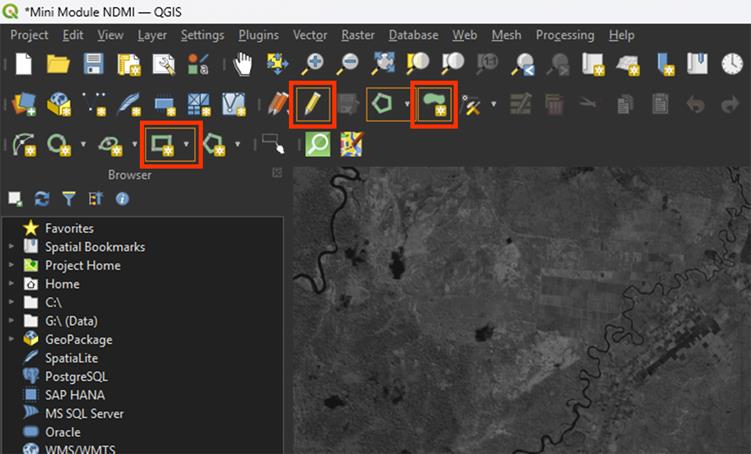
Note: If the options don’t show up, you can add them by right clicking on the toolbar and selecting Shape Digitizing Toolbar.
7. Click and create a rectangle around the area of interest. Right click to draw the polygon. The shape doesn’t have to be the exact same as the example.

You’ll get a pop-up to give the polygon a value. You can keep it on NULL, as the data in the polygon is not important for our needs, but you can also fill it in with a number, like 1.
Once the polygon is created, you’ll see it appear on the map. If you want to redo the polygon, you can press ctrl + z and draw the polygon again.

8. Press the Save icon. Make sure you always do this when working on polygons. You can easily lose the data if you forget. Once you’re happy with the polygon, press the Toggle editing button to stop editing the Shapefile.
Now that we have a study area, we can start clipping the rasters and make them all the same size.
You can watch these steps in this video if you are having trouble.
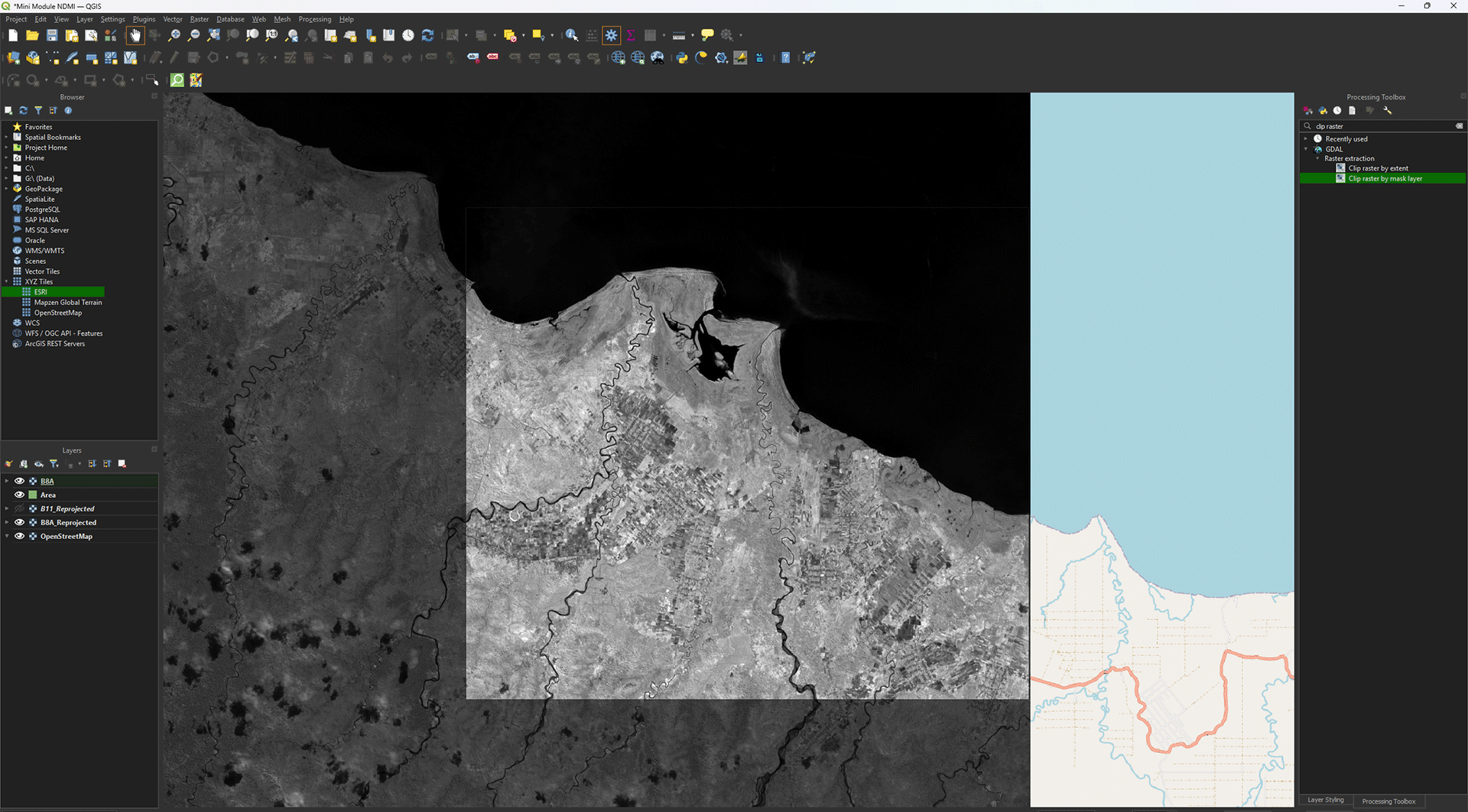
9. Go back to the Processing Toolbox. Search for Clip raster by mask layer under GDAL > Raster extraction. Double click to open.
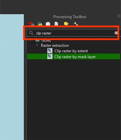
Note: The standard Clip tool is only meant for clipping shapefiles. We need the Raster extraction tools to clip rasters specifically.
11. In the window, set the Input layer to the B8A_Reprojected image.
12. Set Mask layer to Area. This will clip the raster into the polygon we just made.
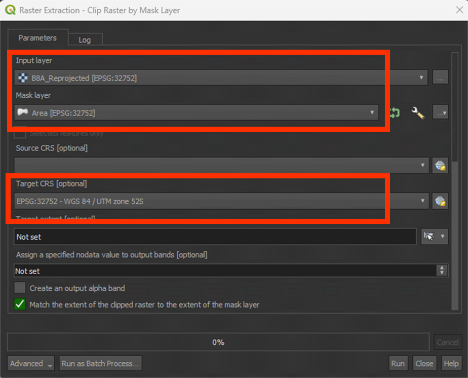
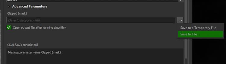
13. Sroll down and go to Clipped (mask) and press the arrow button > Save to file > name it B8A. Save it to an easy to find location. Then, Run the tool.
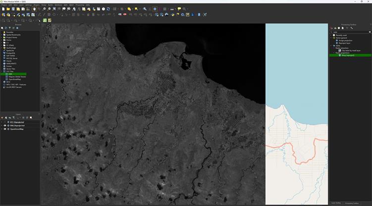
The image should now only show the study area.
We don’t need the B8A_Reprojected image anymore, so we can delete it from our project.
14. Right click the layer we used to clip > Remove layer.
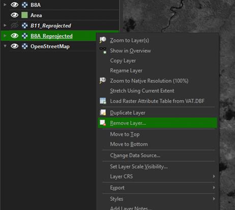
Note: As we saved the layer earlier, you can always add it back into QGIS by dragging it from your folder.
Repeat these steps, starting on step 9, to clip the B11_reprojected image you created as well. Once clipped, save the layer as B11 and delete the B11_reprojected layer.
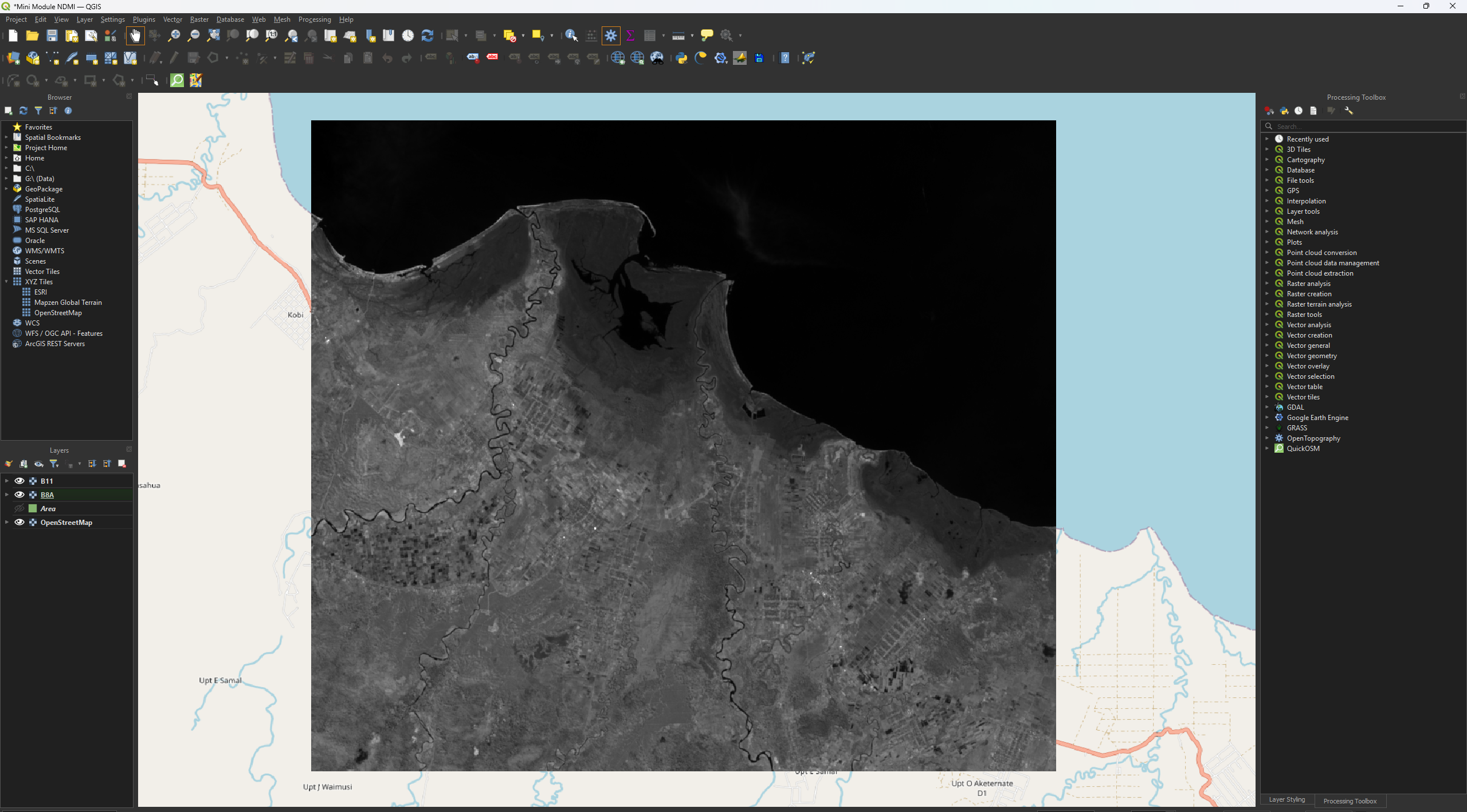
You have now reprojected and clipped the B8A and B11 layers. Before we continue, save your project by pressing the save icon or pressing ctrl + s.
2.3. Digital Elevation Model
For our Fire Risk map, we want to know the slopes of the study area. Steeper slopes make it easier for fire to spread. Now, we will load and prepare the elevation layer, which will be used later for the Slope analysis. For elevation we use a Digital Elevation Model, or DEM for short.
A DEM is a digital representation of the Earth's surface, showing the elevation of the terrain at each point. It is a raster file, with each pixel containing an elevation value in metres above sea level. DEMs are created with the use of remote sensing techniques such as photogrammetry, which uses overlaid aerial or satellite photographs, or LiDAR (Light Detection and Ranging), which uses laser scanners to obtain accurate elevation information.
While we can create our own DEM if we really want to by using LiDAR data, there are plenty of available DEMs for us to use. The elevation doesn’t change much for a long period of time, so we can keep using the same DEM for a while. In this case, we will use OpenTopography. This is an online platform that provides free access to high-quality topographic data, including Digital Elevation Models, as well as related analysis tools. The platform is intended for use by researchers, students, government bodies and others working with Earth surface data.
OpenTopography API Key
In chapter 1.5 Plug-Ins you already have downloaded the plugin OpenTopography DEM Downloader.
To use this plugin, you will need an API key. This unique code identifies you and gives you access to an external service or data via an API (Application Programming Interface). You can get this key for free by creating an account on Opentopography.org. The following steps will take you through the process of creating an account and getting the API key.
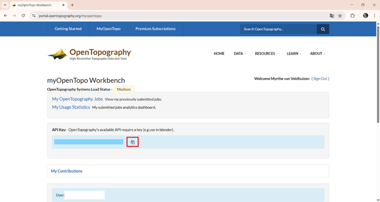
Create an OpenTopography Account and Get an API Key
1. Open the following link in your browser:
https://opentopography.org/blog/introducing-api-keys-access-opentopography-global-datasets
2. At the top left of the OpenTopography website, click My OpenTopo and create a new account.
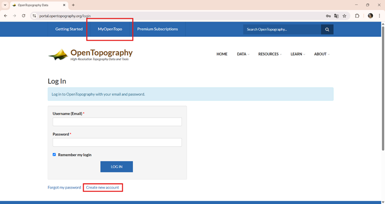
3. Once your account is created, log in and copy your personal API key.
Note: An API key acts like a password, so make sure you never share it with anyone.
We will use the 30-meter resolution Copernicus Global Digital Elevation Model, as it offers a good balance between detail and data size. This resolution is the most detailed freely available global elevation dataset from Copernicus, making it well-suited for regional-scale analysis. As you might have noticed, we already used Copernicus for our satellite imagery. You can download the DEM data from the Copernicus Browser too, but this is a lot easier.
Additionally, this is the lowest resolution data that we will use. When we are going to analyse and combine the layers together, it’s necessary that all the layers are the same resolution and size. As this is the lowest resolution, we can use this as our base and resample all higher resolution data to 30 meters.
Download the Elevation Map
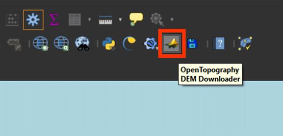
Back in QGIS, we can start downloading the DEM via the OpenTopography plug-in.
1. Click on the OpenTopography icon in the QGIS toolbar. You can find this in the top-right corner of your screen.
2. In the OpenTopography plug-in window, go to Select DEM to download, choose Copernicus Global 30m.
3. For Define extent to download, click the arrow > Calculate from layer. You can select the Area polygon we used to clip the satellite imagery earlier.
4. Paste your API key in the field Enter your API key.
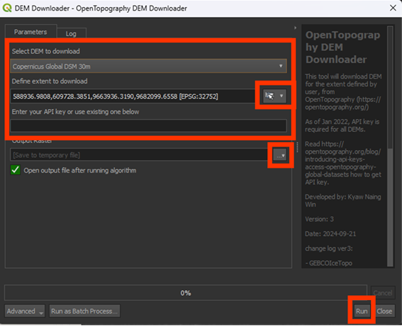
5. Under Output Raster, press the arrow button > Save to File… Here, save the raster and name it DEM. This will save it as a Permanent layer.
6. Click Run to start the download.

After closing window, the map should’ve appeared in the study area we created.
Reprojecting
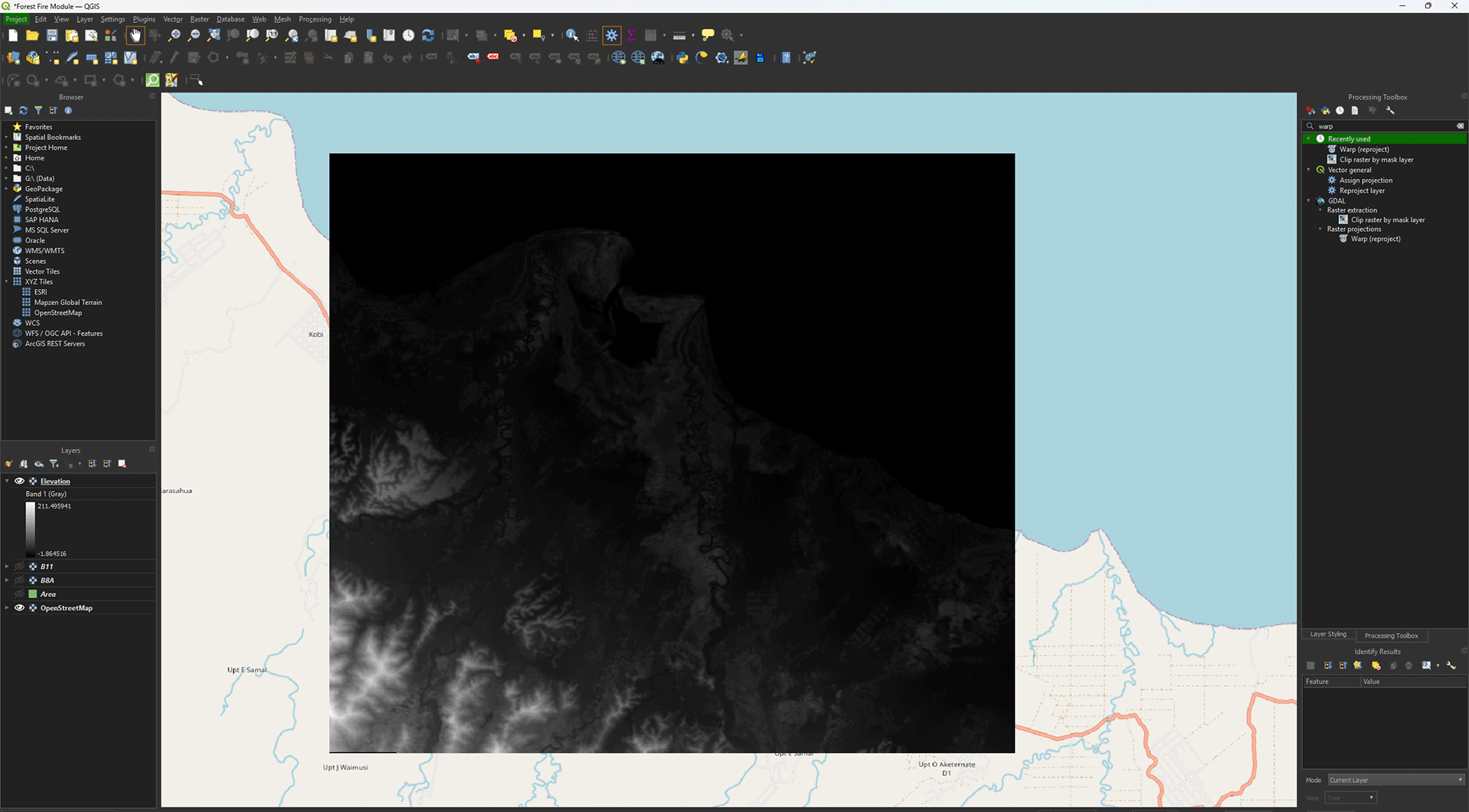
Much like the satellite layers, we need to Reproject the Digital Elevation Model as well. Make sure you have the DEM layer imported into QGIS. Turn off the other layers by pressing the Eye symbols.
1. Open the Warp (reproject) tool.
2. Use the DEM layer as in the Input layer.
3. Set the Target CRS on EPSG: 32752.
4. Set Resampling method to use on Average.
5. Set the Output file resolution in target georeferenced units on 30. Even though the layer already is in 30m by 30m, it’s not as precise as we want, which will lead to issues later on.
6. You can save the Permanent layer as Elevation.
7. Once finished, check if the projection is correctly set on EPSG: 32752.
8. If everything is correct, delete the DEM layer. We don’t need it anymore.
You have reprojected the Elevation layer. Don’t forget to save your project.
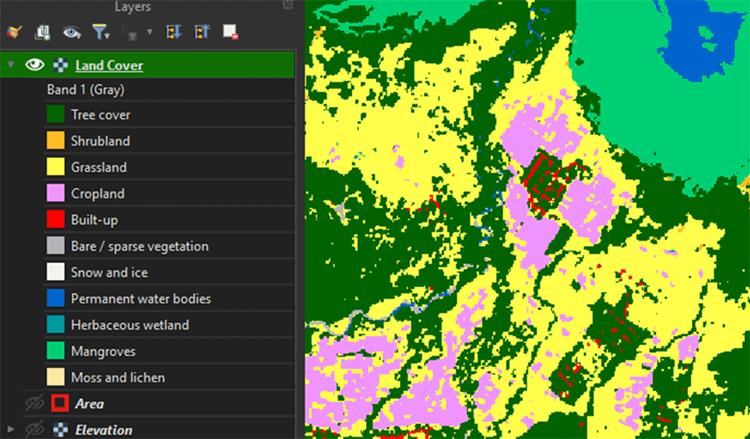
2.4. Land Cover
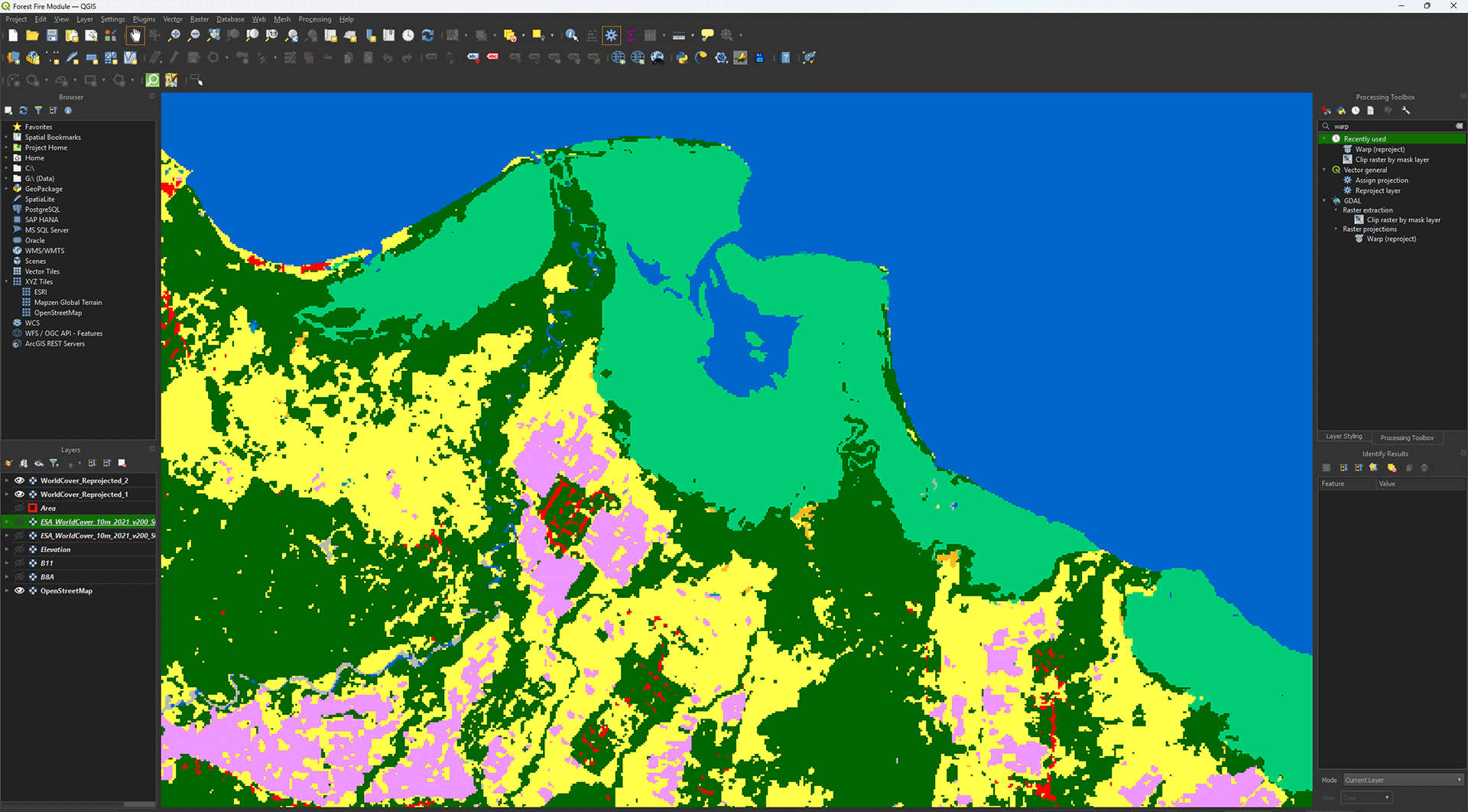
The WorldCover map from the ESA shows all the land cover types that you can encounter in the world. Think of forests, agriculture, cities, oceans, etc. This gives you a quick overview of what the landscape looks like, which can sometimes be a bit difficult if you’re using satellite imagery. The WorldCover map is in a 10m resolution and created from Sentinel-1 and Sentinel-2 data. While very useful, it’s good to remember that the map may not always be fully accurate. Of course, you can create your own land cover map using satellite imagery and machine learning, but this is quite a tricky job, which we won’t do during this module.
If you haven't dowloaded the data yet, you can download the Land Cover data here.
Reprojecting
Much like the previous layers, we need to Reproject these layers as well. Make sure you have both the ESA_WorldCover_10m_2021_v200_S03E129_Map.tif and ESA_WorldCover_10m_2021_v200_S06E129_Map.tif layers.
Note: the only difference in layer names is the S03E129 and S06E129 parts.
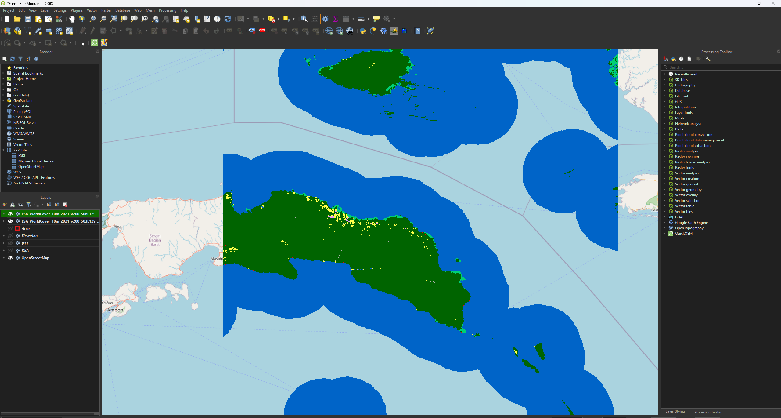
1. Open the Warp (reproject) tool.
2. Use the ESA_WorldCover_10m_2021_v200_S03E129_Map.tif layer as the Input.
3. Set the Target CRS on EPSG: 32752.
4. Set Resampling method to use on Mode.
For this Resample, we use Mode, as it works the best for categorical data, like our World Cover map. We don’t want to get an average of the values here as we did with the satellite imagery.
5. You can save the Permanent layers as WorldCover_Reprojected_1.
6. Once finished, check if the projection is correctly set on EPSG: 32752 and 30 by 30 pixels.
7. Repeat the same steps to Reproject the other WorldCover layer (ESA_WorldCover_10m_2021_v200_S06E129_Map.tif). Save it as WorldCover_Reprojected_2.
Merging Data
As you will often see, the data is split up exactly at the location we want to use, forcing us to download two layers of data. Luckily, we can combine the data to make one layer instead, which will make our work a lot easier later on.
1. Go to the Processing Toolbox. Search for Merge under GDAL > Raster miscellaneous. Double click to open the tool.
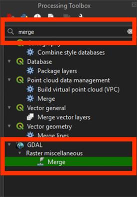
2. By Input layers, press the ‘…’ button.
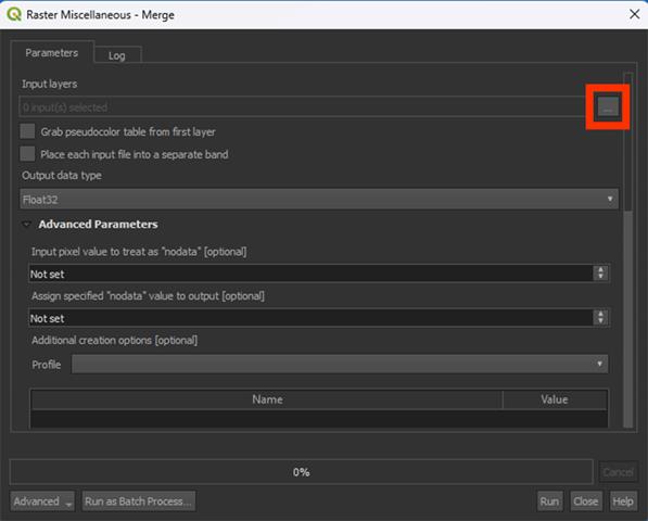
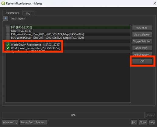
3. Select the WorldCover_Reprojected_1 and layers WorldCover_Reprojected_2 layers that we want to combine, then press OK
4. Run the tool. We don’t need to save a Permanent layer.
Note: This may take a while if they layers are large. You may want to clip the layers first if your hardware is having trouble.
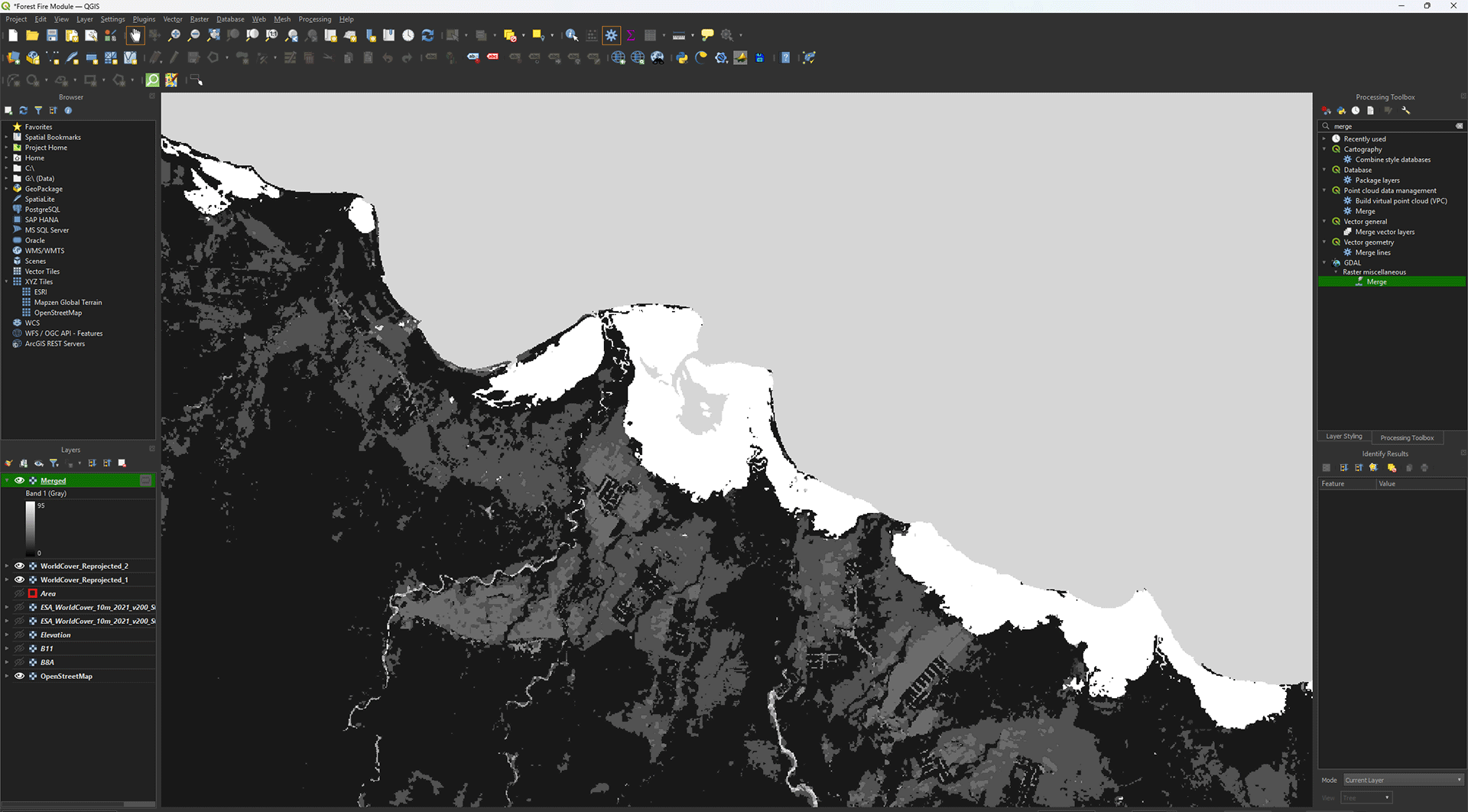
Suddenly the layer is in greyscale. Before we change the symbology, however, we will clip the area into our study area if you haven’t done that yet.
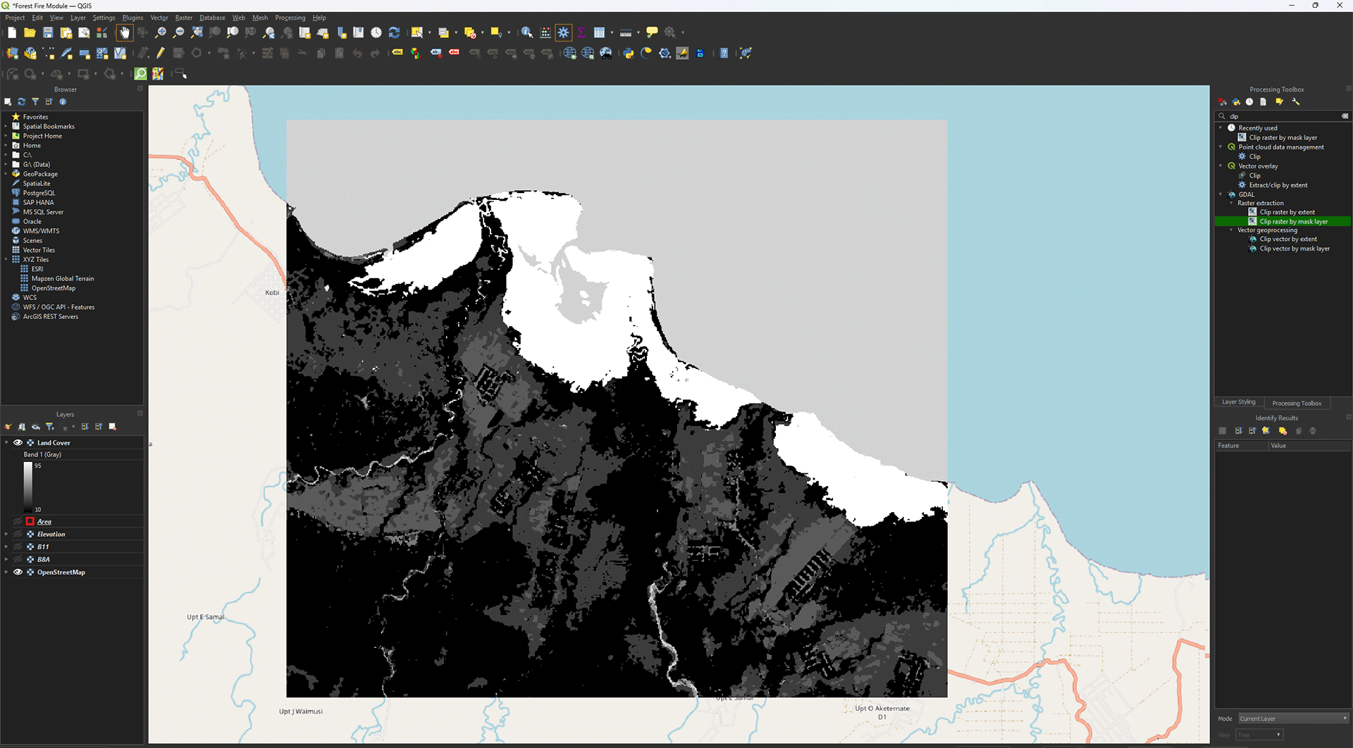
4. Clip the area using the same process as before, with the Clip raster by mask layer tool. Save the Permanent layer as LandCover, then delete the Merged layer, reprojected layers, and original WorldCover layers we imported.
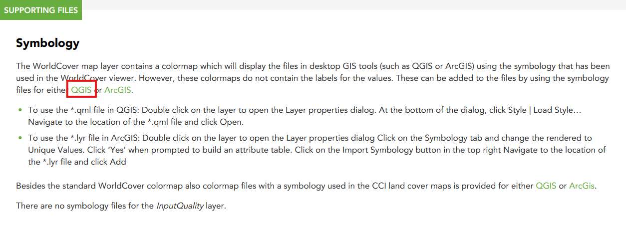
Symbology
You might have noticed earlier that the symbology of the layers was complete nonsense when we first imported the data. We need to add a QML-file to get the correct symbology to show up. If you downloaded the data via the link in the module, the QML-file should be in your Land Cover folder.
1. Right click on the Land Cover layer > Properties > Symbology.
2. Go to the Style button and select Load Style.
3. In the new window, click on the ‘…’ button and load the QML-file you just downloaded. Once loaded, click on Load Style.
The Merged layer should now update with the correct symbology
4. Click Apply and then OK on the Properties window.
Now that we have the imported the WorldCover data, we can see what the land cover types are in the study area. It’s quite varied, which will lead us to interesting results once we start analysing.
You have reprojected, merged, and visualised the Land Cover layer. Don’t forget to save your project before continuing.
2.5. Roads and Buildings
Human activity is always a factor in locations where fires may start. This is why we need to add some extra data to our analysis. You might have noticed that the Land Cover map already has a value for urban areas, but it’s quite difficult to extract and not as precise as we want it. With OpenStreetMap, we can download specific features and edit them to our needs.
Vector layers are shapes that are infinitely sharp and can store data. Unlike rasters, like the satellite imagery, they aren’t made from pixels. If you zoom in on a vector layer, it will always stay sharp. You can create vector areas or objects as features, and they are very useful to visualise a map and quickly analyse whatever you want. A single feature can store a lot of data, which makes them very versatile and easy to edit. We already made a vector layer ourselves for the study area, which is a polygon. Polygons are shapes with at least 3 sides, often used for large objects like buildings, or large areas like cities or countries. You’ll also come across other feature types, like points and lines. Points often represent locations or objects on a map, like trees. Lines will often represent things like waterways or roads. In this chapter, we will make use of lines and polygons.
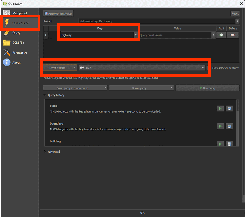
Downloading Roads and Buildings with QuickOSM
Before we start, if you turn off all your layers in the project, you'll see the OpenStreetMap base map. On this base map, the grey and orange lines represent the roads. However, we can't use the base map directly to work with the road data because it's just a visual reference. To actually use the roads in our analysis, we need to extract them from OpenStreetMap using a plug-in. You downloaded the QuickOSM plug-in in chapter 1.5 Plug-Ins.
With Quick OSM, you can extract data directly from OpenStreetMap, including roads and building data.
1. Click on the green QuickOSM icon.
2. In the QuickOSM window, go to the Quick Quiry tab and type highway. This is the layer for the roads. Yes, the naming can be a bit misleading sometimes.
3. Select Layer Extend and select the Area polygon we made earlier. This will extract all the types of roads that are found in our study area.
4. Open the Advanced tab. And deselect Points, Multilinestrings and Multipolygons. As we want to use roads, we only need the Lines for our analysis.
5. Click on Run Query and close the window.
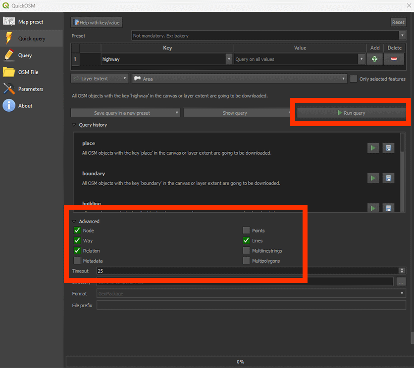
The roads in our study area now appear on the map as lines. They may have a different colour on your map, but that is not important.
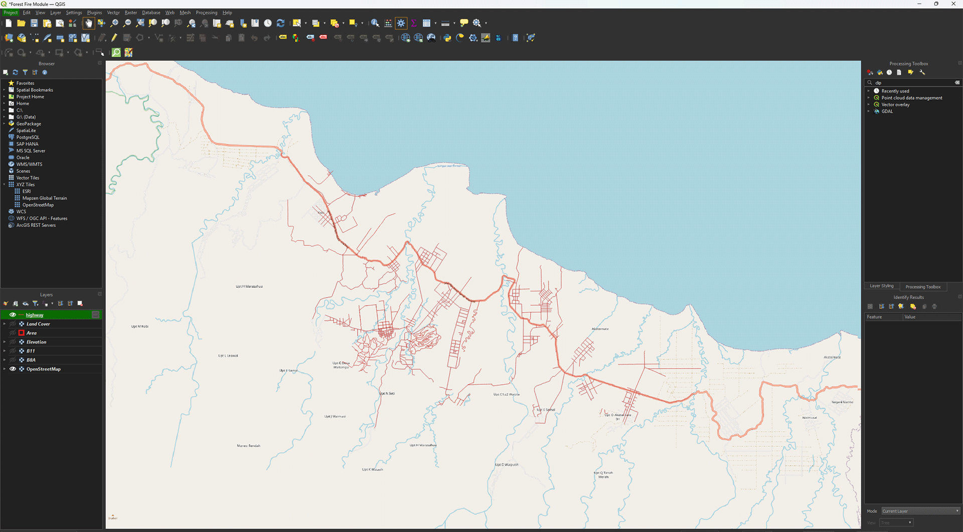
6. Repeat these steps by using the following settings to download the buildings.
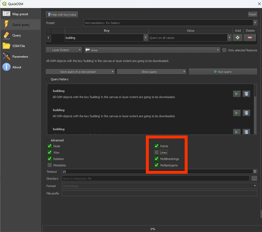
Once downloaded, you should have two layers. Highway in lines and Buildings in Polygons (rectangular shapes).
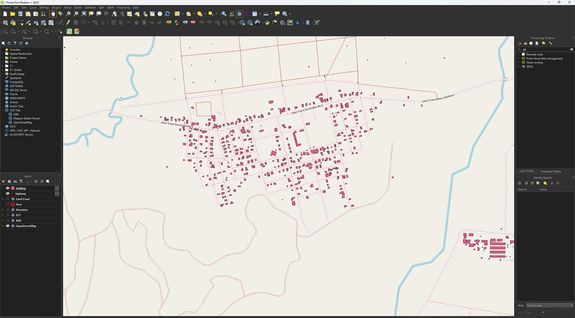
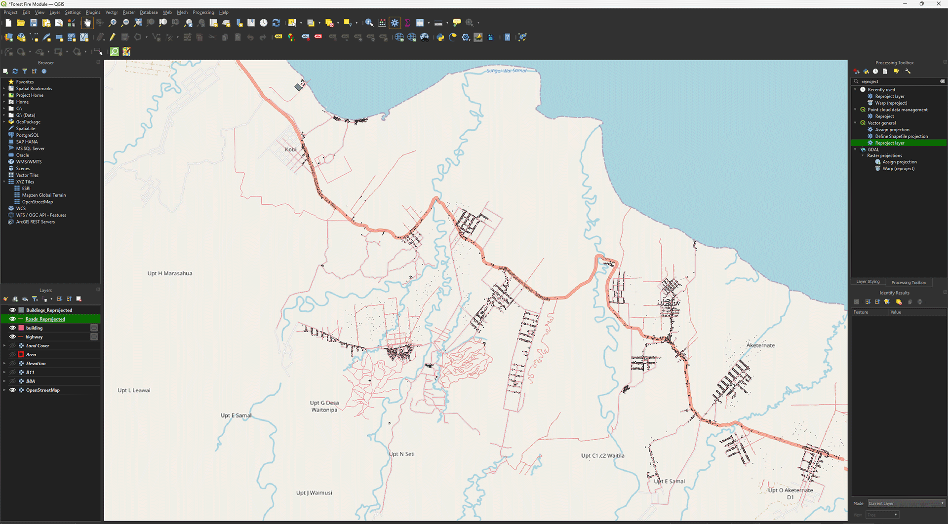
The layers we just downloaded are vector layers, while the other layers like the DEM and satellite layers are raster layers. The main difference is that a vector layer consists of points, lines and polygons. In the case of the highway layer, it’s made of vector lines. A raster layer is made up of a grid of pixels, each with a unique value. You can clearly see this difference if you zoom in and turn on the Elevation layer. The pixel structure becomes visible compared to the sharp lines of the vector layer.
Reprojecting
Much like the other layers, we first need to Reproject it. However, we have to use a different tool for vector layers instead of the one we used for the raster layers. Make sure you have the Highway and Building layers open. Turn off all the other layers by pressing the Eye button next to the unwanted layers.
1. Go to the Processing Toolbox and search for Reproject layer under Vector general. Double click to open the tool.
The tool is meant for reprojecting vector layers. The tool we used earlier to reproject our rasters cannot be used for vectors and vice versa.
2. In the Reproject Layer window, set Input Layer on highway.
3. Set Target CRS to EPSG: 32752.
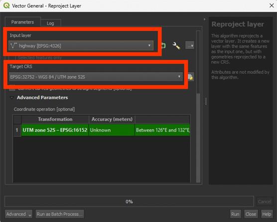
4. Scroll down and under Reprojected, press the arrow button > Save to File… and name the Permanent layer Roads_Reprojected. A vector layer will be saved as a Shapefile (SHP).
5. Run the tool and once finished, close the window.
6. Repeat the same process with Reprojecting for the Building layers. Name the layer Buildings_Reprojected when saving it as a Permanent layer.
When processed, all layers should be in the correct coordinate system. You check it to make sure by going to Properties > Source. It should be EPSG: 32752. As they are vector layers, they don’t have a resolution like rasters have.
Dissolve
One issue we come across when downloading vector data, is that all the lines/points/polygons are separated. Very useful if you need the data inside, but for our purpose, we just want the shapes of the roads themselves.
1. Go to the Processing Toolbox and search for Dissolve under Vector geometry. Double click to open the tool.
Dissolve will let us combine every lose shape into one big shape of roads. If we don’t do this, it’ll be impossible to create a clean Buffer later on.
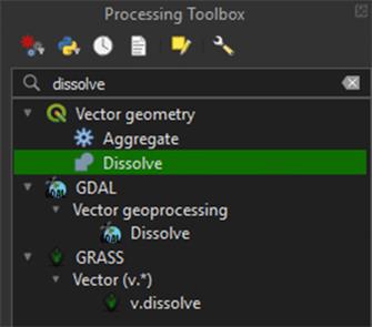
2. Make sure the Roads_Reprojected layer is selected, save the Permanent layer as Roads_Vector. Run the tool.
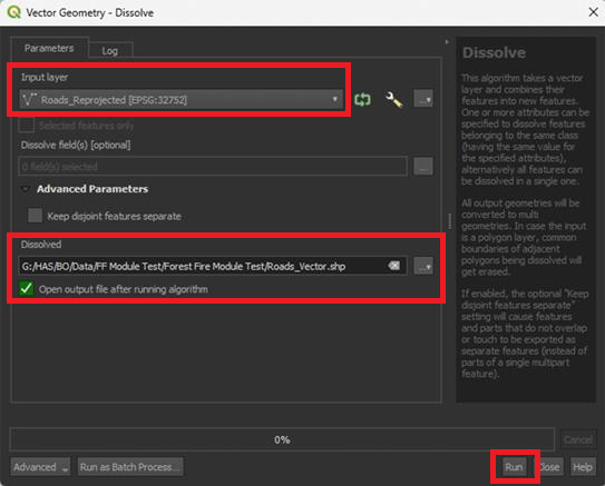
3. Repeat the same Dissolve steps for the Buildings_Reprojected layer. Save the Permanent layer as Buildings_Vector.
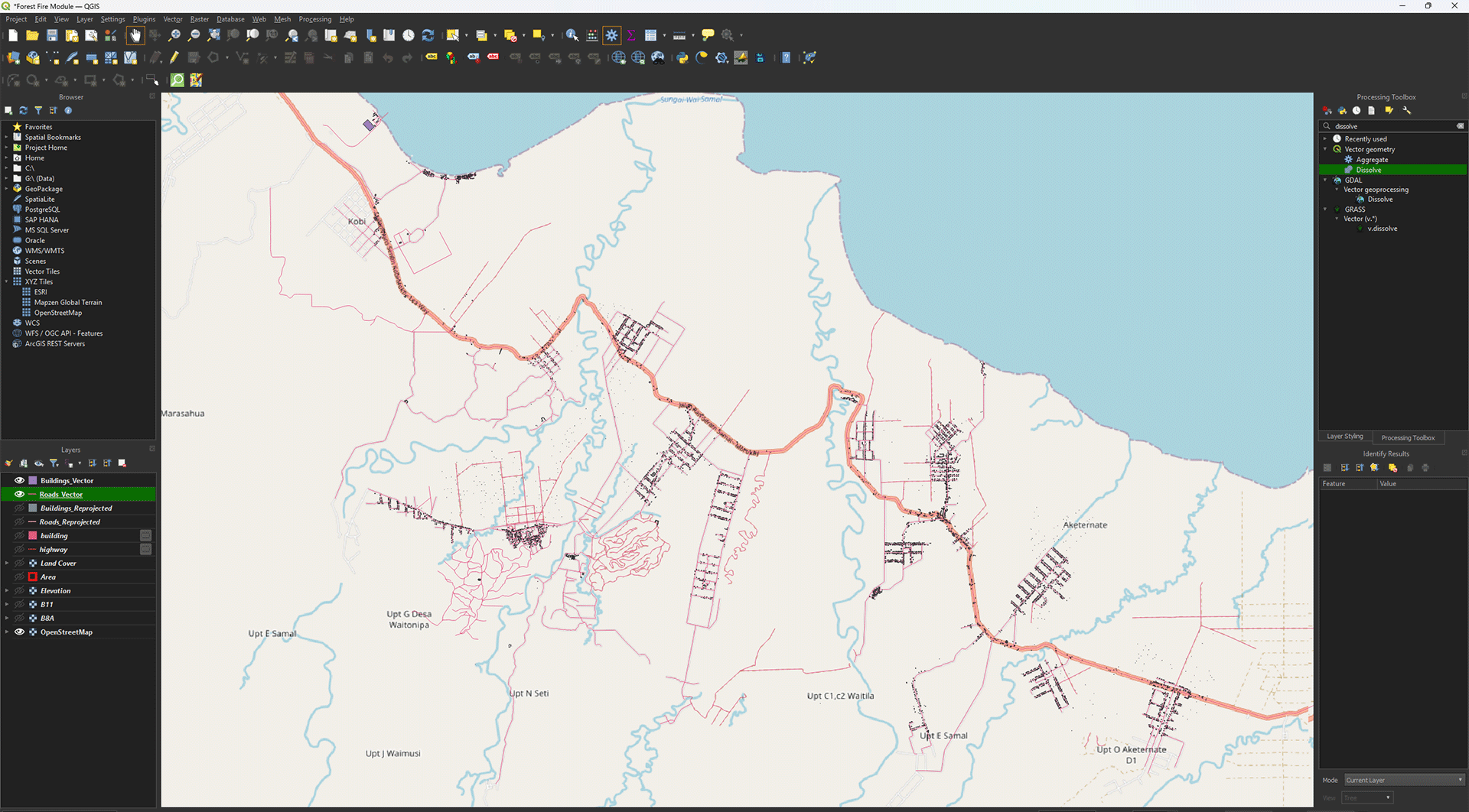
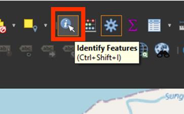
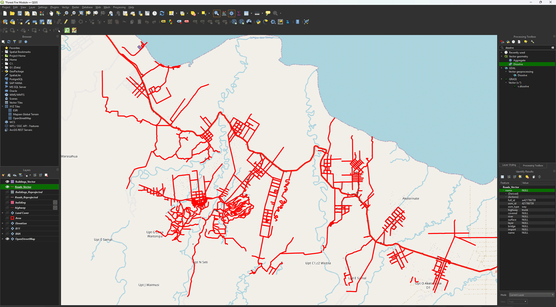
Now all the individual vector shapes are combined in one layer. You can click on a line with Identify Features (ctrl + shift + i) and see all lines light up at the same time.
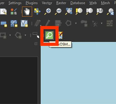
To go back to moving the map with your cursur, press the Pan Map icon

4. Once finished, you can delete the highway and building layers we downloaded, and the Roads_Reprojected and Buildings_Reprojected layers.

You have reprojected and dissolved both the Roads and Buildings layers. This is the final step of 2. Data and Preparation. In the next chapter, we will start on performing the analyses using the data we just imported and cleaned up. Make sure you have saved your project.
3. Perform Analyses
After completing the steps in chapter 2, you should have all the data needed to perform the analyses of chapter 3. In this chapter we will start by calculating the NDMI from satellite bands B8A and B11. After that we will calculate the slope in our study area from the Elevation layer. You will create a buffer around the Building and Road vectors and convert them into rasters. The LandCover layer is already usable as is, so we won’t need to do anything with it in this chapter.
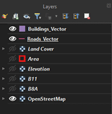
Before starting this chapter, check if the following layers are present in you Layers Panel:
- Area
- B8A
- B11
- Elevation
- LandCover
- Roads_Vector
- Buildings_Vector
All layers should have the CRS set to EPSG: 32752, if this is not the case, the data won’t all be applied to the exact same location and the analyses will go wrong. Also important for the B8A, B11, Elevation and LandCover layer is that the resolution is the same; 30 by 30 pixels. You can check both the pixel size and the CRS by right clicking on a layer in the Layer Panel and clicking on Properties. You will get a pop-up screen. Under the Information tab you will find what the Pixel Size and the CRS of the layer is.
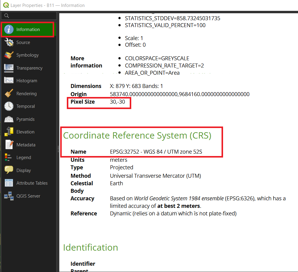
If it shows something other than 30, -30 for the Pixel Size or EPSG: 32752 for the CRS, this means something went wrong with the Reprojection of the layer. You will have to go back to the Reprojecting Step of the layer in chapter 2 and repeat it.
3.1. NDMI
Now that we finally have all our data, we are going to perform the first analysis. This analysis will be important, as it will look at the vegetation in the area we want to map. Vegetation is quite flammable and will be a large factor in fire susceptibility and spreading.
As said when downloading the satellite imagery, we are going to use the Normalised Difference Moisture Index, or NDMI for short. This analysis uses near infrared (NIR) and short wave infrared (SWIR) to calculate the moisture content of vegetation. It is as if we can take a peek inside the plants to see how much water they hold. However, there are other ways to find out what vegetation is more susceptible to fires and it’s important to choose the one that fits your goal. If you want to make a full overview of what vegetation would be susceptible, you’d need to know what types of vegetation are found in your study area. This can be quite difficult and complicated, but it will give you the most in-depth overview of the area’s vegetation.
For this module, we will take a more simplified and quicker approach. The main thing we want to know is the moisture content of the vegetation in our study area. As it is a more global approach compared to looking at all the different vegetation types, we will make certain assumptions. The assumption being that a plant with higher moisture content is less susceptible to fires than a plant with lower moisture content. This won’t give us the most accurate map, but this is an alternative that gives us a good idea of what parts are more and less susceptible to fire. It’s always important to make sure that you know how accurate your data and analysis will be before you actually start analysing.
Calculating the NDMI
Let’s start with the first analysis, which will be the NDMI calculation. To do this, we will need the two satellite images we’ve created earlier, the B8A and B11 layers.
If you have any trouble during these steps, there is a guide video at the end of step 5.
1. Go to Raster > Raster Calculator at the top of the screen. This lets us perform all kinds of calculations on raster layers.
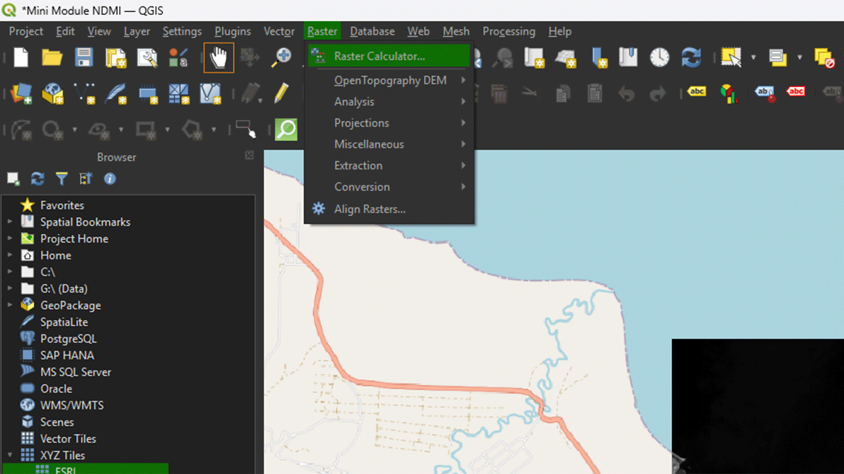
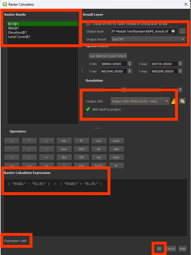
In the calculator you can press the buttons on your screen to make the formula. The calculator is very sensitive to mistakes and will show that there is a mistake in your formula by saying expression invalid beneath the formula input box. The calculator will not run, and you will be unable to click the OK button if this is the case. So, if this happens, double check your formula for any errors. A lot of times the issue lays with a forgotten parentheses “()” in your formula. Another tip to avoid mistakes is to use the buttons on the calculator for the minuses and parentheses instead of using your keyboard.
2. In the Raster Calculator Expression, we want to insert this formula (you cannot copy the formula into the input box):
(B8A – B11) / (B8A + B11)
Note: This is the NDMI formula we discussed before: NDMI = (NIR – SWIR) / (NIR + SWIR)
The easiest way to do this is to use the buttons below Operators. Here you can click to add brackets and plus and minus signs. It is also better to double click a layer in the Raster Bands box to add it to your formula. This way you can avoid spelling mistakes making your expression invalid. QGIS will see any tiny mistake as an invalid formula, so this is why using the operator buttons are often more reliable than using your own keyboard keys.
You can check if the formula is right by looking at the bottom of the Raster Calculator Expression box. Here it should say Expression valid. If it says Expression invalid, check again if the formula is right and you are not missing any brackets.
You can add the layers into the expression by double clicking on the layers in the Raster Bands panel on the top left.
3. Name the Output layer on NDMI_Result and make sure the Output format is a GeoTIFF.
4. Check if the Output CRS is set on the correct coordinate system: EPSG: 32752.
5. When you have done all the steps, and the Expression is valid, click OK to calculate the NDMI.
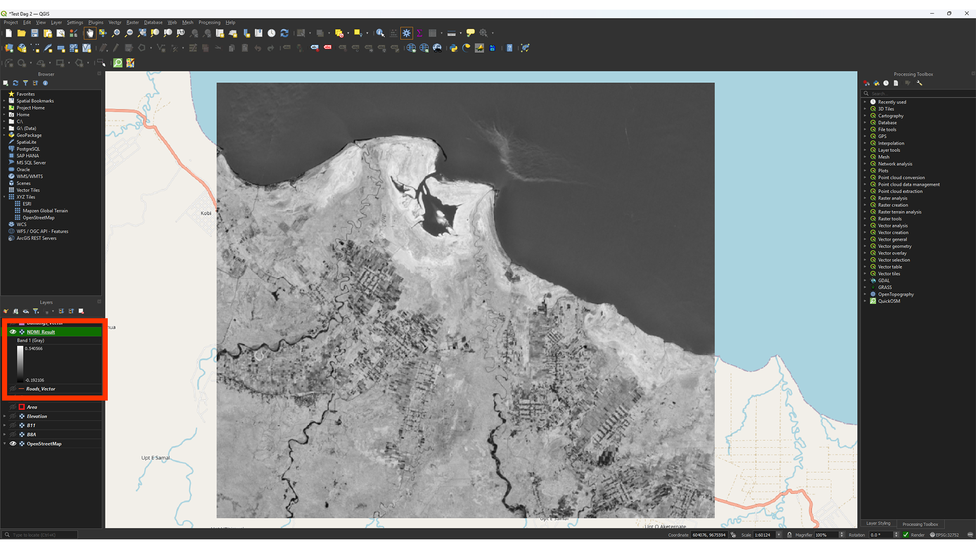
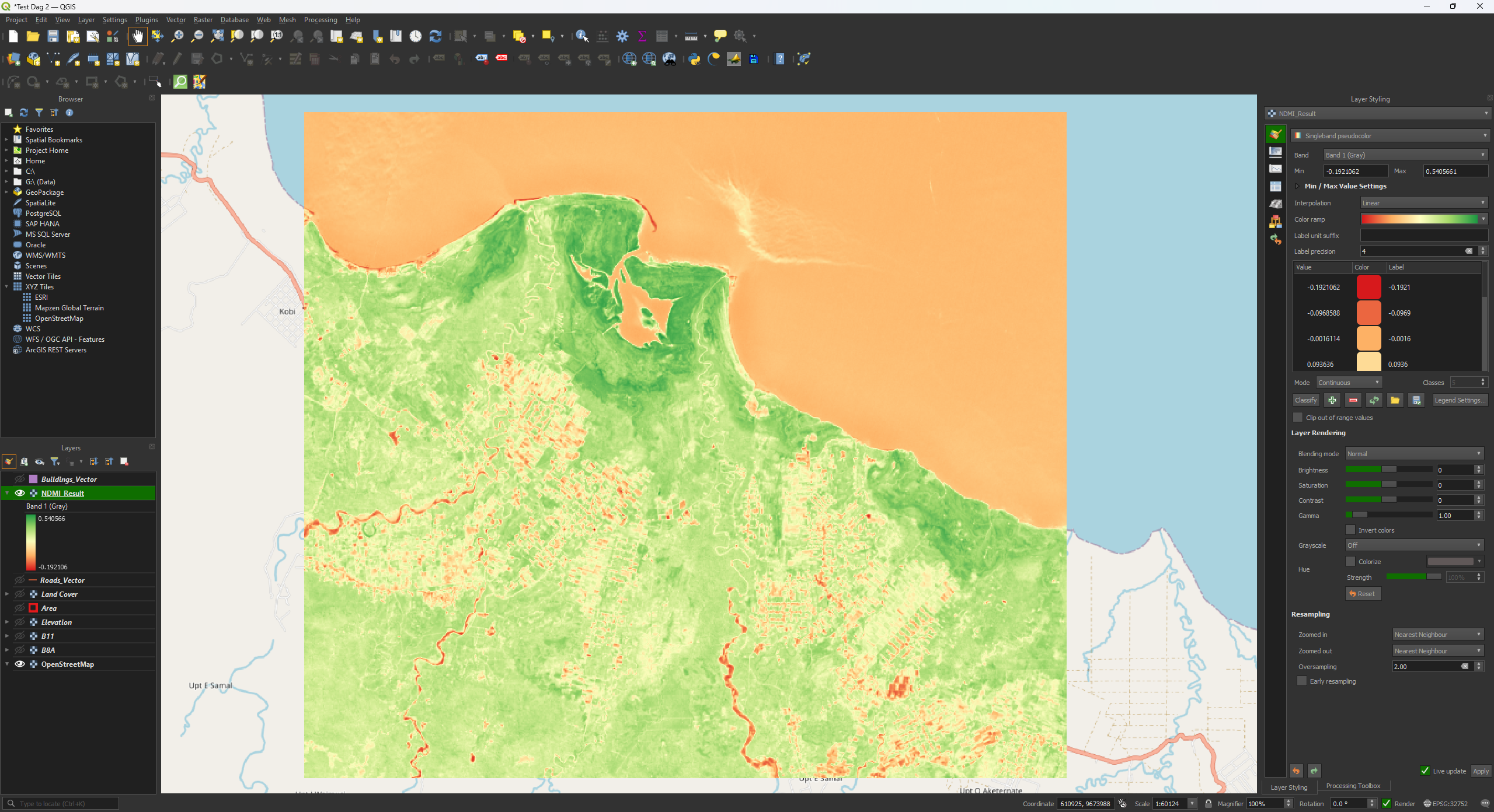
As you can see, the result is a greyscale image. On the left in the Layers panel, you can see the values, which should range between -1 and +1. Higher values show what vegetation contains more moisture.
Note: Depening on your study area's size, the values may differ slightly. It should be fine as long as the value is between -1 and +1.
If you have any trouble with these steps, you can watch this guide video
Applying Symbology
We want to make it a bit easier to read by changing the symbology. This is a step that you can use to understand your results better.
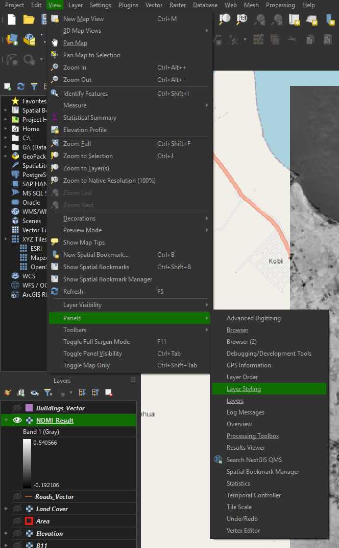
1. If you don’t have the Layer Styling panel open, you can add it by going to View > Panels > Layer Styling Panel.
Note: You can find other panels in here as well, if you ever find that you lost them.
We will just adjust the colours for now. The exact classification isn’t important, but changing the styling gives you a better idea of what you’re looking at.
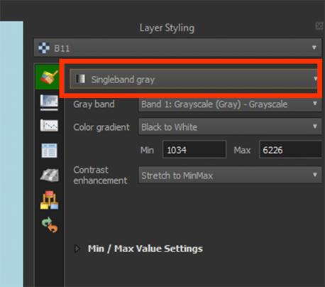
2. Set the renderer to Singleband pseudocolor. It’s usually set on Singleband gray when opening the panel.
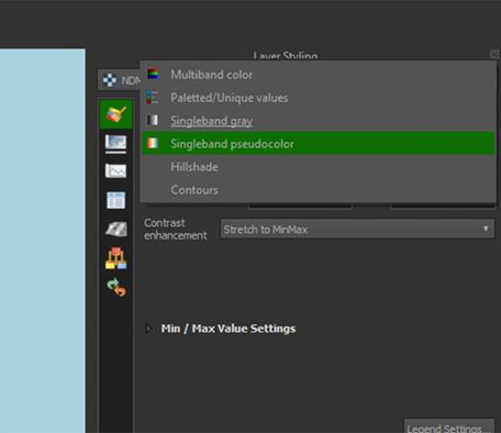
3. For a better viewing experience, we will change the Color ramp to RdYlGn by pressing the arrow next to the Color ramp > All Color Ramps > RdYlGn. (It is possible that it defaulted to this color ramp, in that case you don't have to change it.).
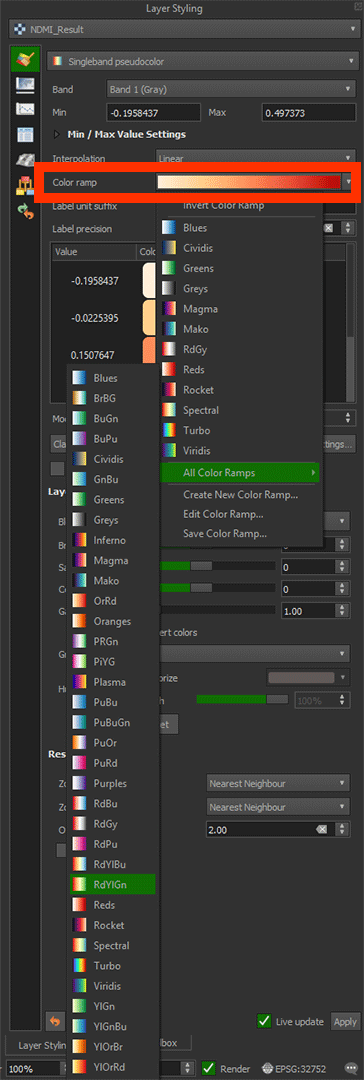
Now you see that the redder colours represent less moisture, or more water stress. The green areas contain vegetation with more moisture, or less water stress. For this index, you’d look at the values like this:
|
Value |
Description |
|
-1 to -0.5 |
Barren |
|
-0.5 to 0.3 |
Stressed, low moisture |
|
0.3 to 1 |
Low stress, high moisture |
Later on in the module, we are going to put these values into the Layer Styling to give the values a Risk classification. But for now, it's just a visual indicator and you can leave it like this.
Don't forget to save your project.
NDVI as an Alternative
A commonly used analysis is the Normalised Difference Vegetation Index (NDVI). This uses the spectral bands to monitor the vegetation’s health. This is very helpful for monitoring large areas of agricultural land or forests, although it's mostly used to monitor crops. You calculate what plants are healthy and which are unhealthy or dead. The formula makes use of the NIR B08 band like the NDMI but replaces the SWIR B11 band with B04 for red wavelengths. A healthy plant will absorb the red wavelength and reflect the infrared rays back to the satellite’s sensor. While this can be used for a fire risk analysis, it assumes that unhealthy plants are more likely to catch fire than healthy plants. This really depends on what types of vegetation is found in your study area, as certain healthy plant species do not contain much moisture, while certain unhealthy plants might still contain more moisture inside.
You can calculate the NDVI in a similar way as we did with the NDMI. You get a value between -1 and +1. Everything between -1 and 0 is either no vegetation or dead vegetation. Everything between 0 and 1 shows how healthy the vegetation is. A lower value is unhealthy, and a higher value is healthy.
The NDVI formula: NDVI = (B8A – B04) / (B8A + B04) NDVI = (NIR – RED) / (NIR + RED)
In this module we will not be using the NDVI (only NDMI), so you DO NOT have to do this step.
3.2. Slope
With the Elevation layer we made earlier, it’s time to create a slope map. The slope map is important, because fire is more likely to occur on steep slopes. This is because rainwater runs off hills quicker when the slope is steeper, causing these areas to be dry. The steep slope also makes fire spread more quickly upwards, because when a slope is steeper, heat from the fire reaches the vegetation above it more easily, causing ignition to happen quicker. This also means that it will spread slower in flatter areas. Therefore, we will now calculate the slope based on the Elevation layer. To do this we will use the Slope tool from the Processing Toolbox. The Slope tool calculates the percentages between the height values of the raster cells. A cell of 1 meter and 5 meters next to each other will create a higher value than a cell of 1 meter and 2 meters.
Calculate Slope from Elevation
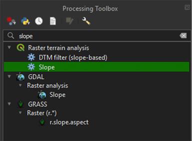
1. Go to the Processing Toolbox and search for Slope under Raster terrain analysis. Double click to open the tool.
2. In the Slope window, under Elevation layer, select the Elevation layer we downloaded earlier.
3. Under Slope, press the arrow button > Save to File… and name the layer Slope.
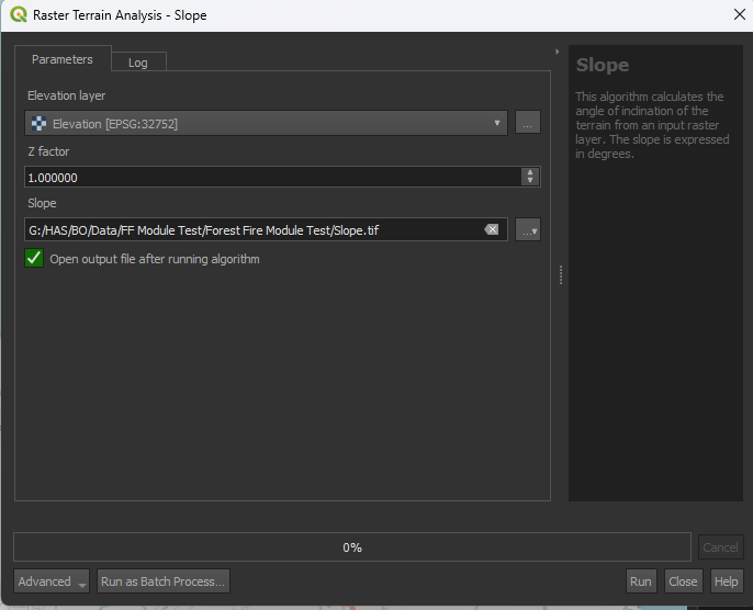
4. Run the tool. Your Slope layer should appear in the layers panel.
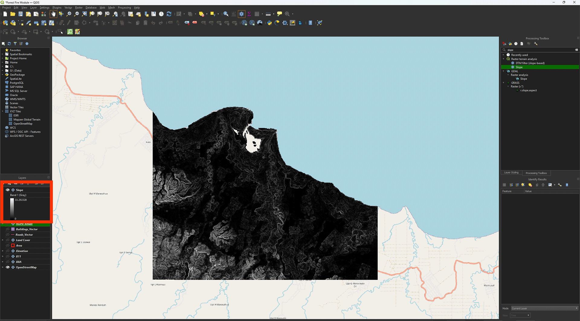
This map is still a bit hard to read, but you can see the slope variations in the landscape. The light colours are very steep, while the dark colours are flatter. In our study area, most flat areas are located on the coast, while the higher and sloped areas are more land inwards. The result is shown in degrees, so our maximum is around 33 degrees.
Note: Again, the value may differ slightly depending on your study area's size.
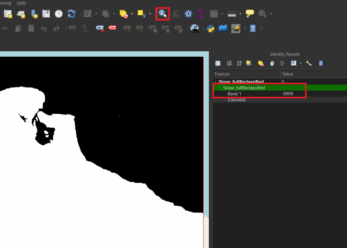
A strange side effect of doing a Slope analysis, is that it will cut the data from the ocean out. This missing data will unfortunately break the Weighted Overlay analysis that we will perform later. This means we have to fill in this missing data ourselves.
Filling No Data
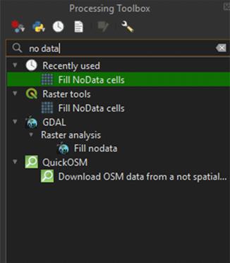
1. Go to the Processing Toolbox and search for Fill NoData cells under Raster tools. Double click to open the tool.
2. Make sure that the Slope layer is selected under Raster Input.
3. Set Fill value on -9999.
4. Save the Permanent layer as Slope_Fill.
5. Run the tool.
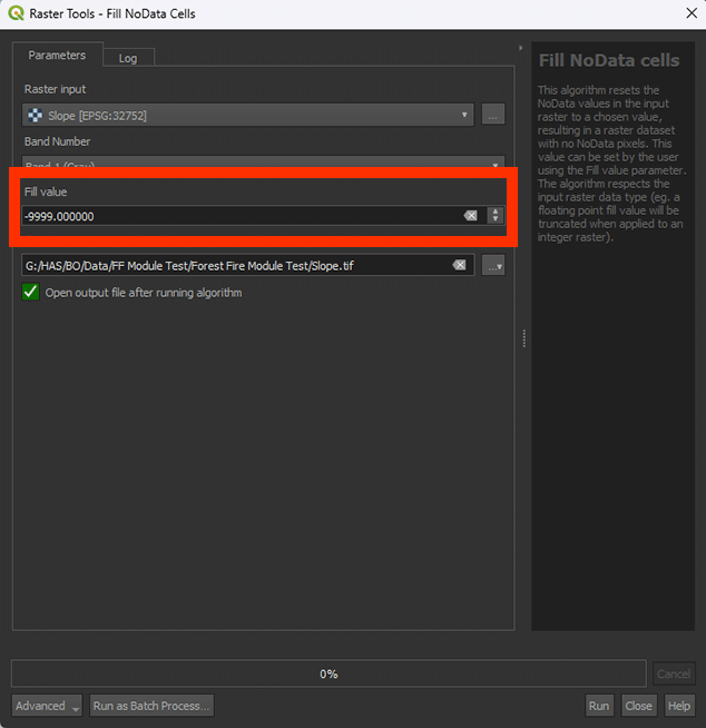
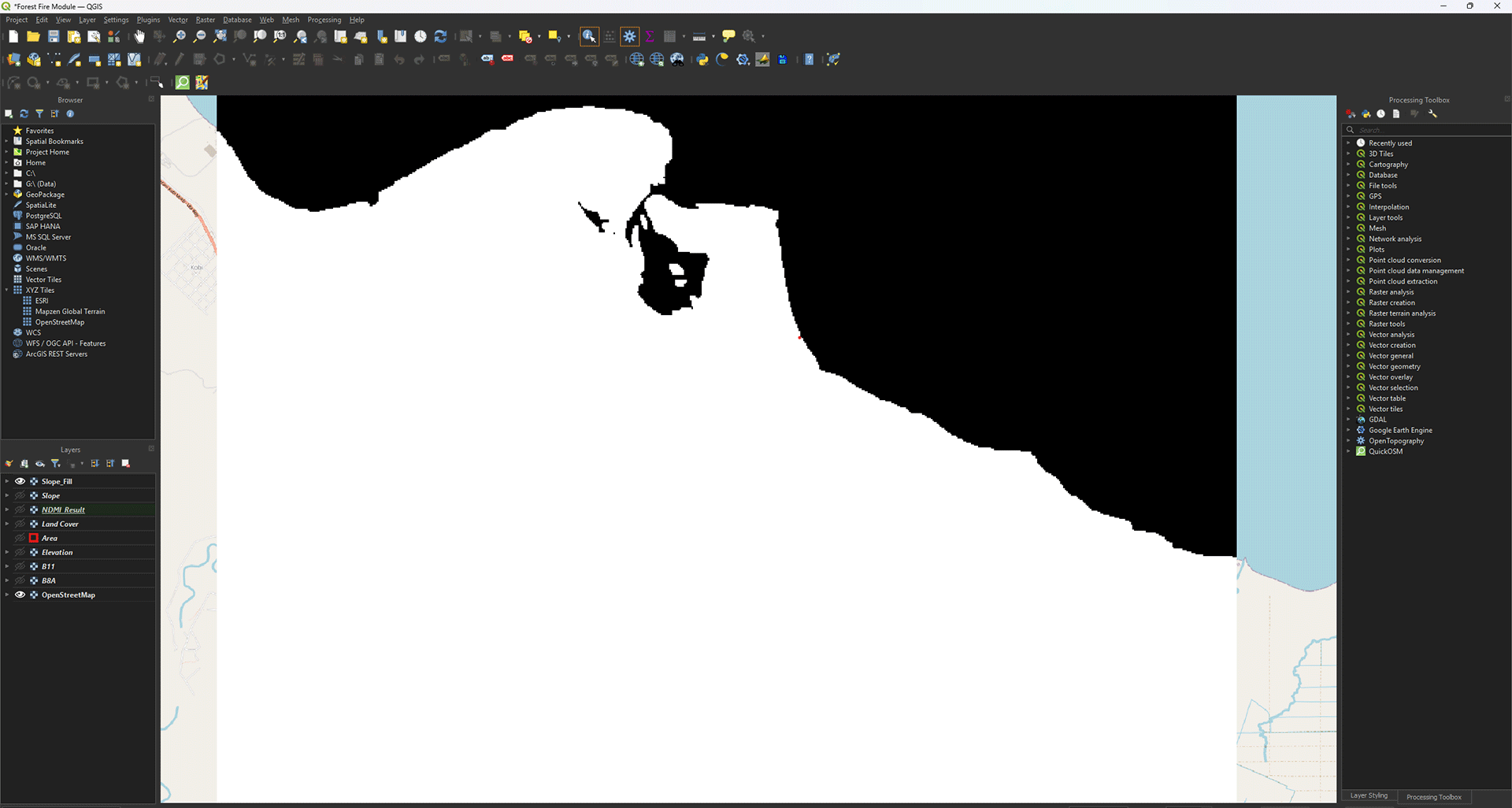
You will see your new layer appear in the Layers panel. This layer should have all the empty ocean spots filled in. You can check the values with the Identify Features button (or press ctrl + shift + i). When selected, you can click on a pixel to see what data it contains. The ocean should say -9999.
To go back to moving the map with your cursur, press the Pan Map icon
Don’t forget to save your project.
3.3. Distance to Built-Up Area
We downloaded vector layers of the roads and buildings in our study area. Fires often start near human activity, so we want to take that into account for our analysis. The closer an area is to human settlements, the more susceptible it is to fire. Creating a buffer around the roads and buildings will show which areas on the map are in close proximity to them, and thus at risk.
Buffer
Note: The buffer calculation can be very heavy and time-consuming for lower powered devices. This is one way to create a ringed buffer, but you can also use a different method we will cover when creating the Buildings buffer. If you cannot complete the roads buffer, you can use the buildings buffer steps and create the roads buffer that way. Make sure that you use the correct values and layer names!
1. Go to the Processing Toolbox and search for Multi-ring buffer (constant distance) under Vector geometry. Double click to open the tool.
For our buffer, we want to create four classes of the same distance. We will start with the Roads layer, which will have a buffer of 1200 meters. The Multi-ring buffer makes this very easy to do.
2. In the Multi-Ring Buffer window, select the Roads_Vector layer as the Input.
3. Under Number of rings, choose 6. This will give the number of rings (classes) we want.
4. Under Distance between rings, set it on 200 meters. The tool will create 6 rings that are all 200 meters wide. As we chose 6 rings, we get a buffer of 1200 meters.
5. Save the Permanent layer as Roads_VectorBuffer.
6. Run the tool
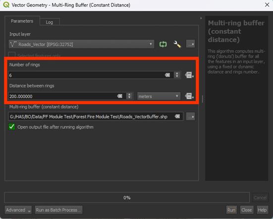
Now we have a buffered layer that has 6 rings of 200 meters.

Symbology
While not a necessary step, we can change the symbology to check if our buffer was created correctly.
1. Go to the Layer Styling Panel and set the Render Type to Categorized.
2. Set Value on distance.
3. Click the Classify button to create the classes.
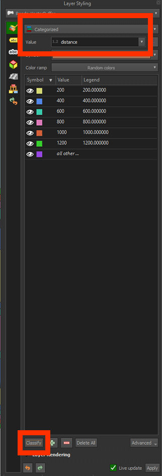
Now we can see that the buffer shows colours based on the value we gave before. Every colour is a width of 200 meters, neatly categorised.

If you click on the Identify Features button (ctrl + shift+ i), you can click on the buffers to see their values. A panel will open named Identify Results. Look at distance and it should show the buffer’s value, in this case ring 6, which is 1200 meters.
Converting the Vectors to a Raster
The buffer is created, but we can’t use it for our analysis just yet. All our other layers are rasters, but this one is still made of vectors. We will need to convert them.
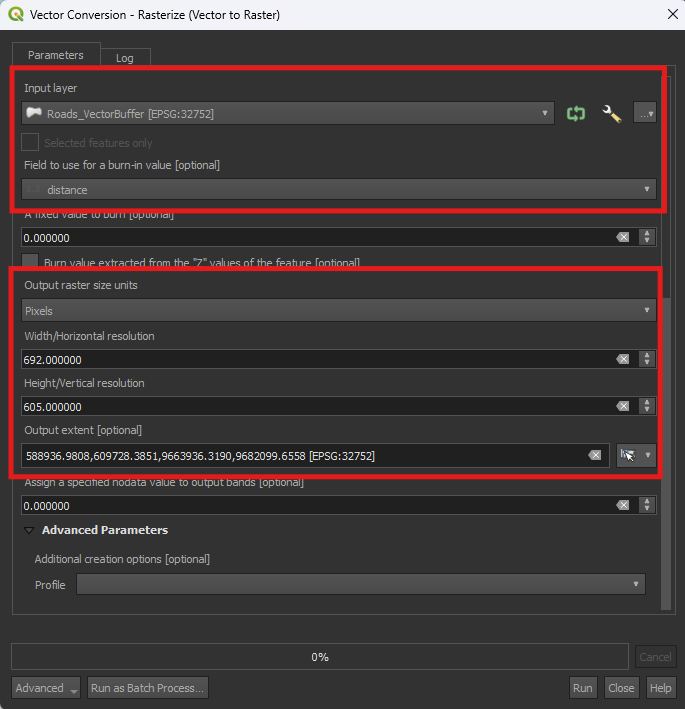
1. Go to the Processing Toolbox and search for Rasterize (vector to raster) under GDAL > Vector conversion.
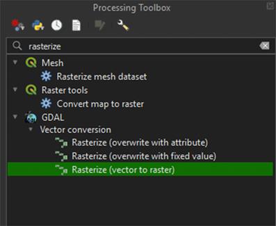
In the Vector Conversion window, you'll need to enter values for width and height. So, before we continue, it's important to use the same values from the other layers. This ensures that the pixel size and extent of the raster match exactly. Luckily, we used an Area polygon to cut them to the same size.
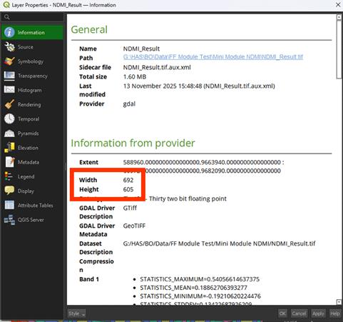
2. Right click the NDMI_Results layer > Properties (you don’t need to close the Rasterize window).
3. Go to the Information tab.
In the Information tab you'll see the width and height of the layer, which is what we’re interested in. In this case, the width is 692 pixels, and the height is 605 pixels. Keep in mind these values may be different for you, so make sure to write down your own values somewhere to use later.
4. Close the Properties window. In the Rasterize window, make sure that Roads_VectorBuffer is set under the Input layer.
5. Set Field to use for a burn-in value to Distance. This will use the six ringed values we created earlier.
6. Set Output raster size units to Pixels.
7. Set the both Width/Horizontal resolution to your width and length you looked up earlier. The width goes in the top box and the height in the bottom one.
In the case of this example the Width is set to 692 and the Height to 605. Your values may differ. Use the values you’ve written down earlier and type them in.
8. Click the arrow next to the Output extent > Calculate from Layer > Area.
9. For now, we don’t need to save it as a Permanent layer, so you can Run the tool.
If you zoom in, you'll see that the river layer has been converted into a raster. Instead of lines, it now consists of individual pixels, just like the other layers we created. However, there is still some empty data, which we will need to fill.

10. Open the Processing Toolbox and search for the Fill Nodata cells tool we used earlier. Make sure the Rasterized layer is used as the Input.
11. Set Fill value on 9999.
12. Save the Permanent layer as Roads_RasterBuffer and Run the tool.
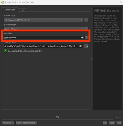
The result looks a bit weird, as the individual rings seem to be gone.

13. Go to the Layer styling panel, set the Render Type to Paletted/Unique values and press the Classify button.
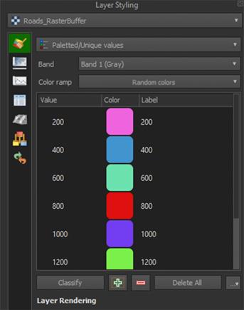
You should now see the individual rings again, with the empty areas filled in with a 9999 value (yellow in the example).

You can delete the Temporary Rasterized layer.
Buildings
Urban areas will have a larger influence size for fire susceptibility. This is why we will create a larger buffer of 2400 meters. For the buildings, we're going to use a different method to get a similar result. The method we used for the Roads works well, but with large datasets, like our buildings layer, it can be quite heavy to run. As we want to do this in a reasonable time, we'll use a lighter way to create the Multi-ring buffers using the Proximity tool. First, however, we need to convert the vector to a raster.
1. Open the Rasterize (vector to raster) tool again and set the Input layer on Buildings_Vector.
2. Make sure Set A fixed value to burn is set to 1. We need to use this now as we don’t have a field to use like we did with the Roads buffer.
3. Set Output raster size units to Pixels.
4. Set the Width/Horizontal resolution and Height/Vertical Resolution, using the same values as before.
5. Click the arrow next to the Output extent > Calculate from Layer > Area.
6. You don’t have to save it as a Permanent layer, so you can Run the tool.
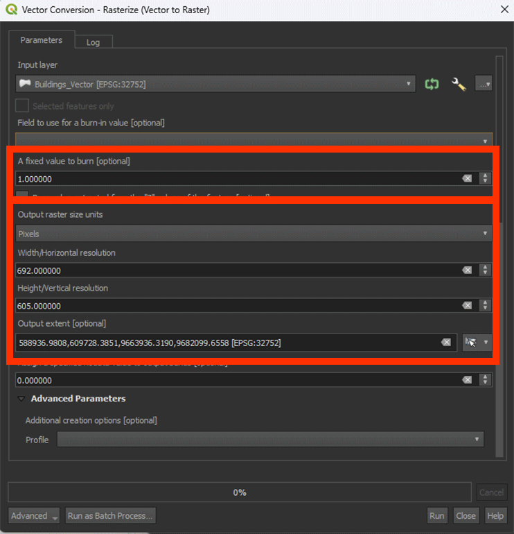
We have converted the vector layer to a raster. This will make the buffer analysis a lot less heavy on processing.

7. Go to the Processing Toolbox and search for Proximity (raster distance) under GDAL > Raster analysis. Double click to open the tool.
Much like the Multiring buffer tool, Proximity lets us create a buffer around the Buildings. However, we can’t create the six rings as before, so we need to Reclassify later.
8. Make sure you have the Rasterized layer selected.
9. Set A list of pixel values in the source image to be considered target pixels to 1. This will make sure that the buffer is created around the buildings.
10. Set Distance units on Georeferenced coordinates.
11. Set The maximum distance to be generated to 2400. This is necessary to create our buffer of 2400 meters.
12. Set Nodata value to use for the destination proximity raster to 9999. Everything past the 2400 meters will get a 9999 value.
13. Save the Permanent layer as Buildings_RasterBuffer and Run the tool
You can delete the Temporary Rasterized layer.

We get a result that looks a bit different from the clean buffers we created for the Roads layer. However, if you click around with the Identify Features, you can see that the values are nicely between 0 and 2400. Everything further than 2400 meters gets a value of 9999. For now, we are finished with this layer. In 4.4 Roads and Buildings, we will Reclassify the layers, which will neatly categorise everything back into ringed buffers.
We finished the analyses. Save your project and we will continue with the Weighted Overlay Analysis in chapter 4.
4. Weighted Overlay Analysis
In the previous chapter, we created new layers with the analyses, which we will need to create our Fire Risk map. To do this, we will perform a Weighted Overlay Analysis.
A Weighted Overlay Analysis lets us calculate the potential risk zones in our study area by giving all the factors scores. We are going to score every layer we made separately and then combine them using a formula to calculate our final risk map. You can give scores in multiple ways, but we are going to use a scoring from 0 to 10. You can think of it as 10 being 100% (high risk) and 0 being 0% (no risk). Depending on how important we think that certain factors are, like land cover types and the distance of a road, we can score them accordingly. For example, a shrubland has a higher fire risk than a mangrove forest. In the scoring you can give the shrubland a 10 and the mangrove forest a 1, or anything inbetween. In the table below, you can see what the scores mean:
|
Risk Class |
Score |
Explanation |
|
Impossible |
0 |
Fire occurring is (almost) impossible. |
|
Very low |
2 |
Risk of fire is possible, but improbable. |
|
Low |
4 |
Fire occurring is possible, but low. |
|
Medium |
6 |
Risk of fire is |
|
High |
8 |
Risk of fire occurring is likely |
|
Very high |
10 |
Risk of fire is very high |
Note: For added nuance, sub-criteria can be given an in-between score: 1, 3, 5, 7, 9.
So, before we calculate our Fire Risk map, we need to score our data using the Reclassify tool. Here we can choose the values from the maps and give them scores based on what we think has a higher and lower fire risk. When doing the scoring, it’s important to do research about your study area. What can you find there? What factors are a potential fire risk? Knowing this, you can give them the most accurate scores possible. However, there is always a bit of guesswork involved. There is no universal rule for a score that something can get. You have to think about it carefully and explain why you chose the scores for the analysis. If you think a mangrove forest should get an 8 instead of a 1, explain why you think that is needed.
You should have 5 different layers:
- NDMI (moisture content of vegetation to see what vegetation is more susceptible)
- Slope (slopes in degrees for fire spreading)
- Land Cover (land use types to see what areas are more susceptible)
- Roads (roads for human activity)
- Buildings (urban areas for human activity)
4.1. NDMI
Let’s reclassify the results from our NDMI analysis and start scoring. When we performed the NDMI analysis, we changed the symbology to 3 different classes, going from barren, low moisture, to high moisture. But by changing the symbology, we only change the visuals, not the data itself. To do a Weighted Overlay Analysis, we need to actually change the data itself. We are going to use the Reclassify tool to achieve this.
If you have any trouble with these steps, there is a guide video at the end of this chapter.
1. Go to the Processing Toolbox and search for Reclassify by table under Raster analysis. Double click to open the tool.
2. Under Raster layer, make sure the NDMI_Results layer is selected and click on the ‘…’ button next to Reclassification table.
This is the place where we are going to score the factors. We will use a similar classification as we used for the Symbology earlier on. For the Reclassification, we’ll use a few extra steps to create more varied values, otherwise we get three large zones and lose detail.
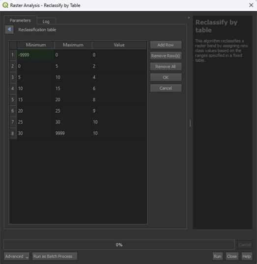
3. Click Add Row and set Minimum to -1 and Maximum to -0.5. The min and max values represent the data from the layer.
4. Under Value, give a score of 10.
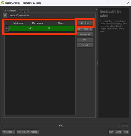
This is how we are going to score. We classify the data in a few classes and then give them a score from 0 to 10. 0 being no risk (things like water may end up being something other that 0, which is a limitation of the NDMI), 10 being very high risk.
5. Set the values as shown in the table below. Make sure you use ‘.’ as decimals and not ‘,’. QGIS always works with periods, not commas.
Note: be sure to not let any rows empty, GIS does not understand this and will give you an error message. So, make sure to delete empty rows before clicking OK.
|
Minimum |
Maximum |
Value |
|
-1 |
-0.5 |
10 |
|
-0.5 |
-0.3 |
9 |
|
-0.3 |
-0.1 |
8 |
|
-0.1 |
0.1 |
7 |
|
0.1 |
0.3 |
6 |
|
0.3 |
0.5 |
4 |
|
0.5 |
1 |
0 |
As explained in the introduction, the closer the NDMI is to -1, the more heat stress the vegetation in that area experiences. This is why areas with NDMI values ranging from -0.5 to -1 are given the highest risk factor and values ranging closer to 1 create less risk.
6. When finished scoring, click on OK. Do not click RUN immediately! You have to save the file first.
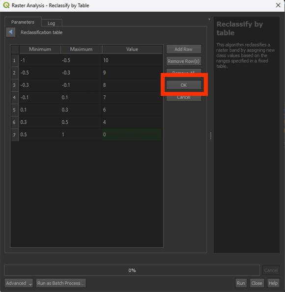
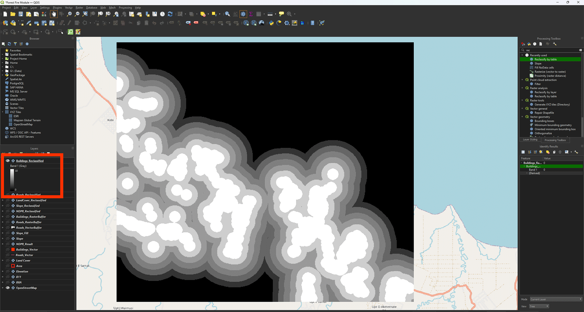
7. Save the Permanent layer as NDMI_Reclassified, then Run the tool.
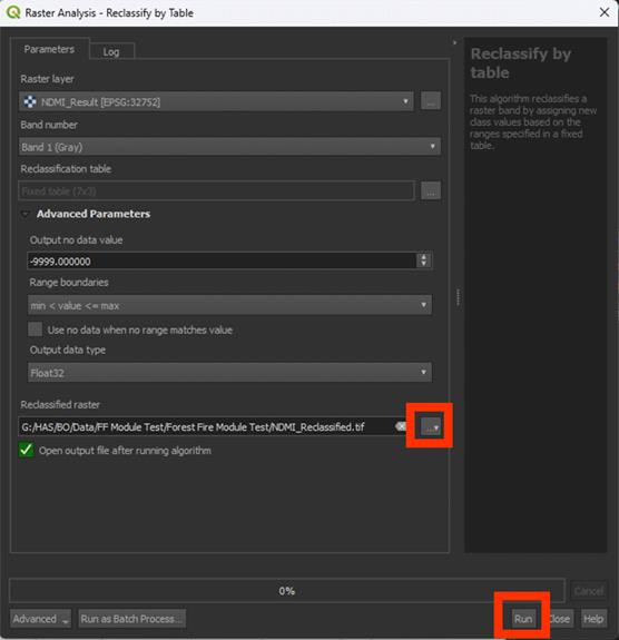
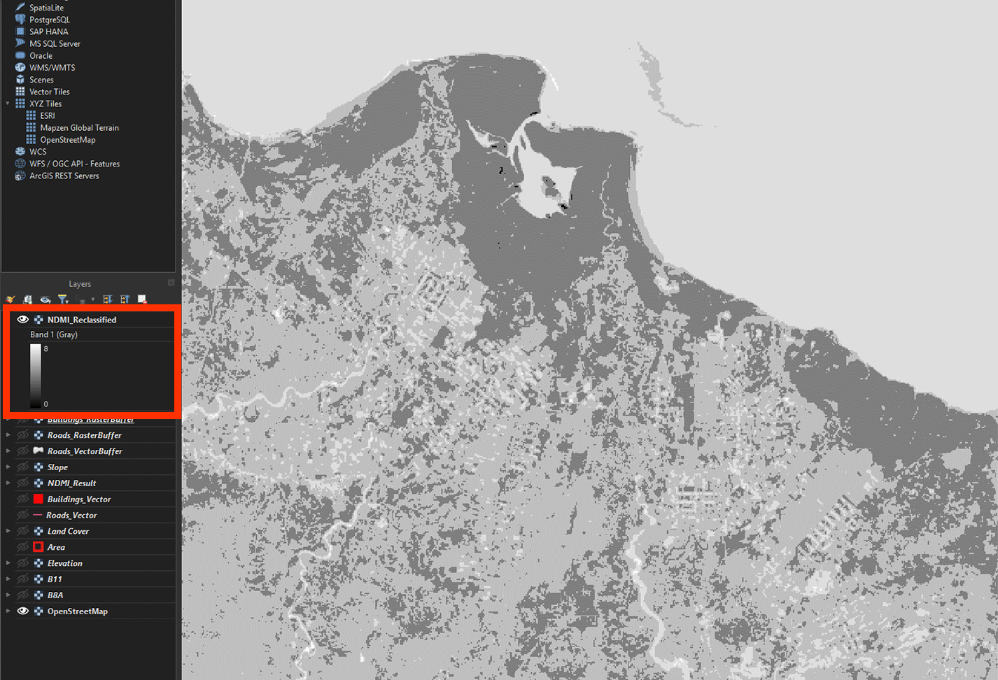
Once the reclassified layer has been created to check if it worked, zoom in. You should see different shades of grey. That means the reclassification was successful. You can check the scores using Identify Features. It should stay between 0 and 10 (in this case being 0 and 8, as there ended up being no area of a value lower than -0.3).
You've now reclassified the first layer, the NDMI layer. We will repeat this process and create the other layers as well.
Don’t forget to save your project.
You can watch these steps in this video if you are having trouble.
4.2. Slope
Next up is the Slope layer. This includes the slope’s steepness in degrees. Your analysis should have a maximum of 40 (in this case being 33) degrees as the steepest. We are going to classify them in easy 5 degree steps.
1. Open the Reclassify by table tool again and make sure the Slope_Fill layer is selected.
2. In the table, fill in the values down below:
|
Minimum |
Maximum |
Value |
|
-9999 |
0 |
0 |
|
0 |
5 |
2 |
|
5 |
10 |
4 |
|
10 |
15 |
6 |
|
15 |
20 |
8 |
|
20 |
25 |
9 |
|
25 |
30 |
10 |
|
30 |
9999 |
10 |
Again, remember to click OK afterwards and not Run before you have saved the layer.
Research has shown that areas with a steeper slope are more susceptible to forest fires. This is because with a steeper slope, rainwater runoff is faster, and the soil is unable to store it in time. Leading to these areas being dry. Fire is also more likely to spread faster on steep uphill slopes. The spread of fire is not the main issue in this module, but it does mean that the area is more likely to be heavily affected by a fire. Research shows that the steeper the slope, the higher the fire risk. This is why the higher slopes in the table above have been given a higher risk value.
You may notice how we use 9999 as the final maximum value. Research has shown that a slope of 30 degrees or more is considered 'high risk'. The slope may be higher than 30 degrees in certain areas, this is why we set the highest value to 9999. It will include everything above 30 degrees. If your study area has slopes that are very steep, like cliffs, you might want to set a limit instead, like 60 degrees, then set all higher values to a score of 0.
An example of what can be put in on the bottom of the table if you have cliffs in your area is included below. We do not have cliffs, so you DO NOT have to include this row. You can just proceed to step 3.
|
Minimum |
Maximum |
Value |
|
30 |
60 |
10 |
|
60 |
9999 |
0 |
3. Click OK after filling in the table.
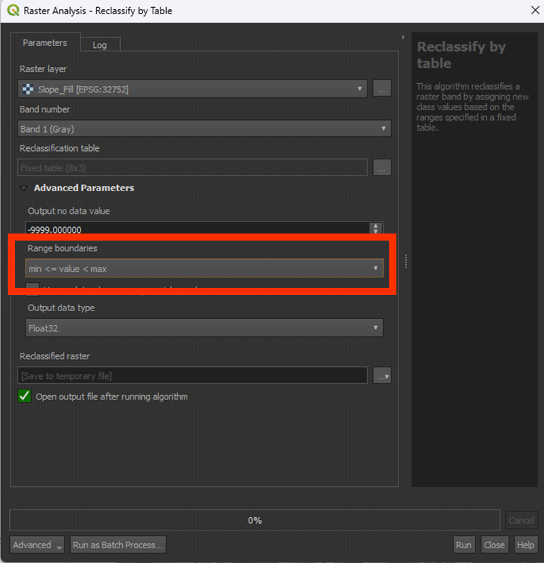
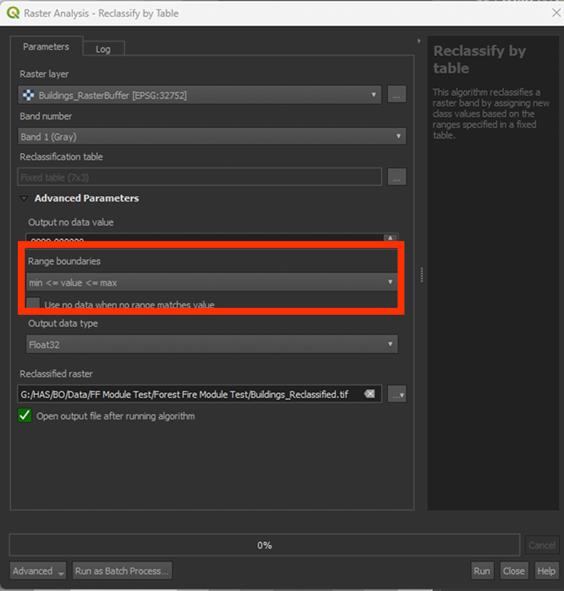
4. Click Advanced Parameters to set the Range Boundaries on min <= value < max. The tool may get confused otherwise with the -9999 value.
Note: look closely at the way the "<" and ">" are pointing, this does matter.
5. Save the Permanent layer as Slope_Reclassified. Once done, Run the tool.
The result should have values between 0 and 10. This case in the example being 0 to 10.

Don’t forget to save your project.
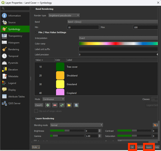
4.3. Land Cover
The Land Cover map is going to be a bit weird to Reclassify. It uses values to determine the land cover type. We can see it on the map with the labels (Tree cover, Cropland, etc.), but the Reclassify tool doesn’t understand that.
We can’t use the label naming of the LandCover map in the Reclassify, we need to use the values. In the Layer Styling panel, we can see the values that correspond to the labeling. In the table, you can see a nice overview for your convenience:
|
Value |
Label |
|
10 |
Tree cover |
|
20 |
Shrubland |
|
30 |
Grassland |
|
40 |
Cropland |
|
50 |
Built-up |
|
60 |
Bare/sparce vegetation |
|
70 |
Snow and ice |
|
80 |
Permanent water bodies |
|
90 |
Herbaceous wetland |
|
95 |
Mangroves |
|
100 |
Moss and lichen |
Note: Yes, there is a weird outlier with the 95 value.
1. Open the Reclassify by table tool again and make sure the LandCover layer is selected.
2. In the table, fill in the values down below:
|
Minimum |
Maximum |
Value |
|
10 |
10 |
8 |
|
20 |
20 |
10 |
|
30 |
30 |
6 |
|
40 |
40 |
6 |
|
50 |
50 |
0 |
|
60 |
60 |
4 |
|
70 |
70 |
0 |
|
80 |
80 |
0 |
|
90 |
90 |
2 |
|
95 |
95 |
1 |
|
100 |
100 |
0 |
Note: The 0 score means that this land cover type cannot burn, like Water, or we don’t take it into the calculation, like Built-up area (we use the Buildings layer for this purpose).
We use the same value for the minimum and maximum amount, as that is how the ESA World Cover data is provided. QGIS doesn’t let us use just 1 value, so this is how we have to fill it in.
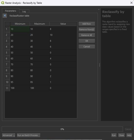
3. Under Advanced Parameters, set Range boundaries to min <= value <= max. This will make the weird min/max values work correctly.
Note: look closely at the way the "<" and ">" are pointing, this does matter.
4. Save the Permanent layer as LandCover_Reclassified and Run the tool.
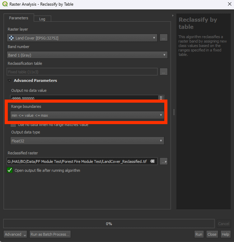
Now we have the reclassified LandCover layer. You can look around on the map and see the different scores with Identify Features. The values should stay between 0 and 10.
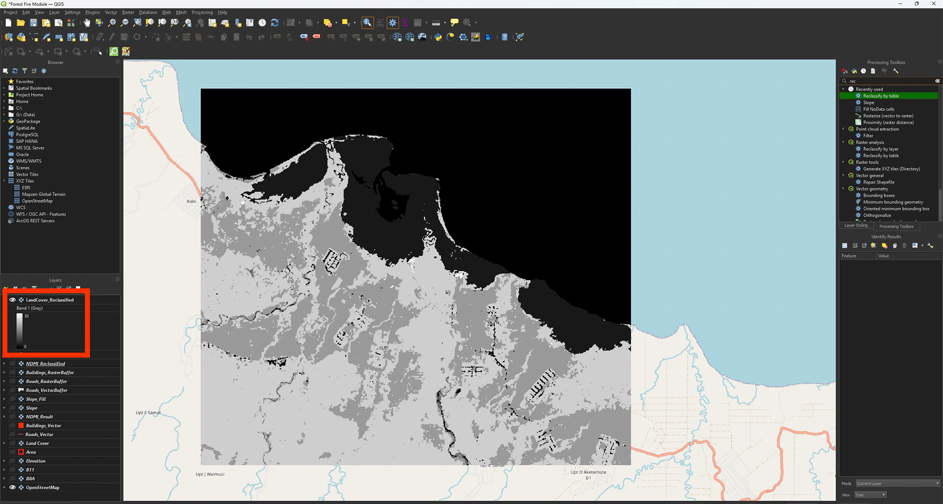
Don’t forget to save your project.
4.4. Roads and Buildings
Finally, we have the Roads and Buildings layers. We will Reclassify these in a similar way.
1. Open the Reclassify by table tool again and make sure the Roads_RasterBuffer layer is selected.
2. In the table, fill in the values down below. The minimum and maximum values represent the ring buffer distances we created earlier:
|
Minimum |
Maximum |
Value |
|
0 |
200 |
10 |
|
200 |
400 |
8 |
|
400 |
600 |
6 |
|
600 |
800 |
5 |
|
800 |
1000 |
4 |
|
1000 |
1200 |
2 |
|
9999 |
0 |
Research has shown that the closer an area is to human settlements like buildings or roads, the more likely fire is to occur. This is because human intervention is the cause of 80%-85% of all forest fires worldwide. This intervention ranges from accidents happening involving fire, to fires that are set on purpose and grow out of control. This is why for both distance to roads and distance to buildings, a higher risk value is given to areas that are closest to these human settlements.
3. Click OK, then save the Permanent layer as Roads_Reclassified and Run the tool.
Note: The Range boundaries can stay on min < value <= max, unless you used the Proximity tool instead of the Multi-ring buffer tool. Then you need to set it on min <= value <= max instead.
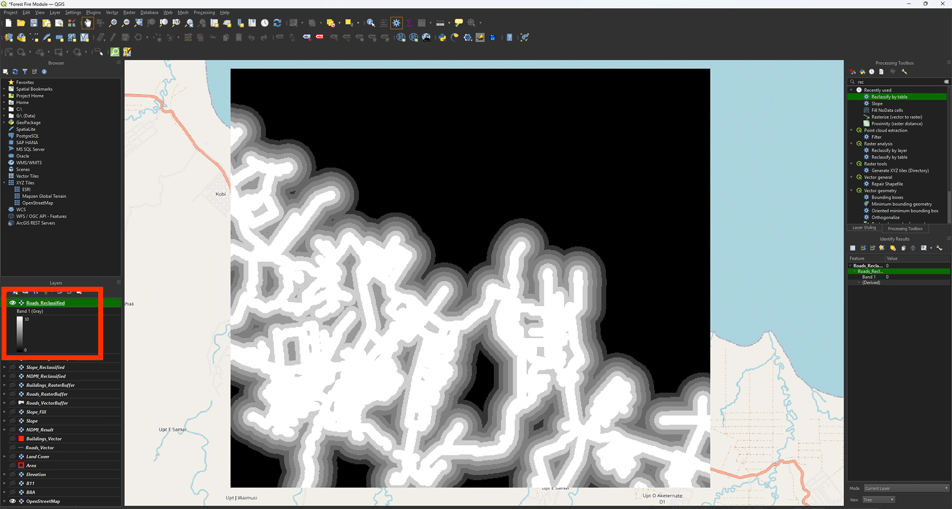
Now we get the layer with all the empty spots filled in. You can check the values with Identify Features (ctrl + shift + i). Everything outside of the 1200-meter buffer should say 0 (coloured in black).
4. Now, do the same for the Buildings_RasterBuffer layer using the table below:
|
Minimum |
Maximum |
Value |
|
0 |
400 |
10 |
|
400 |
800 |
8 |
|
800 |
1200 |
6 |
|
1200 |
1600 |
5 |
|
1600 |
2000 |
4 |
|
2000 |
2400 |
2 |
|
2400 |
9999 |
0 |
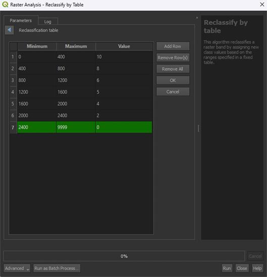
5. Click OK and set the Range boundaries on min <= value <= max. This is only to get rid of the building pixels, which would get a value of 0. It doesn’t matter too much, but it is a bit messy otherwise.
6. Save the Permanent layer as Buildings_Reclassified and Run the tool
Note: You may see some errors when you Run the tool. This is just because of the Range boundaries adjustment. This is expected behaviour.
You have done all the scoring of the layers. We will now continue to the final step of creating the Fire Risk Map itself.
Don’t forget to save your project.
4.5. Calculate Fire Risk Map
All layers are now reclassified, which means we can perform the Weighted Overlay Analysis.
For this, we use the Raster Calculator again, where we can enter different formulas to perform calculations with map layers.
During this analysis, we overlay all the layers, and the final score will be calculated for each pixel, resulting in values between 0 and 10. We also assign a weight to each layer, depending on which layer is more important for our analysis. For example, NDMI is given more weight than the Slope, because the moisture in the vegetation is a more important factor for fire risk than the landscape’s slopes.
Raster Calculator
1. In the top menu, go to Raster > Raster Calculator.
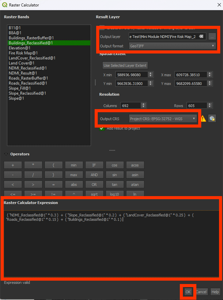
2. In the Raster Calculator Expression field, enter the following formula (you cannot copy the formula into the field):
( "NDMI_Reclassified@1" * 0.3 ) + ( "Slope_Reclassified@1" * 0.2 ) + ( "LandCover_Reclassified@1" * 0.25 ) + ( "Roads_Reclassified@1" * 0.15 ) + ( "Buildings_Reclassified@1" * 0.1 )
Note: If you have renamed the layers, you should use those names in the formula. You can double-click on a layer in the Raster bands section to insert it directly into the formula. If the formula is correct, you should see Expression valid left under the Raster Calculation Expression box. If it says Expression Invalid, you can check if all the brackets are added in the right place, or if you used commas instead of periods, change them to periods instead.
3. For Output layer, save the layer as FireRiskMap by clicking on the ‘…’ button.
4. Ensure the Output CRS is set to EPSG:32752.
5. Click OK to calculate the risk map layer.
With this formula, we calculate the sum of all the pixel’s values that overlap, in this case it being five map layers. With the values we add in the formula, we can add how important the layer is to the formula with weighting. In other words, what is a larger factor contributing to fire risk? In the table below you can see the ranking of the weights we use. These can always differ depending on your research and what you want to calculate.
| Layer | Weights |
|
NDMI |
0.3 |
|
Slope |
0.2 |
|
Land Cover |
0.25 |
|
Roads |
0.15 |
|
Buildings |
0.1 |
The weights given to each layer have been calculated using the AHP-method. This is a reliable way of giving weight to certain unquantifiable variables. It is also a widely used method for forest fire mapping. For more information about how to calculate it yourself, you can look into this paper. The weight should always add up to be a value of 1, or 100%. The Land Cover map, for example, counts for 25% in our calculation.
Now, we finally have our Fire Risk Map. You can see the colours represent how high the score ended up being. If everything went correctly, the value should be between 0 and 10, in this case its 0.25 and 8.1 for the example. The higher the score, the bigger the fire risk. Most of it is located around the crop- and grassland. This is a reasonable result, when looking at the research done beforehand.
Symbology
We can give it some colour to make it a bit more clear.
1. Go to the Layer Styling panel and set the Render type to Singleband pseudocolor.
2. Set the Color ramp on Reds.
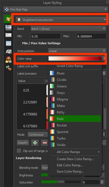
Now we can see the darker red areas having a higher risk for fires.
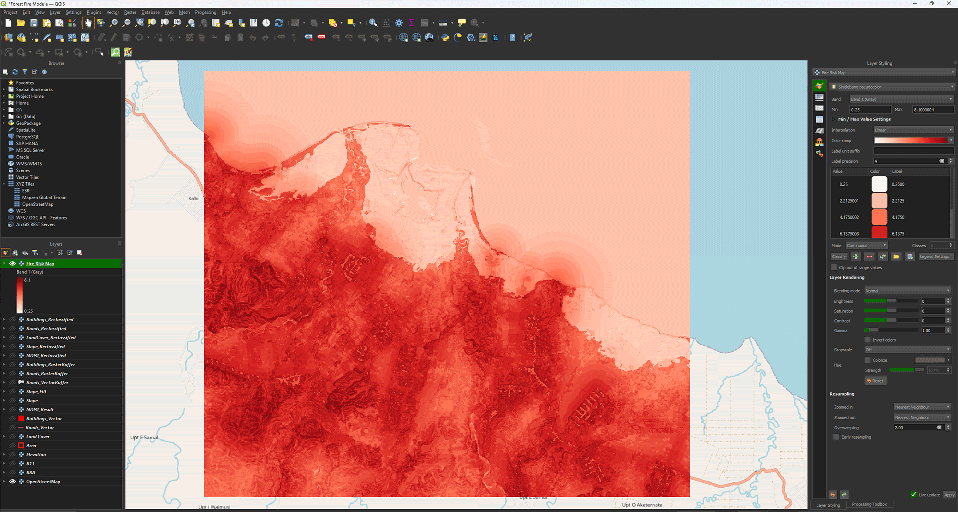
Even though it gives us an idea of what areas are susceptible to fires, the map itself is a bit messy, like how the ocean has a risk value. We can make a better, more usable overview.
Reclassify Risk Map
We want to get an easier overview of which areas are at most risk of fires starting. Knowing this, we could use the map to start mitigating and preventing fires in the future. To do this, we will convert the raster we created to a vector layer using grids.
1. First, we will use the Reclassify tool again. Go to the Processing Toolbox and open the Reclassify tool.
2. Make sure the Fire Risk Map is set as the input.
There are many different ways we can categorize our Fire Risk Map and it really depends on what you think is the best way. For this module, we will divide the score into 4 categories. 1 being low risk and 4 being high risk.
3. In the table, fill in the values down below and press OK:
|
Minimum |
Maximum |
Value |
|
0 |
2.5 |
1 |
|
2.5 |
5 |
2 |
|
5 |
7.5 |
3 |
|
7.5 |
10 |
4 |
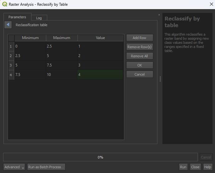
4. Save the Permanent layer as FireRiskMap_Reclassified and Run the tool. Range boundaries can stay on min < value <= max.
Note: look closely at the options, you can easily select the wrong one by not picking the one with "<=" instead of just "<", this does matter.
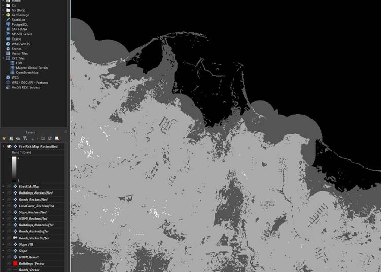
Now we have the Fire Risk Map with 4 categories, ranging from low to high risk. This is already a lot easier to read, but we can use a vector layer if we ever want to use it in the future, as you can overlay it on maps or insert more data than just the risk values. For this module, however, we will just make the vector layer.
Grid Map
We are going to make a grid and use the values from the FireRiskMap_Reclassified to create a grid risk map.
1. Go to the Processing Toolbox and search for Create grid under Vector creation. Double click to open the tool.
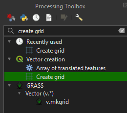
2. In the Create grid tool, set the Grid type to Rectangle (Polygon).
3. Click the arrow next to the Grid extend > Calculate from Layer > Area.
4. Set Horizontal and Vertical spacing on 1000 meters. We will get 1x1 kilometer sized grids, which fit well with our fairly small study area. The study area in the example is about 20x20 kilometers.
Note: Make really sure that the spacing is set on 1000 meters. If you run it when still set on 1 meter, it can crash your device.
5. Make sure the Grid CRS is set on EPSG: 32752.
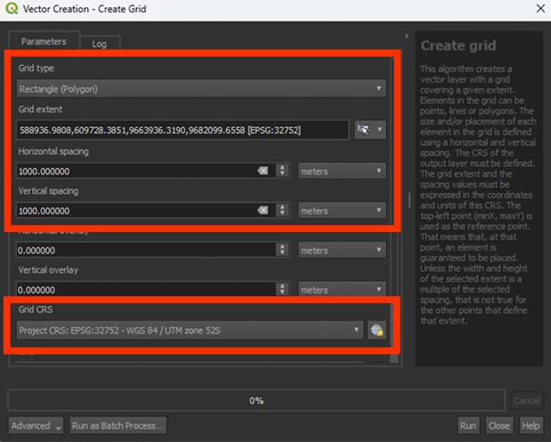
6. Run the tool. You don’t have to save a Permanent layer.
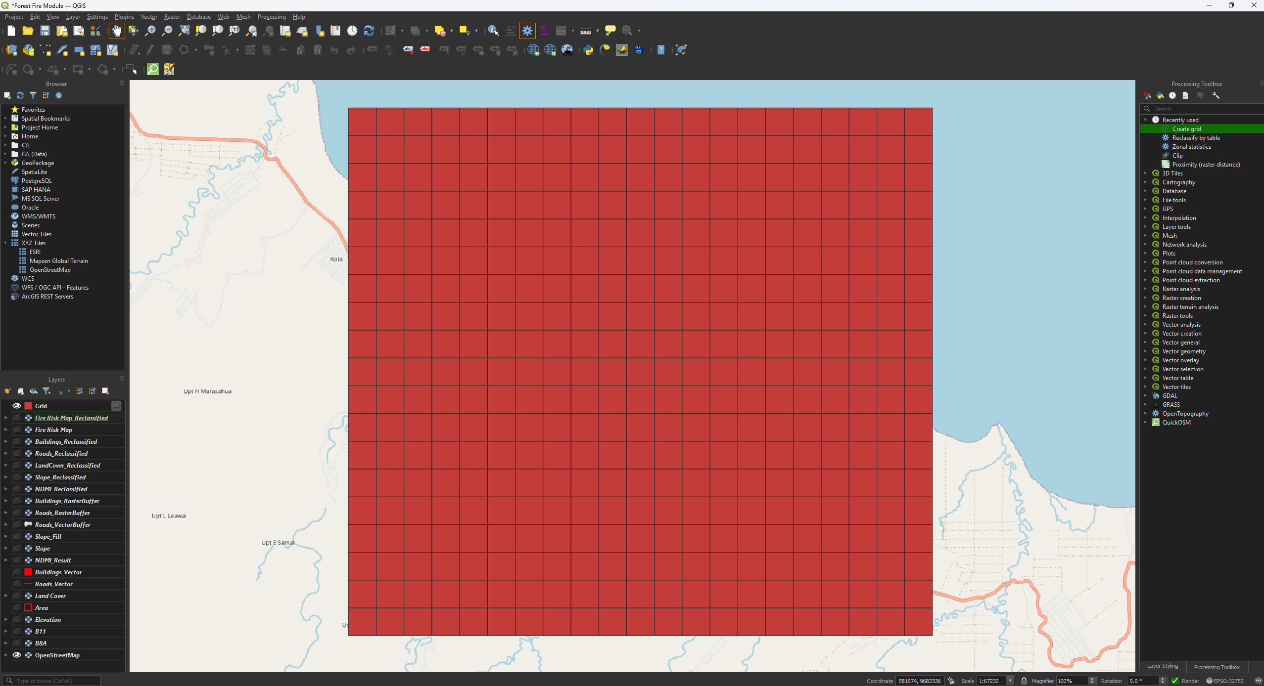
Now we have a nice grid, but it is larger than our study area. Let’s Clip the grid to the correct size.
7. Open the Clip tool, but this time the vector version. We are clipping a polygon, so use the Clip tool under Vector overlay. Make sure the Input layer is set on Grid.
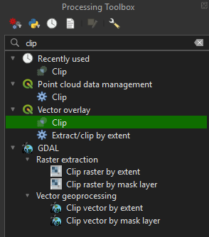
8. Set the Overlay layer on Area.
9. Run the tool. You don’t have to save a Permanent layer.
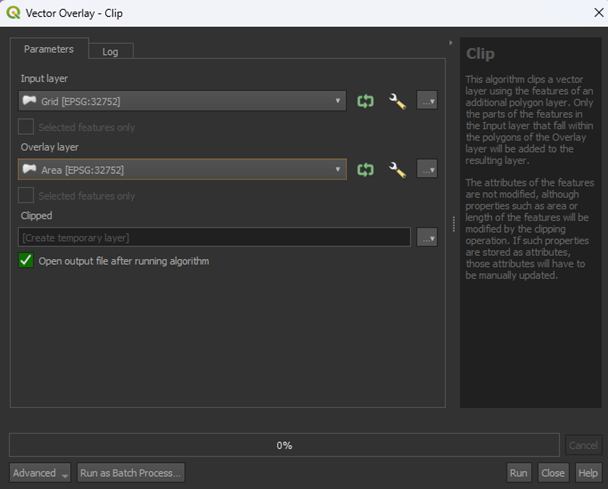
We now have a Clipped layer that is the same size as our study area.
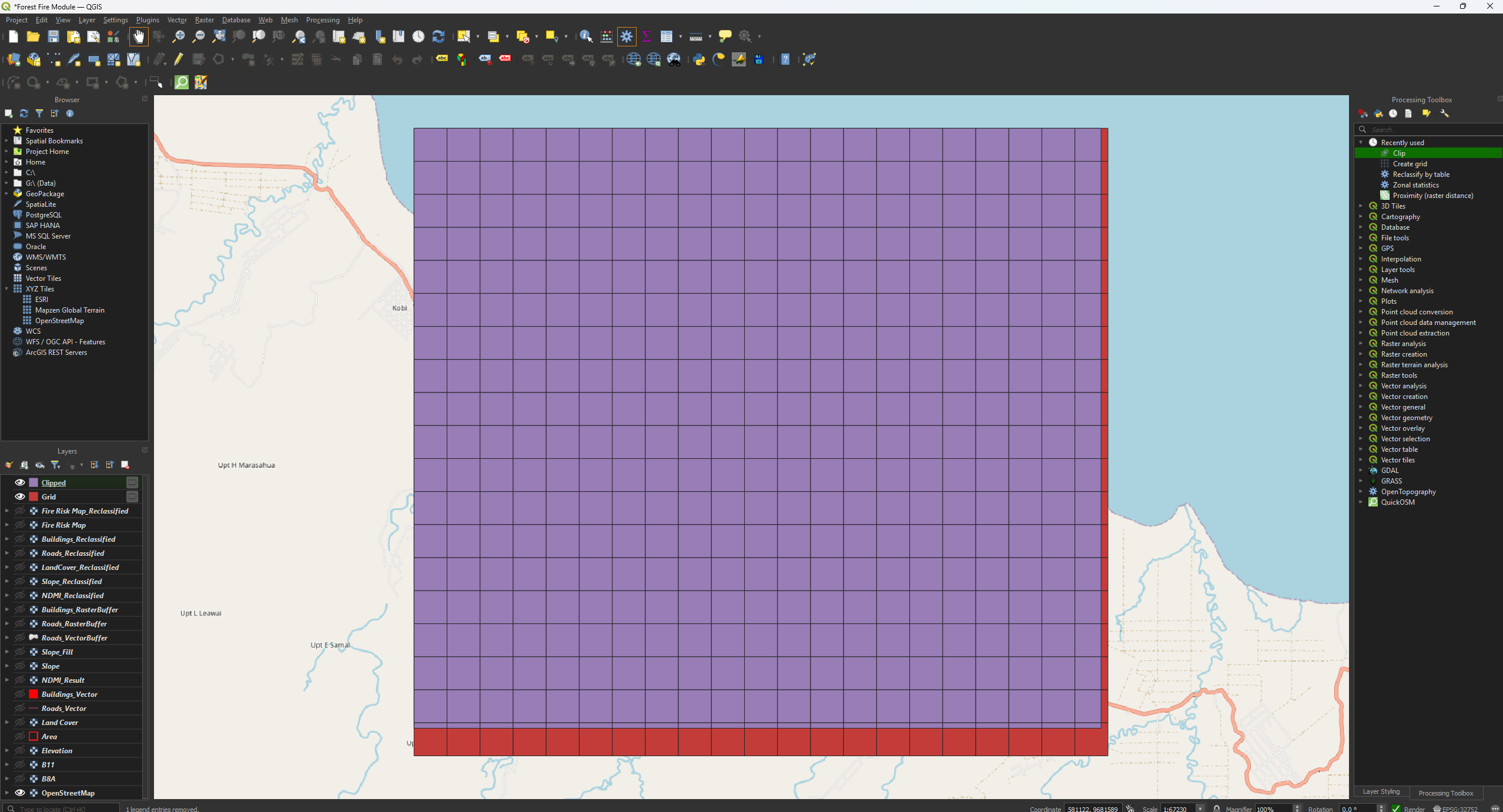
Let’s put the risk categories into the grid we’ve just made.
10. Go to the Processing Toolbox and search for Zonal statistics under Raster analysis. Double click to open the tool.
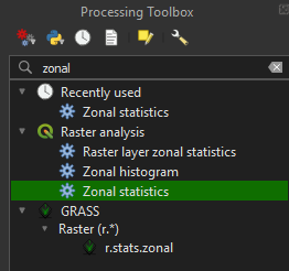
11. Make sure the Clipped layer is used as the input.
12. Make sure that the Fire Risk Map_Reclassified is used as the Raster layer.
13. Then, click on the ‘…’ button next to Statistic to calculate.
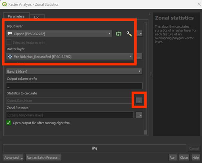
Here is the list of how the tool will calculate the values of the Fire Risk Map in the grid. Because we only have a value from 1 to 4, we will use Maximum. This will take the maximum value found from the Fire Risk Map in a grid cell and give the cell that value.
14. Select Maximum and press OK. You can leave the others on selected if they were already.
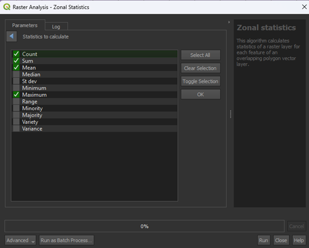
15. Save the Permanent layer as FireRiskGrid (a SHP file) and Run the tool.
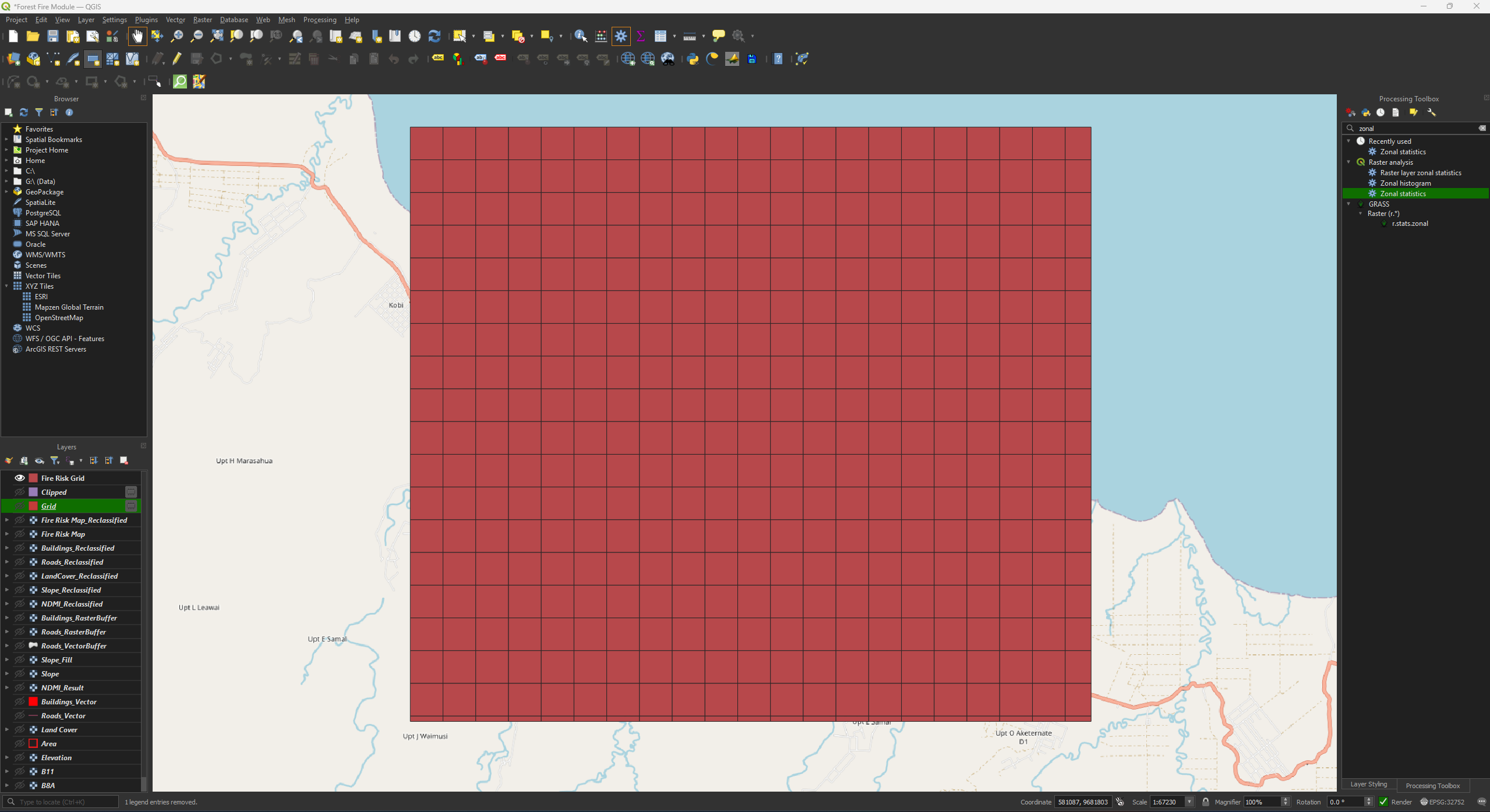
The Fire Risk Grid still has one colour. We need to adjust the symbology to get the final result. You can delete the temporary Grid and Clipped layers.
Final Symbology
We have 4 values, 1 to 4. 1 is low risk and 4 is high risk. Let’s colour them accordingly.
1. Go to the Layer Styling panel and set the Render type to Categorized.
2. Set the Value on _max. You may have to scroll down.
3. Set the Color ramp on Reds.
4. Press the Classify button.
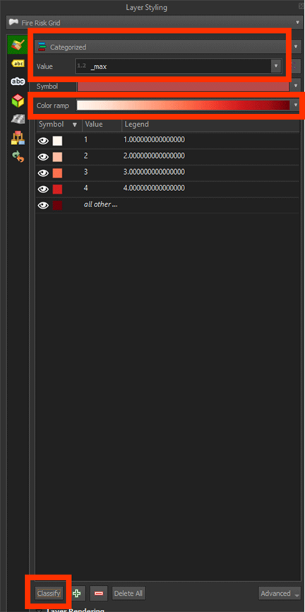
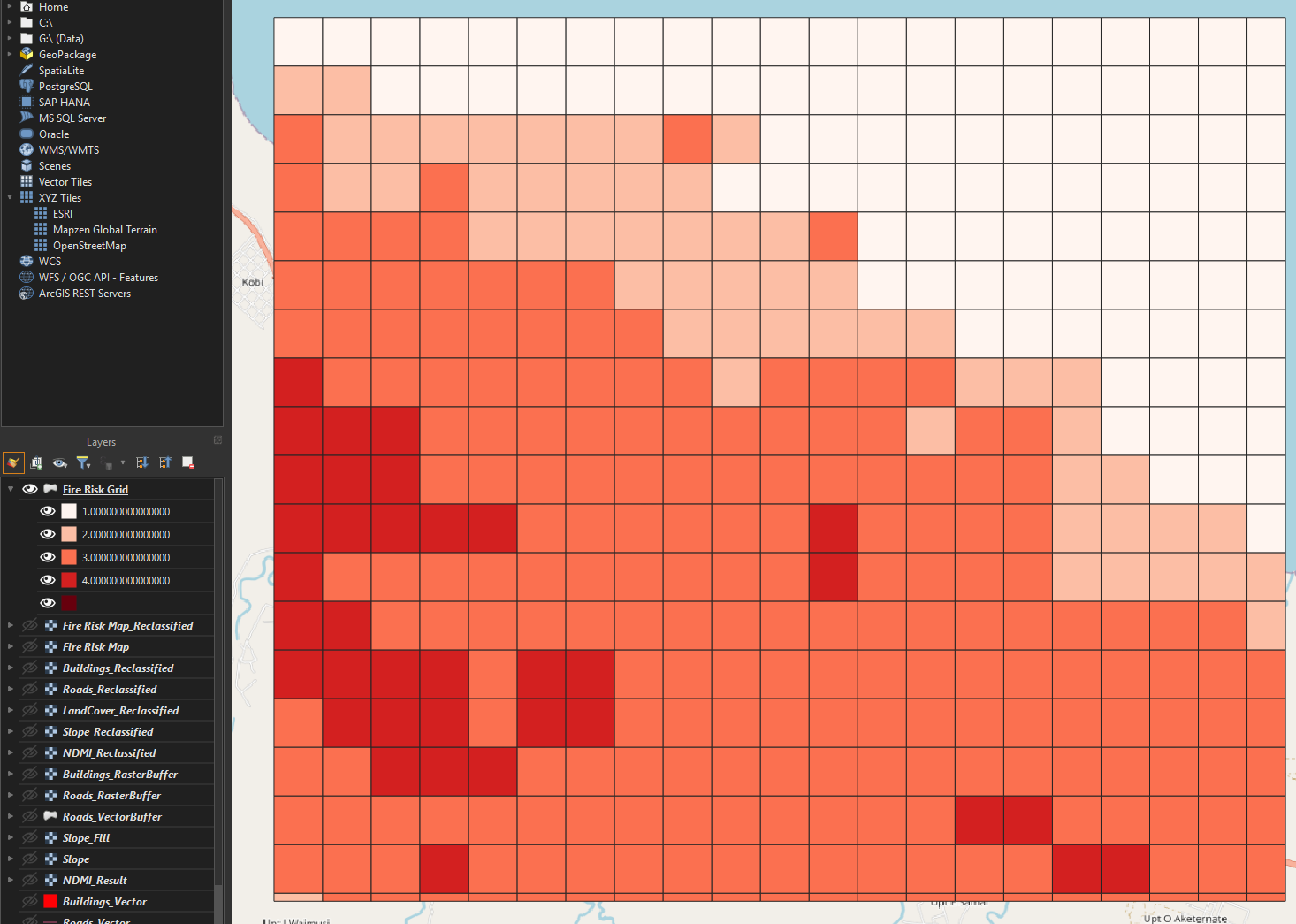
Now we have a grid with the categories. We can see that the biggest risk zones are found on the bottom left of our map. This map can show us what areas would have priority to look into for mitigating forest fires.
To make it a bit easier to see what the grid cells overlap, we can make the layer transparent.
5. Right click on the Fire Risk Grid layer and go to Properties. Then go to the Symbology tab.
6. Open the Layer Rendering tab and set the Opacity on 50%.
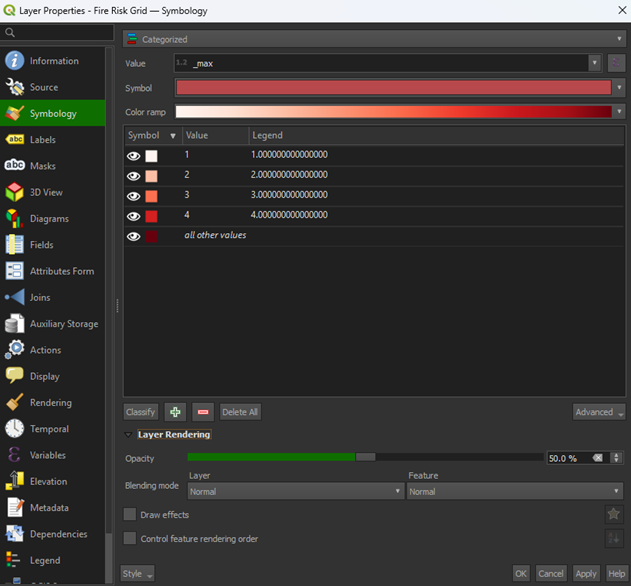
7. Press Apply and then OK to close the window.
If you have other layers open, hide them by pressing the Eye icons and only have the Fire Risk Grid and OpenStreetMap layers open. Now we can see the basemap under our risk map. You could overlay this map over other data too and use it for future analyses.
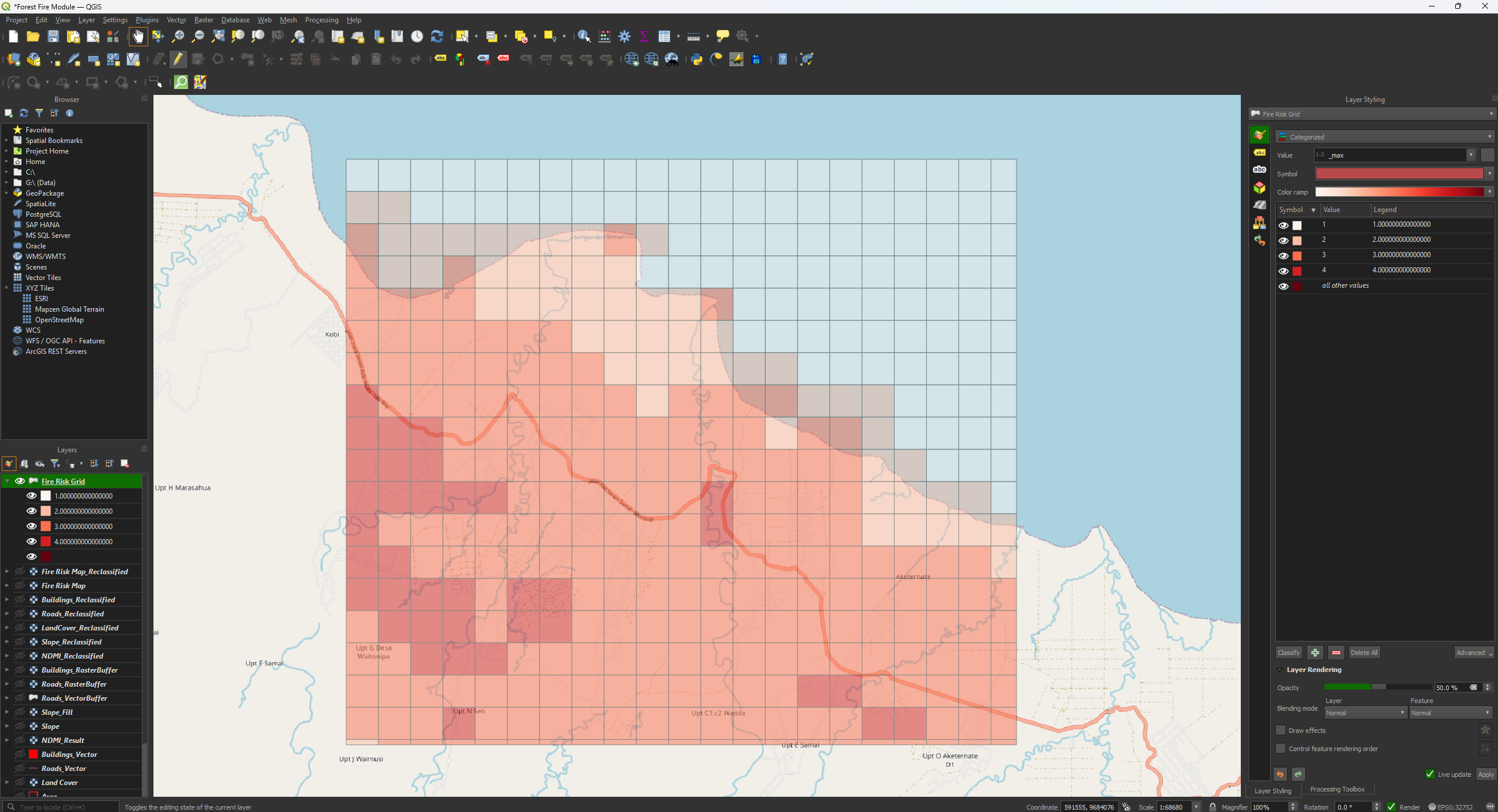
You have now finished the Fire Risk Map. Make sure that you have saved the project before closing QGIS. If you want more practice with the tools and QGIS, take a look at the Extra Assignment which you can find after this chapter.
5. Extra Assignment
In the Extra Assignment you can repeat the steps you have done during this module to practice more with QGIS and all the tools. We used a location in Indonesia earlier, but we are going to a different country for this chapter, Australia.
Australia is known for bush and forest fires, so it is an interesting study area to look at. While you could pick any part of the country, we are going to focus on the Blue Mountains. This is a National Park near Sydney, New South Wales, and has had some big fires in the past. Much like our previous study area, this includes forest, built-up area, water, and agriculture. We will use similar types of data, but now of the Blue Mountains, which means we have to go back and download some new data.
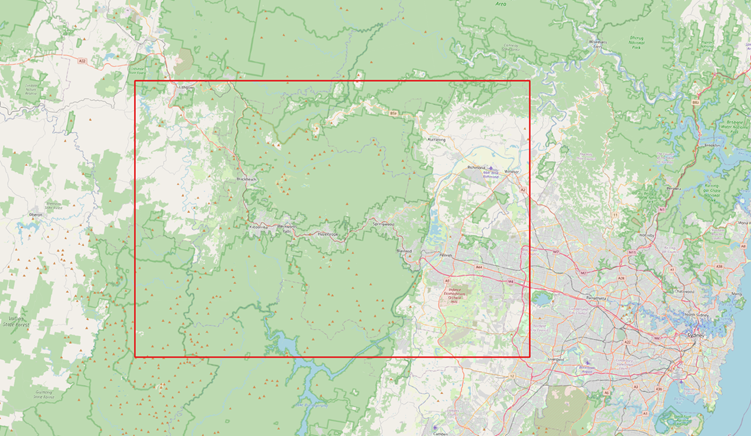
The Extra Assignment will explain what you need to do and what data you need, but performing the data preparation and analyses is up to you. Of course, you can always use the main module as a reference if you don’t know how to proceed. Below is also a flowchart of all the steps and tools you'll have to use. If you are unable to download data for whatever reason, you can download all the data here and click on Download Folder.

5.1. What You Need to Know
Below there is some information about everything you need to know before you start the Extra Assignment. Make sure you read everything. Most of the steps are the same, but there are some things to keep in mind to get to the correct result. Good luck!
Tip: At the top of the Processing Toolbox, there is a History icon. This lets you see all the analyses you have performed. You can double click on an analysis/tool and it will have saved all the settings. This is helpful if you have to redo some steps. Make sure that you set the correct layer as the input and save the layer with the correct name, as to not accidentally overwrite a different layer.
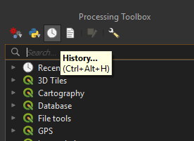
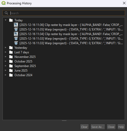
Project and Coordinate System
After starting a new project, you can use these coordinates to find the location: -33.74889,150.59333. Paste these coordinates in the search bar below the Layers panel.
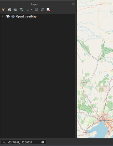
Before you start on the analysis, you have to choose the correct coordinate system. We can’t use the same one we used for the main module. As we are in Australia, New South Wales specifically, we can use GDA2020 / NSW Lambert EPSG: 8058. Make sure you import the OpenStreetMap basemap under XYZ Tiles first, otherwise the CRS may revert back, and you have to apply it again. Every time you have to set the CRS anywhere, you’ll use EPSG: 8058. The resolution will still be the same at 30m.
Satellite imagery
Like the main module, you can get the satellite imagery from the download folder. However, if you want, you can try to download the data yourself. In 6.1. Satellite Imagery, the process of downloading satellite imagery is explained. Do make sure you download the images from the correct location, which is Sydney, New South Wales, Australia. We will still use Sentinel-2 and the B8A and B11 layers. We want to look at the fire season of Australia, which for the Sydney area falls somewhere between October to February. Try to find something around December or January to be sure. Set the Time Range from 2024-10-01 to 2025-02-28. Make sure there is no cloud cover on the area you want to use.
Depending on the data you’ve downloaded, you may have to combine images using the Merge tool. This works the same way as you have done with the Land Cover layer in the main module.
DEM
Make sure you use the correct CRS for all the layers. For the Elevation download, you don’t have to get a new API key, you can always use the same one. The download may be a bit wonky and not fitting your study area. If that happens, you can use the Clip raster by mask layer tool to clip it nicely into your study area.
Land Cover
You may have to use the Merge tool if you have data that doesn’t fully cover your study area. It’s the same process as you did for the Land Cover layer in the main module. You can also download the data yourself by going to 6.2. Land Cover.
Roads and Buildings
Depending on the size of your study area, there could some data missing of the OSM data, mainly the buildings. If you have a large study area, the download can take a while.
When working with larger OSM layers, you might run into some issues when you are saving the layer. To circumvent this, skip saving the layer when using the Reproject and Dissolve tool and use a Temporary layer instead. When you created the Temporary Dissolve layer, right click on the layer > Export > Save Feature As… and save it as a Shapefile (SHP). Then under Select fields to export and their export options, press the Deselect All button. This will remove all the features from the layer (we don’t need them for the analysis).
This should save the layer correctly. If you are still running into issues, you can download the layers here.
NDMI
Calculating the NDMI is the same process as the main module.
Slope
Unless you have a part of the ocean in your study area, you don’t have use the Fill no data tool for this analysis.
Distance to Built-Up Area
As we have discussed in the main module, creating using the Multi-ring buffer can be very heavy. If you have a large study area, consider using the other method with the Proximity tool for creating a buffer. For the buildings, it’s recommended to use the Proximity tool as well.
Weighted Overlay Analysis
As we are using this Extra Assignment as practice, we aren’t going to delve into choosing the correct values for our Weighted Overlay Analysis. You can use the same scores as we used in the main module. There are some things to keep in mind, however:
Slope
The results of the Slope analysis are probably a bit steeper than in the main module. If your slope degrees go above 30, you’ll need to set a limit. Above 60 degrees, the slopes become too steep, so we can value these areas as a score of 0.
The bottom 2 rows in your table should look like this:
|
Minimum |
Maximum |
Value |
|
30 |
60 |
10 |
|
60 |
9999 |
0 |
Land Cover
There is a good chance that some land cover types aren’t found in your study area, like mangroves. The data will still contain naming for mangroves, but no pixel is coloured that way. This is the same as how we didn’t have any snow and ice in our main module study area. You can keep the scores the same as the main module, as mangroves shouldn’t appear anyway, it won’t affect the results.
Calculate Map
You can use the same formula as the main module.
The final result should look something like this:
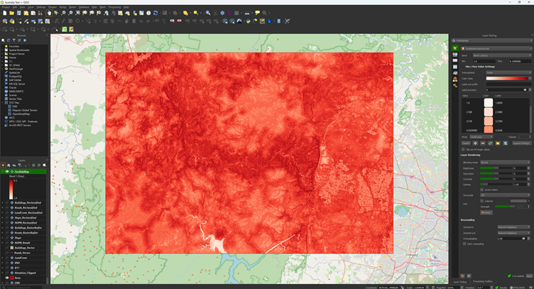
Risk Map Visualisation
The final result of the grid should look something like this:
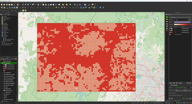
This is a pretty large area, so you can adjust the Reclassify. Just for trying something different, you can give the Fire Risk Map a classification of 1 – 10 instead of 1 – 4.
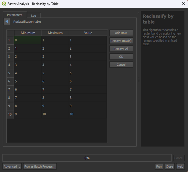
That results into this:
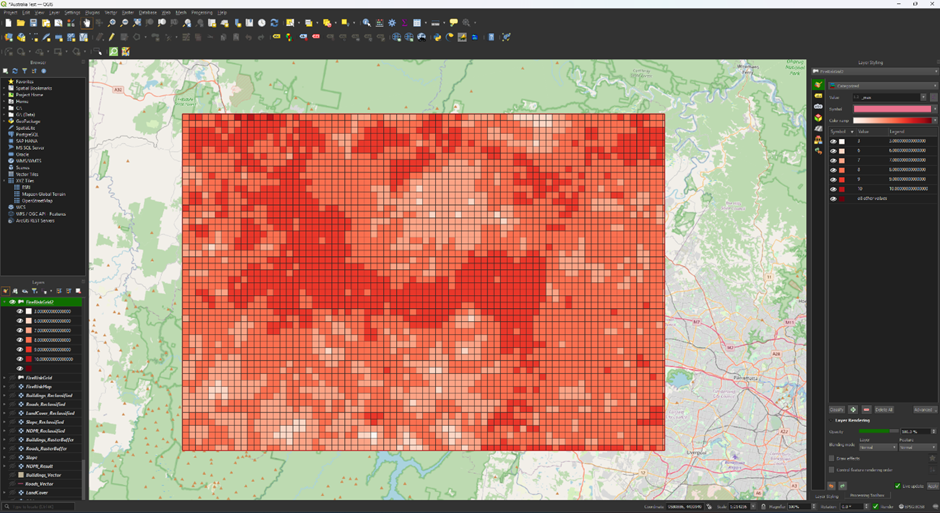
This isn’t a very good classification, but it shows that you can change what the classification is depending on what you want to show. For this data, a risk level from 1 to 4 may not be detailed enough, while it worked for the main module.
6. Download Your Own Data
In this chapter we will delve into how to download data yourself. Downloading data is an important part of GIS analyses, but it can be quite complicated. The main module focuses on doing the analysis in QGIS, so the data is provided. If you want to learn to download your own data, you can follow the steps in this chapter.
6.1. Satellite Imagery
To calculate the NDMI, we need to download satellite imagery. To get these images, we will make use of the Copernicus Browser. For the NDMI, we need two layers, B8A and B11. These layers created by the Sentinel-2 satellite’s sensors. In the Copernicus Browser it is possible to search for all the images that are captured by the satellite and download all the layers that is provided.
Copernicus Browser
Create a Copernicus Browser account. As you will encounter many times while looking for data, you need to create an account to use the Copernicus Browser. This website lets us access the Sentinel imagery and download it for our needs.
1. First go to the Copernicus Browser website: https://dataspace.copernicus.eu/browser/
2. Click on the log in button. You don’t have an account yet, so click on the register icon right of the login panel.

3. Fill in the necessary information on the register form and create a password. For the last three questions, you can fill in whatever applies to you, as it does not matter much. An example of what you could fill in is:

4. You can now click the register button and proceed.
You will automatically be sent to the following webpage that will ask you to verify your registration.

5. Go to the inbox of the email address you used during registration and click ‘verify email address’.
Note: If you cannot find the email in your inbox, try looking for it in the Spam folder.
You will be automatically sent back to the Copernicus Browser.
6. If the login was successful, you will see your name appear where the ‘login’ icon was previously.

You now have full access to the Copernicus Browser and can proceed with the rest of the steps.
Find Imagery
The Copernicus Browser lets us search for all kinds of satellite imagery. This can be quite overwhelming but once you get the hang of it, it isn’t too complicated. We want to find an image of the northern part of the Seram Island, preferably in the months from about June to October.
1. Search for Seram Island by navigating or searching via the Search Bar.

Now we have the correct location, we want to make sure we only get results for what we want.
2. Select Create an area of interest > Draw rectangular area. Draw a rectangle around the island.

Now we can start searching for an image. The main issue we have for Indonesia is the cloud coverage. The islands are covered by clouds most of the year, but we want to have as little cloud coverage as possible, otherwise we can’t see the surface.
3. Select SENTINEL-2. This is the satellite with the spectral bands we need to perform the NDMI analysis.
4. Select L2A. This gives us the imagery with atmospheric correction. The L2A images remove effects found in the atmosphere that may scatter or absorb light rays. As we want to see the reflections of the surface, we need to use the L2A images instead of L1C, which don’t correct the atmospheric effects.
5. Set the Cloud Coverage at about 30%.This will inlcude imagery with some cloud coverage, but as long as it doesn't cover our area of interest, it is fine.
6. Set the Time Range from 2025-06-01 to 2025-10-31.
7. Click on Search.
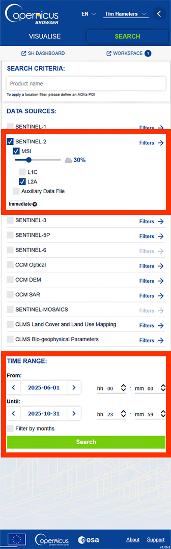
Note: Depending on how much data fits our filter, it can take a moment.
On the left panel, we get a list of all the images that fit our filter.
8. Click on a blue square covering the area of interest.

You get a pop-up with all the images that are available on this location. We want to look for the best image with the least cloud coverage.

9. Look for this image made on 2025-06-10 and click Visualise.
Note: If you can’t find the image, go back to the first Search tab by pressing the < Search button and paste this name into the SEARCH CRITERIA Product name: S2B_MSIL2A_20250610T014549_N0511_R074_T52MEB_20250610T031901.SAFE
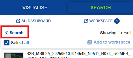
Make sure that the filters are turned off, otherwise the search won’t work. Then, press Search.
If you zoom in on the area of interest on the northern coast of the island, you can see that clouds are not covering it. For this analysis, we will use a fairly small area.
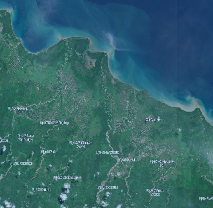
You may have lost the panel with all the images. Click on the Search button and find the image again using the same process.
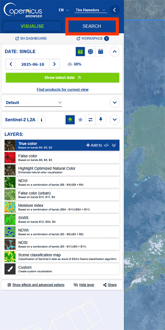
10. Find the image and press the download button.
Note: older data might take a few days to go online if you want to download it.
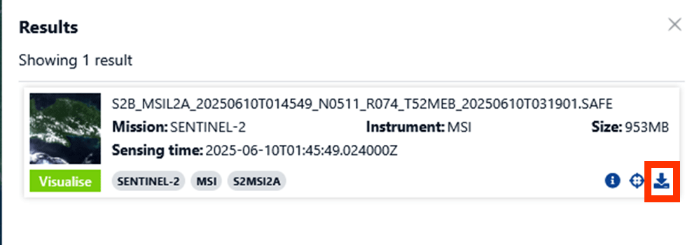
This may take a while, as files can be quite large. If you want to download only the necessary images, you can press the Info button next to the dowload button and go to Download single files. Go to GRANULE > IMG_DATA > R20m. Download the two bands that include B8A and B11 in the name. If you want, you can also download the bands from the R10m and R60m folders. The numbers represent the resolution. R20m has a raster of pixels of 20 by 20 meters.
Note: R10m doesn’t include the B11 band and B8A is named B08. B08 slightly differs in result from B8A as well.

Open the Folders
1. When the data is downloaded, unzip the ZIP-file and save it on an easy to find location.
2. You can find the files we are going to use under GRANULE > IMG_DATA > R20m. Look for the two bands that include B8A and B11 in the name.

3. Select the 2 images and drag them into QGIS. They now should show up in you Layers panel.

4. If the map stays zoomed out, you can right click on the layer and press Zoom to Layer(s).

6.2. Land Cover
With a land cover map we can see all the land types in our study area, like forests, built-up area, and agricultural land. This can provide us with more data than is possible to gather from a satellite image. To download a land cover map, we will use ESA World Cover.
Go to the website with this link: https://viewer.esa-worldcover.org/worldcover/?language=en&bbox=128.07272069321286,-3.9330011740705544,131.25679476439183,-2.3446455990049913&overlay=false&bgLayer=OSM&date=2025-11-21&layer=WORLDCOVER_2021_MAP
Download Data
Downloading land cover data is quite simple. Look up Seram Island and have the area of interest in your viewport. Make sure you have enough data, as we cut out what we don’t need later.
1. Before we can download our data, you need to log in. You can use your Copernicus account to log-in as well.

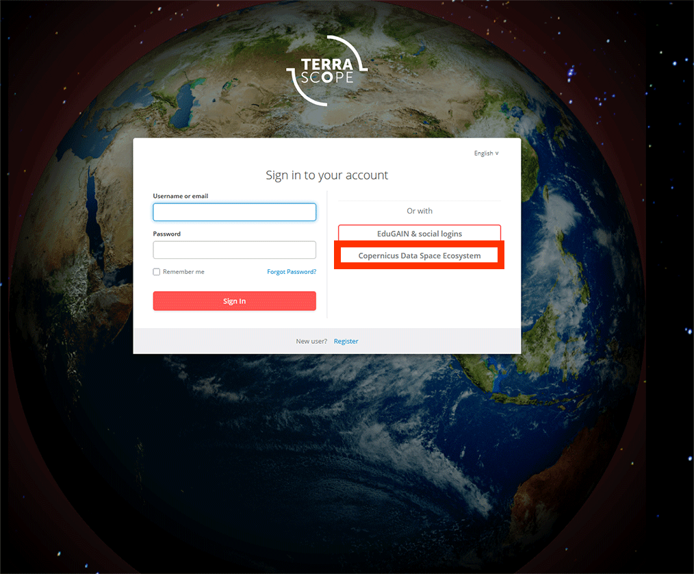
2. On the left, make sure you have WorldCover Version 2 selected. This is the most recent data available.

3. Click on the Download tab. You should see these two layers in the results if you have Seram Island in your viewport. Select ESA_WorldCover_10m_2021_v200_S06E129 and ESA_WorldCover_10m_2021_v200_S03E129 and press Next.

4. On the next page, press Download. The data will be downloaded into a ZIP-file. Extract them to an easy to find location.
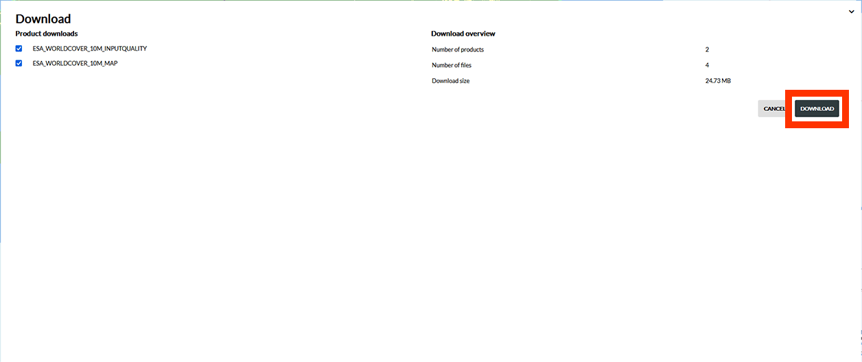
5. Open the folder and drag the ESA_WorldCover_10m_2021_v200_S03E129_Map.tif and ESA_WorldCover_10m_2021_v200_S06E129_Map.tif layers into QGIS (coloured images).

6. Finally, we need a QML-file to add the correct symbology later. You can find the QML-file if you click on the Information icon on the WorldCover website or by using this link: https://esa-worldcover.org/en/data-access. Scroll all the way down and click on the first QGIS link under Symbology