Preprocessing a DEM and calculate flow direction
| Site: | OpenCourseWare for GIS |
| Course: | Hydrological Analysis in QGIS - FOSS4GE 2026 |
| Book: | Preprocessing a DEM and calculate flow direction |
| Printed by: | Guest user |
| Date: | Thursday, 2 July 2026, 11:09 PM |
1. Introduction
In this first tutorial, you’ll take your initial steps into preparing a Digital Elevation Model (DEM) for hydrological analysis. Before we can delineate streams or define catchments, the terrain data needs to be cleaned, structured, and transformed into layers that reveal how water would naturally move across the landscape.
By the end of this tutorial, you will be able to:
• create meaningful subsets of larger raster datasets
• identify and fill sinks in a DEM to ensure continuous flow
• calculate flow direction and apply clear, informative styling to the resulting raster
These foundational steps form the essential base for the stream and catchment delineation workflows you’ll explore in the following tutorials.
This tutorial is based on a session in the QGIS Masterclass that is available as an on-demand course at the Australian Water School. Until 3 July 2026 you can get a discount of 20% with code AWS-FOSS-20.
2. Starting our project
Let's first start QGIS and add the provided data.
1. Start QGIS 3.44 Desktop with an empty project.
2. Go to the Browser panel and find the folder where you have stored the course data
3. Right-click on the folder name and choose Add as a Favorite from the context menu.
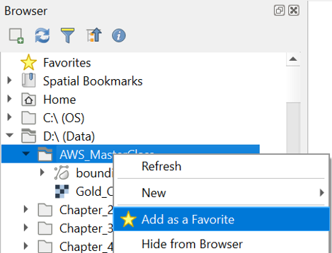
Now you have a nice shortcut to the folder.
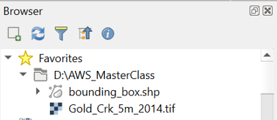
4. Go to the top of the Browser panel and find the course files under Favorites.
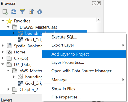
5. Add both layers (bounding_box.shp and Gold_Crk_5m_2014.tif) to the map canvas by clicking right on the layer name and choosing Add Layer to Project from the context menu. Alternatively, you can drag and drop the layers in the map canvas.
Now both layers are in the Layers panel, and you can see them in the map canvas.
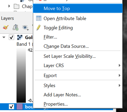
6. Make sure that the bounding_box layer is above the Gold_Crk_5m_2014 layer. You can click right on the layer and choose Move to Top from the context menu if needed.
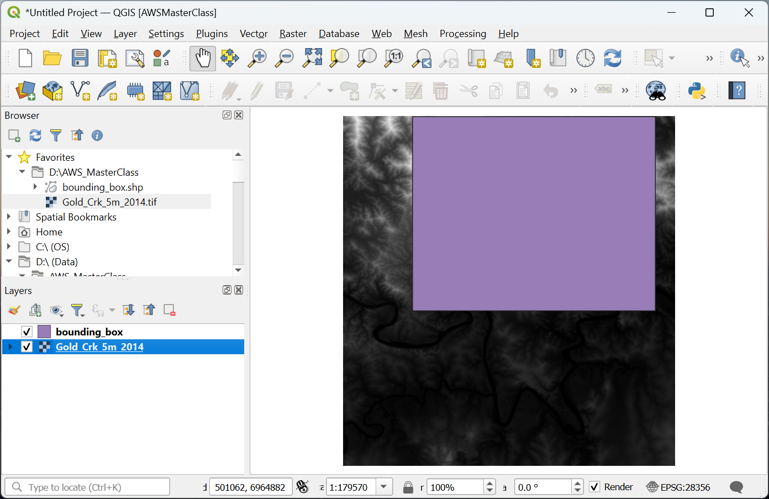
Note that in the lower right of the QGIS window you can see the projection (Coordinate Reference System – CRS) of your project, which, in this case, is the same as the projection of your layers.
7. Click on the EPSG: 28356 in the lower right of the window and check which projection is used.
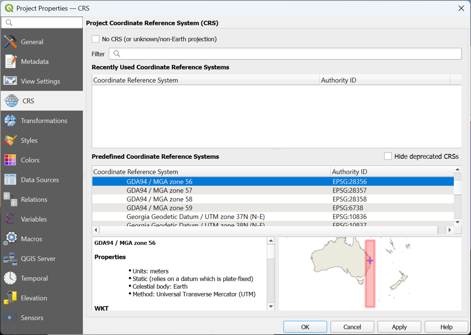
For this project we'll use the GDA94 / MGA zone 56 projection. For DEM analysis it is important to use projection, you can't use a Geographic Coordinate System, such as WGS-84, because the units of the x and y coordinate will be different from the z values.
8. Close the Project Properties – CRS dialog by clicking Cancel.
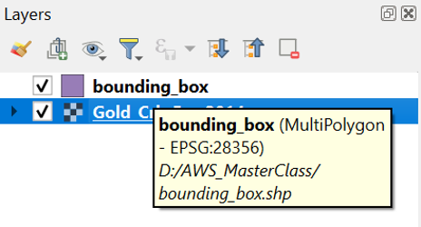
9. Hover your mouse of the layers in the Layers panel. This will show the CRS of the layer and where the layer is stored.
To have a bit more reference where the area is located, we can add OpenStreetMap.
10. In the Browser panel, expand the XYZ Tiles folder and add OpenStreetMap to the project.
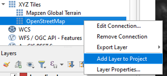
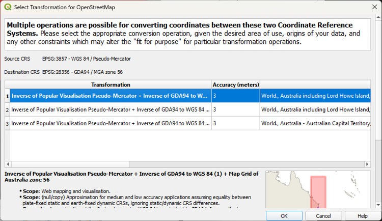
A popup will appear to choose the transformation for the on-the-fly reprojection of the OpenStreetMap layer (EPSG: 3857) to the projection of our project (EPSG: 28356).
11. Click OK to accept the default transformation.
For more background layers, you could also use the NextGIS QuickMapServices plugin or the MapTiler plugin.
12. Rearrange your layers in the Layers panel, so that from top to bottom you have bounding_box, Gold_Crk_5m_2014 and OpenStreetMap.
Before we continue, we'll save the project. It's important to regularly save your project.
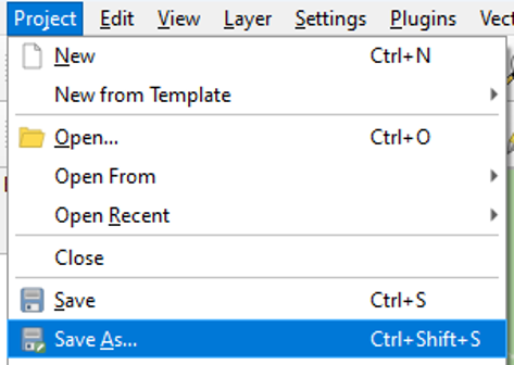
13. From the main menu choose Project | Save As.... Browse to the folder where you store the data and choose a file name, e.g., GoldCreek.qgz.
Next, we'll clip the DEM to our study area.
3. Create a Subset of the DEM
To reduce the calculation time of the algorithms, we will subset (or clip) the raster layer to the bounding_box polygon.
Note that in a real case you don't have a bounding box, but you need to use your expert hydrological knowledge to estimate what the extent of your catchment is. In that case you can choose Raster | Extraction | Clip Raster by Extent from the main menu. Then you can drag a box in the Map Canvas and use that for clipping. While using that, make sure your on-the-fly reprojection is similar to the layer that you want to clip, because the map canvas coordinates are used by the algorithm.
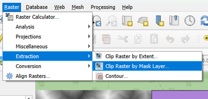
1. From the main menu select Raster | Extraction | Clip Raster by Mask Layer.
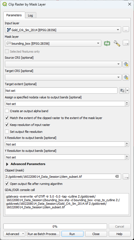
2. In the Clip Raster by Mask Layer dialog, choose Gold_Crk_5m_2014 for the Input layer. For Mask Layer, choose bounding_box. Check the box to Keep resolution of input raster and keep the defaults for the other options. Choose dem_subset for the Clipped (mask) output and click Run. Click Close when done.
Always use the Browse button
in dialogs to choose the output file name. Temporary layers can cause errors and you’ll lose the layer after a crash. It’s also a good way to trace back steps after you made a mistake.
3. Now you can remove Gold_Crk_5m_2014 from the Layers panel: right-click on the layer name and select Remove Layer... from the context menu.
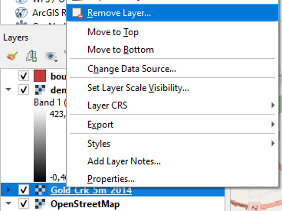
We remove layers that we don't use in the next steps to avoid that we use the wrong layer in our calculations. Removing layers from the Layers panel does not mean that the layer is deleted. In the Browser panel you can still find the layer in the folder.
Next, we'll style the DEM and generate elevation contours.
4. Styling the DEM and Generating Contours
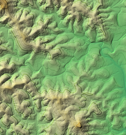
Let’s style dem_subset, so we can better interpret the study area. We’ll create an appealing visualisation of the DEM with a colour hillshade and elevation contours.
4.1. Style the DEM with a colour ramp
The DEM is a continuous raster. Continuous rasters represent gradients and can therefore contain real numbers (or floating point). Continuous rasters are styled in QGIS using ramps in the Singleband pseudocolor dialog.
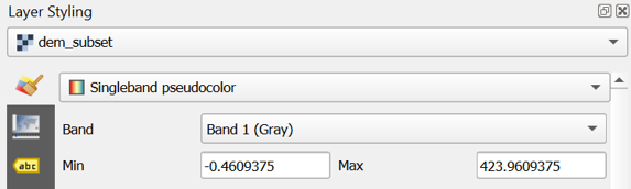
1. In the Layers panel, select dem_subset and click  to open the Layer Styling panel (or press F7).
2. In the Layer Styling panel choose Singleband pseudocolor from the drop-down list.
3. Right-click on the color ramp and choose Create New Color Ramp.
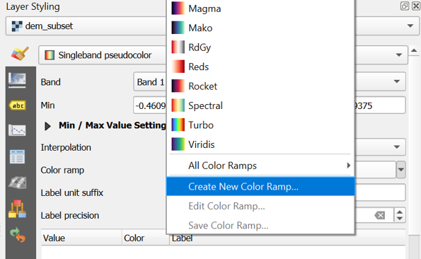
4. In the popup Color ramp type dialog choose Catalog: cpt-city from the drop-down list.
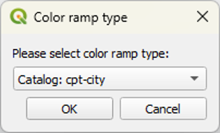
The cpt-city catalog has a lot of useful preset colour ramps.
5. Choose a color ramp from the Topography section. Note that cd-a and sd-a are nice choices. cd-a will be used for the remainder of this exercise.
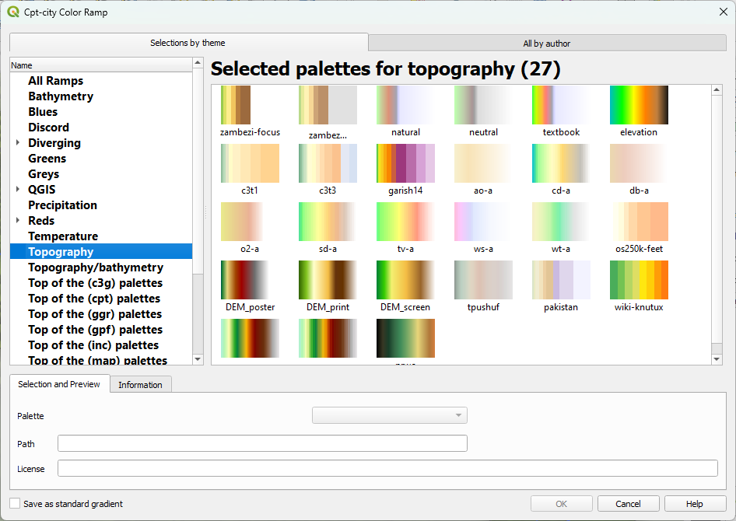
6. Click OK to close the dialog.
7. Back in the Layers panel, click Classify to apply the colour ramp.
This gives you more intuitive colors for the DEM so you can intuitively distinguish higher and lower areas.
Next, we'll render the DEM as hillshade.
4.2. Render the DEM as Hillshade
Now you will further improve the visualization by rendering the DEM as a hillshade raster.
1. Right-click on the dem_subset layer and select Duplicate Layer from the context menu.
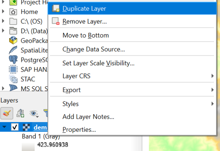
This creates a copy of the dem_subset layer called dem_subset copy.
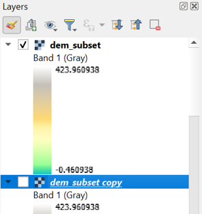
2. Rename the dem_subset copy layer to hillshade. You can do this by clicking right on the layer name and choosing Rename Layer from the context menu.
3. Move the hillshade layer so that it lies above the dem_subset layer in the Layers panel and make sure it’s visible and selected.
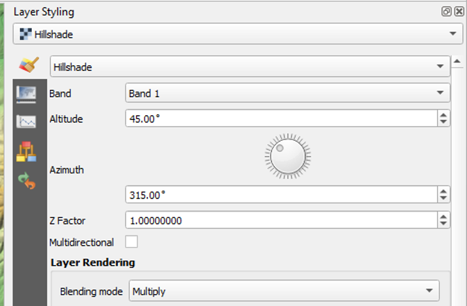
4. In the Layer Styling panel, which should still be open, make sure that the hillshade layer is now selected. In the drop-down list change Singleband pseudocolor to Hillshade.
Now the hillshade layer is visualized with a shading. Which direction is the illumination coming from? Is this possible in reality?
Hillshade gives the best results with an artificial illumination in the northwest, which in reality cannot exist in the Northern Hemisphere. If you move the dial in the Layer Styling panel to the southwest, you will see an inverted relief.
5. Zoom in on the map canvas so we can see the hillshades in more detail.
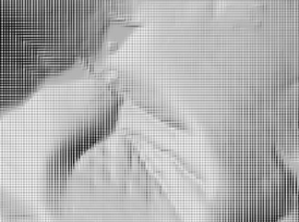
You’ll see a blocky pattern. This is because the default resampling method for both Zoomed in and Zoomed out is Nearest Neighbor. This method is fine for categorical data. However, elevation is considered continuous data.
6. In the Resampling section of the Layer Styling panel choose a Zoomed in resampling method of Bilinear. For Zoomed out you can choose the same. You can also check the box for Early resampling.
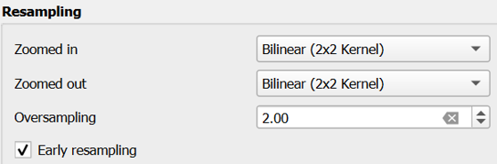
You can now see the smoothing effect in the map canvas.
In the next section, we're going to blend the DEM colours with the hillshade.
4.3. Blend DEM Colours with Hillshade
Next, you will blend the DEM with the hillshade layer.
1. In the Layer Styling panel make sure the hillshade layer is selected. In the Layer Rendering block of the panel, change the Blending mode to Multiply.
As you can see, blending gives a much nicer effect than transparency. With transparency the colours will fade. Now we can clearly see the elevation differences: the gradient from south to north and the valleys where we expect the streams.
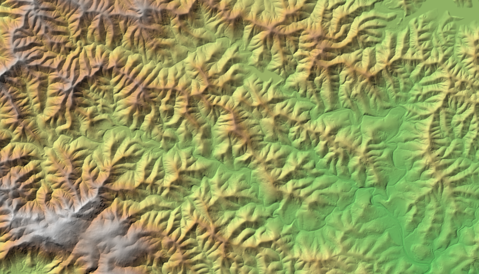
Blending modes allow for more elegant rendering between GIS layers. They can be much more powerful than simply adjusting layer Opacity. Blending modes allow for effects where the full intensity of an underlying layer is still visible through the layer above. There are 13 blending modes available. See the QGIS Documentation for more information.
In the next section, we'll add elevation contours.
4.4. Generating Contours
You can also render elevation data as contours.
1. Duplicate the hillshade layer and turn it on. Name this layer contours and drag it to the top of the Layers panel.
2. Make this contours layer the target in the Layer Styling panel.
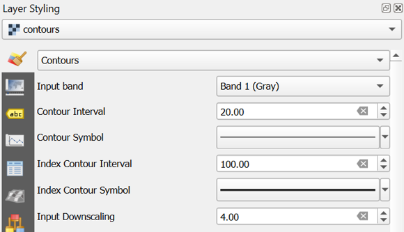
3. Switch the renderer from Hillshade to Contours.
4. Set the Contour Interval to 20.
5. Set the Index Contour Interval to 100.
6. Click the Index Contour Symbol.
7. Select Simple Line.
8. Increase the Stroke width to 0.66.
You can also apply a Blending mode to this contour renderer.
Since you duplicated the hillshade layer it inherited the Blending mode setting of Multiply.
First see how the contours look with no blending.
9. Set the Blending mode to Normal.
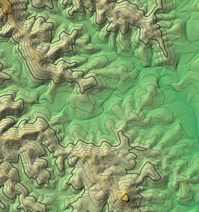
10. Now change it to Overlay.

Feel free to experiment with others to see how they change the appearance.
Finally, it will be easy to keep these layers together in a group that we can easily switch on or off.
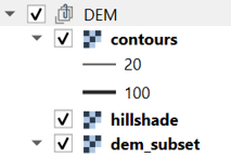
11. Select contours, hillshade and dem_subset in the Layers panel and click right. Choose Group Selected from the context menu.
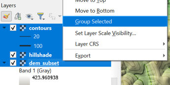
12. Name the group DEM.
Now we're going to prepare the DEM for hydrological analysis.
5. Fill Sinks and Calculate Flow Directions
Raw, unprocessed DEMs have artifacts such as depressions. Artifacts are a result of the DEM acquisition process and must be removed before a DEM can be used for hydrological analysis, like catchment and stream delineation or hydrological modelling. There are several algorithms for filling sinks. Here, we’ll use the core QGIS functionality for filling sinks and calculating flow directions with the Wang & Liu algorithm.
5.1. Fill Sinks (Wang & Liu)
Since QGIS 3.44, a native tool for Fill Sinks with the Wang & Liu algorithm is available in the Processing Toolbox. The implementation is the same tool that was originally provided by SAGA.
1. In the main toolbar, click ![]() to open the Processing Toolbox panel.
to open the Processing Toolbox panel.
2. Go to Raster terrain analysis | Fill sinks (Wang & Liu).
3. In the dialog, make sure the Input layer is dem_subset, change the Minimum slope (degrees) to 0.01, because the default value generally doesn’t give good results. For this exercise, we’re only interested in the flow direction, therefore uncheck Open output file after running algorithm for the filled DEM and watershed basins. Name the Output layer (flow directions) flow_direction_saga.tif.
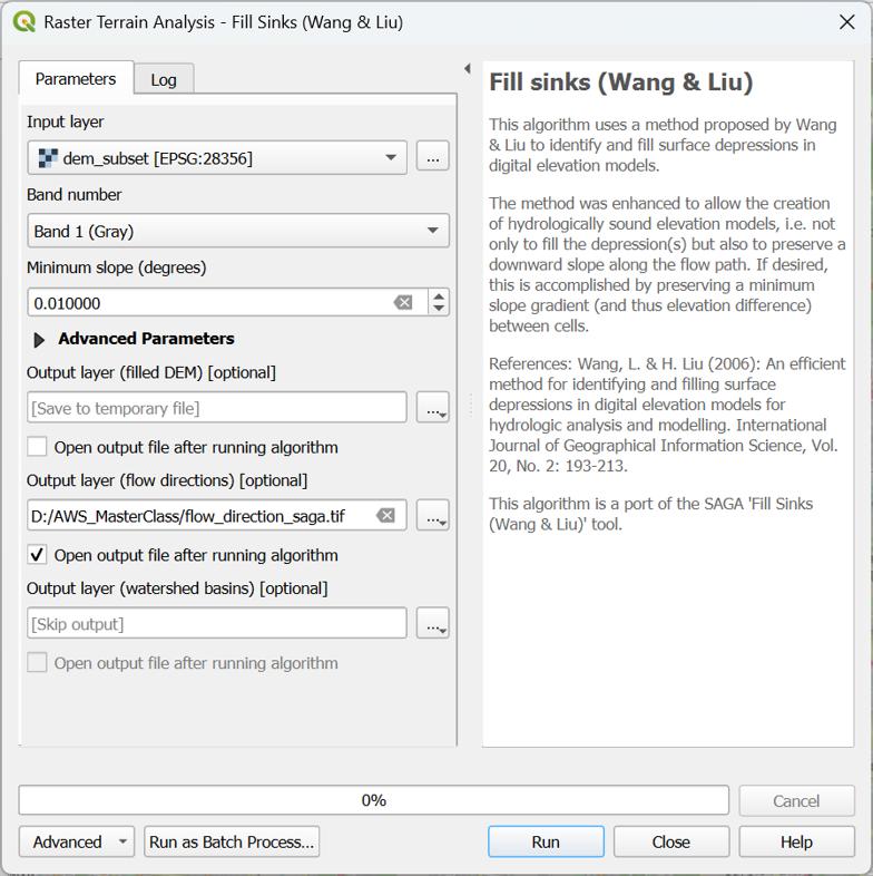
4. If your dialog looks like the screenshot, click Run. After processing click Close to close the dialog.
5. Drag the flow_direction_saga layer to the top of the Layers panel.
Next, we'll style the flow directions with arrows.
5.2. Styling the Flow Direction Layer using Arrows
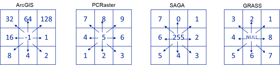
A flow direction layer indicates the direction of flow for each pixel. Direction can be expressed as compass direction, however we cannot store text in a raster. Compass direction can also be expressed by degrees on a circle where north is 0 degrees, east is 90 degrees, etc. To store 360 degrees, we would need more than 8 bits (0-255), which would increase the file size. In addition, the D8 method uses discrete directions to the surrounding pixels. Therefore, GIS software recodes the 8 directions. Each software, however, does it in their own way:
We can styling the flow_direction_saga layer by adding arrows. This can be done using the mesh styling functionality of QGIS. To use that functionality, we need to convert the GeoTIFF to mesh format. We can do that with the Crayfish plugin.
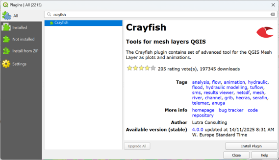
1. Install the Crayfish plugin from the Plugins Manager in the main menu.
2. In the Processing Toolbox, go to Crayfish | Conversions | SAGA Flow to GRIB.
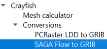
3. In the SAGA Flow to GRIB dialog, choose flow_direction_saga as Input raster and flowdirmesh_saga.grb as Output file (GRIB).
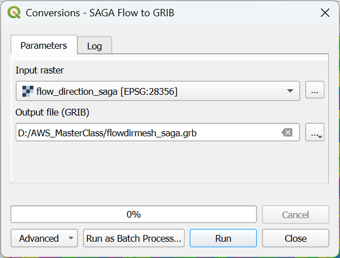
4. Click Run and Close to close the dialog.
5. In the Browser panel, expand the flowdirmesh_saga.grb group (you might need to refresh the Browser panel with the ![]() button) and add the flowdirmesh_saga layer with the mesh icon
button) and add the flowdirmesh_saga layer with the mesh icon ![]() to the map canvas.
to the map canvas.
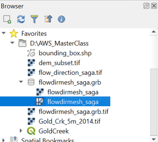
This might take some time. If the file is too large for your computer’s memory, you can get errors. In that case, you can clip the flow_direction_saga layer to a smaller area and repeat the steps to convert the file to the mesh format.
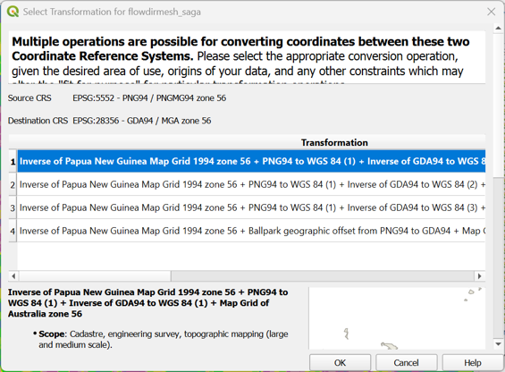
6. If the transformation popup appears, accept the default by clicking OK. Note that the mesh for some reason has a different CRS.
When the map canvas shows a completely yellow layer, the flowdirmesh_saga layer has been loaded and we can start styling it.
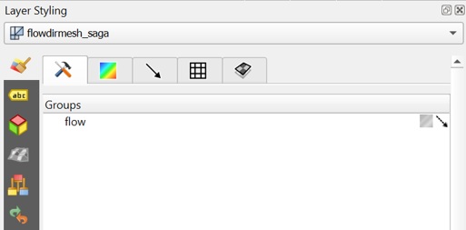
7. Select the flowdirmesh_saga layer in the Layers panel and open the Layer Styling panel.
8. In the Layer Styling panel, stay on the Datasets tab ![]() and click on
and click on ![]() to disable contours and click on the arrow
to disable contours and click on the arrow ![]() to enable vectors. You probably need to make the Layer styling panel larger to see all icons.
to enable vectors. You probably need to make the Layer styling panel larger to see all icons.
Now so many arrows are drawn in the map canvas that it turns black. Let’s tune the settings to improve this.
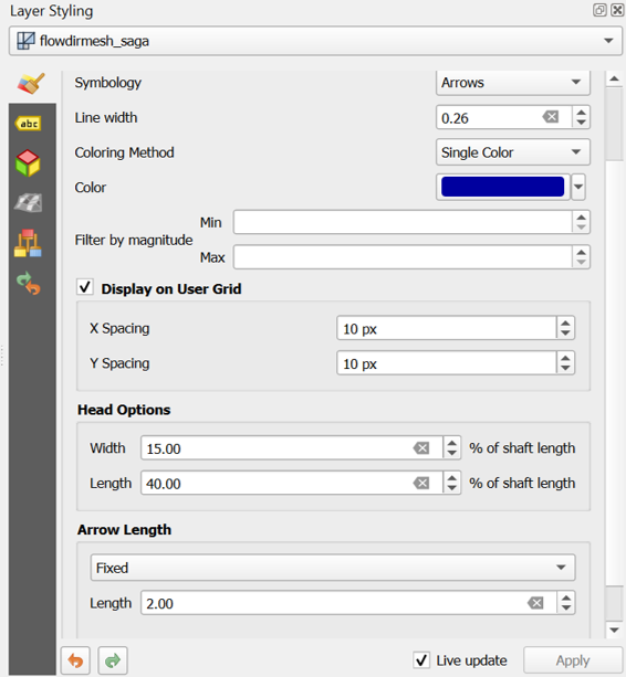
9. Go to the Vectors tab ![]() and change the Arrow Length settings at the bottom of the panel to Fixed and the Length to 2.00. Change the Color to dark blue.
and change the Arrow Length settings at the bottom of the panel to Fixed and the Length to 2.00. Change the Color to dark blue.
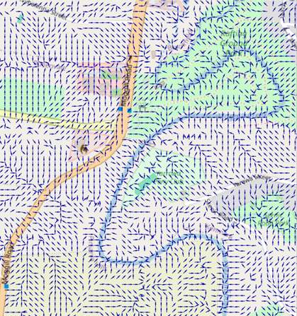
10. Zoom in to see the flow direction with arrows.
11. Check the box to Display on User Grid to show the arrows fixed to a grid, e.g. with an X and Y Spacing of 10 px.
The settings are depending on your zoom level. Play with the settings to get a nice result. You can also try the other Symbology settings for visualization as Streamlines and Traces. Don’t forget to regularly save your project.
The arrows are much more intuitive than a coloured flow direction raster. You can plot the arrows over any layer in the map canvas.
Next, we'll visualise the flow directions in the 3D View.
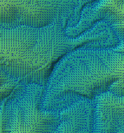
5.3. Visualize Flow Direction in 3D
We can also visualize the flow direction using the QGIS 3D Map View.
The 3D Map View will show everything from your 2D map canvas in 3D.
Here we would like to see the arrows over the OpenStreetMap layer.
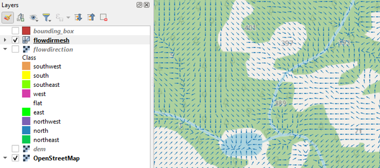
1. Make sure that in the map canvas you show the arrows above the OpenStreetMap layer. You can hide the other layers.
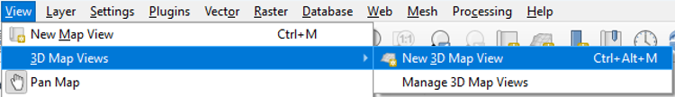
2. In the main menu, choose View | 3D Map Views | New 3D Map View.
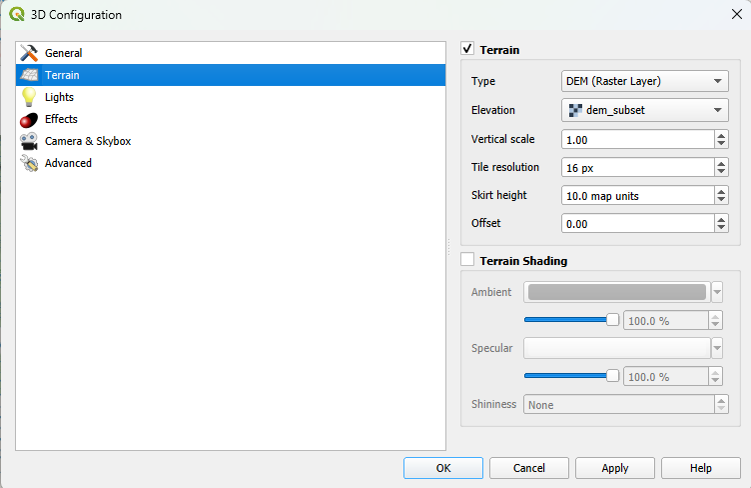
3. In the 3D Map view, click the Configure ![]() button.
button.
4. In the 3D Configuration dialog, stay in the Terrain tab and change the Type to DEM (Raster Layer) and choose dem_subset as Elevation. Click OK to apply the settings and return to the 3D Map view.
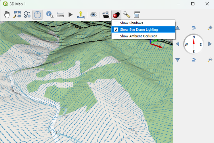
The 3D view will now start rendering.
Try to navigate the scene with the different mouse buttons and the compass. You can change the Vertical scale, Tile resolution and Skirt height in the 3D Configuration to improve the visualization. You can also Show Eye Dome Lighting.
6. Conclusion
In this tutorial, you have learned to use native QGIS tools to style a digital elevation model, render contour lines and to calculate and visualise flow direction in 2D and 3D.
This video shows the procedure: