Tutorial Zonal Statistics and Area Computations
6. Area computations with discrete rasters
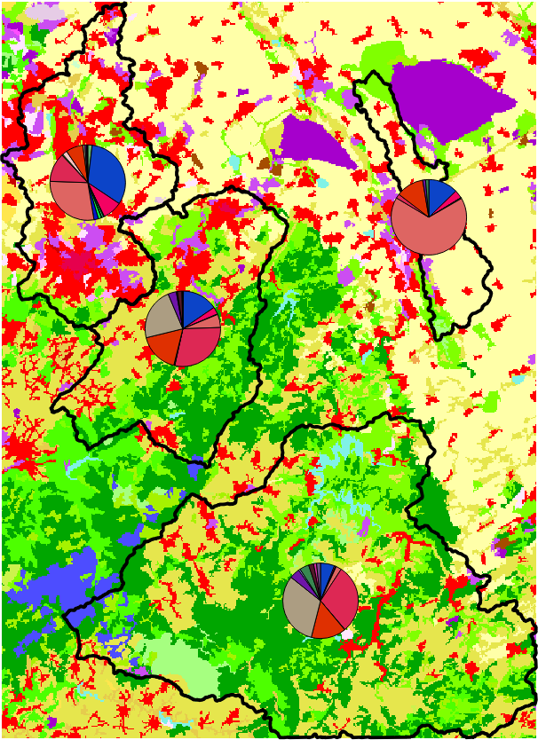
6.3. Visualise with pie charts
A quick way to visualise the results of the previous subsection is to use diagrams.
1. In the Layers panel click right on the zonal_histogram layer and choose Properties...
2. In the Layer Properties window choose the Diagrams tab.
3. Choose Pie Chart from the drop down menu.
4. Select all HISTO fields and click  to add them to Assigned attributes.
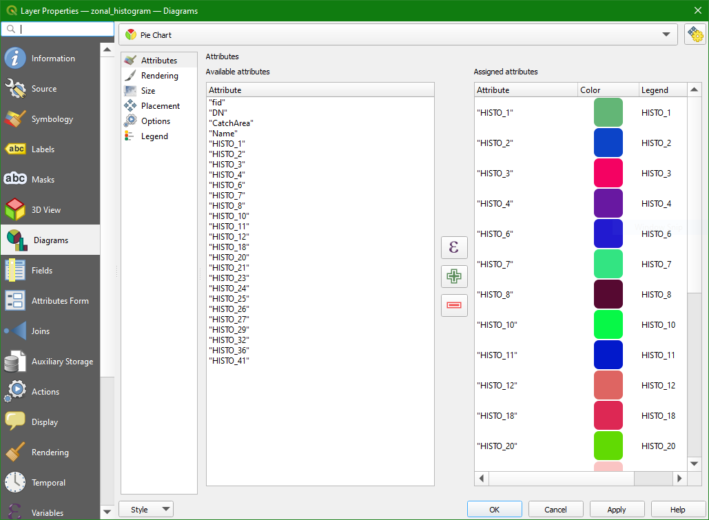
There you can change the colours and the text of the legend.
As you see we have a lot of classes. Here we are using CORINE Level 3 classes. In reality we might want to use the more aggregated Level 1 classes. In QGIS you can reclassify rasters with the Reclassify by table tool in the Processing Toolbox.
5. Click OK to see the result on the map
In the next chapter you'll learn another tool to calculate additional univariate statistics.