Symbolizing Points by Varying Size
4. Styling the Population of Cities
Time to show the cities nicely. Of course you are not familiar with this data, in real life you will probably know your data a bit better. But one tip we can give you here is that the population is an attribute for each city. You can find this in the field POP_MAX. It is the total number of inhabitants for the agglomeration, not just for the place of residence.
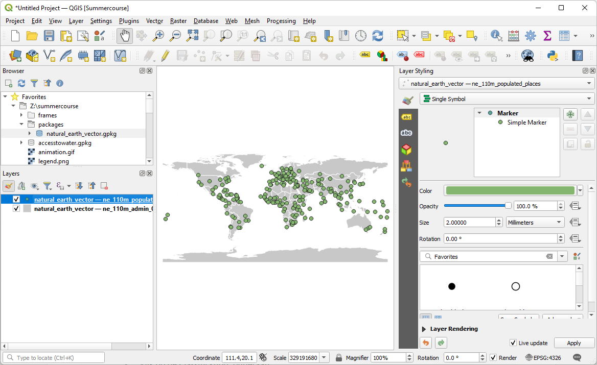
1. Switch on the point layer with the cities by checking the box before the layer in the Layers panel.
2. Make sure this layer is the target in the Layers Styling panel.
We don't want to show the cities all with the same symbol. We want them to be represented with different sized circles, which symbolize the number of inhabitants. Let's set that up now.
3. In the Layer Styling panel use the drop-down menu to change the Single Symbol renderer to the Graduated renderer.
4. Choose the POP_MAX field for Value.
5. Change the Method from Color to Size.
6. Click Classify.
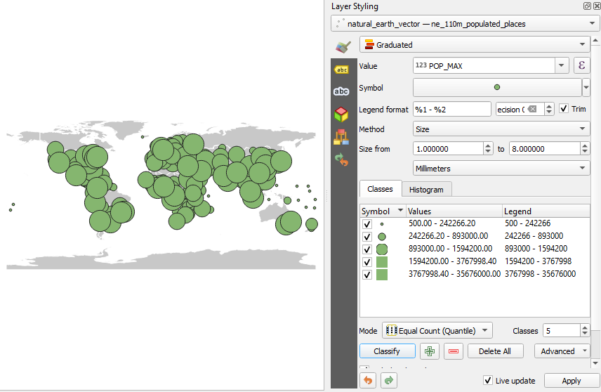
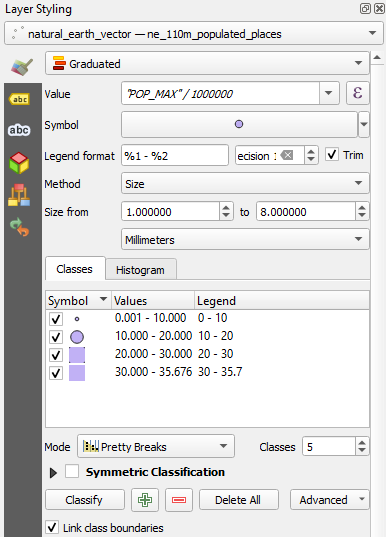
You will now see a first map with circles showing the population. The legend is still quite illegible, because the number of inhabitants gives very large numbers! It is better to work with millions of inhabitants as a unit, instead of individual inhabitants. We're going to change that now.
7. In the Layer Styling panel click  next to Value POP_MAX to open the Expression Dialog.
8. Change the expression to:
"POP MAX" / 1000000
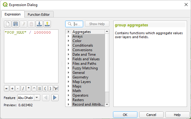
9. Click OK to close the dialog.
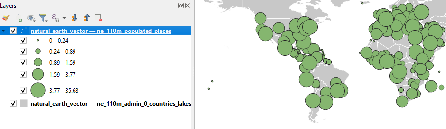
10. Click again on Classify to apply the calculation of the new values.
The legend is now much more readable.
The cities are still displayed with a random color, in this example green. You probably have a different color. That is not the desired color. We'll adjust that now.
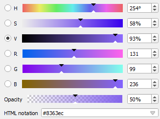
11. In the Layer Styling panel click on the point next to Symbol.
12. Click on the Color bar and change the color to RGB 131 | 99 | 236.
13. Set the Opacity (that's the inverse of transparency) to 50%.
14. Go back by clicking  two times.
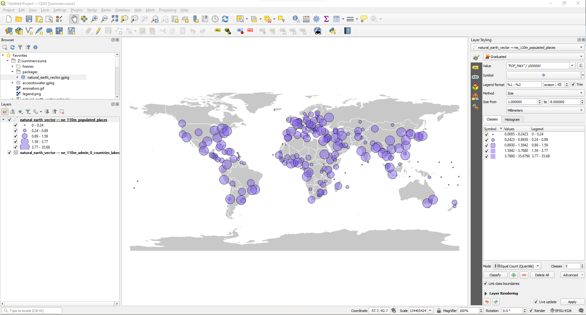
In the Layer Styling panel you can see that by default it creates five classes for the population in the cities and that it uses the Equal Count method or Quantile. Quantiles are a nice statistical principle to create classes with, but now you get very weird class boundaries. Although a little less attractive statistically, we are going to adjust the class boundaries so that the boundaries are more appealing for the user.
15. In the Layer Styling panel change the Mode from Equal Count (Quantile) to Pretty Breaks.
16. Next, uncheck the box for Trim and see what happens to the legend. Then switch it back on.
Most cities fall in the lowest class. For these circles the stroke is too thick in comparison with the surface area of the circle and their color is almost invisible. Therefore, we're going to remove the stroke specifically for the lowest class.
17. In the Layer Styling panel, double-click on the symbol of the lowest class to change the styling properties for this specific class.
18. Select the Simple Marker renderer.
19. Change Stroke style from Solid Line to No Pen.
20. Click to go back.
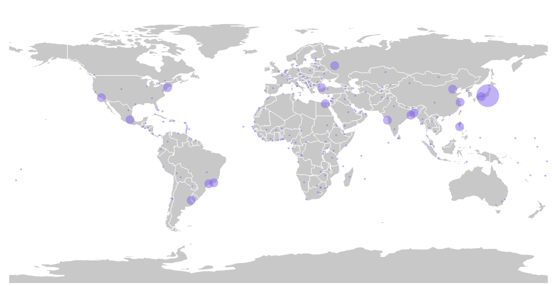
You just generalized the map. The map itself still shows all cities, but attention is now drawn to the large cities, which apparently have more emphasis than the small ones. This will help the reader to get a better sense of how the population is spread over the earth.
Maybe we can make the map even more dramatic and clearer by boosting the size of the circles a bit.
21. In the Layer Styling panel the Size is by default scaled between 1 and 8. Change this to a scaling from 1 to 12.
Play with bigger circles. The larger the circles, the more expressive. But at some point they overlap so much that it becomes too much. It is a personal assessment of what is correct in this case, there is no standard rule for that. Intuitively I would say that 1-12 gives a nice expressive map, without exaggerating.
In the next section we're going to add a background color for the oceans and change the projection.