Symbolizing Points by Varying Size
8. Improve the Legend
The legend is now displayed by means of four circles, one above the other. That takes up a relatively large amount of space. And is that really so beautiful? Can't we make those circles overlap?
And the answer is: yes you can! But not by default, not based on this symbolization. We need a data driven size symbolization. So we have to adjust the symbols, and then we can get the right legend on the layout. It's just a few steps, it's not much work. It's just a bit unexpected, it's not very obvious. Are you in?
1. Go back to the main QGIS window and save the project. Just in case...
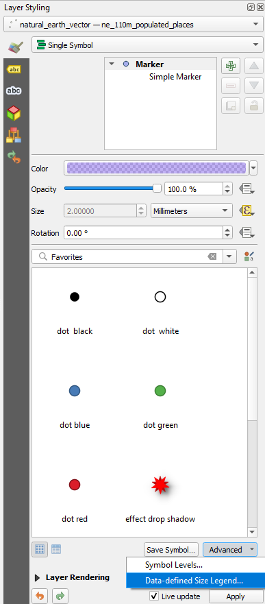
We're now going to change the Graduated point symbol back to Single Symbol.
2. In the Layer Styling panel make sure that the point layer with the cities is the target layer and change the renderer from Graduated to Single Symbol.
The first of the four symbols is now reused. It has the same color and is 50% transparent. But it's very small and without stroke.
3. Click on Simple Marker and change the Size to 2 mm.
4. Change the Stroke Style to Solid Line.
Now we're going to vary the Size with the population.
5. Click on the Data defined override button  next to Size.
6. Choose Assistant... from the drop-down menu.
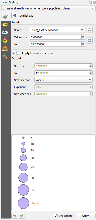
7. For Source create the expression
"POP_MAX" / 1000000
8. The values still go from 0 to 0. Click the refresh button  to calculate the correct range.
9. Change Size from to 0.5 and to 12 as we had before.
10. Choose for Scale method Radius.
11. Click  to go back.
12. Click on Marker and then on Advanced. Choose Data-defined Size Legend... from the dropdown menu.
13. Choose the option Collapsed legend.
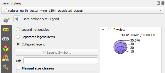
That already looks like something!
"POP_MAX"/ 1000000 is not very human readable.
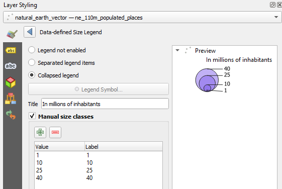
14. At Title write In millions of inhabitants.
Actually the legend is already quite nice, but we're going to improve it further.
15. Check the box before Manual size classes.
16. Click the  button and add 1 as class boundary. Repeat this for 10, 25 and 40.
17. Go back to the Print Layout. If you had closed the window you can find the Print Layouts of the project in the main menu under Project | Layouts.
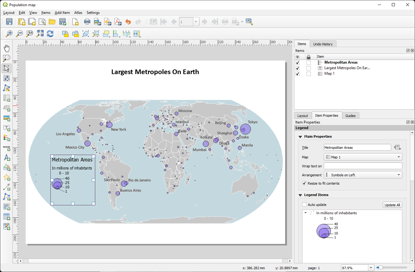
For some reason (bug?) the 0 - 10 class remains.
18. Remove the 0 - 10 class.
19. Add text with the data source and the author of the map.
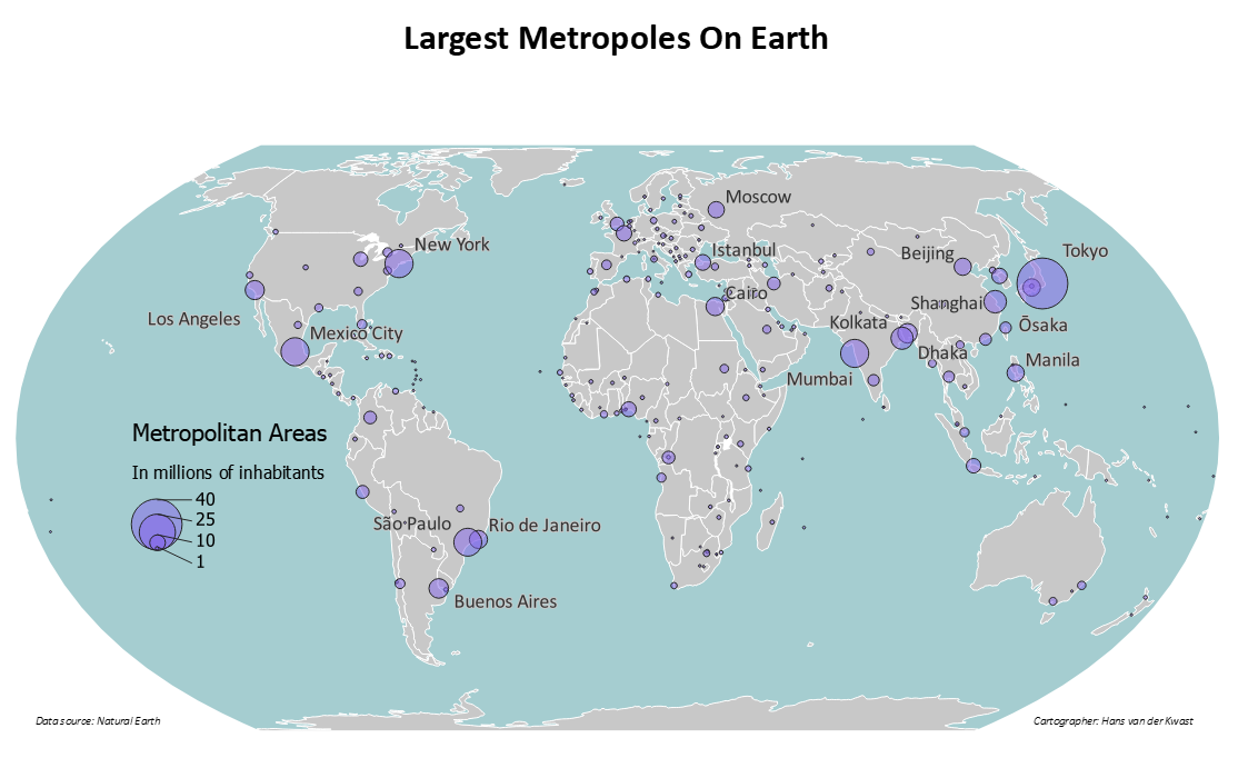
19. Export it to PDF by clicking  .
.
In the next section are some questions to reflect on the map.