Create a Heatmap
4. Styling Points with Different Renderers
Let's style the point with the water taps.
Make sure the points layer is on top in the Layers panel.
For some reason it shows the data with a categorized legend based on color. We just want to see all points in the same way. Let's try a few options.
1. Change the renderer from Categorized to Single Symbol.
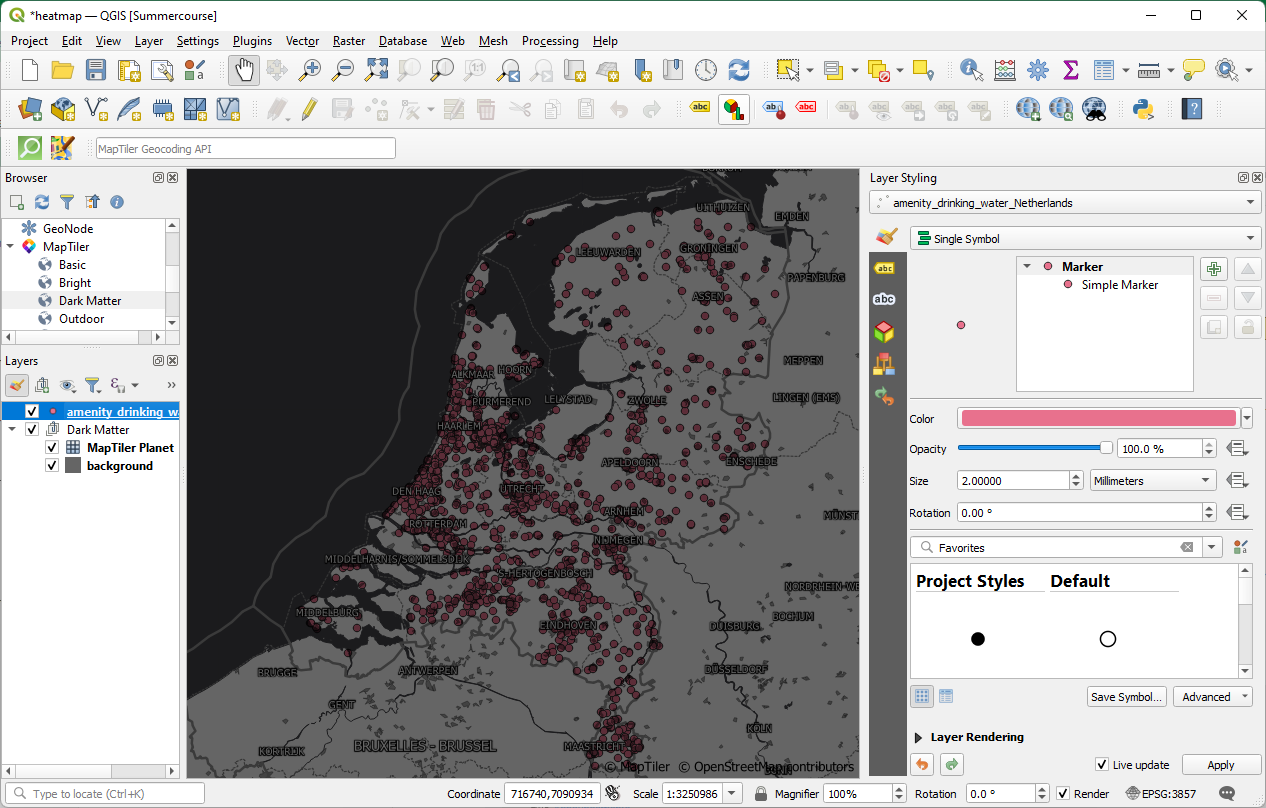
Now each point gets the same symbol. This looks a bit chaotic. We can see that some areas have many overlapping points.
2. Change the renderer to Point Displacement.
This renderer will visualize all features of a point layer, even if they overlap. To do this, the renderer takes the points falling in a given Distance tolerance from each other and places them around their barycenter following different Placement methods:
- Ring: places all the features on a circle whose radius depends on the number of features to display.
- Concentric rings: uses a set of concentric circles to show the features.
- Grid: generates a regular grid with a point symbol at each intersection.
3. Play with these settings. More info can be found in the QGIS Documentation.
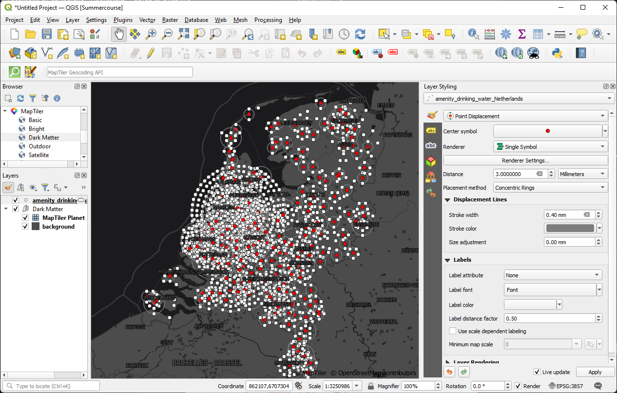
Although this looks arty, it's not really what we want. Let's try something else.
4. Now try the Point Cluster renderer.
This
renderer clusters points that are within a specified distance. Those
are are the red points. The white points are the original points that
don't form clusters.
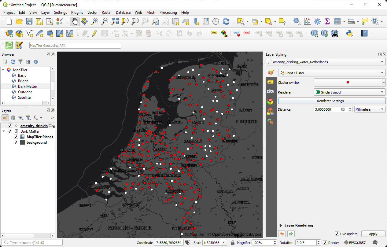
This
doesn't make the distribution clearer. We could add a Font Marker to
show the amount of points included in the red points, but that's also
not so clear.
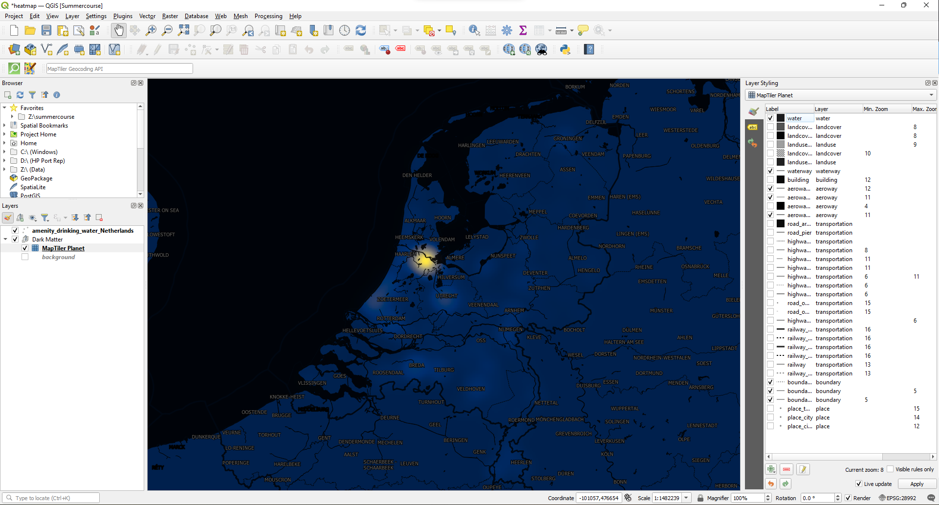
5. Now choose the Heatmap renderer.
We
need to tweak it a bit to look better and also see the backdrop, which
is now completely covered with by the ramp of the heatmap.
6. Change the Color ramp to Cividis, keep the rest as default.
7. Under the Layer Rendering section, change the Blending mode for the Layer to Multiply.
Because we use blending the gray background layer doesn't give nice results. We can change it to white or switch it off.
8. Hide the background layer by unchecking its box in the Layers panel.
This looks better. Now you can recognize where the clusters with water taps are in the Netherlands.
But we still can do some finishing touches to improve it.
9. Remove the landover and landuse polygons from the MapTiler Planet vector tile. They are disturbing too much the map.
10. Change the projection of the project to the Dutch Amersfoort / RD Nieuw projection, EPGS:28992.
Don't forget to make the water taps point layer permanent and save your project.