Choropleth Maps
4. Create the Choropleth Map
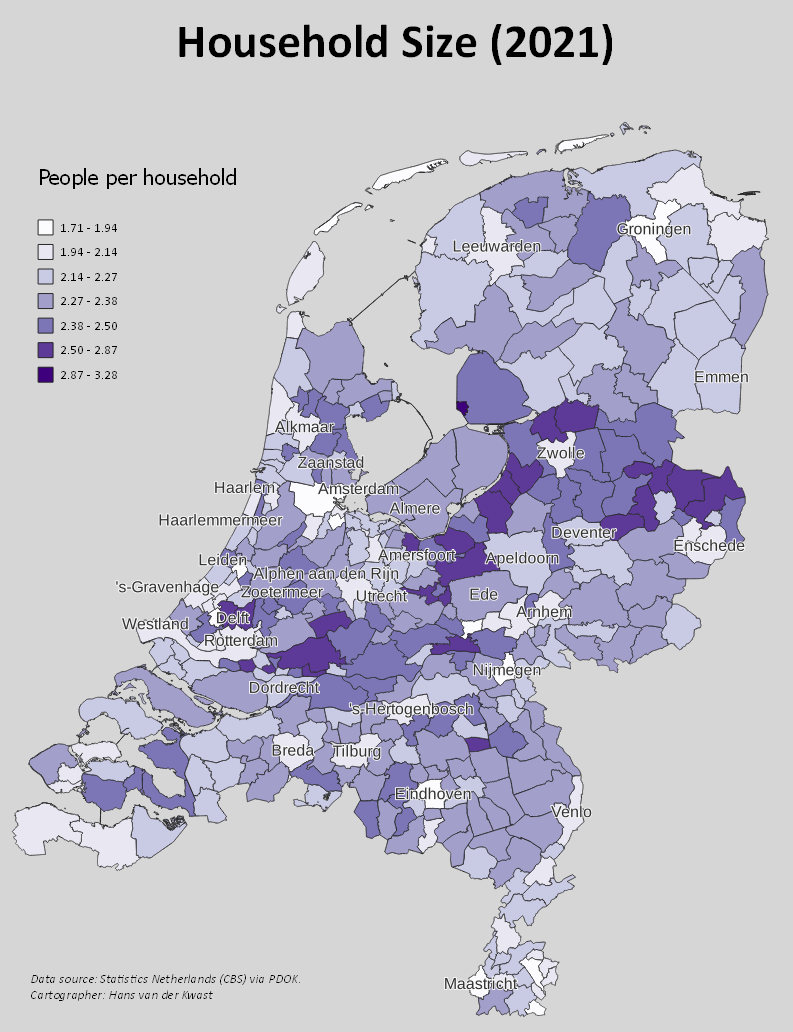
Now the data is ready to be presented as a choropleth map.
1. Click  to open the Layer Styling panel.
2. Change the Single Symbol renderer to the Graduated renderer. The Graduated renderer is used to assign ramps to choropleth maps.
3. Choose PeoplePerHousehold as the Value field used for the styling.
4. Click Classify to see our first results.

Let's tweak it a bit to make it nicer. First we need to improve the color ramp.
5. Click the drop-down arrow at Color ramp and choose All Color Ramps | Purples from the menu.
You can choose another nice one. Most important is that the color ramp should not give a bias to the interpretation. Blue is associated with water, red with danger. So here I choose purple because it's a bit neutral.
6. Increase the number of Classes to 7.
7. Change the Mode to Natural Breaks (Jenks).
You can play with these settings to get a nice result. With these settings there's a nice contrast between the municipalities with a high number of people per household and the other ones. Read this blog Lisa Charlotte Muth from Datawrapper to better understand color scale to use with your data.
8. Change the Precision to 2, to show only 2 decimals in the legend.
9. Have a look at the Histogram tab, click Load Values to see the distribution. This can also help you to decide on the class boundaries.

For the user it's easier to understand the map if we plot labels with the names of the municipalities.
10. Go to the Labels  tab.
tab.
11. Change from No Labels to Single Labels.
12. Choose gemeentenaam as the Value field. This field contains the names of the municipalities.
The map looks to crowded now. Let's adjust the settings so we only see the large municipalities.
13. Go to the Rendering  tab.
tab.
14. Click the Data defined override  button next to Show label.
15. From the drop-down menu choose Edit....

16. In the Expression String Builder dialog create the following expression:
"aantalInwoners" > 100000
This will filter the municipalities with more than 100,000 inhabitants and only those labels are shown.

17. Click OK to apply.
Now we need to improve the readability of the lables.
18. Go to the Buffer  tab and check the box to Draw text buffer. Set the Size to 0.5 mm.
Feel free to improve the map further and create a Print Layout.
Discussion questions:
- How can the map be further improved?
- Can you give an interpretation of the result? Is there a trend?