Visualize and Animate Mesh Data
2. Visualize Precipitation Mesh Data
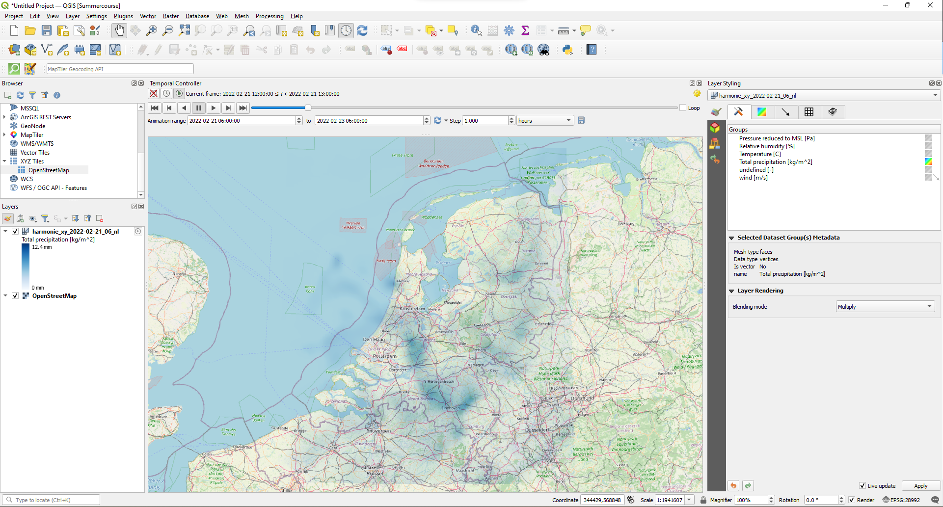
We're going to visualize precipitation predictions from the HARMONIE-AROME Cy40-model. This model predicts precipitation for the next 48 hours with a spatial resolution of 2.5 km and a temporal resolution of 1 hour. The data are provided as open data by the Royal Netherlands Meteorological Institute (KNMI). The files come in the GRIB mesh format. The GRIB format from KNMI, however, is difficult to use in QGIS. Therefore we use the files provided by Euros Zeilen.
On the main page you can download the GRIB file of 21 February 2022, when a lot of rain was predicted for the Netherlands. After the tutorial you can try to apply what you've learned to the recent predictions available at Euros Zeilen.
1. Open QGIS Desktop with a new project.
2. Locate the downloaded GRIB file in the Browser panel and expand it by clicking the black triangle.
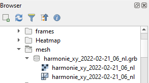
The mesh format is indicated with the  icon.
icon.
3. Drag the mesh layer to the map canvas.
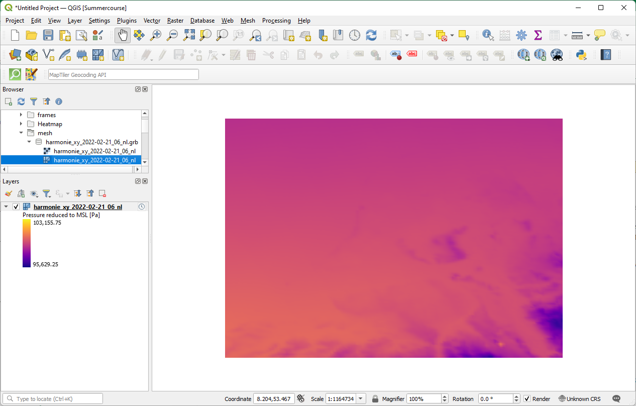
The mesh layer shows the default color ramp and has an Unknown CRS according to the projection of the project shown in the lower right of the window.
Let's improve this.
4. Set the projection of the project to the Dutch Amersfoort / RD New projection (EPSG:28992) by clicking on Unknown CRS.
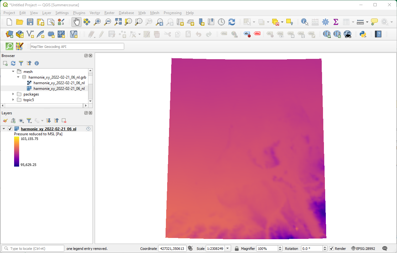
To be sure that the mesh is at the correct location (Netherlands) and to have a nice backdrop, we're going to add OpenStreetMap.
5. In the Browser panel, expand the XYZ Tiles folder and drag OpenStreetMap to the map canvas. Accept the default transformation and make sure that the OpenStreetMap layer is at the bottom of the Layers panel.
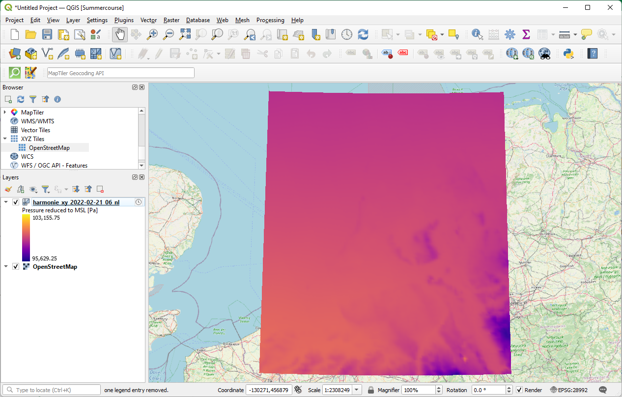
Great, the mesh is at the expected location!
Note the  icon next to our GRIB layer. This indicates that it is a temporal mesh.
6. Click the  icon to inspect the Temporal Layer Properties.
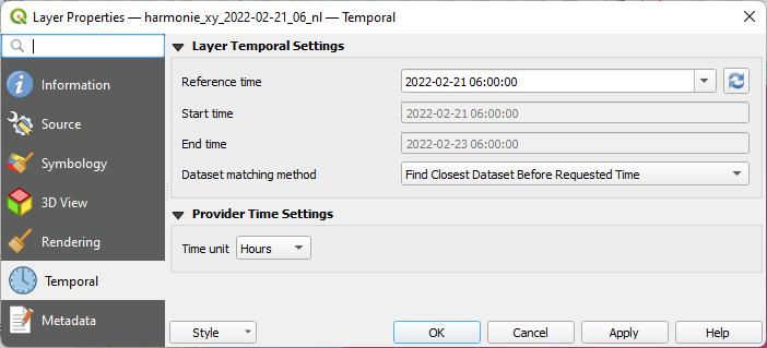
This is read from the mesh file.
7. Keep it as it is and click Cancel to close the dialog.
Now let's change the styling.
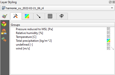
8. Click  to open the Layer Styling panel.
Note that the Layer Styling panel is adjusted to show the options for styling mesh data.
9. In the Datasets  tab click on the contour
  icon for Total precipitation [kg/m^2], because that's the variable that we want to visualize.
Note that the units of precipitation are in kg/m2 , which equals mm.
10. Now go to the Contours  tab.
tab.
Here we can change the color ramp.
11. Choose Blues for Color ramp.
It would be nicer to have the 0 mm cells (no precipitation) transparent.
12. Double-click on the Color of the row with the 0 value and set the Opacity to 0%.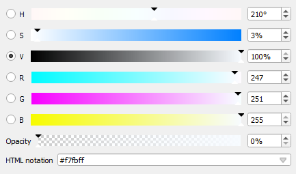
13. Click  to go back.
Let's improve the legend.
14. Click Legend Settings....
15. Type mm for Suffix (note that there needs to be a space before the unit).
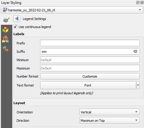
16. Click Customize at Number format.
17. Set Round to to 1.
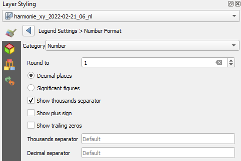
18. Click  to go back.
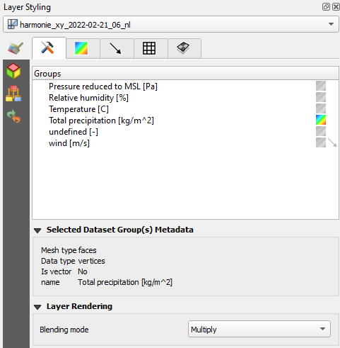
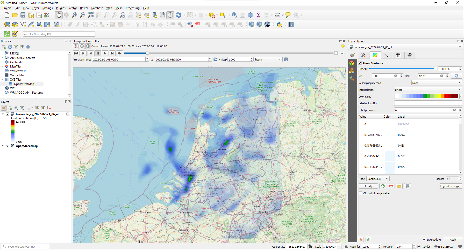
19. Go to the Datasets  tab and change under the Layer Rendering section the Blending mode to Multiply.
Now we're ready to animate the precipitation.
20. In the Map Navigation toolbar click the Temporal Controller Panel  icon.
icon.
21. Click  .
.
22. Resize the panel if needed and click 
Let's try another color ramp.
23. Go back to the Contours  tab in the Layer Styling panel.
24. Use the drop-down at Color ramp to choose Create New Color Ramp....
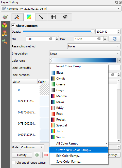
25. From the popup choose Catalog: cpt-city and click OK.
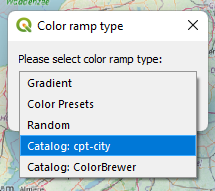
In this catalog you can find many presets of ramps categorized per theme.
26. Choose the Precipitation theme on the left side and select one of the ramps, for example precip2_17lev.
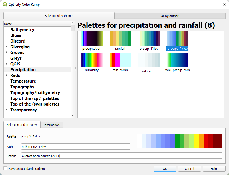
27. Click OK to close the dialog and apply the ramp.
28. Check the result and adjust the ramp if needed.
Next, we're going to do some calculations and create a graph.