Visualize and Animate Mesh Data
5. Create Graphs with the Data Plotly Plugin
The time series in our CSV file can be used to create graphs with spreadsheets or other software. In QGIS we can create graphs with the Data Plotly plugin.
1. Install the Data Plotly plugin from the Plugins Manager.
2. Click  in the toolbar to open the Data Plotly panel.
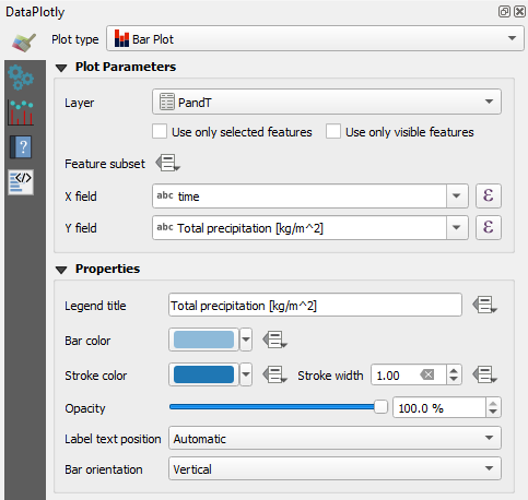
Let's visualize precipitation as a bar plot.
3. Change Plot type to Bar Plot.
4. Change the Layer to PandT.
5. Choose time as X field and Total precipitation [kg/m^2] as Y field.
Don't bother about the Legend title, we'll not show a legend for the graph. Keep the blue colors for Bar and Stroke.
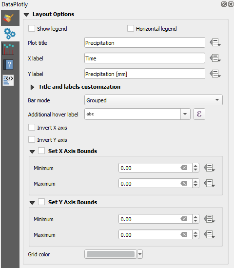
6. Go to the  tab and uncheck the box for Show legend.
7. Type Precipitation as Plot title.
8. Change X label to Time and Y label to Precipitation [mm].
9. Click Create Plot.
10. Adjust the panel to the proportion of the plot that you would like to see. Click  to export the plot to a PNG file.
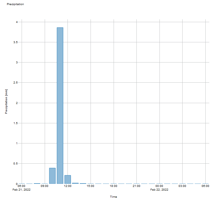
- How can we improve the bar plot?
 tab.
tab.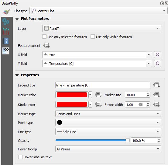
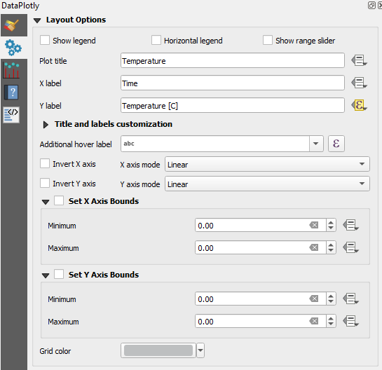
 tab and change the Plot title to Temperature.
 button and choose Edit.... from the drop-down menu.
'Temperature' || ' (' || char(0176) || 'C)'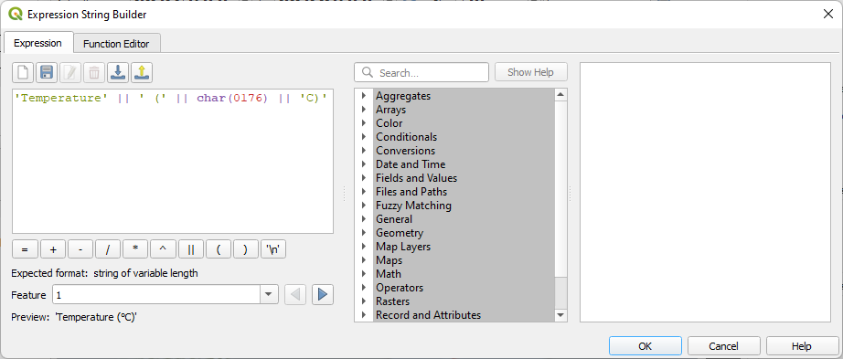
 to export the plot to a PNG file.
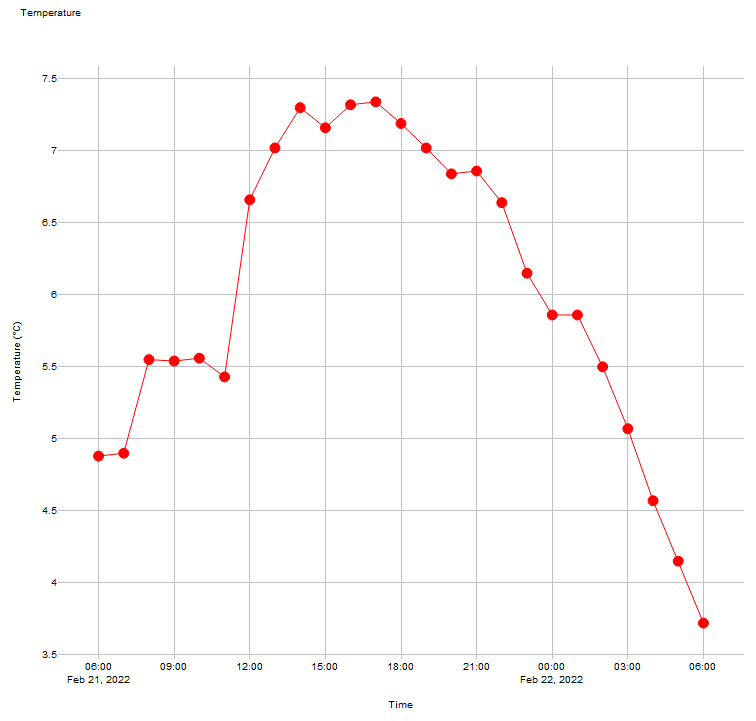
- How can we improve this plot?