Visualize and Animate Mesh Data
6. Create a Print Layout including a Data Plotly Plot
It is possible to add the plot to a Print Layout.
Let's first improve a few things in the map.
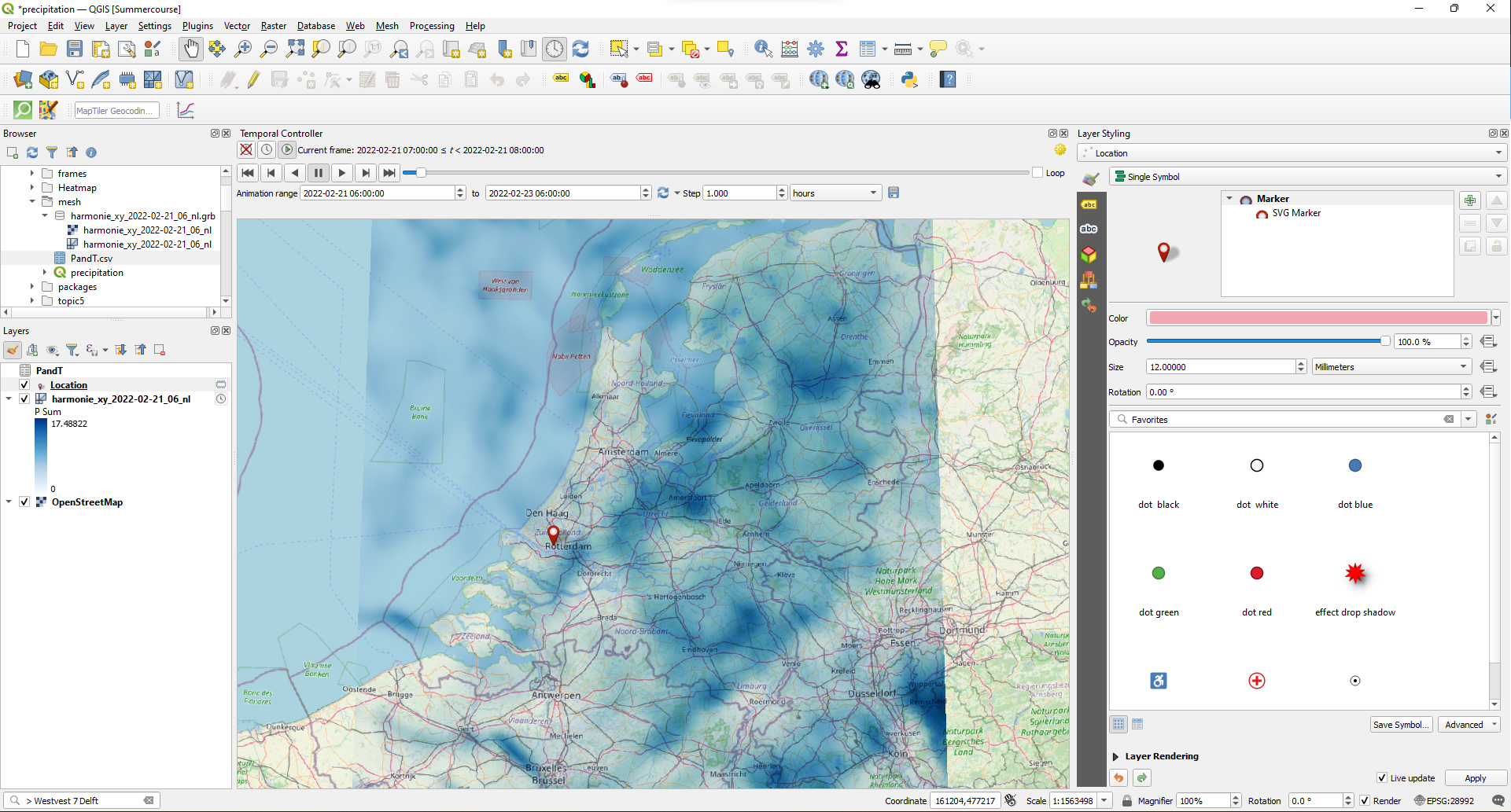
1. In the map canvas zoom out to the Netherlands and make sure that the P Sum is still visible.
2. Go to the Layer Styling panel and choose Location as the target layer.
3. Click on Simple Marker. Use the drop-down menu at Symbol layer type to change the Simple Marker to SVG Marker.
4. In the SVG browser choose the red marker under symbols.
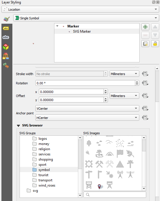
5. Click on Marker and change the Size to 12 mm.
Now let's create a new print layout.
6. Click  in the Project toolbar or choose Project | New Print Layout... from the main menu.
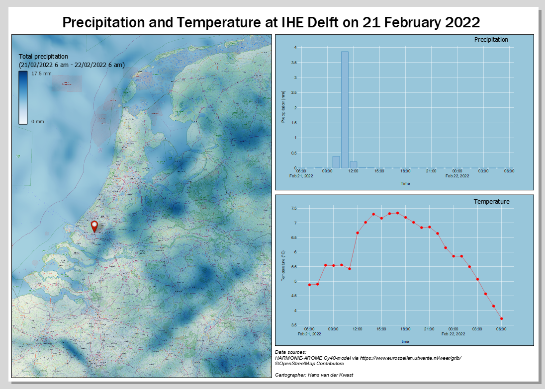
7. Name it Precipitation.
We'll keep the orientation of the sheet to landcape, because we want a map and a graph next to each other.
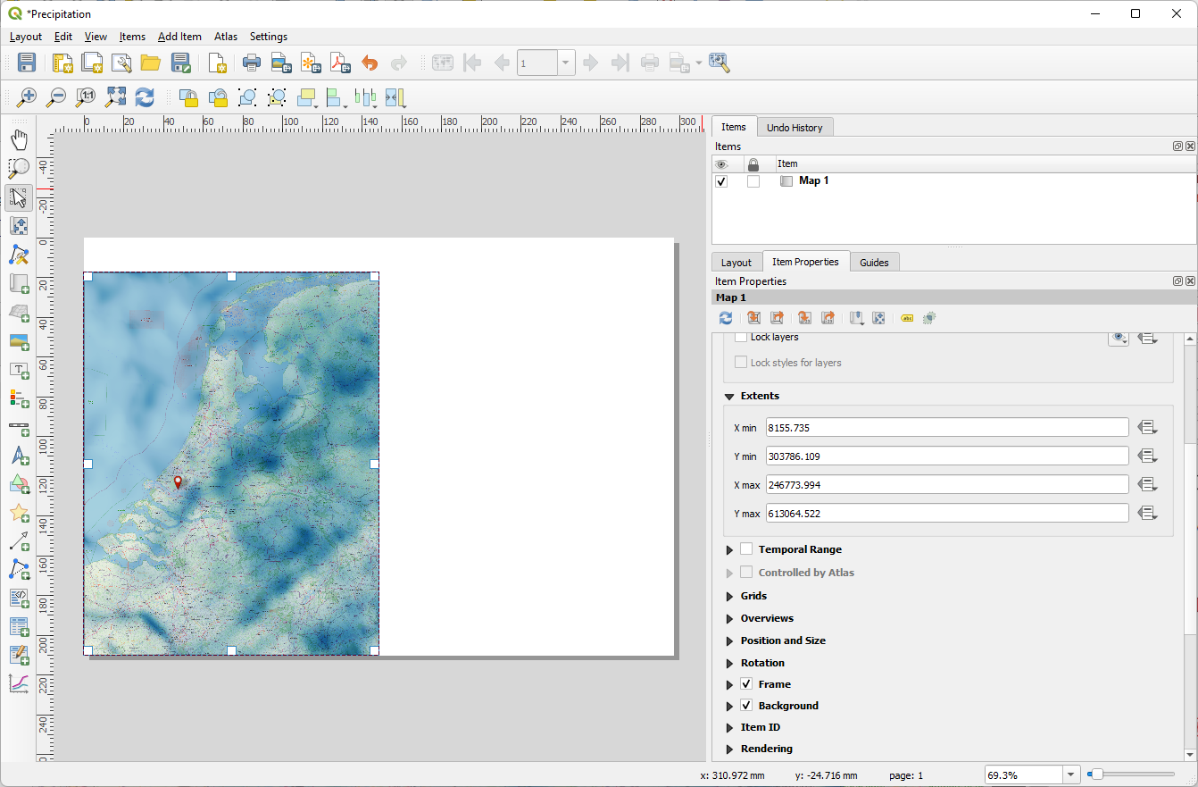
8. Click the Add Map  icon and drag a box that covers the left half of the sheet, leaving a little space at the top for the title.
9. Use the Move item content  icon to adjust the position and scale of the map. Make sure the whole country fits and that there are no gaps without precipitation data.
10. In the Item properties check the box to add a Frame.
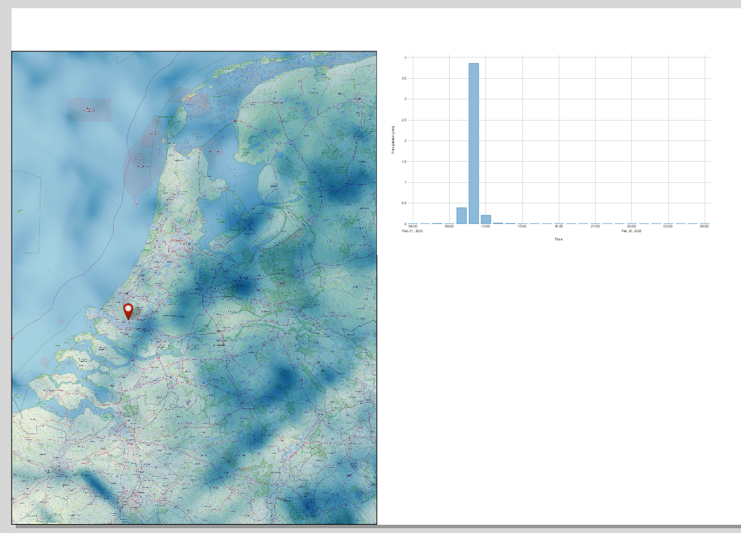
11. Click the Add Plot Item  icon and drag a box that aligns with the top of the map, is half its height and keep some space between the map and the plot.
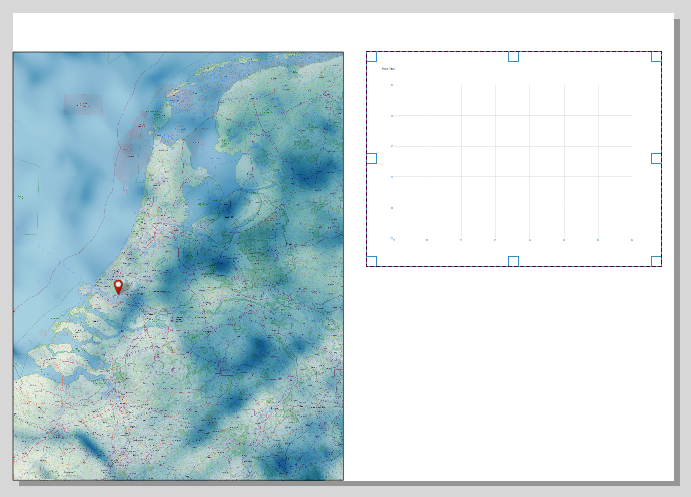
12. In the Item Properties click Setup Selected Plot.
13. Set it up for Precipitation as we did before (and try to implement some improvements). Don't add a title and make the fonts size 16.
14. Nudge the graph so it aligns better with the top of the map.
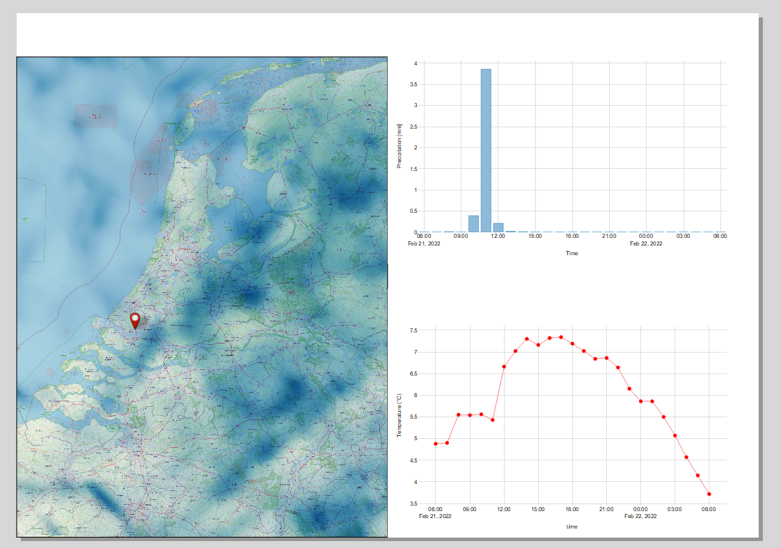
14. Now add a new plot for the temperature in a similar way. Tip: for the y-axis label expression you can find the expression that we used before under Recent (generic) in the Expression String Builder.
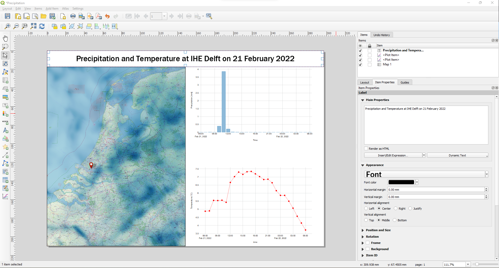
15. Click Add Label  and drag a box covering the white space at the top of the sheet completely.
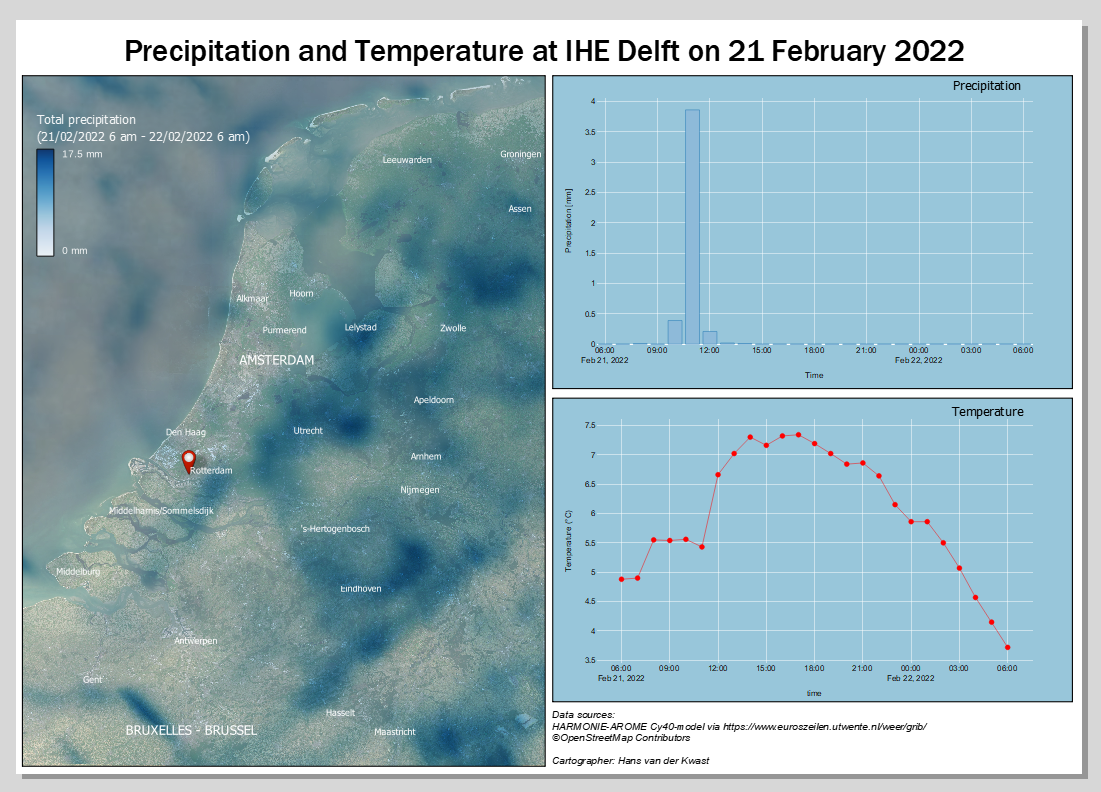
16. Type in the Item Properties Precipitation and Temperature at IHE Delft on 21 February 2022.
17. Choose a clear sans serif font, size 24, Horizontal alignment Center, Vertical alignment Middle.
Let's add a legend for the map.
18. Click the Add Legend  icon and drag a box in the North Sea.
19. In the Item Properties uncheck the box for Auto update.
20. Remove all layers, except the mesh layer from the legend using  .
.
21. Remove P Sum by selecting it and clicking  .
.
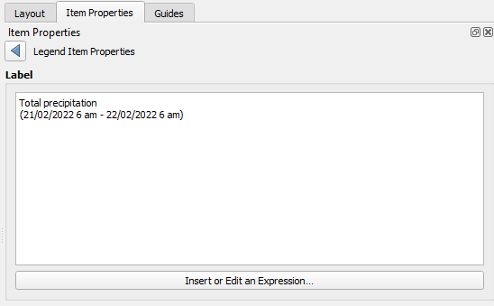
22. Double click the layer name and change it to:
23. Click  to go back.
24. Double-click on the color ramp.
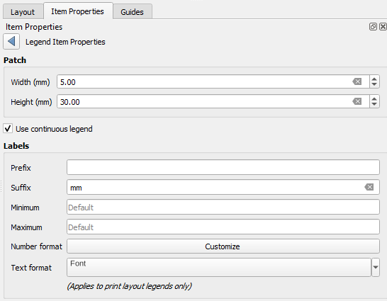
25. Change the Width to 5 mm and the Height to 30 mm. Set the Suffix to mm (don't forget the space before the unit).
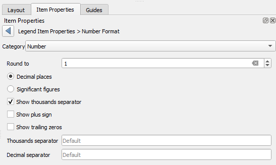
26. Click Customize at Number format and set Round to to 1.
27. Click to go back.
28. Set the Font to 8 points.
29. Click to go back.
30. In the Item Properties scroll down and expand the Fonts and Text Formatting section.
31. Change the Subgroup font to 10 points.
32. Scroll further down and uncheck the box before Background.
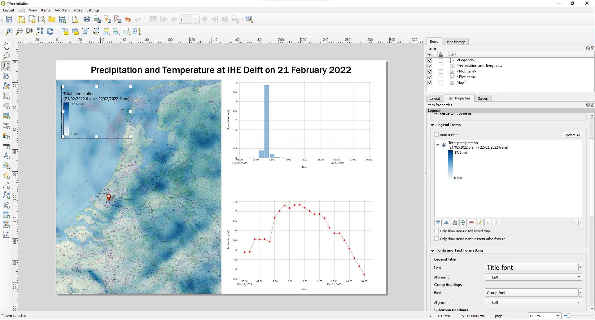
A reader from the Netherlands doesn't need a scale bar when the map covers the whole country so we can leave that away. Also a north arrow is not needed in this case. However, we do need to cite the data sources.
33. Add a text mentioning the data sources and author.
34. Try to tweak the Print Layout so that looks great.
You can also try a different backdrop by using a vector tile from MapTiler.