Tutorial Cartography for Map Figures in Academic Journals & Books
3. Hands On
3.6. Style The Data
We've decided on our story, loaded our data, and set up our page. Now it's time to style the data.
- First, let's center our view on the Great Lakes area using the zoom tool. It doesn't have to be perfect. We will adjust later.
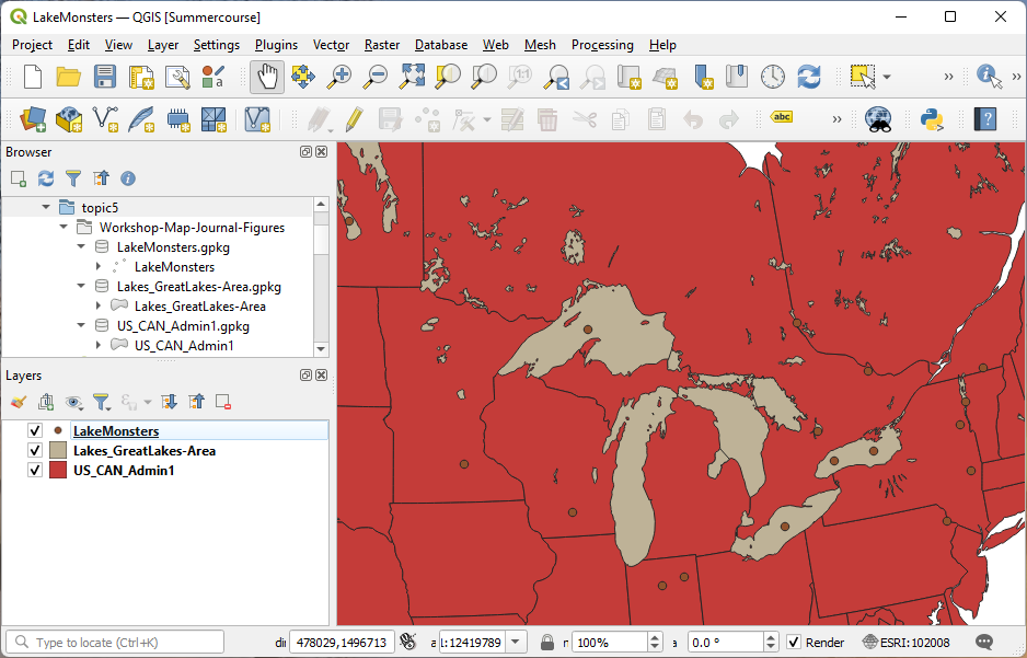
Again, these colors do NOT communicate well at all. We'll change it soon.
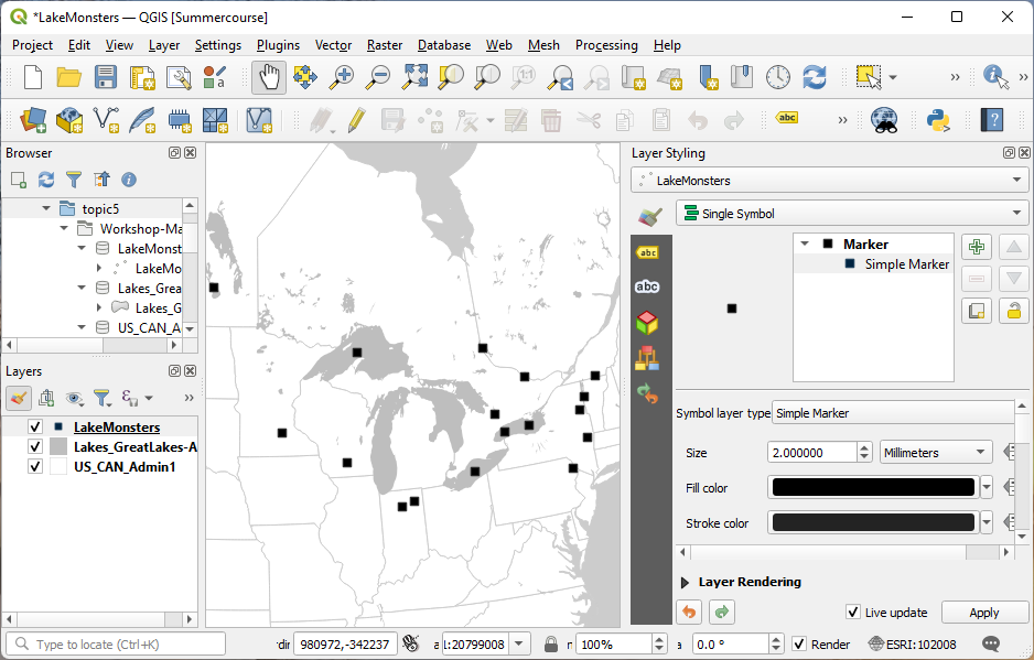
Let's open the Layer Styling Panel. This is a toolbar that can be docked on the side of the window and allows us to make changes to the layer styling with live updates (so we don't have to keep clicking to update).
States
Let's start with the largest background layer. This will have a big impact on how we style the other layers and will help set the tone for how we work.
- Open the Layer Styling panel by clicking

- In the Layers panel (table of contents), click on the States layer (US_CAN_Admin1). The options in the Layer Styling panel on the right should now reflect the current state of the States layer.
- In the Layer Styling panel, click on the words Simple fill - this lets us access the details of the way the state polygons are displayed.
- Click on the colored box for the Fill color.
- I want to make the fill of the states white, so in the HTML notation box, I will specificy #ffffff as the color (6 Fs). You could pick any color you like from the various color selector methods. When you're done, click the back buton
 to go back to the Simple fill options.
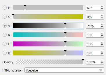
 - For the Stroke color (the outline of the polygons), I want to pick a shade of gray. Click in the color box next to Stroke color. In the color sliders, you can move the V (for value) to 80%, or you can put #cbcbcb in the HTML notation.
The stroke on the states might look a little light and might be confusing to the eye because the ocean color is the same color as the fill. Let's change the background color to make the ocean color easier for our eyes to understand:
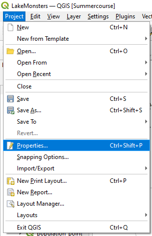
- On the Project menu, select Properties.
- In the General tab, click on Background color. Change it to the same color as the stroke of your states. Click OK in the color interface.
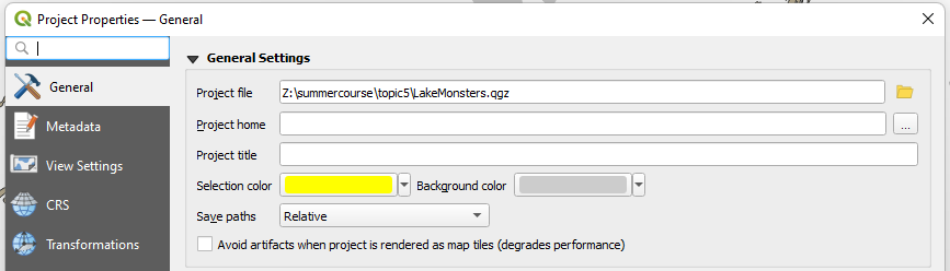
- Click OK in to close the Project Properties dialog.
We've got more work to do, but this is already starting to look better!
Lakes
Let's work on the lakes next.
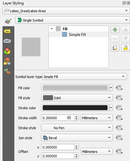
- Select the lakes layer (Lakes_GreatLakes-Area) on the Layers panel so it's activated in the Layer Styling panel.
- In the Layer Styling panel, change the fill color to 75% white (25% black)
- For the Stroke style drop-down menu, pick No pen, which removes the stroke altogether.
Remember our discussion of Visual Hierarchy? The background layers - the states and the lakes - now seem to recede and demand less of our attention. This is important so we can make the monster locations stand out next.
Lake Monsters
The last layer to style is the lake monsters.
- Activate this layer in the Layers panel by selecting it.
- In the Layer Styling panel, click on the words Simple marker.
- Scroll down to the box that contains different marker shapes. Circles are the obvious choice for point data, but I like to use squares for my point markers rather than circles because they stand out. Both are good options. In academic publications,
I try to avoid shapes like stars. They might look silly, but more importantly, they are complex shapes and we're trying to avoid complexity. Choose the square.
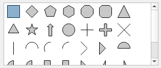
- For the Fill color, I'm going to use straight up black (#000000). This will make the points stand out well against the lighter background data.
- Adjust the Size as needed. I'm going to leave this for now until I see how it looks in the composer.