Tutorial Cartography for Map Figures in Academic Journals & Books
3. Hands On
3.9. Print Layout
Now that we've styled the layers we can go back to the Print Layout to finalize the map design.
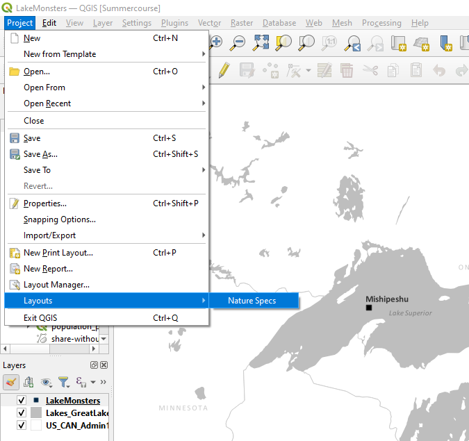
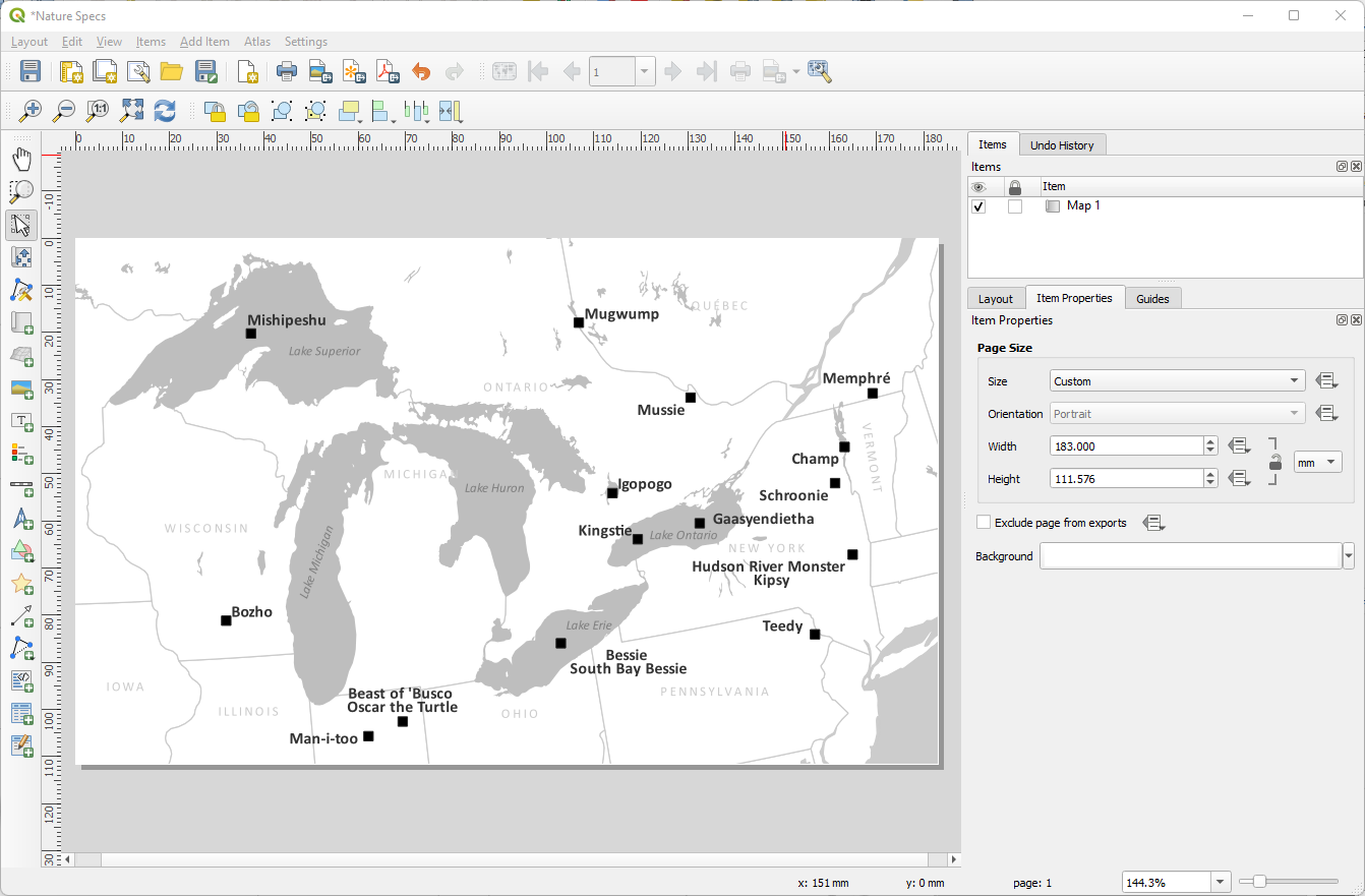
1. Open the Print Layout we made earlier with the page dimensions set to our journal specifications. In the main menu go to Project | Layouts | Nature Specs (or whatever you named your layout).
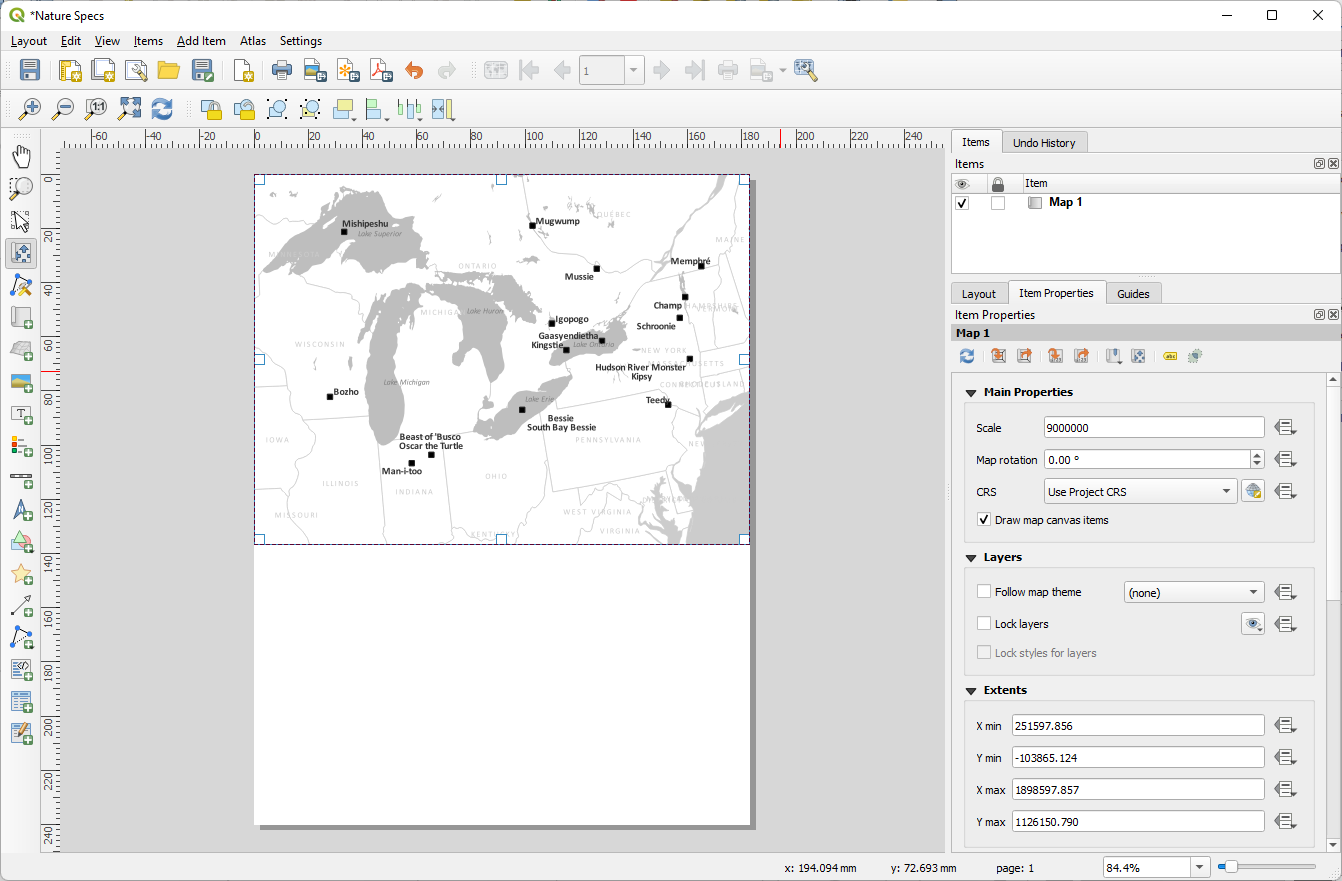
The Print Composer requires that you add any map elements that you want in your composition, including the map itself. Each of these items also has properties that can be accessed by clicking on the element on the page. The properties for any given element are displayed in the right side panel. Remember to switch back to the Select/Move Item button or the Pan Layout Tool after adding things.
2. Add the map with the Add Map  tool. Fill up the
space at the top of the page, allowing the tool to snap to the corners.
We won't need the whole length of our layout as it currently is, but
we'll adjust that later.
tool. Fill up the
space at the top of the page, allowing the tool to snap to the corners.
We won't need the whole length of our layout as it currently is, but
we'll adjust that later.
With the map selected, let's adjust the scale and center of the map.
3. Change the scale number in the Item Properties and recenter the map with the Move Item Content tool such that the data is centered and fills up the map space. Remember that our story focuses on the Great Lakes area, so we don't need to show data outside that space.
4. Using the resizing handles (they look like white squares when the map is selected), adjust the size of the map to fit the data well.
Now that we've picked a scale to render our map at, your
labels may not look quite the way you want them.
5. Copy the number in the
scale box of the Item Properties for the map. Switch to the
main QGIS window and paste that copied number in the scale box at the
bottom center of the window.
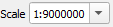
Now the scales match and we can see the effect it has on our labels.
6. Spend some time adjusting them to a better position.
7. Switch back to the layout window and click the Refresh view button. I might adjust my scale, center, and some of the labels as needed. For states that are not fully visible in the map, I will probably move the labels off the map so they aren't getting cut off. Also, you may need to turn off the option to Show all labels for this layer (including colliding labels) for any labels that are misbehaving (some of mine were in different places than I put them in the layout).
8. Now we can resize the map to tighten up the border.
Again, using the resizing handles, adjust the size of the map to fit the
data well. (I adjusted some label placement yet again as I refined my
composition. This is normal. As you change one aspect, others may need
adjustment too.). I also changed label settings in the Print Layout and unchecked Allow truncated labels on edges of map. In the Rendering tab in the Layer Styling panel check what happens if you uncheck Show all labels for this layer (including colliding labels) and check the box Only draw labels which fit completely within feature. It's a bit trial and error between a combination of settings and manual edits of individual labels.
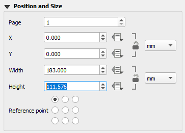
Finally, let's adjust our map canvas to fit our map:
9. In the properties for the map, look in the Position and Size section to see how high the map is. Copy that number.
Finally, do we need any other elements? This depends on (1) your story, (2) your audience, and (3) what other maps you have in the paper you are submitting. Is this for a North American audience? Then you probably don't need a scale bar or north arrow because the Great Lakes are a fairly recognizable area. Is it for an international audience? Maybe you need those things. Maybe I have another map that shows all of North America or the world and I've already outlined my study area in that. Then I don't need to add extra context.
If I was going to put a scale bar and north arrow, I would put them on Iowa and Illinois and I would make them the same gray as the state lines or maybe the same color as the lakes and they would be reasonably small. Complex compass roses are wonderful for large maps, but they are not a good choice when your space is limited.
Sometimes I will put a box behind the scale and north arrow filled with the background color (white in this case) to avoid conflicts with the data around them. We can cut off a part of the Iowa/Illinois state line to make the label more clear and not hurt the way the map communicates the data.